For starters, we’d like to say thank you for the amazing reception our free eBook Web design and Mobile Trends for 2013 has had since its launch last week, and especially to all those who made it possible by sharing their insightful opinions.
Today we’re doing a review of the end conclusions, where we will identify and analyze 10 of the key trends. This is just a brief overview of the conclusions you can read in the book. In fact, we have now released an updated version of the eBook in PDF format, which includes a few corrections and a new layout for an easier and more enjoyable reading experience.
-
What will be those key trends?
- 1. CONTENT FIRST
- 2. SIMPLICITY OF DESIGN INTERACTION AND CONTENT
- 3. UX CENTERED DESIGN
- 4. APP STYLE INTERFACES
- 5. THE UNIFICATION OF DESKTOP AND MOBILE INTO A SINGLE VERSION
- 6. SVG AND RESPONSIVE TECHNIQUES
- 7. FLAT COLORS AND NO MORE SKEUOMORPHISM
- 8. TECHNOLOGY AGNOSTIC
- 9. EXPERIMENTATION AND INNOVATION IN DEVICE SENSORS AND INTERACTION
- 10. THE INTERNET OF THINGS
It’s no easy task putting together a short summary of all the interviews, but as far as we’re concerned, there are a few memorable statements in the book which nicely encapsulate the conclusions we’ve come to:
Bruce Lawson:“If I go to a train website, I don't really want to see a picture of Richard Branson smiling at me, I don't want to read the Chief Exec's ambitions and life history. All I want to know is what time my train is and how much it is.”
Karen McGrane:“Mobile is not the Lite version. You don’t get to decide which device people use to visit your website. They do.”
Simon Foster:“I always keep it in mind that no matter how beautiful I make a website the average user only really wants to spend about 10 seconds on it.”
This project reveals the need to prioritize content and the user’s point of view. Almost all the participants expressed concerns about accessibility and application performance across the multiple devices that exist today and will only continue to increase in number. This wasn’t the case a few years ago, as Rachel Andrew points out:
“We were all saying ‘in a few year’s time we’re going to have massive screens and all this space and people are going to have really fast connections’ and what’s happened is we’ve all ended up on tiny little screens with crappy bandwidth.”
So years ago the tendencies would have been very different. We would have been focusing more on development of visual effects, animation etc...But the future is unknowable.
We have to reach our target users, wherever they live, whatever device or browser they use, and serve them our content in the most efficient way possible. Though this is what web standards evangelists have been shouting from the rooftops for years.
All the trends discussed here are interdependent and fundamentally defined by three principles: Content oriented, UX-centered and Simplicity, which make up the new paradigm we’ll need to work with when we come to face the deluge of devices that’s looming on the horizon.
-
1. Content First
Content-first will be the center of the galaxy. Content is the most talked-about term in the book. In the coming months we’ll see deep debate about how content should be presented to the user and whether or not we should adapt it to the device.
In any case, this should be our main concern. We need to create efficient, searchable, accessible, multi-platform content and make sure it reaches the user via the best interactive experience possible.
-
2. Simplicity of Design Interaction and Content
Simplicity is the new paradigm. The process of simplification will be the only tool we have to make content accessible and readable on the greatest possible number of devices, with the best user experience. Content strategy, UX, Usability, Accessibility and Visual Design must all be guided by this new paradigm.
-
3. UX Centered Design
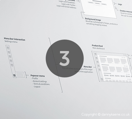
The user’s point of view and their experience of using the site and its content is what is ultimately important. All participants agree on simplification on a visual and interaction level. Traditional websites will continue to adopt mobile app UI patterns precisely because they offer a more simple and efficient user experience, which brings us to the next point, “App Style Interfaces”...
-
4. App Style Interfaces
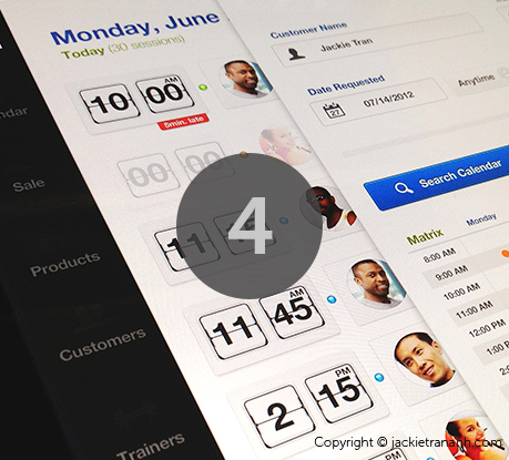
Over the next few months we’re going to witness a process of transformation for most desktop websites, which will increasingly imitate the style and interfaces of mobile apps, unifying and simplifying content and design and at the same time facilitating the creation of responsive projects.
-
5. The unification of desktop and mobile into a single version
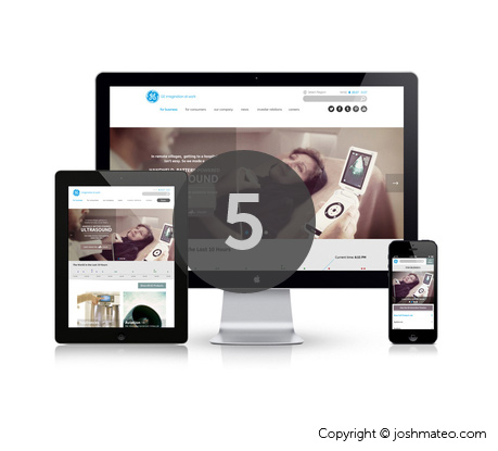
Responsive, Adaptative Content, Mobile First, Device Agnostic, Resolution Independent; all these terms are evolving towards a common destination which is the unification of desktop and mobile into a single version. But how to integrate apps and experiences through multiple devices?
Our experts foresee an evolution in responsive. The trend until now has been to adapt content, but many voices now argue for unification.
-
6. SVG and Responsive Techniques

The search for multi-platform versions and cross-platform technologies will lead to responsive techniques such as SVG, webfonts, design with typography and icon fonts evolving and becoming more widespread, and on a visual level we’ll see trends like the ones coming up in the next point...
-
7. Flat Colors and no more skeuomorphism
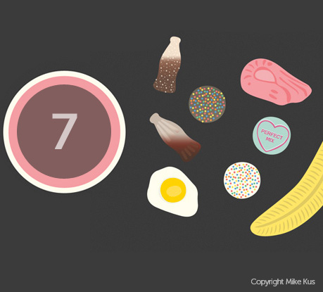
The main visual trends identified by our participants were simplicity, minimalism, clear layouts, app-style interfaces, design focusing on typography, less decoration, less skeuomorphic interfaces, flat style, flat colors... This exact trend towards simplification in design and seemingly aesthetic matters, such as flat colors, responds to the need to create adaptative projects and serve images and scalable elements to retina displays with excellent performance on 3G connections, but also to mobiles with inferior provisions from the non-western market and to devices such as eReaders.
-
8. Technology Agnostic
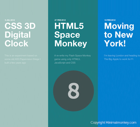
Technology agnostic, of course, is the main idea.
In web standards based applications, looking at the data graphic below we can see that the HTML/ CSS/ Javascript trio is the “primordial soup”. We then have lots of CSS in its various forms, custom filters, CSS Effects, 3D Transforms, Preprocessors and technologies such SVG or webfonts related to responsive techniques. It’s worth pointing out the growing interest in Javascript for web app development, but when it comes to effects, animation, filters etc., it will step aside to make way for the new capacities of CSS3.
In server-side languages Ruby and Python and experimentation with Node.js are becoming more widespread. The multiplicity of frameworks and builders will be another constant.
On the other hand we have the development of native apps for iOS and Android, where there’s nothing new either, just the intense and continual increase in demand and the desire to have more suitable cross-platform technologies, based on web standard technologies or otherwise. The spread of Android means demand for Android apps seems to be gaining in importance.
Another thing that really stands out is the growing interest in WebGL, particularly among the big agencies. This technology is raising high expectations thanks to its performance and the potential it offers on an experimental level.
-
9. Experimentation and innovation in device sensors and interaction
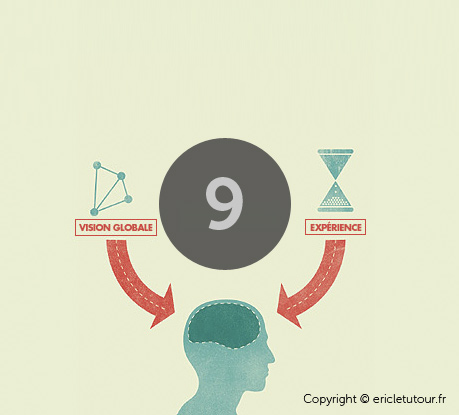
It will be a time for getting the best out of mobile technology and creating new user experiences, exploring device sensors and experimenting widely with touch-enabled-interfaces, speech-based, etc.
-
10. The internet of things
Soon we’ll be able to communicate not only with our fridges and televisions, but even with devices with tiny LED screens, In-kitchen devices, In-car audio interfaces... Hundreds of totally different platforms will spring up. Without a doubt, interactive TV will have a leading role. How will we be able to evolve towards a rational unification of all this?
As Aarron Walter says, we’ll see an “Ecosystem of connected services” and we’ll have to work hard on integrating services and user accounts.
Well, that’s it for our humble account of what will be happening in the next year, and as we say at the end of the book:
“These conclusions won’t be anything like the reality, because at this very moment some anonymous genius is probably giving form to a new technological revolution.”
-
Data visualization. Web Design Trending Terms
The following images are a visual representation of Trending Terms, the most frequently mentioned terms throughout this project. These data visualizations allow us to gain an overall vision of the visual and technological web design trends for this year.
