When you design longer forms, you’ll actually get more of another kind of conversion, thus proving that longer web forms increase conversions as well!
Conventional wisdom in web design says that you have to avoid designing web forms to be long because they hurt your site’s conversion rates. You’ll lose leads and customers who don’t want to bother with taking the extra time to fill out more fields. So goes the conventional wisdom.
There are even specific case studies backing this up, such as the famous Expedia example, where the company shortened its contact form by one field and got $12 million in extra profit.
Certainly, this means that forms should always be shorter, right? Conventional wisdom can’t be wrong, can it?
In this case, conventional wisdom is wrong. While shorter forms certainly increase conversions, that doesn’t tell the whole story because it’s the exact type of conversion that you should care about—not just more conversions in general.
When you design longer forms, you’ll actually get more of another kind of conversion, thus proving that longer web forms increase conversions as well!
Longer Forms for More High-Quality Leads
According to HubSpot, you should design your forms to have more fields if you want to capture more high-quality info from your site visitors. It turns out that shorter forms produce a greater, overall number of conversions, but longer forms produce more high-quality conversions. This makes a lot of sense when you analyze it.
Yes, shorter forms mean that you’ll get more people overall willing to fill out the info and submit the form. However, when people fill out more info about themselves in longer forms with a few more fields, they will provide you with more high-quality info. It’s that simple. So we can say that longer forms produce more high-quality conversions.
Defining Longer and Shorter Web Forms
At this point, it’s extremely useful to define what makes a longer form and what makes a shorter form.
First, you should ask yourself as a designer what’s really necessary for a company to know from its prospects to help it market to them in the future. HubSpot says that only three fields are at least necessary: name, email address and job title. If we go by this definition, then really anything more than three fields qualifies as a longer form.
If we look at a Marketing Experiments study that compares best-performing forms based on the number of fields, then five fields is the definition of a shorter form since it had the best conversion-rate, quantity-wise. It compared five-, seven- and nine-field forms, with the shorter form beating out the longer form by a 3.4% conversion rate.
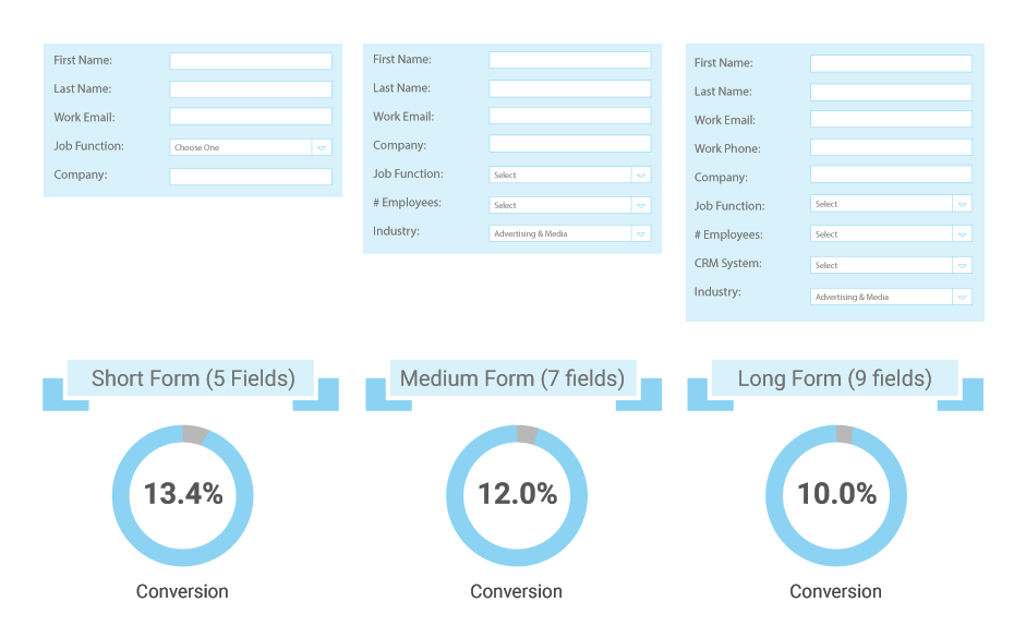
Of course, remember that the longer form of nine fields will have the better high-quality info conversion rate. This refers to the richness of the info that the company receives, as you naturally get more specific info with more form fields.
Considerations for Forms Designed for the Buyer’s Journey
Since forms are meant to help site visitors and buyers convert, designers have to create with the users in mind all the time. Besides form length and the number of fields, you also should think about how easy it is for buyers to use forms and fields.
For example, use natural language forms to boost conversions. Whatever you want to call them—some call them Mad Libs forms since people are encouraged to fill in the blanks in a form themselves—they can help your client’s site’s conversions. There was a famous study done by Yahoo’s chief design architect, Luke Wroblewski, that concluded how natural language forms raised conversions on forms by 25% to 40%. That’s significant!
That’s because forms like these use natural sentence structure and ask for buyer info in fields that are naturally sprinkled throughout the sentences. This makes it seem less invasive when people are inputting their personal info.
Therefore, you as a designer should consider straying from the norm for a change and incorporating this form into your next landing, contact or lead-capture page. Depending on how much info you want to know from buyers and how many fields you sprinkle throughout the natural sentences, you can still make this setup a longer form as well.
Look at these examples of natural language forms.
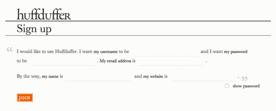
First up is Huffduffer’s. Note how each field that asks for user name, password, email address, real name and website is naturally worked into the sentences.
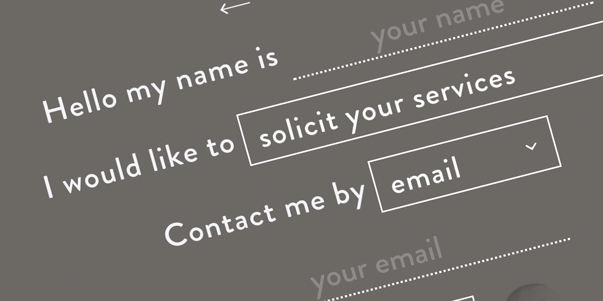
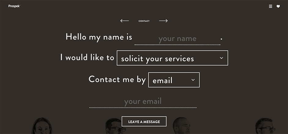
Next is Prospek.ca’s. There are four fields in total that people can fill out, yet the natural way of filling out the form improves the user experience and, thus, conversions.
Application From a Designer’s Standpoint
So as a designer, how do you apply all of this knowledge as you’re creating a form for your client’s site?
It’s important to understand what your client wants in the first place. Does the company want to get more leads overall (shorter form) because it wants to put more prospects into its conversion funnel, or does it want more narrowed-down leads (longer form) because it already knows its target audience?
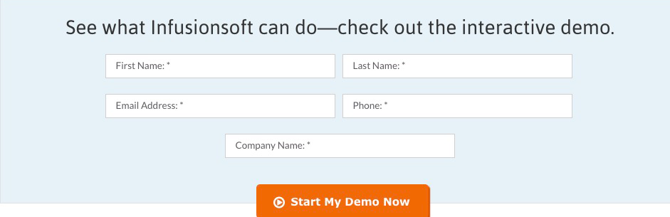
If your client just wants to get a bunch of leads submitting their contact info, then you should take your cue from a form like the one on InfusionSoft’s demo landing page. Note how it has just five fields that ask for only the basics? In addition, the fields are arranged for how people read in the west, which is in rows, from left to right. This emphasis on easy readability and “skimmability” also helps conversion rates.
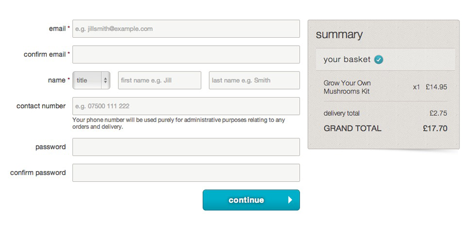
Now, let’s say your client wants to boost his high-quality conversions that are characterized by more specific details. Then, you should use a form length like this one for personal info during the checkout process on an online store. Note how there are eight fields in all, as well as a box you can check at the bottom. With a form of this length, your client’s obviously going to get more high-quality conversions of richer data, which is perfect for follow-up marketing.
Conclusion
Yes, there are many places on the web that proclaim how shorter forms are the best for conversions, but these sources fail to consider the quality of these conversions. As we’ve demonstrated, while the overall quantity of general conversions is greater with shorter forms, it’s the longer forms with more fields that increase the richness and quality of the data of these conversions.
So the only question that designers have to ask themselves is what kind of information do my clients want to get from site visitors? If they only want general info like names and email addresses, then the shorter, the better. But if they want more specific details for real audience and lead targeting, then longer forms will definitely boost high-quality conversions.