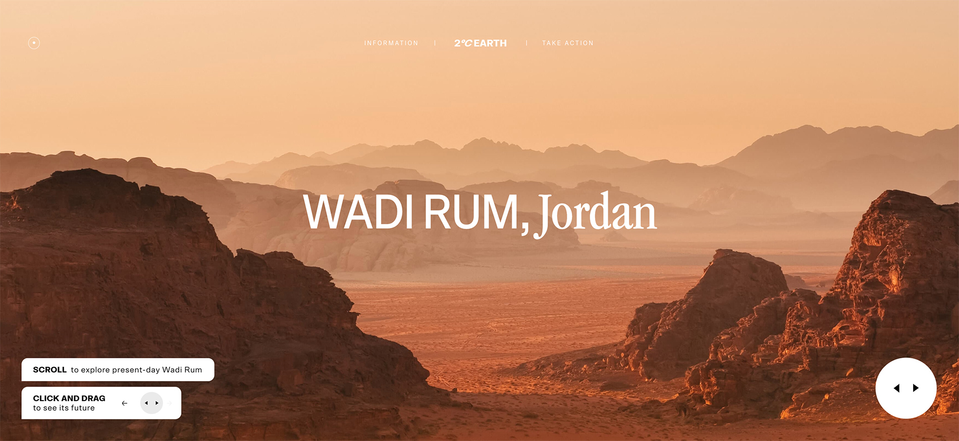
Congratulations to Jingqi Fan for winning Site of the Month September 2020 with 2°C EARTH. Thanks to everyone who took the time to vote, find the winner of the Pro Plan in our Design Directory at the end of the article.
A labor of love that began early this year as my undergraduate degree project, 2°C Earth is a visual guide that explores five locations around the world whose natural and cultural heritage is threatened by climate change. Created to be visually engaging, auditorily immersive and easily digestible for audiences disengaged from our climate crisis, this interactive experience hopes to educate and inspire more people to join the collective fight for our future.
Context
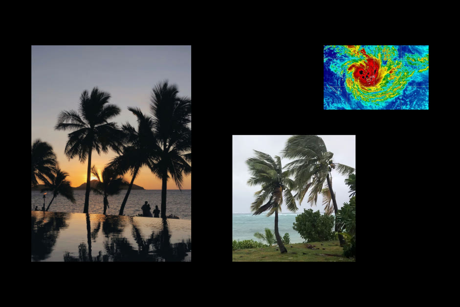
2020 has been a year of unrest, disasters, and—an ongoing pandemic. This is the year that not only defined but also challenged the concept and purposes of 2°C Earth. When I stayed in Fiji early this year, Cyclone Sarai tore through its islands. My time there manifested itself into a devastating wake-up call for climate change. The heavy rainfall, flash floods and damaging winds was not only a window into our changing world but also an emotional anchor that formed the basis of 2°C Earth.
Project Definition
Foundation
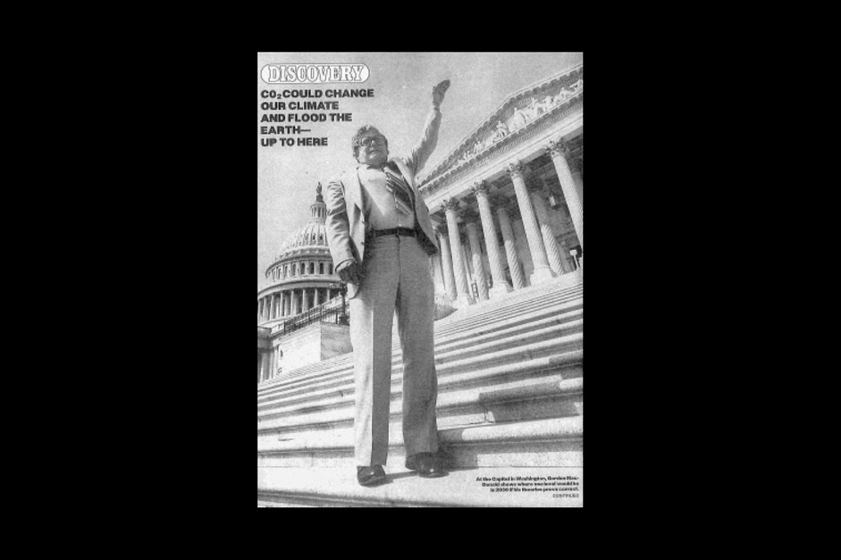
Research began by finding compelling ways to approach the topic of climate change. As I delved deeper, I found a promising angle—the concept of degrees. I was drawn to the fact that small increases in average global temperature correspond to devastating environmental impacts. As Dunne and Raby wrote in Speculative Everything, critical design should “unsettle the present rather than predict the future”. In doing so, we reside in the space between the probable and the plausible. For this project, it means a world that has warmed 2°C above pre-industrial levels—a world that’s warm enough to cause severe and in some cases irreversible consequences but salvageable if we act now.
...critical design should ‘unsettle the present rather than predict the future.
The Twist
In considering the broad topic of climate change, it becomes clear that this global phenomenon cannot be viewed as one isolated from our human world. Travel, in turn, became the twist that I had been looking for all along. Tourism enables us to explore incredible places around the world yet wreaks damage on those very places we visit. What would some of the most beautiful destinations look like if Earth warms 2°C? What if people could travel to those places virtually and immerse themselves in its landscapes and ambience?
Visual Explorations
Throughout the process of exploring possible directions, I tried to give myself lots of space to ruminate over ideas and to push the project further against the limits of what its concept could hold.
Research
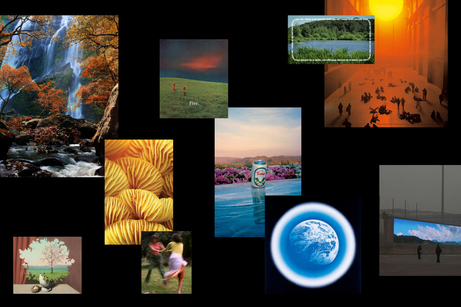
I was drawn to the theme of nostalgia, rich color palettes and the notion of freedom that we often associate with travel.
Potential Directions
During the early phases of this project, I was quite hung up on a few ideas:
- A draggable map in which users could choose different locations to travel to.
- Carbon Dioxide particles overlaid on the experience with the particles growing denser as users travel to more locations.
- A pop-up window or notification alert informing users of weather, carbon footprint and other location-related information.
- Classic gridded homepage with images cut out to different shapes, like picture frames on a wall.
Some of the early designs from my XD file.
Later on in the process, it became clear that the elaborate homepage concepts were overpowering the main content of the experience—the destinations. So, I shifted my focus. The homepage, in turn, receded while the destination pages were given their much deserved spotlight.
Some more refined designs from my Figma file.
Content Development
Visual Content
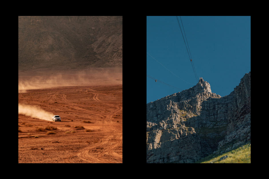
To create an immersive and enticing experience for the visitor, images are chosen for their idealized depiction of each location’s character and ambience.
Written Content
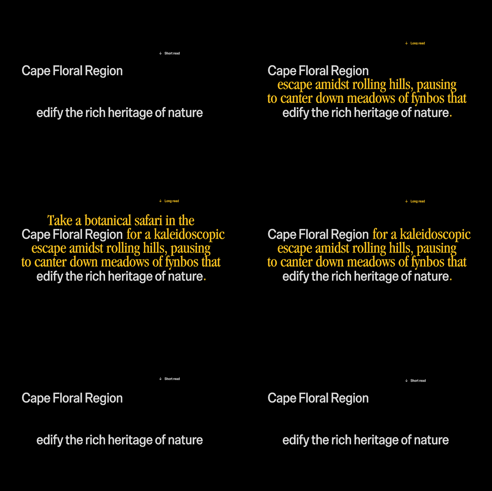
Copy utilizes a tone of voice reminiscent of writings from travel guides. World Heritage and Tourism in a Changing Climate, published by UNEP, UNESCO and the Union of Concerned Scientists, became the main reference for this project. I often referred to the report in choosing destinations to focus on. Location specific data were obtained from credible sources, i.e., peer-reviewed scientific journals and databases(courtesy of my tuition-enabled access to my university’s extensive library).
Building the Experience
The State Toggle
Once I had a visual language and content system that was beginning to take shape, the different keystone pages that had to be built out were clear. Among them, the destination page was the most exciting but also the most challenging. I began by creating a destination view component with a present and future view stacked on top of eachother. Toggling would reveal and hide the present view by animating its CSS clip-path property. Math.min() and Math.max() are used to bound the slanting of the clipped shape as well as achieve the shifting angle effect when users move their cursor around the page.
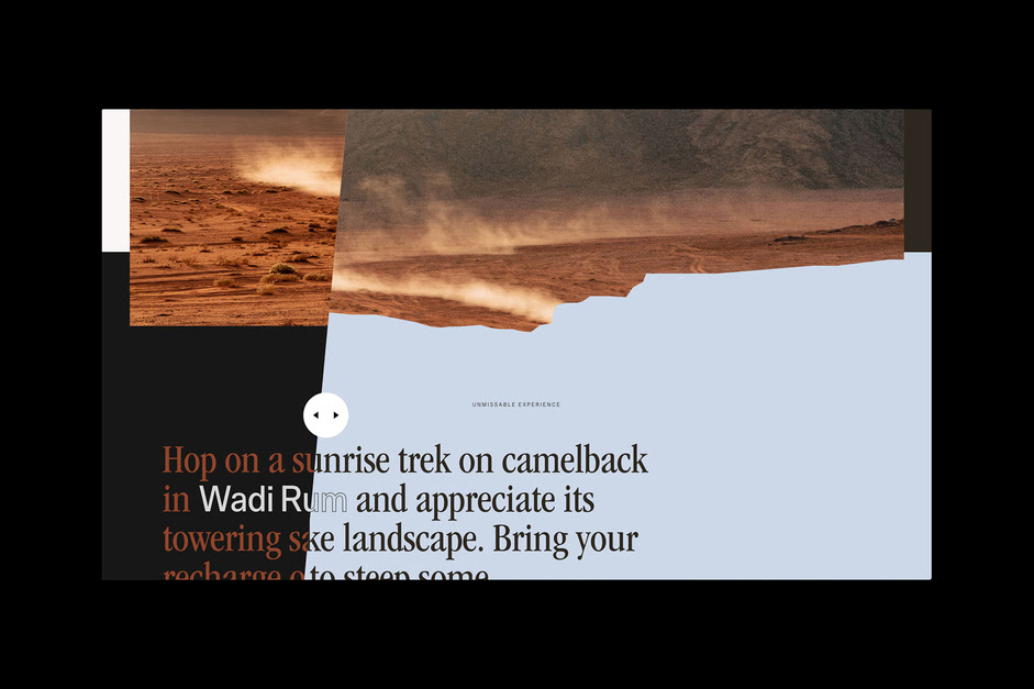
Toggling gesture on the Cape Floral Region page.
Syncing the Scroll
The destination page is essentially two pages in one. In an ideal world, the two scrolling containers would move together. I’ve come to realize that it’s an impossible solution to implement; the browser would simply give up trying and the fans in my laptop would spin out of control. Well, what if I sync the scroll positions right when users are about to see the other view so we don’t waste unnecessary energy? I could also hide the view that isn’t visible to the user with visibility: hidden. Lo and behold, the frame rate began hovering around 60fps again.
.jpg)
Sound
2°C Earth is introduced through a soft yet captivating voice that evokes the feeling of Mother Earth. Then, to hone in on the immersive aspect of this project, I added ambient sounds throughout the experience—set to loop. Location-specific sound effects were added to each destination and triggered on scroll to keep the user’s audiovisual journey in sync.
Experience introduction.
Motion
Once I had the toggle mechanism in place, I was able to build out other destinations fairly quickly by feeding in settings and parameters from a JSON file. With the layouts ready to go, I needed to create a cohesive motion story throughout the experience. Clip-path and overflow: hidden; reveal animations stylistically echoes the toggle motion in destination pages while simple opacity fades help soften out the sharp edges in the rest of the experience.
Transition from the homepage to destination pages function as an expanding window that transports visitors into those locations.
Wadi Rum page.
Take action page.
Geolocation
The only missing piece in the experience is a call to action. What could be a visitors’ takeaway after travelling to different destinations and learning about its plight? I decided to add a personal impact component at the bottom of every destination page that makes emissions-related comparisons by detecting the user’s location—a slightly creepy but personal way for visitors to realize their potential impact on our environment.
Personal impact component displayed on a laptop in a quiet forest.
Technologies
Nuxt is the backbone of this interactive experience. Animations were created with GSAP, smooth scrolling and parallax are done with Locomotive Scroll, and sound controlled with Howler.
Tools
Initially, I designed in XD, then I switched to Figma for the rest of my prototyping endeavors. Photoshop, Illustrator, Premiere Pro, After Effects and Audition are used to design and edit the visual, motion and sound of the experience. Visual Studio Code is my code editor of choice. pyftsubset, ImageMagick and audiosprite were the command-line tools I used to efficiently optimize assets for production.
Credits
Jingqi Fan is a graphic and interaction designer creating meaningful experiences within print and digital contexts. She also enjoys coding.
Thanks for getting involved in the voting process and tweeting about it, @glenncatteeuw you have won the Pro Plan, DM us on Twitter to get your prize! :)
