As you already know, microinteractions are one of the hottest UX trends right now. They enhance user experience, provide important feedback, explain functions and even entertain your audience. Today, I'm going to dive a little deeper and share some tips on how to take your microinteraction design to the next level.
Microinteractions - A Magic Formula?
Microinteractions are such a fundamental part of website design these days, that any site without them will probably look boring and bland. We like to think of them as the magic components that add delight, create surprise, and offer something entertaining and engaging.
However, creating fabulous microinteraction design isn't always easy. You've got to create something practical which makes the user's life easier. It needs to be intuitive, human and responsive. In short, if you haven't got microinteraction design mastered by now... you really need to get on it pronto!
Explaining Microinteractions
Essentially, you should think of microinteractions as small product moments that accomplish one task, and one task only. You use them all the time when you're online. Here's just a few examples of microinteractions in action:
- Liking a Facebook post
- Setting a status message
- Changing a setting on a site
- Rating a song
- Doing an online search
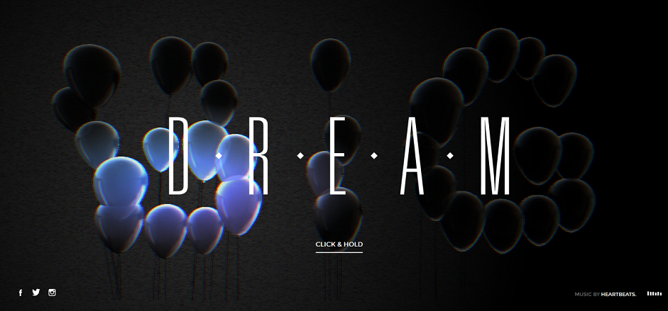
They're a vital cog in the wonderful machine we call the online experience. Your user triggers the microinteraction, which in turn, triggers another part of the process. With a nice use of progress bars and simple instructions you can create a really unique user experience. Just check out this site:

Another key thing to keep in mind about microinteractions is that they're a human-centered design concept. They mirror how we humans actually do something - and that's why they're so deliciously easy to use. Never forget this fact when you're implementing them into your own designs!
KLM totally nail it - using microinteractions to highlight changes, states and guide user further to discover more reasons to travel.

What's the Big Deal?
Hey, they're only a little design element, so why should you care? Sadly, this is an attitude that's all too common in the world of web dev - but ignoring microinteractions is a big mistake. It's the little details that mean the difference between web design success and problematic failure. Here's why microinteractions rock:
- They give control via instant feedback
- They offer subtle guidance to your users
- They make the user experience much more rewarding
- They improve on-site navigation
- They make it easier for users to interact with your site
- They encourage sharing, commenting or liking of content
- They enable easy viewing of notifications or messages
We really like the use of the long-scrolling trend and navigation on this site. It's intuitive, creative and every detail of it creates an amazing immersive experience.

How to Make your Microinteractions Amazing
Before you get started, you'll need to think about what you want your microinteraction to accomplish. You should also ascertain where and when it should be used for best effect. When you're ready to get designing, consider the following:
- Response time. Your users expect the microinteraction to activate immediately - within 0.1 seconds if we're being precise. Anything longer, and it'll be dissociated with the initial action...and will probably annoy your users too.
- Repetition. We all love clever design, but if it's too clever, it'll irritate people. Ditch the gimmicks and complex animations, and keep it in-line with what your users expect.
- Simplicity. Yes, we know your designs rock. But complex typography, muted colors and lack of structure will confuse your users. Don't add more detail than you need and aim to communicate the message as quickly and effectively as possible!
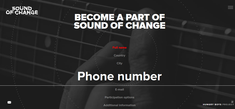
Take input forms. They are a fantastic way to gather data, but they can be dull. Check out how this site uses microinteractions to spice things up.

- Relatable. Your text should read like people talk. It should communicate human emotion, and all your copy should match the moment. Keep it light-hearted, but also respectful and helpful.
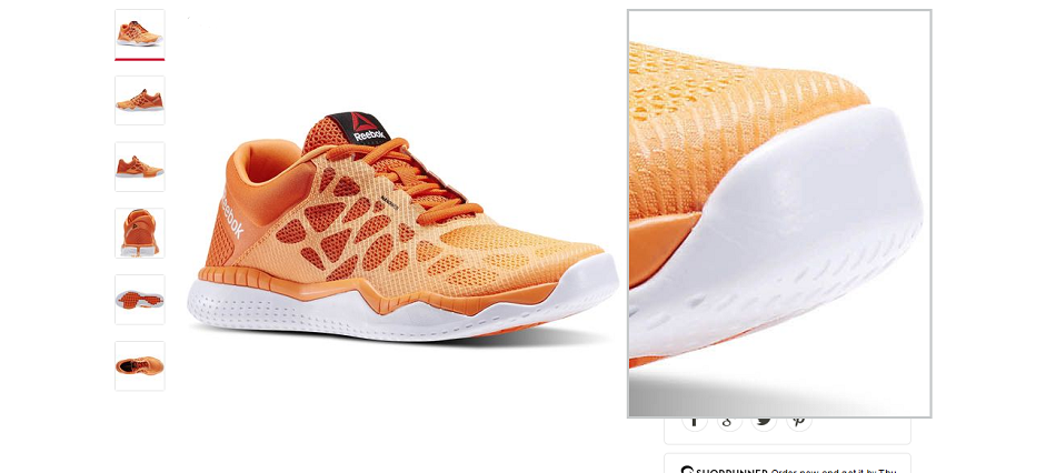
5.Easy-to-use. Your microinteraction should mimic natural human behavior. Keep it familiar, and always keep in mind human error (and how you can prevent it). For example, think of hover states or custom cursor pointers. Reebok's intuitive cursor and hover to close-up are classic ecommerce features put to great use.

- Animation. Animations aren't just aesthetically pleasing; they can enhance the user experience. Make sure that your animation informs about progress, but doesn't burden current actions. If they're visually stunning, that's great - but it's more important that they're useful.
7.Balance. Contrast is great if you're trying to highlight a specific process or action. However, use it too much and you'll distract your user. Make sure the balance is harmonious on your site, and that every moment is visually connected to your overall app design. When it comes to microinteraction, it should all be about complementing the bigger picture.
8.Evolution. Remember, your microevolution doesn't have to behave the same every time it's used. Here's a great example of how you can keep things interesting, and if you want your design to shine, you need to think about details like this.
You can find more tips about creating awesome microinteractions here and here.
Time to get Microinteracting?
Yes, microinteractions may be small. But they have considerable impact and can make or break your design. Our recommendation? If you're not feeling confident with microinteraction design, now's the time to start swotting up on your technique... because these small experiences make a big difference to the user experience.
