Introduction
For most agencies, keeping your own website up-to-date is a mystery land far far away, always forgotten, never remembered. And yes, we were no exception. As the saying goes, the cobbler's children have no shoes. Meaning that most professionals do not apply their skills to themselves. Sound familiar? This is where our story took an unexpected turn. Here we take a closer look at our Site of the Day AND Developer Award winning agency portfolio minus99.com
When the new year kicked off, we did what all agencies did and without procrastinating, just sat down to: "Ok guys, let's get together and see what we have on the books for the upcoming year and set some goals." The whiteboard has seen so many different ideas and approaches, some far fetched, some quite doable. In the end, one stood out the most. We had to update our agency website in order to let people see the world through our creative eyes. Because where else would you be able to reflect your style and show off to prospects?
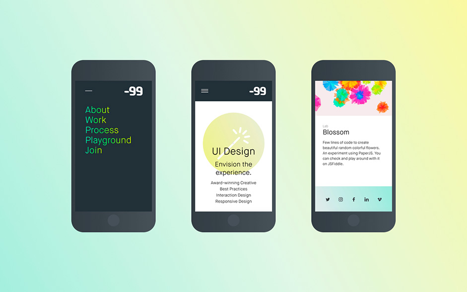
However, this was not an easy task to tackle. Especially when you have big clients you’re always doing your best to please. The team decided to devote their spare time to the website and things slowly started coming to life. Next, we came up with several brand new concepts, sketches, wireframes and ideas. Thoroughly going over them one by one, we eventually landed on one decision: A simple, clean and flat design with hints of color was the choice, rather than going for complicated animations and elements which users do not generally feel comfortable around.
The Key: Grid
A grid is like underwear, you wear it but it's not to be exposed.Massimo Vignelli - Legendary Italian designer
Setting a unique grid layout can make a big difference in the sense of how designers work. Designers often face the problem of finding solutions for new visual and structural experiences. By far, the best approach is grid. Grids can easily create a balance between solid visuals and overall structures of the website.
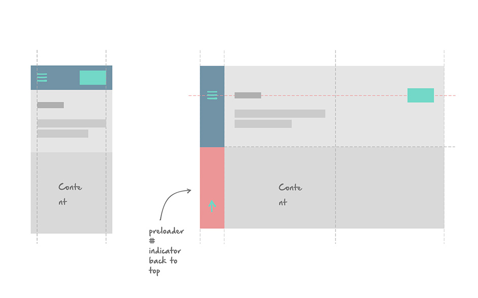
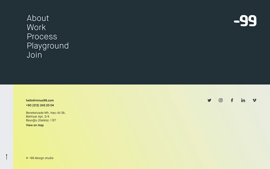
Grid layout structures also offer more flexibility and enhance the overall visual experience of visitors. As a result, we can easily update the layout in a well consistent way that would match any screen size you might be using. By keeping the menu fixed on the left side, what we did with the viewport was to divide it vertically and horizontally into two columns and two rows. As you might have seen, the active-menu and footer work together to reflect the vertical division. On the other hand, the “Works” tab reflects the horizontal division of the grid.
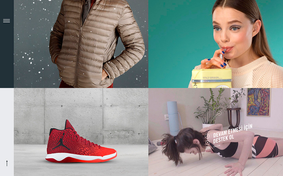
See how it all came to life in the video below:
In terms of giving the visitors some sort of reaction for their interaction while going through the pages, the user is greeted with a fancy loading bar under the menu button. However, it actually has more uses like indicating scrolling up or down, as well as showing the page number in the homepage - plus, it’s shiny!
It moves, it breathes! Animations and interactions.
Transitions and animations are like the seasoning of your dish, an excess of it will end up ruining your meal.Alaa Alnuaimi - Founder, -99 design studio
Interaction design seeks to go beyond making something 'just work'. Instead it focuses on creating an intuitive and exciting experience which will ultimately leave users with the feeling of encountering something grand. Touchable, scrollable interfaces have created new levels of expectations. Nowadays, it’s all about how users feel while using technology. If your design elements are complicated or don’t meet their expectations, they will leave with a negative experience. Interactions are the essence of all user experiences. Without good interactions, there won’t be a good user experience. While adding simple transitions between views on your website can make it more fluent and give a good feeling, an excessive use of it (other than for experimental purposes) may end up making the whole feature redundant after a couple of visits.
Bear in mind, in today’s saturated online landscape, your tech-savvy users are looking for more than mere functionality. They want to be amazed with every interaction and every response they take to get to those interactions. The grim thing is, if they don’t get to feel that, or if they have a negative experience while engaging with your brand, even just once, chances are they won’t come back ever, never ever...The cherry on top, if you can’t offer the positive user experience they are looking for, be sure that someone else will and in no time!
Guess what? Code can be beautiful!
To make something work you can write its code in many ways. But each way has its own ups and downs. In the case of our website, we chose the beautiful way, meaning quality over quantity. Keep in mind that "Code is poetry." and no one likes reading massive poems.
Let's face it. Making transitions and animations work well on a wide range of devices can be tricky. The key point here is to keep your code minimal and use CSS rather than DOM manipulation. For us, the less the number of coded lines, the better!
We love the new libraries and tools out there but we tend to use only the lightest of them. The reason behind this is that you don't want to carry hefty backpacks as you move around and the same goes for your website.
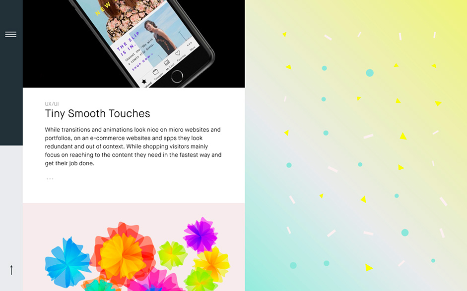
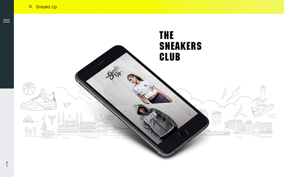
What we used to make it work.
As a matter of fact, it's not as complicated as you might think. After all, we just made a huge speech about keeping it clean and light. As a result, the tools might even surprise you.
Front end and libraries:
Tools:
- Sketch
- Photoshop
- Adobe Premiere Pro
- Add one pinch of creativity and massive scoop of team work. Mix it all together and voila!
Before you go: About us
-99 design studio is a multi-disciplinary digital agency, run by a group of creative design addicts who live and breathe UI/UX. At -99, we utilize analytics, creativity, user experience and cutting-edge technology to add value to our clients and the businesses they conduct. By helping them grow their brand and doing it with distinctive style, we establish a smoother yet stronger online presence overall. Our team works together to solve a wide variety of business challenges and create elegant, useful as well as engaging designs that push clients forward while using cutting-edge web technologies, platforms and tools.
The result? Why don't you head over to minus99.com and have a look?
