Congratulations to Exo Ape for winning Site of the Month August with Ali Ali. Thanks to everyone who took the time to vote, find the winner of the Pro Plan in our Directory for designers, at the bottom of the article.
Ali Ali is a commercials director from Cairo, Egypt and the co-founder of Good People Films. He is probably most known for his directorial debut, “Never Say No to Panda” which won him a Gold Lions in Cannes, and with over 100-million YouTube views, was named by the Guardian as one of the most watched viral campaigns of all time. Eight years later, Ali has directed more than sixty commercials and global campaigns for brands such as Vodafone, Google, Coca-Cola, Budweiser and Amazon.
.jpg)
Approach
Ali approached Exo Ape earlier this year to create a unique director’s portfolio that needed to reflect the quality of his work, as well as his strong affinity for minimal design and typography. Since he is always on set, we quickly learned that he is (and we are quoting) “notoriously slow at getting back to emails”, so carefully planned calls were needed to make this project a success.
A unique director’s portfolio that needed to reflect the quality of his work, as well as his strong affinity for minimal design and typography
Concept
During our calls we found out that people who want to hire Ali are busy, and always on the road. Hence we needed an easy-to-use website with always in reach contact CTAs. Besides that, it needed to become a place where people could get to know Ali better and learn about his work and background. We decided to go for a less-is-more approach, where we would prioritise important information, while telling his story in a typographically interesting way.
Art Direction
Ali has a strong opinion about design and typography so the pressure was on from day one.
Typography
The fact that Ali’s first name is the same as his last name was an interesting starting point, and could serve as the main typographic element on the page. In order to create consistency in font-size we are using a typographic scale throughout the rest of the pages.
We brought the typography to life by adding an experience layer of micro animations and page transitions.
We carefully selected Monument Grotesk by Swiss type design agency Dinamo that would allow for distinct layout variations and dramatic size contrasts. We then brought the typography to life by adding an experience layer of micro animations and page transitions.

Details
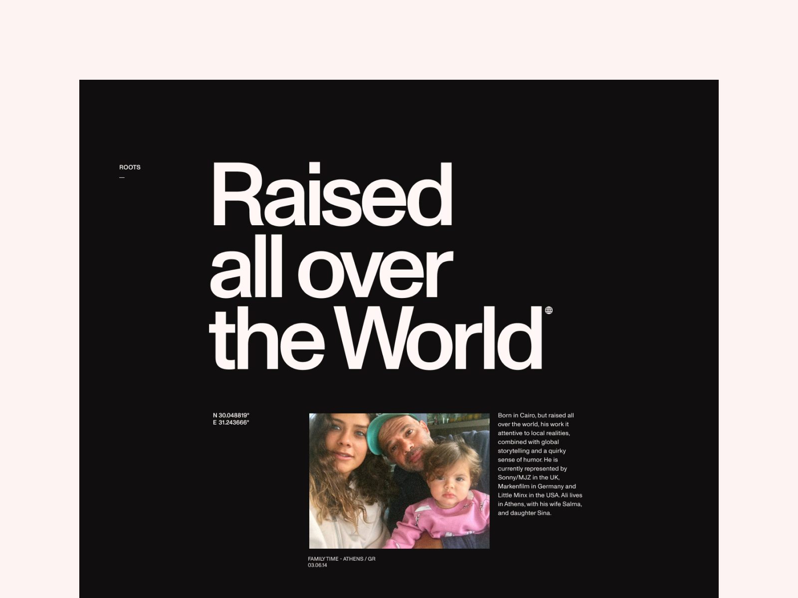
As a subtle nod to the film industry we have added a film grain effect that overlays on each page. The bio page was split into chapters, so we could tell Ali’s story in a more compelling way. Personal images were added to create stronger emotional connections, and important life-events are chronologically presented so visitors get a better sense of time and place.


When we sent in our first design draft we were pleased to hear that he “f***ing loved it
Motion
After design approval we continued by creating motion studies in order to show how certain elements and interactions should behave in the final website. This is an important step to get a better feeling if things work or not, and to communicate to our developer how things were envisioned during the design process. We often create a couple of variations in Adobe After Effects to see what type of motion works better with the brand or product. In each variation we test different concepts and easings, to end up with the motion that works best in the final experience.
Wipe Transition
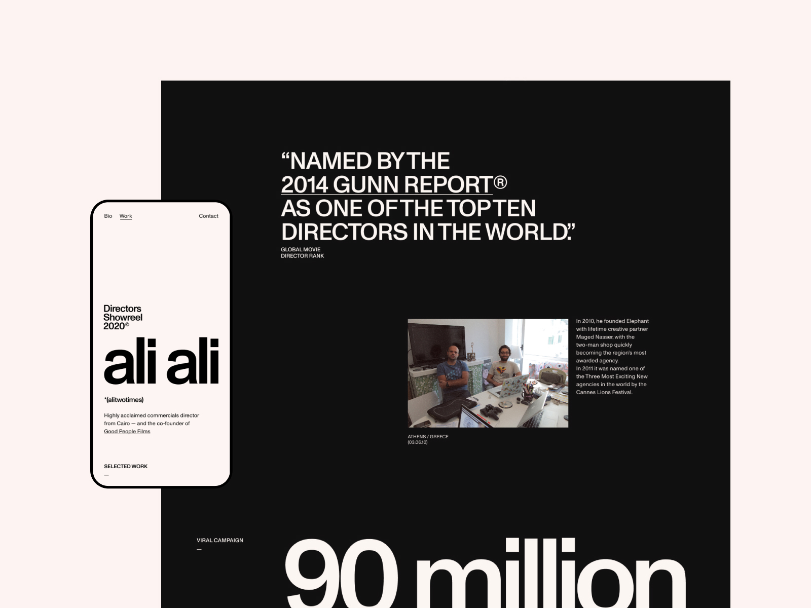
The wipe transition is one of the highlights of the website. We wanted to create a subtle left-to-right switch between Ali’s work and bio, where the main typographic element “ali ali” holds a prominent place on both pages. As the “work” and “bio” page have a strong relationship, we consciously grouped both navigation buttons in the top-left, while we separated the contact button, and placed it in the top-right. This puts emphasis on both sections of the main navigation, as they are equally important.
While inside the video player, the info-panel can be opened by scrolling down. The audio fades out to give the overall interaction a premium touch.
Custom Video Player
Since all of Ali’s work is video based, we decided to add some interesting details inside the video player to create a delightful experience. While inside the video player, the info-panel can be opened by scrolling down. The audio fades out to give the overall interaction a premium touch.
Dynamic Hover Effects
The simplistic design approach allowed us to play with different hover states within the grid. It made perfect sense to use short preview videos when hovering over a thumbnail, but in order to make the grid more interesting we decided to add multiple hover variations. After experimenting with various options we decided to go with an image gallery within the thumbnail. Inside the gallery Ali can select multiple stills that will appear when a user hovers over the thumbnail. Based on the number of selected stills, the code will automatically divide the thumbnail into multiple hit-areas.
Modular Grid
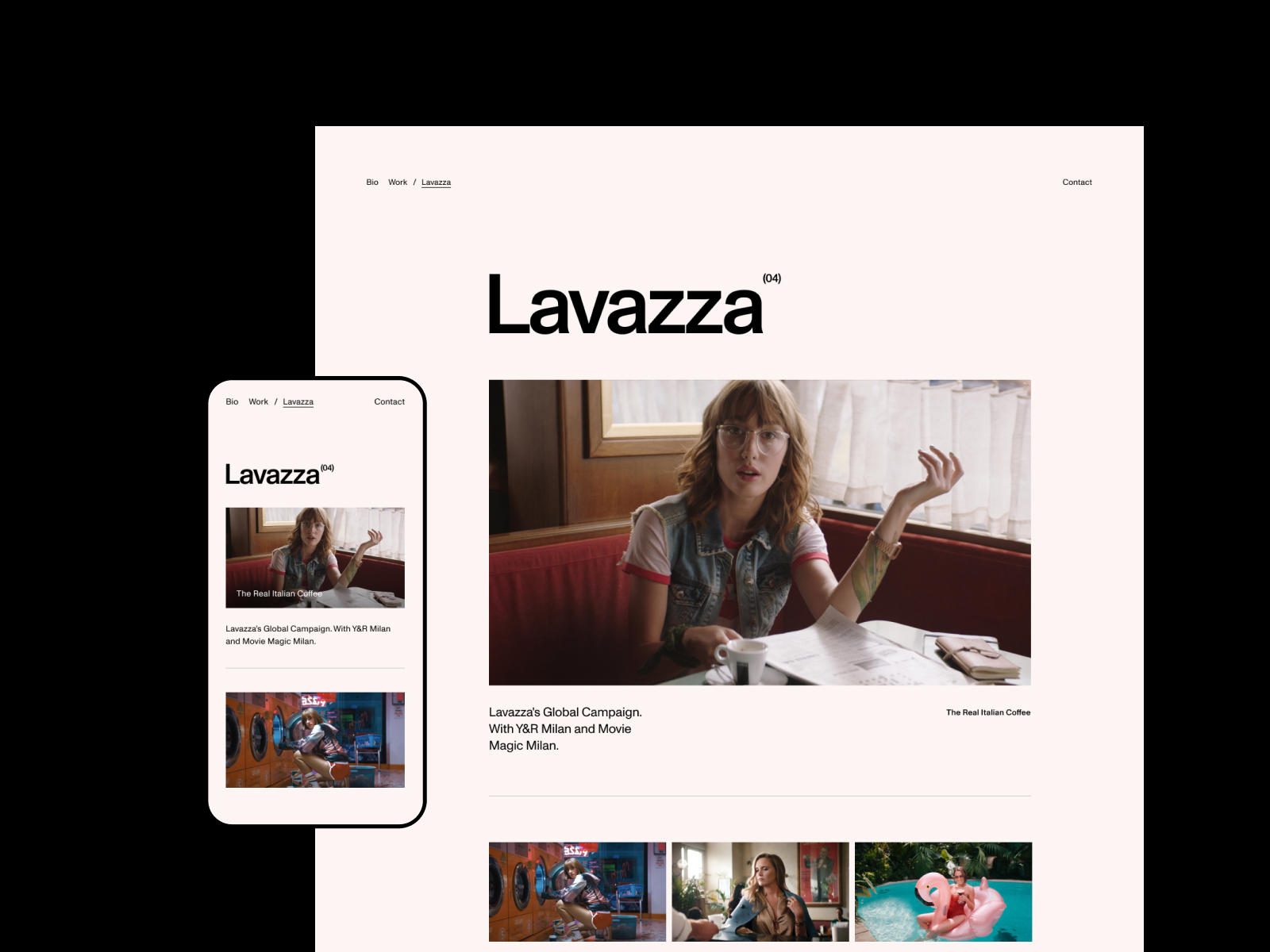
The homepage features a flexible grid system where Ali can work with predefined rows to build a grid that fits all needs. We added a custom grid builder within the CMS so Ali can add blocks, arrange the order and content-type of each grid item. These can then be linked to a single film or a campaign page.
Technologies
We wanted to make sure that the code would reflect the style of the website, clean and lean. So we tried to avoid the use of unnecessary libraries and made sure most of the development was custom made, and built from scratch.
Backend
We used WordPress in combination with KeyCDN Cache Enabler which creates static HTML files and stores them on the server. This means that a static HTML file will be delivered whenever possible, to provide users with the response data that would otherwise involve the resource intensive process of using a database.
WebP
In order to display images in next-gen formats we used Optimus to convert images to WebP. The WordPress Cache Enabler parses the JPEG and PNG images which are then included in the WebP cached HTML file.
Animations
All the animation parameters were carefully recreated from our motion studies. Creating these animations in After Effects gives us the benefit of exploring solutions and interactions without any form of technical limitations. This way our developer has a better understanding of how to structure the HTML and animations can be implemented in a consistent and efficient way.
For the text animations we used GSAP to split the HTML text into words and lines so we can easily apply the masked stagger animations. For the page transitions we used a CSS clip rect to mask all incoming and outgoing pages.
Scrolling is built with virtual-scroll which enhances the smoothness of the website and overall experience.
SPA
As for the page loading and page transitions we used Highway.js in combination with a custom component loader. While defining multiple renderers, views and routes we are in full control of which animation we trigger and what component to load for each page.What happens behind the scenes of a website is just as important as how things look on the front.
Optimization
We believe that a fully optimized website is just as important for the user-experience as the aesthetics. A lot of time is spent to meticulously validate our code, optimizing our assets and making sure our Lighthouse score is (nearly) perfect on each page, resulting in a smooth and fast loading web experience.
SEO
One of the requests from Ali was great findability in the search results. Since Ali didn’t have an existing website on his alitwotimes.com domain, it was quite a challenge to rank the website. On top of this, most of his content are videos without a lot of text for Google to index.
To start with a strong foundation, we took care of all the technical SEO requirements. After the launch period, the ranking improved due to promotion on numerous design and web blogs. Traffic spiked, and the website managed to claim the number one spot within a couple of weeks.
Tools
Development
Design
Other
Company Info
Exo Ape is a design-driven agency that crafts immersive experiences that inspire, affect and delight in a digital-first world. We are playing somewhere on the intersection between design, technology and motion. Our stuff is 100% hand-made and custom-tailored to revolutionize brands in the digital space.
Credits
Robbert Schefman, Digital Art Director & Visual Design Ronald Gijezen, Motion & User Experience Design Rob Smittenaar, Front-end & Creative Development
Thanks for getting involved in the voting process and tweeting about it, @belaklubos you have won the Pro Plan, DM us on Twitter to get your prize! :)
