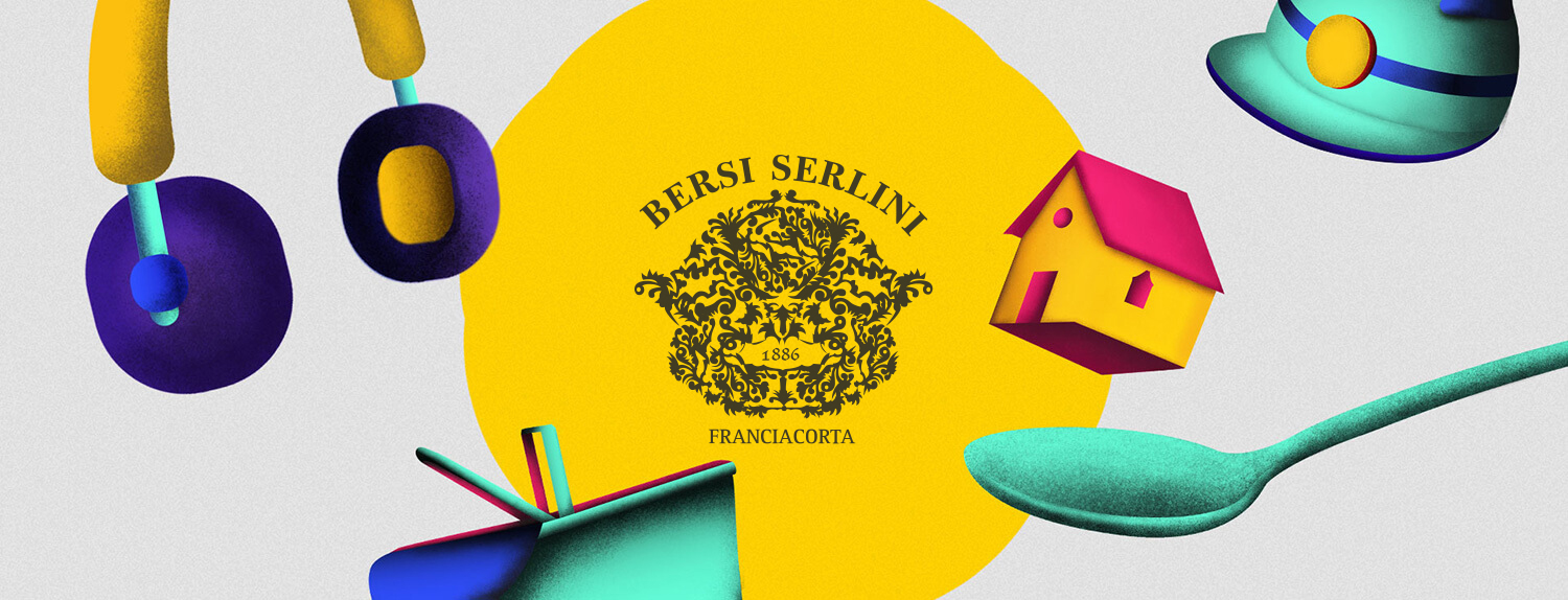
Always on the forefront of the Italian scene in terms of innovation and, of course, quality, Bersi Serlini is an Italian wine cellar located in the Franciacorta region. Chiara Bersi Serlini, chief of the maison with her sister Maddalena, contacted us to create amazing yet simple introduction to this year’s regional wine festival.
We decided to translate this sense of simplicity and celebration through colorful glow-pastel illustrations which our illustrator stubbornly described as: “not art, not rubbish, they just know what they’re not”.
The concept for the Web Design was based on three grounds:
- Bersi’s wine capsule;
- The bubbles from their signature Spumante;
- The willingness to provide an emotional and festive feel;
Usability was another huge topic, as we wanted this website to be both an introduction but also an “on-field” guide to the event for participants who chose to tackle multiple experiences.
Web
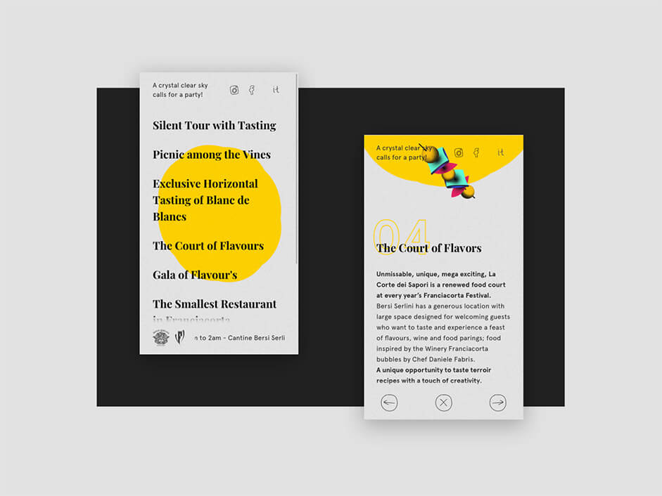
The Website structure is composed of Home Page, Event Page and a Click & Hold overlay.
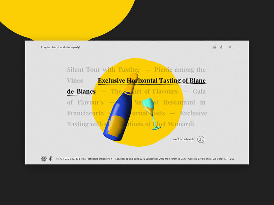
In the Home Page everything is centered within the circle, as the “capsule” of the bottle keeps all the beauty inside. This circle and its bubble effect are realized with GSAP and the MorphSVG plugin.
Two paths alternate: The first is the one from the original capsule, while the second presents a circle with smoother angles. When hovering one of the events, we created a “rollover menu illustration effect” with Pixi.js for the elements (namely the illustrations) that join the scene.
To obtain an emotional effect we added a noise on the background too achieve a “paper effect”. On top of this, we implemented a displacement map and a light fluctuating effect on the illustrations to make everything more “sparkling”.
To obtain an emotional effect we added a noise on the background to achieve a “paper effect”. On top of this, we implemented a displacement map and a light fluctuating effect on the illustrations to make everything more “sparkling”.
Event Page
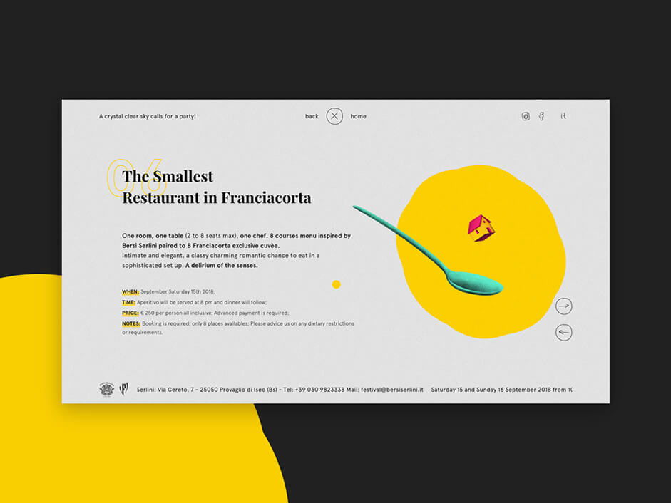
A smooth transition brings us to the Event Page, where we provide all the useful information by relocating the illustrations to the right, all the while keeping the effects and obtaining a dynamic experience.
Tit bits
We then focused on 4 particular features:
Click & Hold
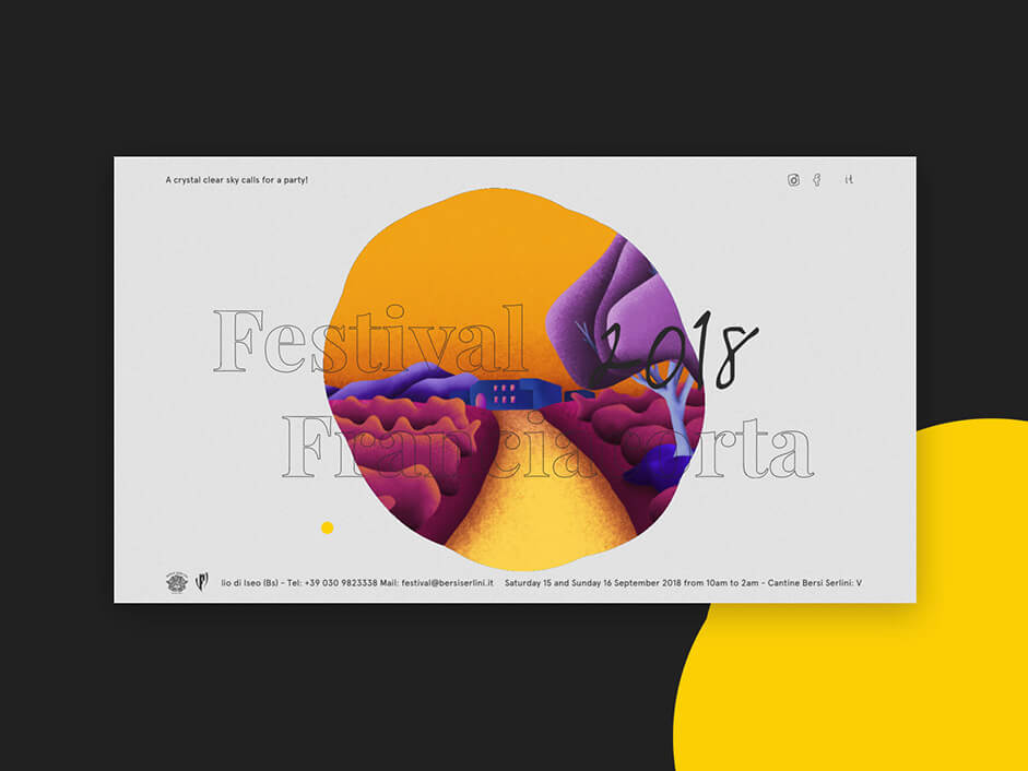
The click & hold animation makes the “maison” pop-out of the central bubble. We realized this through a vanilla javascript that separates the screen into various sectors, each assigned with a single image. Depending on the mouse position and the corresponding sector, a certain opacity and z index are set, all while resetting the previous image upon movement.
The click & hold animation makes the “maison” pop-out of the central bubble. We realized this through a vanilla javascript that separates the screen into various sectors, each assigned with a single image
Weather Forecast
When preparing for a party, you better watch the forecast. That’s why we felt fitting to add, on the top-left corner of the Home Page, an indication on the current weather at Bersi Serlini. This was achieved through the use of open-weather API and the creation of custom sentences.
Icons Magnetic Effect
The magnetic effect is achieved through .js calculations which rely on text container dimensions, position of the mouse in regards to the container and the position of the text within the container. This lost element is animated with GSAP and made as smooth as possible by the addition of an ease. The final positioning data is also influenced by fixed values that can be directly set into the HTML through specific attributes.
Mouse Pointer
Like in most Adoratorio’s production, we designed a custom pointer coupled with a multiply and lerp effect.
Technologies
Festival Bersi Serlini 2018 is hosted on a classic apache server. Since the project didn’t require a back office, we stored all the data in a Firebase Realtime Database with Json format files. We used Webpack as module blunder and npm (which come both as a part of Vue-cli) to run our script and manage said packages.
While working on this project, we used vue.js, a progressive framework configured with webpack, vue-loader and PWA features which, thanks to their adaptability, are easy to integrate with other libraries and tools.
Each css component is scoped and pre-processed by Sass. For text animation and transitions we prominently used GSAP, while we created and managed illustrations through a unique canvas built with Pixi.js.
Company Info
Adoratorio is a multi-disciplinary digital agency based in Italy. We identify the essential around new visual perspectives.
