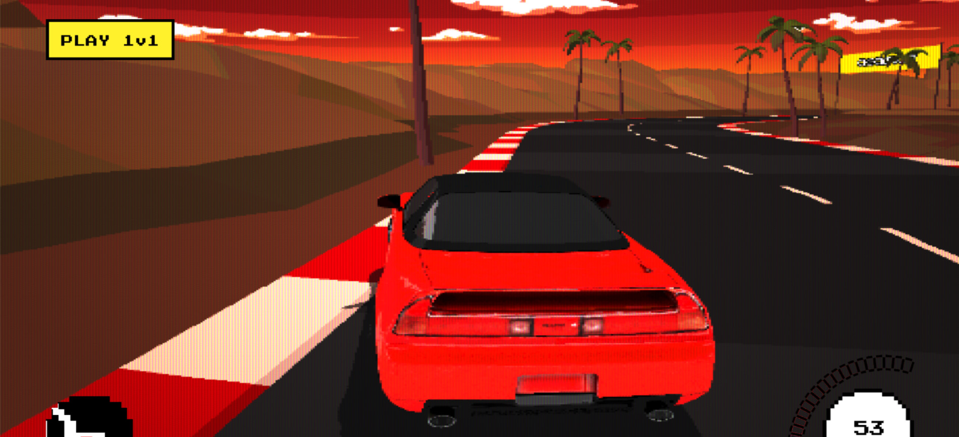
Having previously worked with MullenLowe on the Acura: Total Control Experience, we were delighted to receive the call that we’d be partnering with them again on a new, creative experience for Acura. This time it was very ambitious.
Inspired by their TV commercial, we were tasked with celebrating 20 years of driving through an immersive racing game that showcased six different cars from Acura’s history. The twist? Completing each race would unlock a new car and track, each styled into a different era of racing video game. Start your engines and prepare for a bit of nostalgia. 🏎️💨
Ready… Six Cars. Six Eras. Six Treatments?
Before diving into production, we had to align on the mechanics of the game. Per the TVC, the races would revolve around beating a set time to progress to the next level.
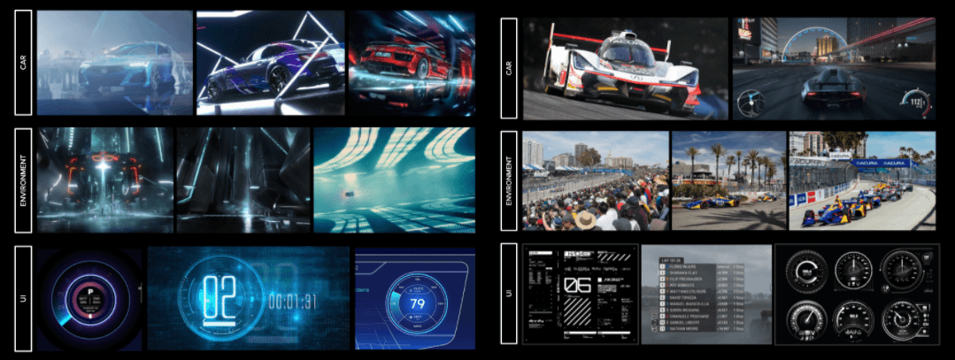
As racing game fans ourselves, we started with inspiration material that would help us evolve from the initial, basic level (featuring a 1990 NSX), through to the final Type S race that pushed the graphics towards something found on high-end modern mobile gaming.
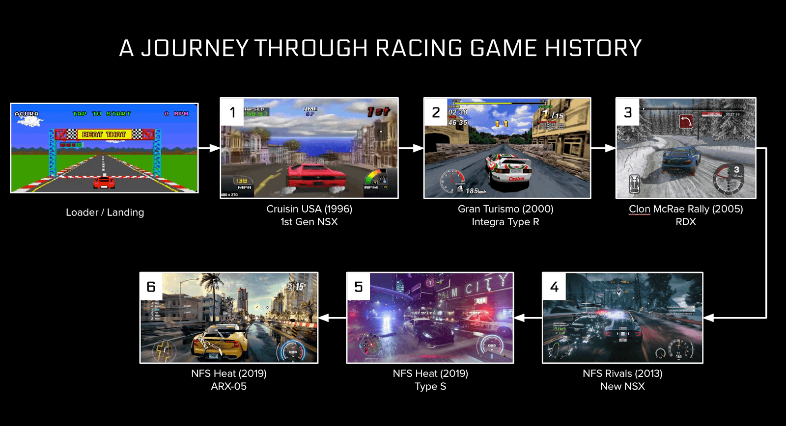
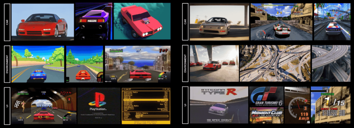
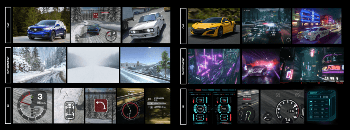
To fully immerse the user, we decided to evolve all aspects of each level, with the car, environment and UI all transforming on every race advancement.
With the overarching narrative in place, we then began to concept each race. To fully immerse the user, we decided to evolve all aspects of each level, with the car, environment and UI all transforming on every race advancement. To support this, we worked on a series of boards that would become the ‘north star’ for each level, guiding design and development.
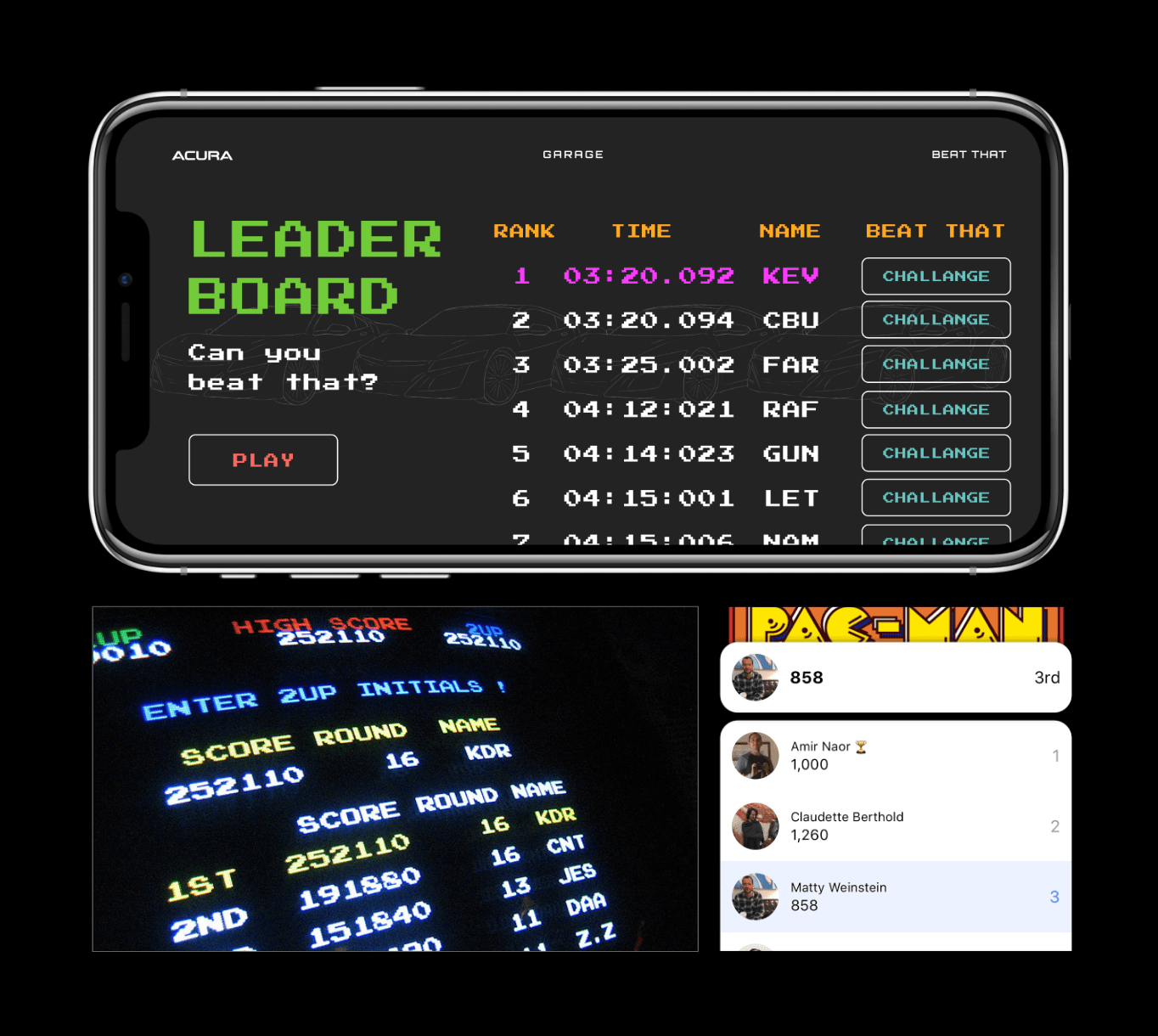
And like every great racing game, we wanted players to be able to compete with their friends. This would be in a classic arcade gaming style, with players saving their race times using a three character name, before viewing them on a leaderboard.
The game would also be deployed as a Facebook Instant Game, making it easily shareable and promotable across social media.
Set... Scoping and Tools
As anyone who’s worked in a production environment would know, managing scope is incredibly important. Given the bar we’d set ourselves at kickoff and the fact that we had a two month timeline (including the Christmas break), this was going to be key for us throughout the project.
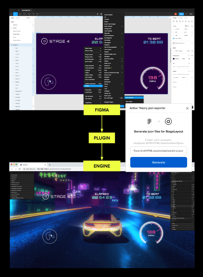
To do this, we utilized our tightly integrated Cinema4D workflow for track design, Adobe Substance Painter for car models, and a custom Figma pipeline to bring each unique UI style directly into the engine to be rendered with WebGL. We also leaned on our GUI tooling to create unique driving dynamics for each car by adjusting parameters such as top speed, acceleration curve, body roll, steering sensitivity, and drift. But more on that later…
Go! Diving into Production
Creating the Cars
Since we were working with Acura, the way we presented cars was a very important aspect of the game. The biggest challenge was to create a unique stylization for each model, inspired by key moments in video game history, while making sure the cars looked as close as possible to Acura’s iconic models. Our 3D modeling process involved:
Stage 1: SourcingThe first step involved sourcing the 6 chosen cars online: NSX 1990, INTEGRA 1995, RDX, ARX-05, NSX 2019 and Type S. Once sourced, we identified all major structural changes needed on the models.
Stage 2: OptimizationWe then actioned structural changes, removing detail and optimizing high-poly models to 15-20k polys max (exterior only) to be suitable to the web environment of the game. Once the models were optimized, we unwrapped them and exported the following maps: Normals, Base Color, Roughness, Metalness and AO.

Using the optimized models and their exported maps, we customized and stylized the 6 cars. We used Adobe Substance Painter to fully control the textures’ customization and play with the different maps to add detail, change colors, adjust AO/metalness/roughness or increase/decrease the normals.

We then exported PBR textures directly from Substance using a custom export config.
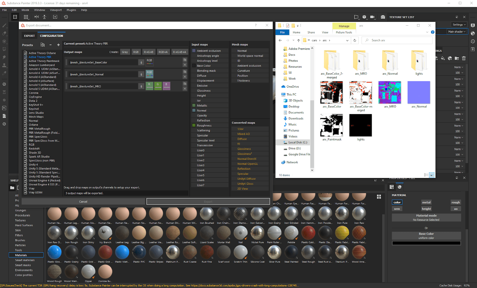
To be able to tweak values directly in the game and allow for more flexibility, we went a bit further and created more maps for each car.
We first assigned three colors to define the desired level of reflections/roughness of the car’s parts: white for the windows, gray for the paint and black for everything else. We then exported this map as a paint mask, and used it in Hydra (our internal framework) to give the paint a realistic clear coat and reflections on the windows.
When possible, we exported basecolor maps with a white paint color on the car. Using both these basecolor maps and the paintmask previously exported, we were able to completely modify the car’s paint color. Finally, we created two more maps for the car’s lights. One for the headlights and tail lights, and a second one for brake lights.

Building Out The Tracks
With the cars taking shape, we also needed to build out the tracks. That is ...create six tracks each lasting 30-60 seconds and each in their own style. To do this, we relied heavily on procedural placement of environmental assets. We kicked this off by drawing the initial track spline in Cinema4D and testing it to make sure it raced well. We then fed that same spline data into several cloner objects to generate randomized buildings and other environment props around the outskirts of the track. While it usually didn’t result in a polished environment on the first try, it provided a solid base for our artists to build on top of. This was ultimately a massive time saver.

To get the environment props out of Cinema4D and into the build, we wrote a custom script pipeline that would export the position, rotation, and scale data for each prop and recreate them as instances at runtime. We also exported additional attributes on each prop so that we could add variation to color and scale in the shader if necessary.
The beach terrain, for example, was created by duplicating a single rock mesh hundreds of times.
Since keeping file size down was a priority, we used instanced meshes not only for environment props, but for the terrain itself. The beach terrain, for example, was created by duplicating a single rock mesh hundreds of times. This technique allowed us to generate large landscapes at a minimal download cost, often squeezing large portions of terrain out of a single 10kb asset.

Different UI for each level
Given how early on we’d fallen in love with the idea of different graphical styles for each level, by the time it got to UI, we had our work cut out for us. Not only did we have different moods for each track and car, but we also needed to customize treatments for auxiliary screens such as the tutorial, leaderboard, speedometer, pause screen and sharing.
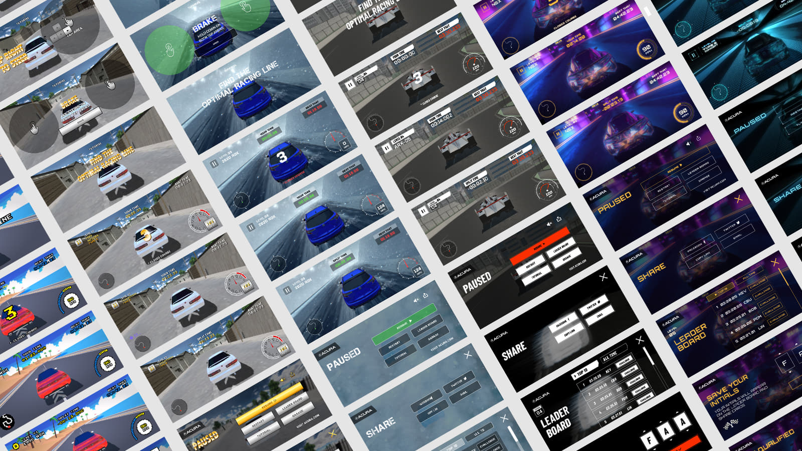
With this in mind, we tried to stay true to a high level goal of limiting the time developers would spend integrating design (sadly they didn’t want to work 50 hour days)
Thankfully, since the experience was more a video game than a content website, we didn’t need a fully responsive approach and could get away with scaling each screen, greatly reducing the amount of time spent on them. Also, given our design team has been using Figma, we were able to leverage Figma’s plugin API -- another time saver.
We ended up making a custom Figma plugin used to export artboards into our WebGL engine UI layout system. This included position and size of the "boxes" element, as well as text settings for MSDF font rendering.
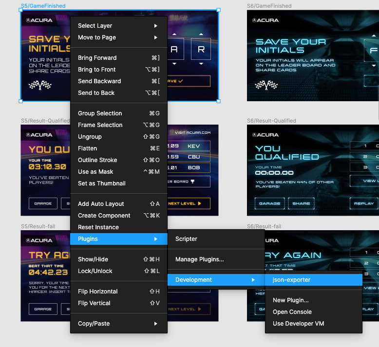
This also integrated perfectly with our WebGL scene GUI, enabling developers and designers to jump in and tweak settings and manage custom shaders of each component.
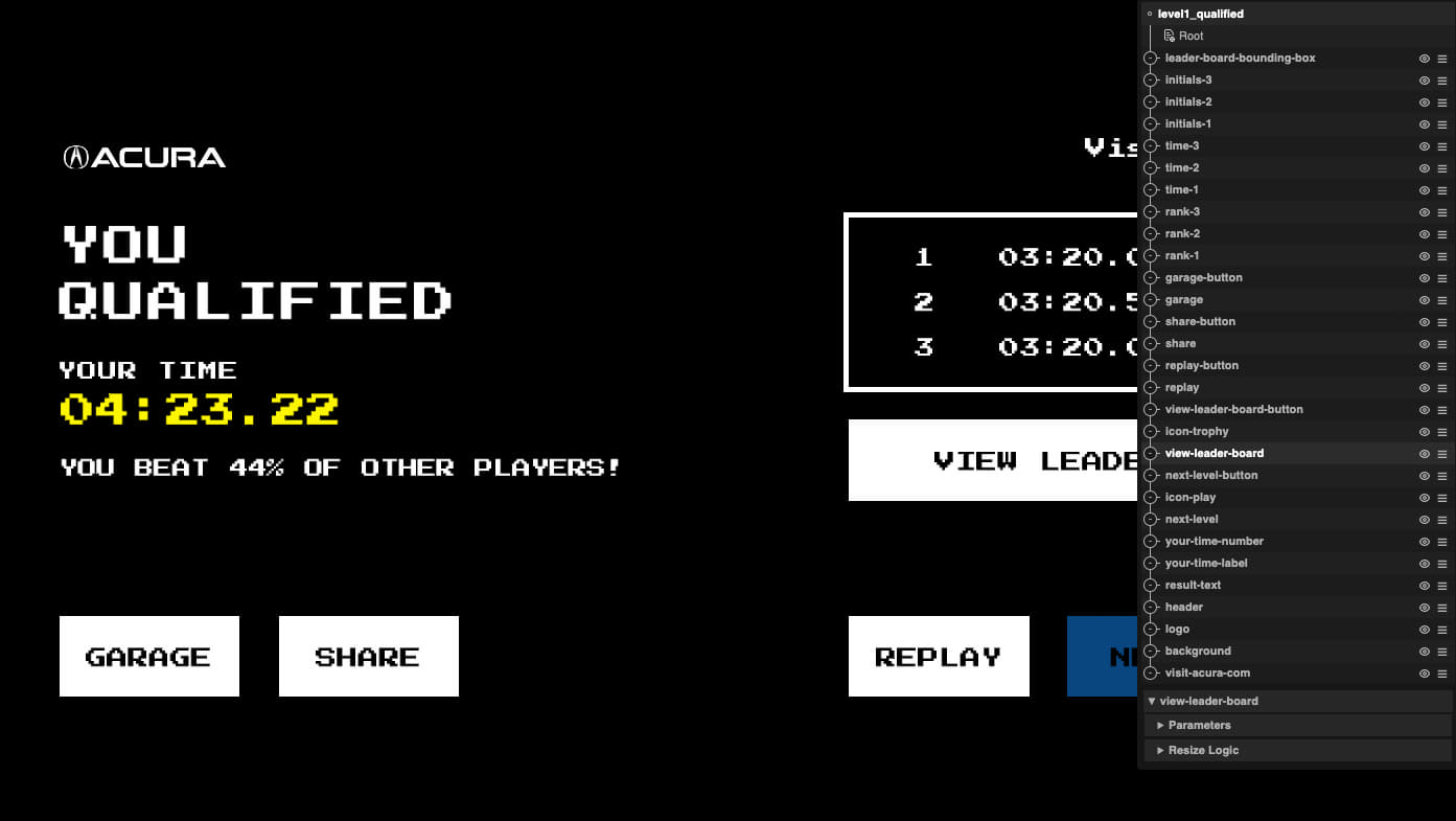
While styled differently, each track in the game had the same essential UI screens -- and we tried to account for this in our UI process. We separated each UI screen implementation into a controller and a view, with only the view class needing to be changed for each track (to add custom animation logic or different shaders). The controller handles all interactions the exact same way, whether it’s the first or the last track.
It wasn’t all smooth sailing...
While they often help with efficiency, new tools and workflows also naturally introduce some new issues which need to be patched up. In one instance, we needed to create export-optimized wireframes for a few complex screens, where gradients, fills and other effects would interfere with the exporter.

Another issue was the discrepancy between the font settings (letters-spacing and size) in Figma and their look once rendered in WebGL with MSDF. Our solution was to build a font calibration tool which allowed us to choose correct settings multipliers for each font face. This is now saved in our projects database, meaning if we need the same solution in the future, it will be ready.

Powered by.. Our Backend Tech
On the backend, Google Cloud Firestore, Cloud Functions and Cloud Storage were utilized to keep track of race times and ghost car data for virtual challenges, along with daily and all-time leaderboards for each track. Custom share images were generated including the time to beat. The Web Share API was utilized to share links in the same way as native apps.
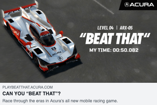
The game was deployed to both the web and to Facebook as an Instant Game.
The Finish Line
This project was challenging on many fronts; from specific details of the car models to the overall production schedule. We are proud to have had this opportunity to work on such a great concept for an exciting brand, demonstrating how Active Theory’s people, tools, and processes combine to showcase the potential of web technology.

Company Info
Active Theory is a creative digital production studio with offices in Los Angeles and Amsterdam. Learn more on their site here.
