As a studio, one of the most difficult things to do is to make your own portfolio, but the work that we presented in our old website was so outdated that we had to, as our last website didn’t reflect the things we can now do. But how to start your new studio website with all the client work that you have to do?
The Story
So how did we manage to finish this website? Well, we worked in phases on our website whenever we had time to work on it. Client work comes prior to everything else at Wonderland but we really needed to change our website since it was also generating the wrong type of clients and the not the work we wanted.The work you present on your website is the work you mostly get hired for, and since it wasn’t generating the clients we wanted, we created extra room in our planning to make something we really liked that fitted with the current style of Wonderland.
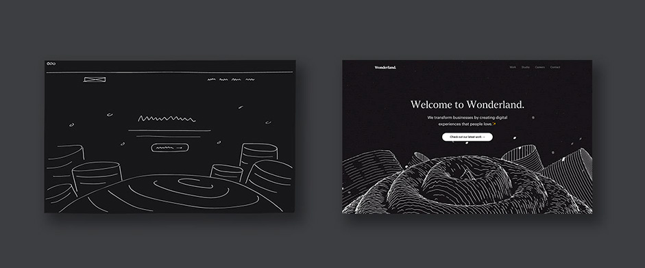
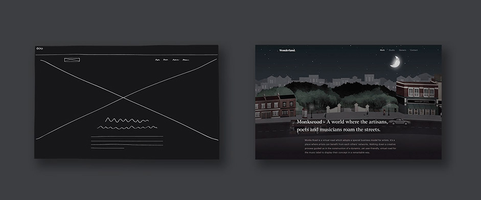
Firstly each team member of Wonderland was given a task to come up with what they really wanted to see on the new Wonderland website. When everybody had something in mind, or had collected their visual inspiration, we sat together with the team and started to share our ideas. Based on the ideas that were shared, we listed the best ones and created a visual exploration of these ideas by making some moodboards and sketches and generated the first screens for our new website. Everyone was asked to collaborate and add notes to the things that were made. Some on paper, some on Invision - the tool we use the most for sharing our designs within the team.
This was not a continuous process since it was constantly interrupted by work we needed to do. Normally we try to focus on 2 projects per team member, to really focus on the output of the work - which we want to be as high as possible within the available time & budget of the client. Well, after some time we all agreed on how the new website should look and also the infrastructure was nailed - this was basically the same as we had before but then with more detailed case studies, since this was one of the most important things of the new website.
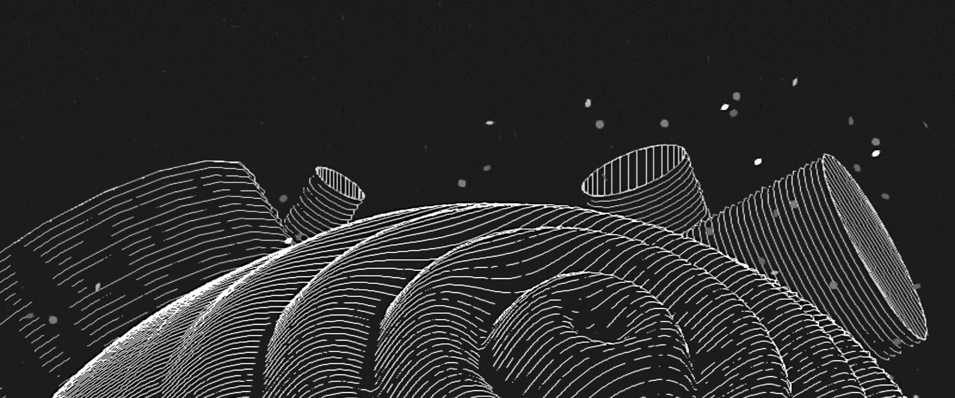
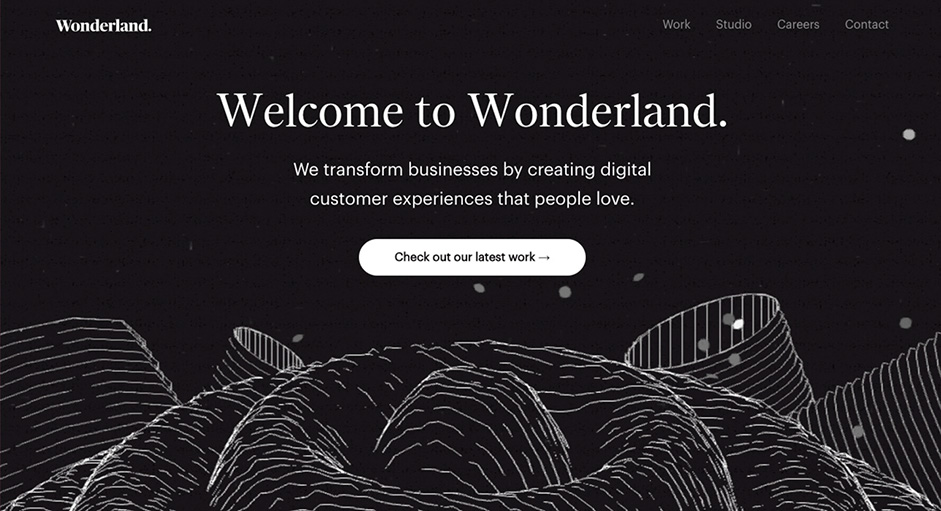
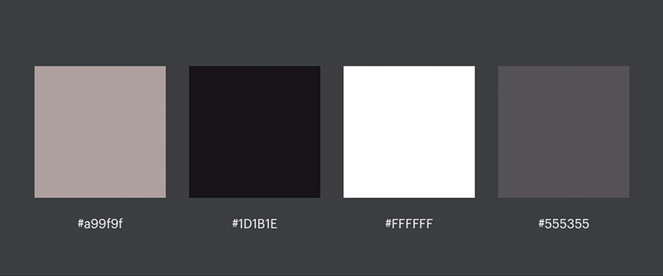
Our previous website had a mix of dark & white ui with some space white particles & lines here and there. This was the basis of the new website where we wanted to create a dark “spacey wonderland” with white lines & particles flying around.
On the homepage, we created a landscape that needed to present something cool/weird, whose main function was to directly view the work page & our case studies. That is the main goal of this website, to explore/inspire the work that Wonderland does. Also, when you click - everything speeds up - a little surprise factor.
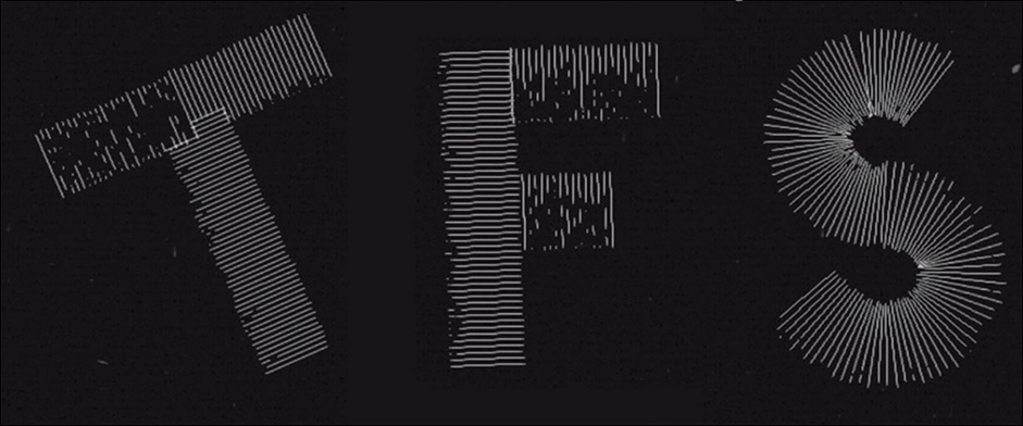
The work page, alongside the homepage, were the two most important pages on the website, so we created them using the same style for both. Instead of showing a project image, which is very common in work pages, we wanted to do something different by using lines. We came up with the idea of making 2D/3D letters in lines and positioning them randomly on the work page.
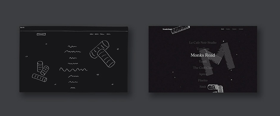
As you scroll on the work page, you see that each letter is displayed randomly which is also a little surprise factor. We then added some floating particles in both pages to finish the whole experience. We wanted to play with subtle animations and not to overdo things. In the end, people still need to view and explore your website without being interrupted by too many animations.
One developer was tasked to do the creative artworks on the home and work page, and the other developer the content pages like studio, careers, content and the case pages. The design was done together by the Wonderland designers.
Technical
The good thing about creating your own portfolio is that you can try new technologies and try crazy things. In this case, following the designs we could recognise two different parts:
- Content pages: with scrollable pages with images and text.
- Artwork: which rendered 3d graphics and had non-standard interactions.
We made two git repositories with different stacks and two different team members were in charge of each one.
- Content pages
The content pages were done with Angular. It was the first time we had used Angular because it is one of the most popular frameworks, so we decided to check it out and after making a quick prototype with we decided to go with it. In the beginning there’s a lot of messing around but once you get the hang of it, it becomes a quick and clean way to create digital experiences, that are of course maintainable and scalable.
Once we got the app up and running the next challenge was to make it “SEO Friendly”, with single-page apps that means either mocking the page & meta data with a backend language, or going Node. We decided to go with Node.js since this is something we do not have a lot of experience with, and to become better you have to keep trying out new ways and things to improve.
- Artwork
For the artwork we used a custom javascript framework for interactive motion graphics, with Three.js as a renderer. The framework takes care of initializing the scene and entities, setting states and animating the transition between states. We also made some tools that we are reusing for new projects to visualize those entities, states and transitions.
Some libraries and tools we used are GSAP (for the animations), Require.js (to load modules), Grunt (for different dev and build tasks).
As for specific 3D graphics, we made a few custom shaders (for vertex displacement in the lines, particles floating around, and the grain as a post-processing filter).
- Putting everything together
Basically, the Angular app was the one handling the router and used the artwork api to set its states. The app is hosted in a node server that pre-renders the pages.
Company Info
At Wonderland, we understand that great UX design is the result of attentive discipline in design and development in order to recognise the best way to deliver products and experiences that ooze both purpose and style. If you like our work, you should follow our blog where we write short essays about user experiences, new case studies and running an UX Design Studio, or have a look at our dribbble account and instagram account.
Bisou from the Wonderland team!
