Introduction
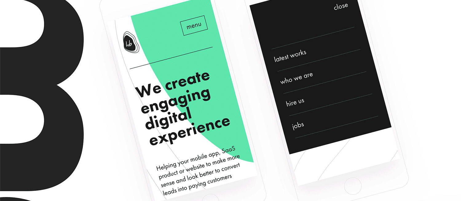
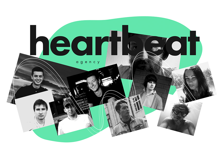
Heartbeat Agency is a small team of digital professionals based in Odessa, Ukraine. The creation of the new visual identity occurred as a result of changes in Heartbeat Agency’s business vision. The new site is the embodiment of the agency’s expertise in product design, visual identity, and front-end development.
Forming the desired perception
Before speaking about the website, we have to cover the visual identity part. And it’s not about overall aesthetics. As aesthetics can have an immediate effect, but they don’t work well in the long perspective. What is the agency's desired perception? What story do all those cute moving elements complement? In this case, the form came after the substance. We see the green shape moving as the experience continues. It's a substance of every product. Something that always comes before the visual communication and must be well defined. It’s the result of answering some critical questions. Who are you? What are you doing? Why are you doing that? Who is going to use it?
It's quite easy to answer these questions. But sometimes we forget to do it. Because we create something, and when we create something we are super excited. Without that, any brand’s communication is not clear enough. It can't be stable, and there is no synergy in elements. And that's what Heartbeat Agency is helping their clients to prevent. They analyze businesses to help build and maintain a complementary visual identity.
When the meaning is unclear, there is no meaning
Experience
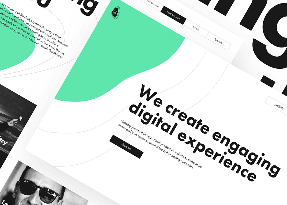
There is a definite border between websites that we use day to day and sites that want us to say wow. Here, the aim was to find a golden middle. That's why some areas look like there was no proper attention paid. So, we refused to use a classy portfolio burger menu on the desktop. We lost a place to make an excellent interaction but made navigation much more accessible. The menu items are always there, and you don’t have to click each time and wait to see the actual site structure. There is no need to hide four menu items that fit well.
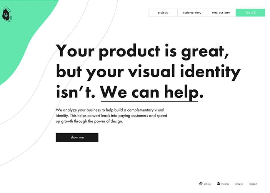
There are no fancy scrolls or flying particles on the homepage. The user gets the chance to concentrate on the precise value proposition and decide what to do next. Then they’ll land on the latest portfolio work, seeing a dynamic front-like loader. There are different loaders for the main and inner pages. The first one is there for aesthetics. But the second one not only makes the experience more consistent, but saves several seconds to load images. That was an important touch, as each project in the portfolio consists of many separate image elements.
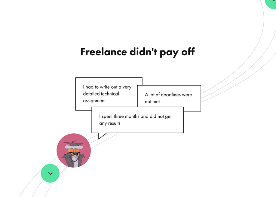
There is also a “Customer Story” page which kills two birds with one stone and shows the process which leads to success and a real customer feedback video. We made it in the form of an interactive story. There is a dialogue between agency and client, complemented with scroll-triggered animation and interactions. They're made to complete the story, not to grab the user’s attention. On mobile, swipes are used instead of scrolling, as it’s a more natural and essential mobile gesture.
The main thing is to keep the main thing the main thing.
Technologies
In general, this website is a Single Page Application. There is no actual load between pages thanks to Vue.js. A JavaScript framework we used for web experience. Along with CloudFlare, it allows a browser to load the main page in less than 1 second. The official Vue-router is smoothing the load process between the screens. There are no white blank pages while surfing and it complements the experience. KUTE.js morphs the main green shape which moves as you surf through the website. And Velocity.js handles some smaller interactions and animations through the website.
The Webpack module bundler helped us to gather everything and stay organized. We also wanted to be Google and SEO friendly. Server-Side Rendering is not there, but we found Prerender-spa-plugin to handle SEO side of things well. We've built Portfolio pages on Readymag, and Typekit brought some nice web fonts into the project.
Company Info
Heartbeat Agency is a digital startup design consultancy based in Odessa, Ukraine. In 2017 they’ve helped digital products in the travel and entertainment sphere to grow and obtain a visual identity that complements their business strengths.
