Introduction
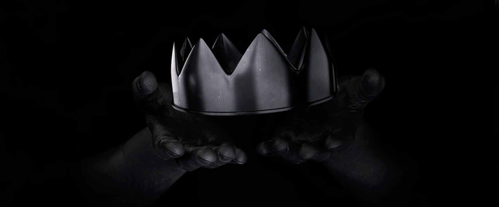
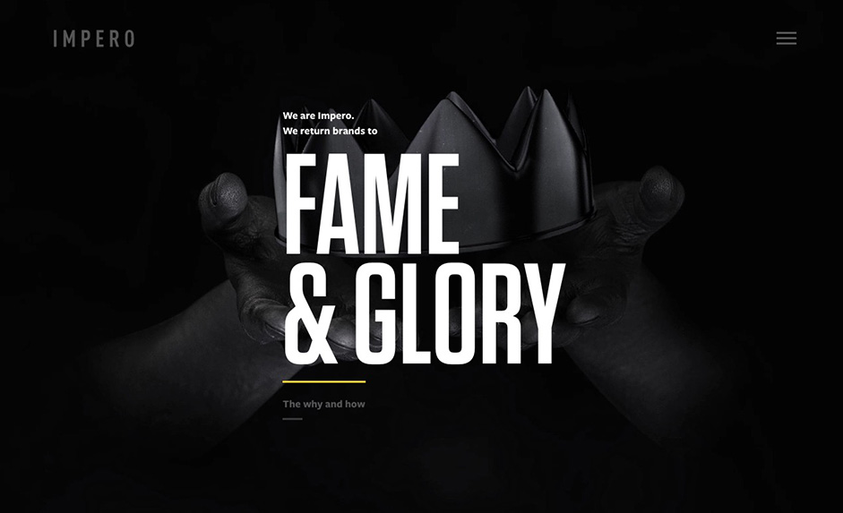
We wanted a website that reflected what we can do, and who we are. So, we made one. Strong, bold and to the point – just like Impero. For the www.weareimpero.com landing page we used a combination of mediums, including photography and Cinema 4D to created a surreal atmosphere.
A very personal project
Personal projects are the hardest jobs for any agency. We spent years trying to design and build weareimpero.com. We would gather steam and then end up parking the project when things got too busy. Months later it would be picked up again and often a decision would be made to just scrap the whole thing and start over again. It was a project that was so personal to us as an agency that we collectively could not agree on what we really wanted to get out of it.
Finally getting to the point
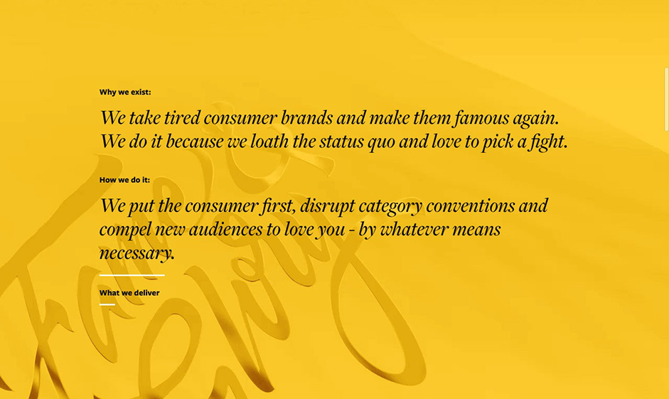
Three years later, we decided enough was enough. We pulled together a small team and cut everyone else out, we sat our arses down and got to work on it. We decided to shed a lot of projects from our portfolio. We focused on the ones that we really loved and put all our energy into showcasing their stories.
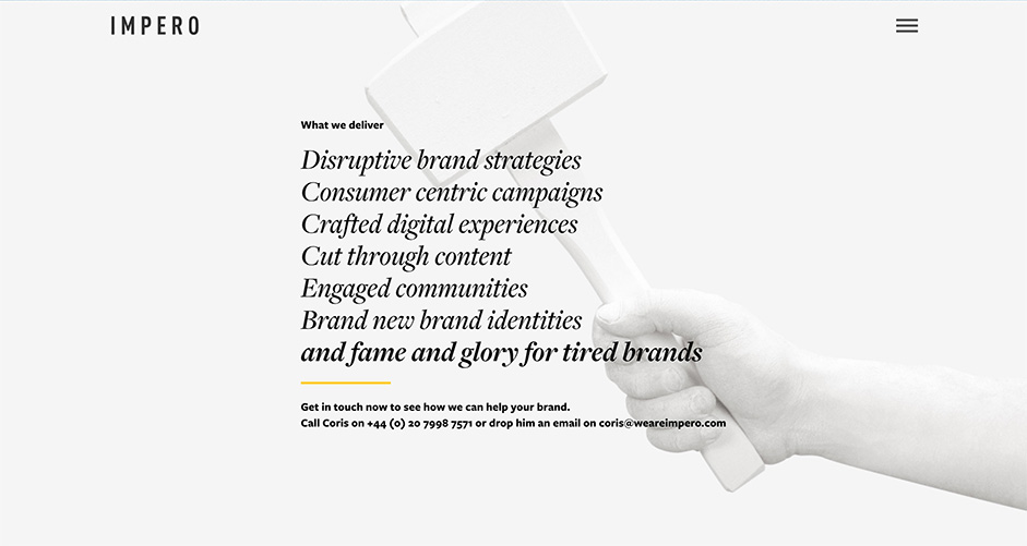
Weareimpero.com has been our blood, sweat and tears, it has become a living and breathing entity. We are constantly changing it, growing it and improving it, and if you asked anyone at Impero, we'd say it was not finished. But what we can say is, this website is wholeheartedly us.
– Michael Scantlebury, Founder and Creative Director, Impero.
Building a little bit of magic
All of the website's content was created in-house, building crazy make-shift rigs to get the right shots. The creative process was a strange tie in the office, it was covered in glitter and staff would be walking around with black, white and yellow painted arms. A lot of clever tricks were pulled for this website, such as the use of high speed cameras, green screens, 3D modelling and some clever code.
Technologies behind the build
The site stack is NodeJS on the back-end coupled React Server Side Rendering. We used threeJS for the coins and React Transitions for the smoke effect which is an animated sprite. We also added our own custom CSS animations on certain pages along with ScrollMagic for on-scroll animation events.
Front-end Frameworks and Libraries: React, ScrollMagic, ThreeJS.
Backend Technologies: Babel / Babelify, Browserify.
Server Architecture: NodeJS, Dokku / Docker, Google Cloud Platform.
Tools: Gulp.
Company Info
Hello We Are Impero. Impero is designed to do one thing and one thing only – return tired brands to fame and glory. We are an independent creative, digital and social agency based in London and Buenos Aires. Intrigued? Visit us our website, find us on Twitter or see our latest work and inspiration on Instagram.
Specialties: Digital & Brand Strategy, Content Creation, Digital Design & Build, Digital Innovation, Social Media Strategy, Campaign ideation & analytics, and Community Management.
