The United States is a country in a constant state of change and development. Our roads, landscapes, skylines and general way of life have changed, but the actual definition of what it means to be American hasn't. The collaboration Lyft - Cities Talk Back examines and expands upon what it means to be American.
Lyft is a ride sharing app largely focused in major cities; many of their drivers are immigrants or the children of immigrants. Lyft realized that they had a unique opportunity to add new voices to the conversations surrounding immigration and the American way of life. Hello Monday, Even/Off Studios and Lyft collaborated to build a platform to share a few of these voices with a national audience.
When we say "America is an idea, not a geography" the meaning behind it is that America can’t be pinned down to a singular location, or city. Nobody exclusively owns the definition of who or what is American. It doesn’t belong to one person alone.
Art Direction
We explored a number of different design directions before landing on an updated American look and feel. Americans are known for being bold. They are unabashedly who they are, and they are proud to show that to the world. Our design brings that boldness to life by using classic American colors and bold type paired with a clean aesthetic and small star details that tie the visuals together. The simple story pages with minimal animations ensure that users are able to read the narratives with ease and allow the impactful stories to shine through. With careful placement of photography, we help bring our characters to life and through script type, we give them personality.
Experience Introduction
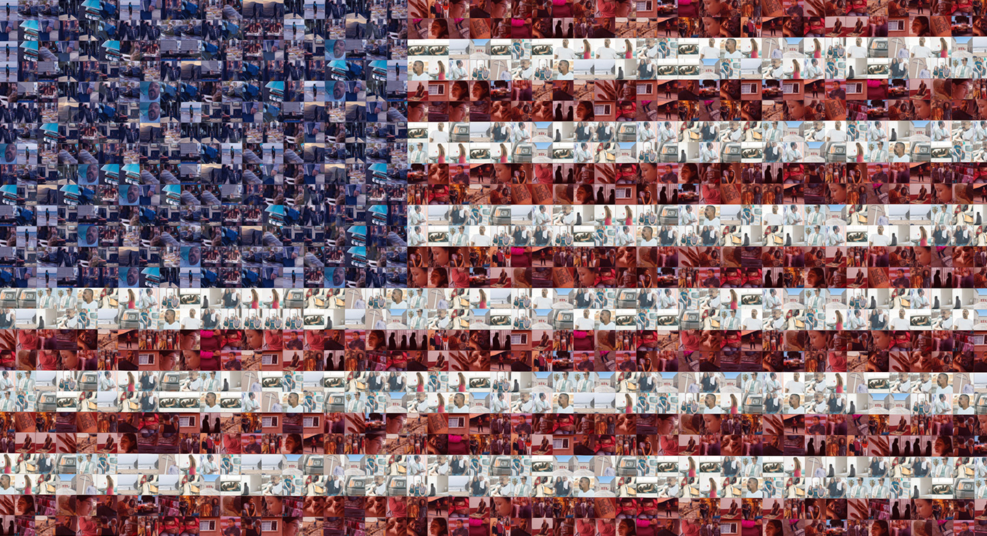
With Even/Odd creating beautiful stories and videos, we knew we needed to capture the users’ attention before discovering the amazing stories from the Lyft driver community. Through multiple iterations, we designed our flag concept. It starts with a number of portraits in a dark and emotional universe. As the user scrolls, the portraits zoom out and resolve into an American flag. The idea was to quickly showcase that it is the people who live in the US that make up the fabric of America. They are what make this country great.
As the user scrolls, the portraits zoom out and resolve into an American flag.
Navigation
Though we’ve designed the site to allow users to explore in multiple ways, the simplest way to navigate is from the first story to the last. We’ve created a seamless transition from the end of one story to the beginning of the next, allowing users to click or scroll through to the next story. Though, if users want to jump from story to story, they can do so through the simple menu or the carousel experience on the landing page. However, since the videos are such emotional pieces and so integral to the experience, we wanted to ensure that users always receive a preview of these videos no matter where they were navigating from. We found it gave the site depth and dimension while serving as a functional element for the users to preview what’s up next.
If users want to jump from story to story, they can do so through the simple menu or the carousel experience on the landing page.
Technologies
The site is built with vanilla ES6 Javascript that uses a lightweight webpack configuration for building. It's a purely client-side application with no server-side languages involved. We built an internal command line tool that uses Chrome Headless to pre-render the site for better search engine optimization.
The 3D flag portion of the site is built with OGL, a minimal WebGL framework that made it easy to create the 3D environment with little overhead. Our goal was to offload as much work as possible to the GPU for optimum performance when dealing with the flag tiles for the intro effect. We used instanced buffer geometry that was animated with custom vertex shaders. The photos used on the tiles were all packed into a single texture atlas – which meant we could save bandwidth and further improve the performance of the intro animation. It had the added effect of making it easy for our designers to update the photos.
Company Info
Hello Monday is a creative studio that makes digital (and magical) products, experiences, and brands. We’re called Hello Monday because we aim to make Mondays better. Better for the people and organizations we collaborate with, better for their customers, better for us, and better for our planet. That might be a lot of pressure to put on design and technology, but we asked them and they’re totally okay with it.
