Client
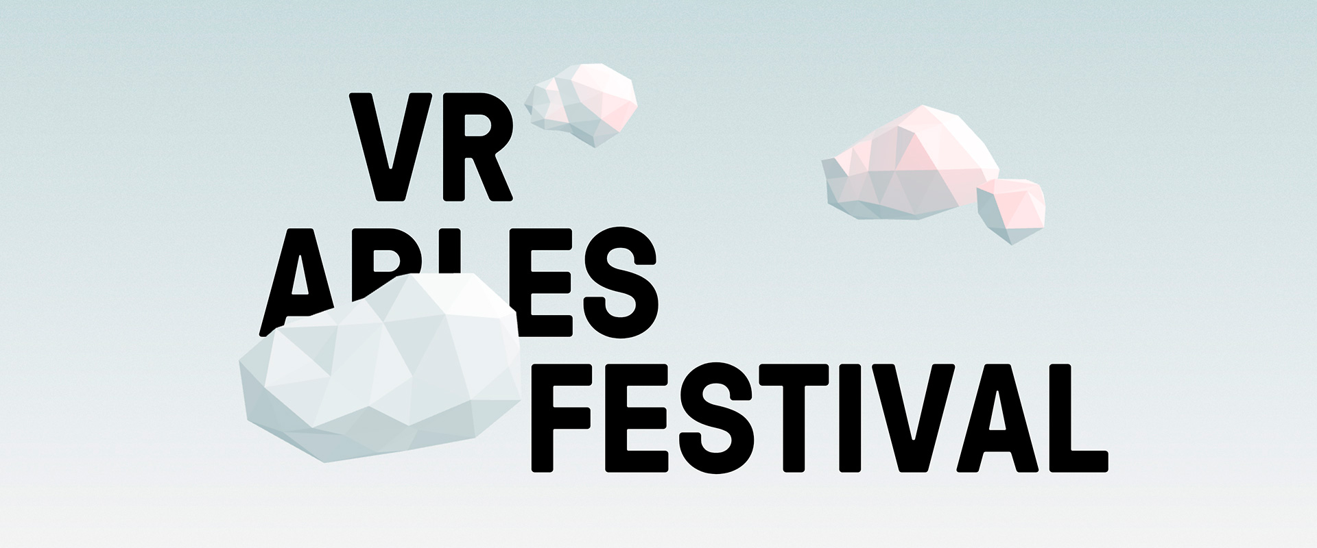
The VR Arles Festival was created to discover virtual reality through movies, documentaries and artistic creations, and bring the spectator to the best productions in the world. It takes place alongside the Rencontres d’Arles, which offers an overview of contemporary photographic creation and practices and is a reference in French photography festivals. Twenty movies are presented which invite you to dive into fictional universes or documentaries and feel your very own experience. A jury of recognized filmmakers, photographers and virtual reality pioneers was gathered to designate the best movie award.
Brief
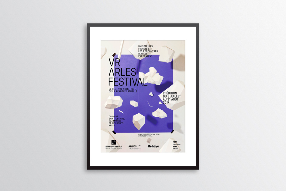
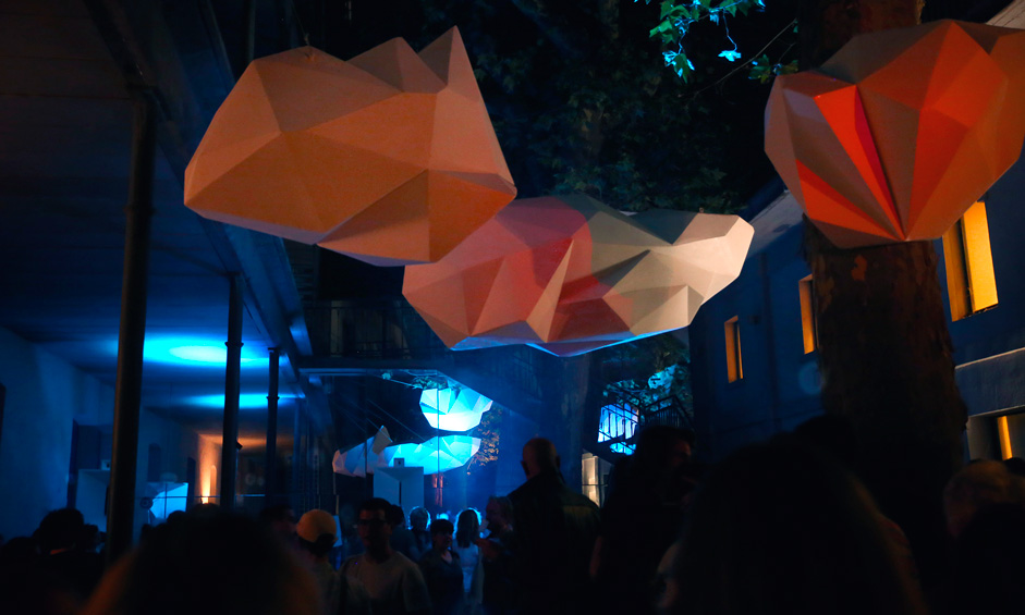
We took inspiration from the venue where the staging was especially made by a scenographer and all the volumetric clouds were made in low poly. The main goal of the website was to present the program, jury members and news of the festival. We wanted to imagine a digital concept to highlight the 360° movie, but avoid a too technical graphical universe, with an overuse of pixels, dark backgrounds and glitches. Instead, we opted for a more dreamlike and lightweight approach that was way more in tune with the festival’s identity.
Approach
Les Animals is a brand new French digital studio with a small team. At the moment as there are only 2 of us: an art director and a developer, we have no choice but to be polyvalent and stay curious about everything.We were immediately convinced we needed to make use of the volume on the website, so we rolled up our sleeves and got down to learning the most famous open-source software for creating 3D: Blender. As we were accustomed to the Adobe suite, at first we had a hard time getting our heads around Blender. But it ended up being quite simple and we managed to create everything we had in mind.
Moving from Blender to three.js was a breeze, as you can precisely keep every parameter of the objects and the camera: position, focal length, aperture etc. the possibilities are endless, as you can handle many parameters like depth, scale and distances. It has been a good way to test several ideas we had in mind regarding interactivity.
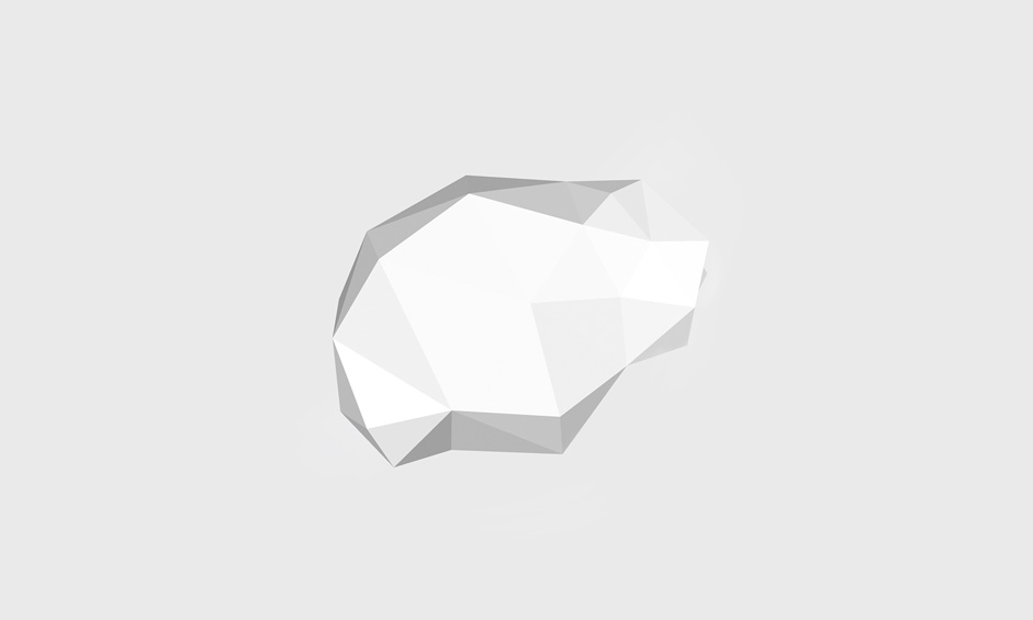
Three.js comes with some useful tools to place the lights precisely. Being real-time, you can manipulate the scene to position all the objects and do adjustments very quickly.
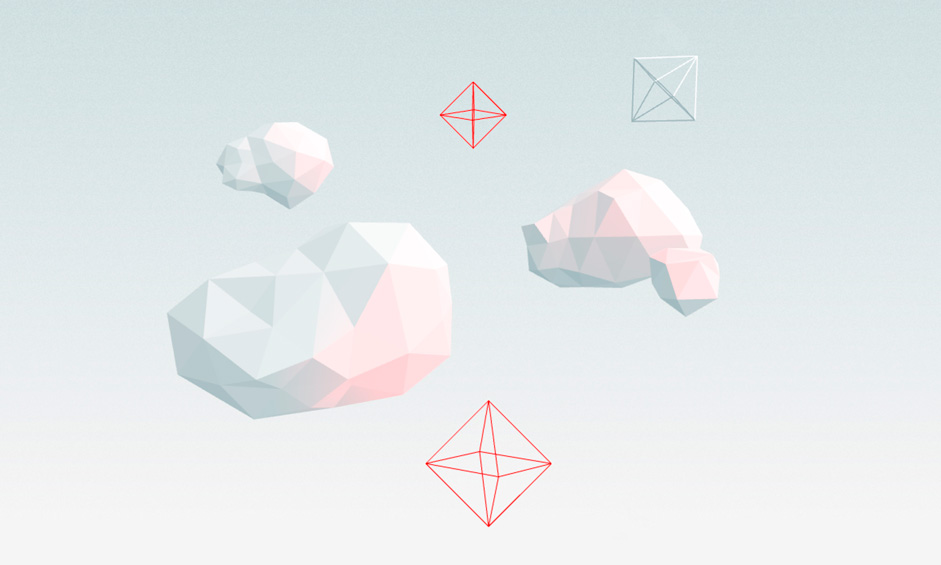
We used the cloud shapes from the logo on the front page, but wanted to go further with the rest of the site, by having more varieties of shapes, and by bringing some sense with it. We restricted ourselves to scroll animation to keep it simple to avoid too much motion happening at the same time. Adding a subtle noise also helped the background to not be too cold.
Transitions, an eye for detail
We paid a lot of attention to the page transitions to create a navigation as fluid and smooth as possible. The sidebar menu helped us to create a site wide generic transition. We relied on the library barba.js to abstract all the Ajax file calling part.
The movie pages benefited from a dedicated transition. We used the constraint of the video player format to our advantage . The YouTube JS API was used to have very precise control of when to trigger transitions and animations.
About fonts
The font used in the main titles is the GT Pressura bold was designed by Marc Kappeler and Dominik Huber and was released in 2012. Alongside the clouds, we put in place a dedicated transition for the page titles. We distinguished the arrival transition from the one used when the page is scrolled. In both cases, each letter is animated vertically with an odd and even alternance to produce something catchy.
When entering the page, using a mask was way more interesting than a simple fade and prevented too much movement being produced. This effect works particularly well with big fonts, and capitalized to homogenize the characters height. During the page scrolling, we stopped using this mask to let the letters move much more widely and fill willingly all the available space in the screen.
Challenging the good old thumbnail grid
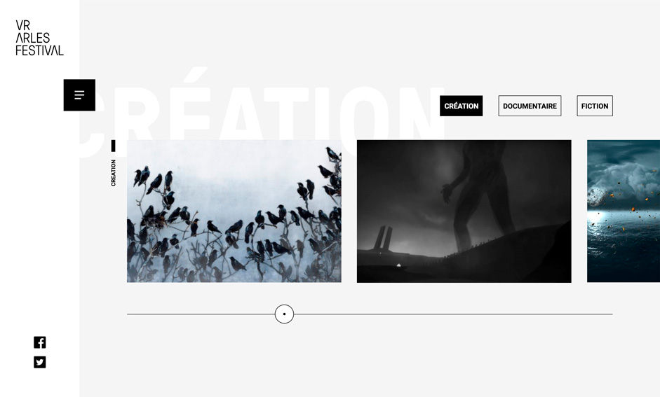
We used a draggable slider to avoid a simple thumbs grid, and binded it to the page scroll to have multiple ways of using it whilst never losing the user. We also added a skew transform when dragging the thumbs to have a more natural and organic motion. The GreenSock tools were useful (notably Draggable), and we coupled it with some custom scroll tools.
Animating a contact form
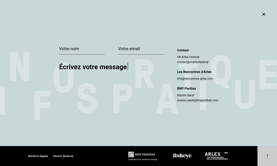
A contact form is definitely not something very sexy and appealing, so we wanted to keep it simple and pleasant to use. The text animation helps to catch the user’s attention and produces a small surprise when opening the box.
Bad luck!
The 404 is a playground. Even if this page is hardly even seen by the common users, we wanted to have fun making it. We will let you discover it by yourselves.
Tools
- Front-end: LESS, Barba.js (Ajax), Three.js, GSAP
- Back-end: WordPress, (PHP & MySQL)
- Server: OVH
- Tools: PhpStorm, Blender
- Font: GT Pressura
About Les Animals
A dark haired artistic director and a blond haired technical director. Except this harsh opposition, Laurent Canivet and Jean-Baptiste have been forming for nearly 10 years an inseparable duo able to cope with all the storms and challenges.After graduating from the Gobelins school, they loitered like Harry & Lloyd in the digital landscape of Lyon in France before bringing their digital expertises to the Extra agency. They left five years later, in 2017, to found the studio Les Animals, the outcome of their peregrination.
