
Resn was asked to develop a platform that shines a cinematic spotlight on the new Ford Focus and involve the Latin American market in the writing process of a short film; starring the car, its new features, and one gigantic piñata!
Over the course of the campaign users put their concepts up for submission, earning a chance to see their take on the next chapter come to life. Winning chapters were selected and produced professionally, forming ‘Las Fantasticas Aventuras del Focus 2015’.
The film and its story have to be at the center of the experience at all times. It is this fact in particular that dictated the way we designed the platform; clean, motion-driven, and with a pinch of cinematographic flavour.
Storyline
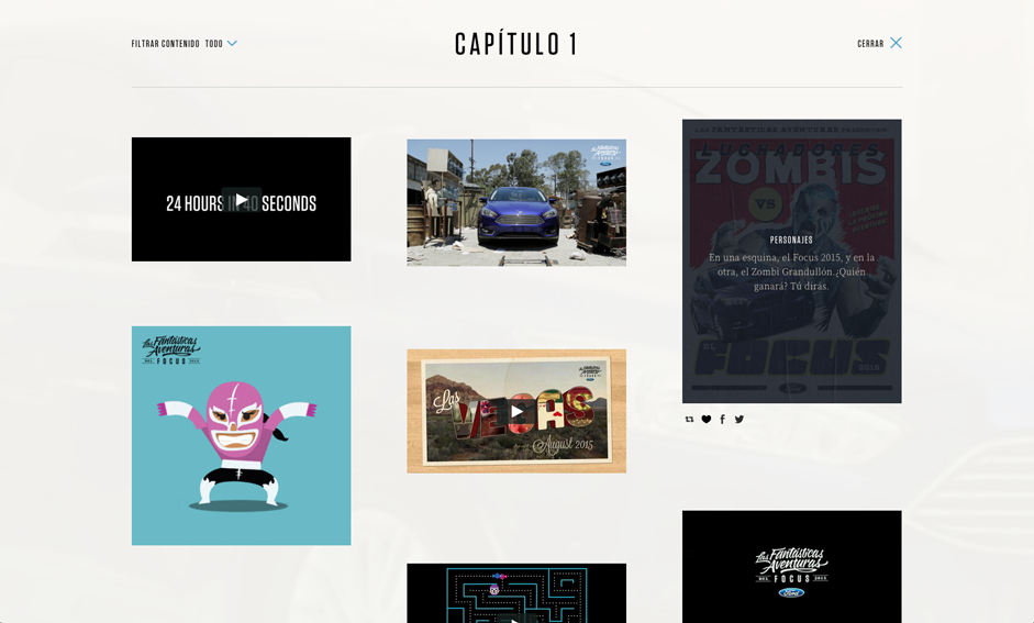
Inspired by the layout and motion of a film reel, the chapters of the story are arranged horizontally, as a sequence of images we call the ‘storyline’. Each of the images represents a chapter and is used to navigate the website.
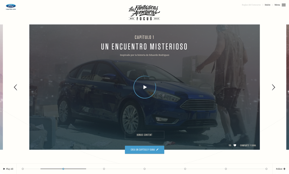
When chapters opened up for submission and entered the production phase, more functionality was added to the storyline.
As the story progressed, information about the cast and additional behind the scenes content became available for users to explore.
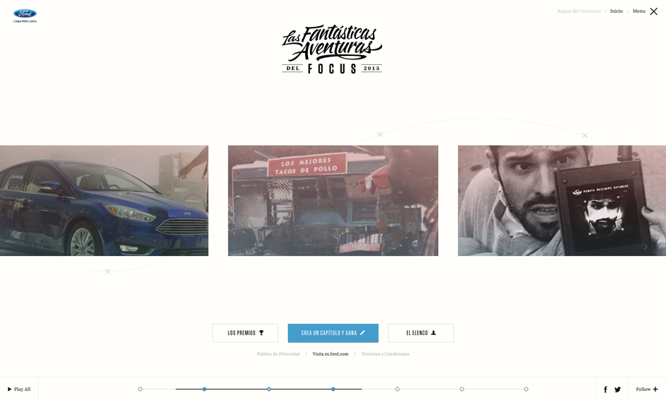
The storyline can take multiple forms, smoothly scaling and repositioning the chapters based on context and screen size. A click on the menu button, for example, will move the storyline back elegantly and present the chapters side by side.
This makes it possible to hop from one chapter to another with ease and it creates a clear overview of the available content, without ever pulling the user away from the story.
Timeline and plot
To support the storyline we created a more abstract, timeline like representation of the story. This ‘timeline’ shows which part of the story is currently in view and provides a simplified way to interact with it. Each dot on the timeline forms a shortcut to navigate to a specific chapter.

Additionally — we wanted the third layer to visualize the concept of a roadmap — a plotted line was added to the background of the site, on which the story’s key locations are displayed in a subtle manner.
Big screen
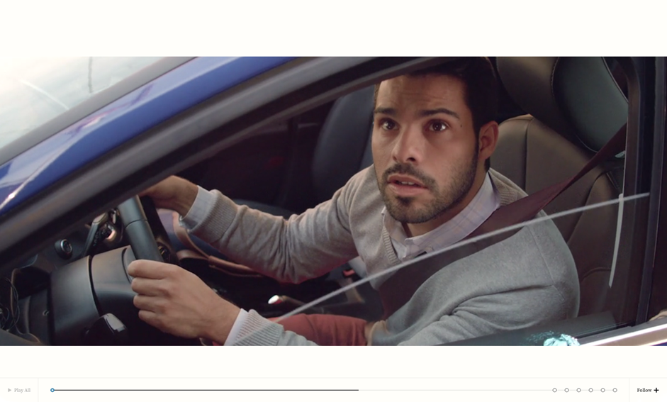
Available chapters and the most recent trailer can be experienced straight from the storyline. The selected chapter takes over the screen and transforms into an ultra-widescreen video player, utilizing the timeline in smart ways to control the video.
This integrated, distraction-free presentation of the film is essential to the look and feel of the project, and an effective way to keep the user engaged.
Technical Approach
A unified drag and drop system, as well as basic keyboard input, helps the user to navigate the website freely.
Even while watching the film, skipping through the story is as simple as grabbing the page and flinging it around. Likewise, the timeline offers an intuitive way to slide from start to finish in no time at all.
To get a better understanding of how all of this would come together, we decided to elaborate the techniques used in a prototype first. Solving individual problems in isolation unmasked the ideas that didn’t work and, more importantly, taught us how to approach the ones that did...
Act normal
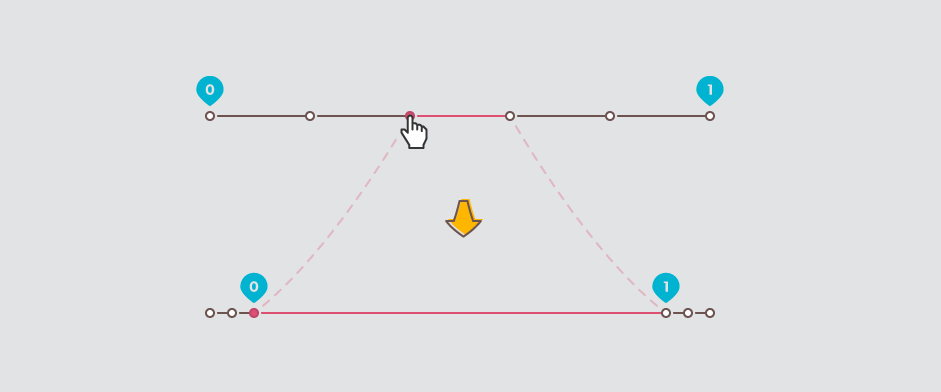
For the story to flow the way it does, we need the three main components to feel connected and move in coherence. To achieve this we make use of the simple, but powerful concept of ‘normalization’. By mapping every location on the storyline, timeline and plotline to a value between 0.0 and 1.0, we eliminate their difference in size. This allows for numerical information to be shared between components.
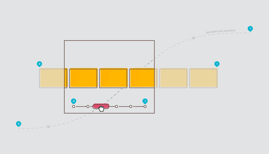
When the position and shape of a component change, values representing this change are communicated across. Each line has its own mathematical interpretation of these values and uses them to calculate a new position, size, and layout.
By far the most interesting problem to solve here is the transformation of the timeline, taking place when the video starts playing. The comfortable ‘0 to 1 means left to right’ no longer applies and the timeline becomes a progress bar. During this transition we extend the line segment between the current and the next chapter, so that it represents the full 0 to 1 range. Sadly, the remaining dots will have to move out of the way. “Off you go!” Straight into negative space.
Keep running
When working with big images it can be a real challenge to keep the flow of the experience consistent. Especially when elements are expected to move, scale, zoom, and mask at the user’s command, the frame rate is likely to drop below freezing — if not done carefully, that is.
A common solution to at least part of this problem is the use of matrix transformations. Mathematical transformations (translation, rotation, scale, etc.) can be represented by a special grid of numbers, called ‘matrix’. Any number of transformations can be bundled together into a single matrix, which only has to be applied to an element once. Very efficient!
Another crucial factor to consider is when, and when not to make the application perform processor intensive tasks. No matter how efficiently elements are moved around, timing things poorly is going to cause long faces.
One of the challenges we came across is finding the right time to start interface animations, so that they don’t interfere with any of the more important storyline transitions.
Cut the crap
Besides moving everything from left to right, matrices are used to achieve the desired cropping effect on the images in the storyline. This prevents us from having to use the relatively slow masking tools available.
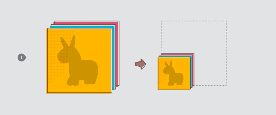
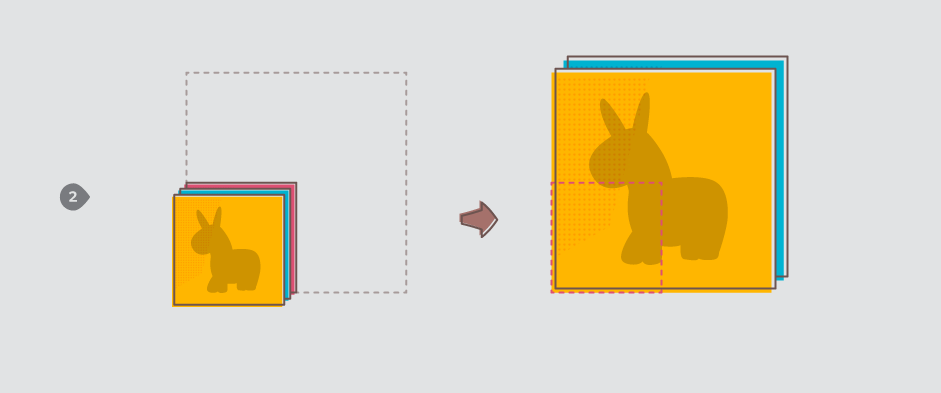
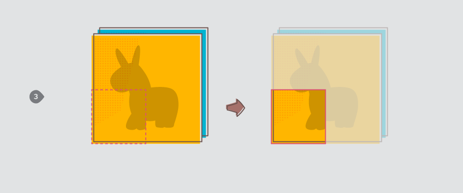
The photo and video content of each chapter is wrapped in three DIVelements. Scaling these elements individually gives us full control over what part of the image is shown.
- We start by scaling the outer DIV. This naturally results in the image shrinking (or growing) in size.
- Next, we apply the mathematical inverse of the same scale to the second DIV, reverting the image back to its original size. Wait, what?
- When we change the overflow property of the outer DIV to hidden, it becomes clear that things are not quite the same at all; the parts of the image that exceed the dimensions of this element are no longer visible. Tada!
- To make the image zoom in and out within this cropped container, we need one more layer. This is where the third, innermost DIV comes in. We can now transform the content independently, in whatever way we desire.
Watch it tumble
There are many ways to go about populating a website with data dynamically. For obvious reasons it requires a database, some sort of content management system, and a way to retrieve the data at the front end. In this particular case we decided to use the Tumblr platform and utilize its post structure, tagging system, and public API to manage our data.
Whether it’s a chapter, production trailer, or fact about a cast member; every piece of content shown is linked to its very own, dedicated Tumblr post. Tags are added to each post, for us to know exactly what we’re dealing with. These tags help us categorize and select specific items whenever needed.
The fact that Tumblr returns the body of its posts using HTML comes in handy as well. Through a custom parsing system, it allows us specify (and differentiate between) data fields for every post. We use heading, paragraph and even stylistic HTML elements to define things like title, location and author.
We essentially built a complex Tumblr theme, pulling in our own HTML template and scripts to glue it all together.
A Whimsical Undertaking
Las Fantasticas Aventuras is another important milestone in Resn’s development. A huge driver and core principle in our approach to digital execution is narrative, using the power of storytelling to connect with our users.
We created an experience that accommodates the client with a robust and familiar CMS, whilst affording ourselves complete front end freedom. Eyebrows often raise when we mention that this is, in fact, a Tumblr page.
Written by Niels Trumpie — As interactive developer and Technical Lead at Resn, Niels guides highend projects from concept to execution.
