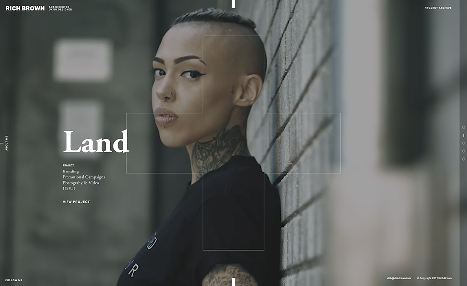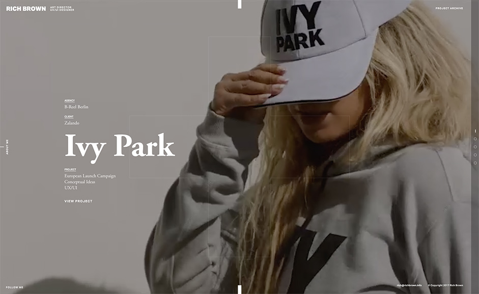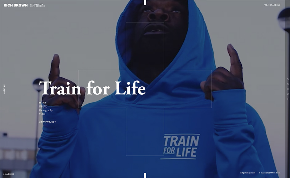
The portfolio project of Rich Brown was a collaboration between Rich, a UK based Art Director and Jordan Woolnough of UK based Grit Digital. It was a side project for both and for one reason or another the project took a year to design and develop. The primary goal was to create an impressive mobile focused experience showcasing Rich’s work.

1: Design
Wowing the audience in an overcomplicated impressive “WOW” experience is great, but a designer’s portfolio’s main goal is to showcase a designer’s work, clearly without over complication, resulting in conversations. Break down the content and what you have is effectively 4 pages; a homepage consisting of featured projects and contact details, an About page detailing Rich’s career history and skillsets, a project archive and a project detail page, that’s it. The structure is simple for a reason, and the decision to ditch conventional navigation was intentional, the experience on mobile devices felt more natural using linked signposts and you are only ever 1 click away from the homepage, which in itself IS the navigation.
The design doesn’t mess around too much with conventional UX, it’s minimal, clean and timeless but ’shows off’ a little, exploiting impressive interactions with simple design disciplines. The use of the masked “+” is not just a stunning transitioning effect, and the navigational lines are not just intuitive prompts to cycle through the carousel, but are actually self branded elements taken straight from Rich’s tattoo’s which gives them real value. It’s those touches that makes a project personal.

’ Shows off’ a little exploiting impressive interactions
2: Experience
A minimal design requires an immersive experience, and the site is brought to life with the use of micro-interactions, dynamic screen and page transitions and strong use of video. The homepage UI consists of 3 ways to scroll through the project carousel, natural you can scroll with the middle wheel, use the navigational circles on the right side, or click the line prompts top and bottom. The text links are more pleasing to hover over than they should be and interacting with the “about” page is a joy to switch between pages. On the inner pages, there’s something very pleasing about the progressive appearance of the content and the way the page inverts from white on black to black on white as you scroll. It’s these details that really makes the user experience. The site has been designed with mobile in mind, and the experience is almost identical between multiple devices, the execution of interactions and video are still present for all mobile devices, which is surprising considering the speed of the load times.
Technologies
The front-end initial templates were built from scratch with SASS, compiled with Gulp and utilising BrowserSync for live reloading and parallel device testing. The CSS architecture is loosely based on Harry Roberts' ITCSS methodology. The animations use GSAP, which works alongside SmoothState.js to handle the AJAX page transitions. Local development was initially using a LAMP stack for templating partials and includes, before being saved as static HTML for deployment on the Amazon S3 live environment.
The cross-shape masking effect was the greatest challenge to overcome during development, for which we were required to use inline SVG, animated using GSAP. GSAP has the power to control individual SVG elements, animating them smoothly and performantly across devices, plus handling the quirks of transform animations involved with SVG on the fly where other animation libraries may not.
Company Info
Rich Brown is a freelance UK based Art Director. Mostly experiences in UX/UI design driven with a passion to work with like minded creatives and developers designing meaningful visuals and immersive interactive experiences. Rich is also a photographer and also dabbles now and then in brand design and video.
Jordan Woolnough is a UK based creative lead front-end developer working for Grit Digital. Always found deep in code, exploring new technologies and methodologies.

