How we started
Higher Ground is a Melbourne based cafe who are quite famous in the country for their style and food, they offer not only great food but also great moments. After receiving an email from them, we started the design process. Their team’s very open minded view, meant we were easily able to create a nice web site and interaction.

Our challenge
Higher Ground is special: with deft service, striking surrounds, and beautiful food, it offers a unique experience when eating out in Melbourne. When it comes to making a design for a company like HG you feel like pushing your boundaries more and more. The picture is one of the very important key elements for the web. When we received the first assets from the team we felt like we were on the same page and it made us feel stronger - because when visual elements are right for each other it makes it easier to create a design with a soul. Our main goal was to able to make a design with emotions, which we think this is the key to making people connect with your design work.

I’m gonna’ keep on trying, ‘till I reach my higher ground.Stevie Wonder
Art Direction
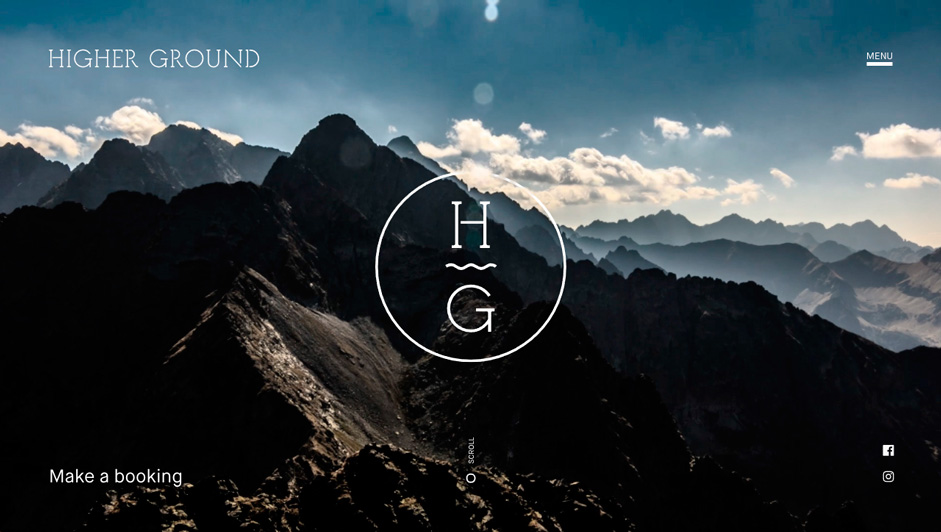
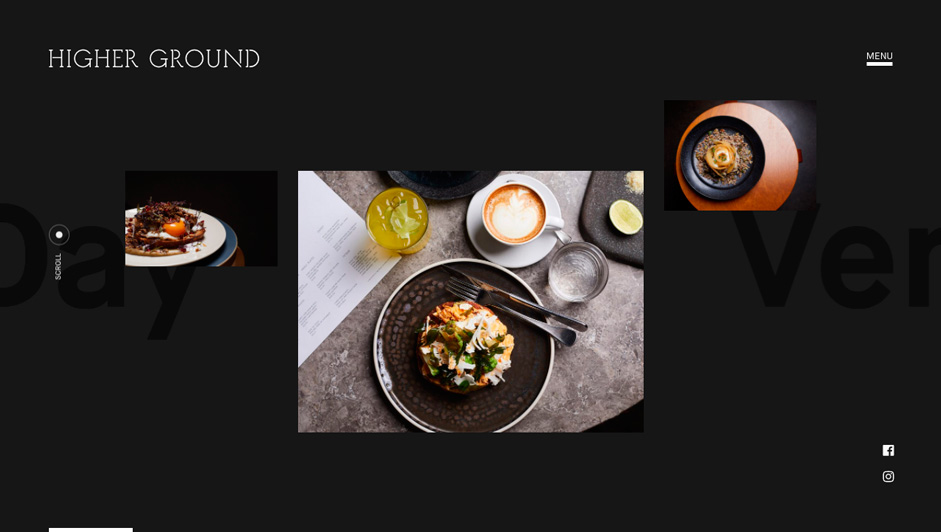
Our main goal was to able to connect perfectly with their concept and soul. For this reason, we wanted to keep the site minimal and have harmony between the typography and the image. At the same time, we opted to use a color palette that is related to their cafe design. With these all elements, we wanted to emphasize the sophisticated part of the HG, so all the animations and interactions are designed from this approach. We worked on the timing of the animations very sensitively. With all the hard work we reached the high level that we were aiming for.
Technology We used
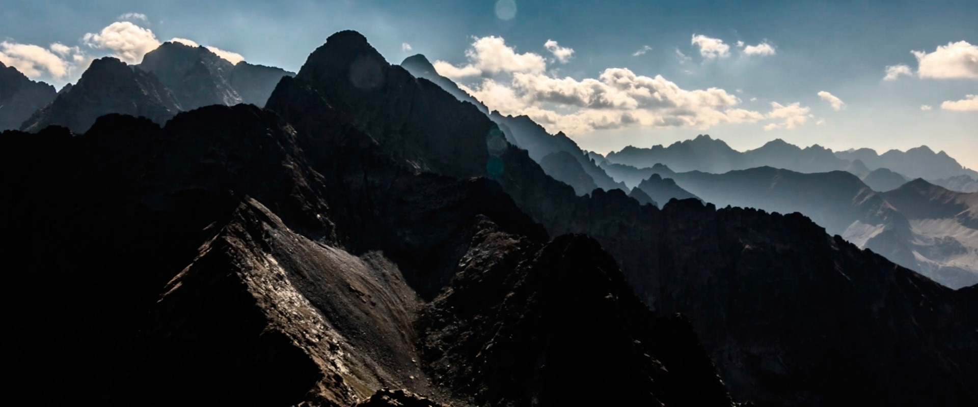
We had the idea to create a cloudy effect on the sky in the cover picture of the homepage of Higher Ground. We wanted the clouds to move like there was wind blowing at the top of the mountain, so we chose to use Pixi.js, a 2D WebGL library that enables the creation of liquid effects. Thanks to Pixi.js we succeeded in simulating cloud movements. Another effect we wanted to realise is the mask shape moving behind an image by following the user cursor position: we first created big blue masks with transparent shapes in their center. Then we put them inside frames above some images in the website and hid the edges of the masks. Thanks to the requestAnimationFrame function we had the cursor position in realtime. Finally when the user moves the mouse over an image, we change the mask image position (x and y value) and put it in the center just behind the cursor by using TweenMax.js.
We used ThreeJS and TweenMax alongside WebStorm, a lightweight JavaScript IDE. The setup for this site consisted of HTML, JavaScript, and LESS. Everything was compiled using Grunt.
