Introduction
Casamance is an exclusive designer and manufacturer of woven yarn dyed finished and embroidered fabrics for upholstery and furnishing applications. We were commissioned to create their semi e-commerce platform that provides the entire fabric catalog (more than 5000 products), collections, the lookbooks, the brand DNA and more.
The Design
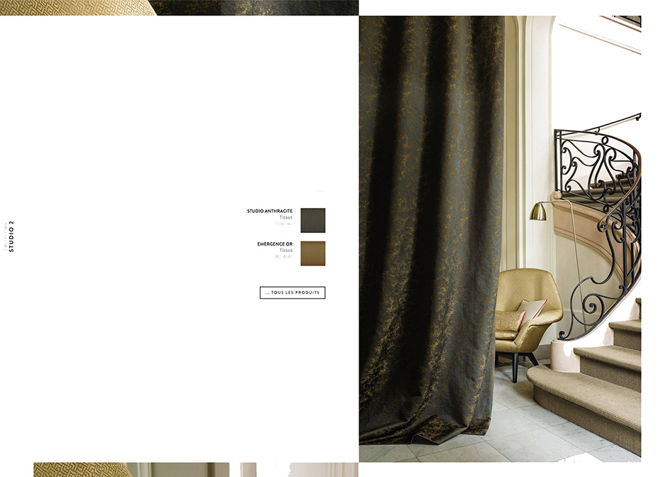
For years, Casamance used printed catalogs for their communications, where the collections and products were showcased in a bunch of top-end photographs. These catalogs were very minimalist to highlight the photographs.

The first thing we wanted to keep is this minimalist touch to provide a clean and easy discovering experience through the magnified photographs. We didn’t want to add a lot of effects that could get over the pictures themselves, a little parallax inside the photographs is enough.
The Layout Concept
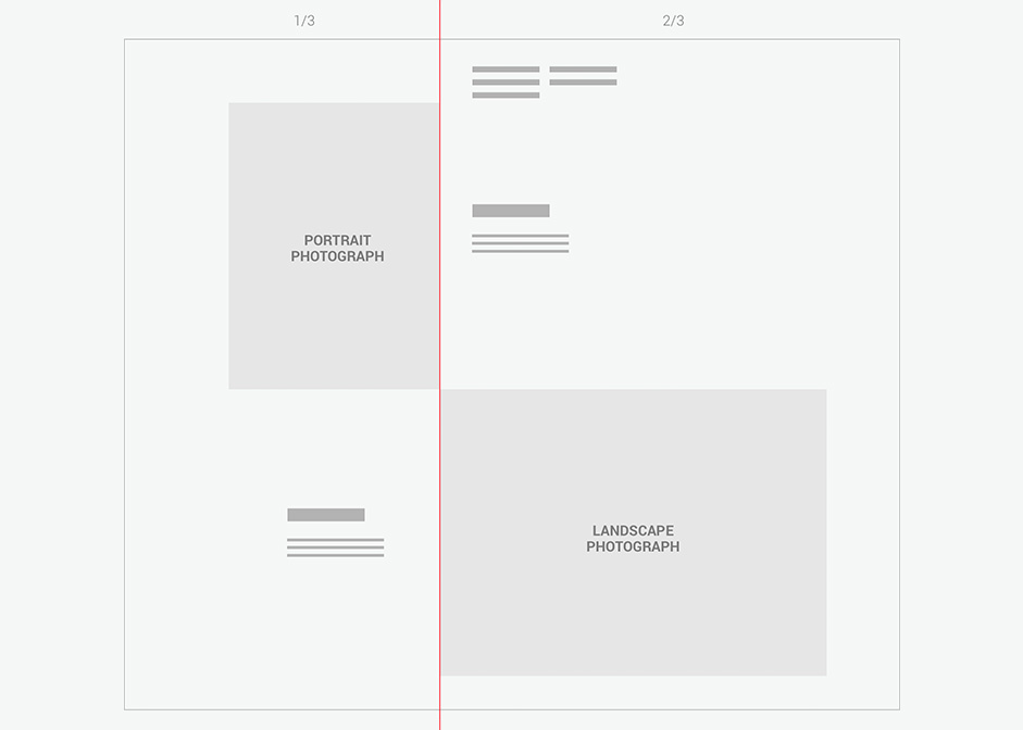
Casamance didn't want us to crop the photographs, just leave them as they were. It was a problem, because most of the pictures were portrait and only a few were landscape. It’s better to work with landscape pictures when it comes to creating a web layout.
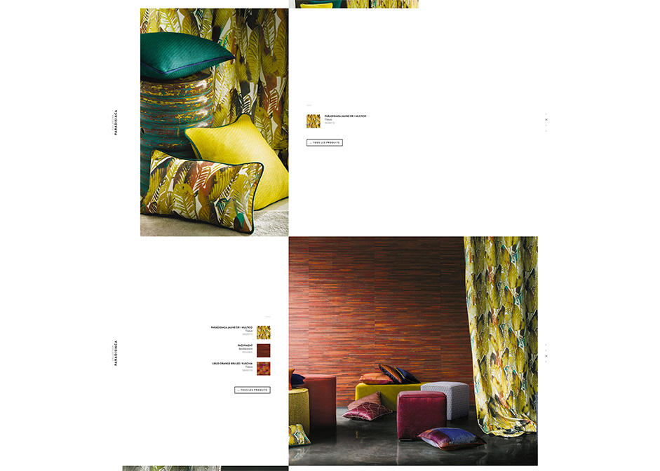
So we came up with the simple idea of splitting the page layout in to two parts : 1/3 - 2/3, so the left side would be dedicated to portrait and the right side to landscape. With this solution, we didn't have to crop any photographs. We just had to reserve the right side for the landscape pictures.
The Collections
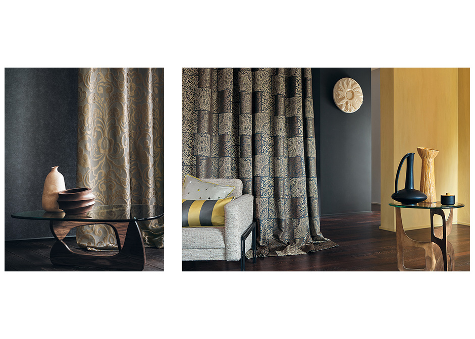
Casamance have created more than 200 collections and counting. This is a place where they can display them as kind of case study of their work. A simple listing with more images and less content was the best choice.
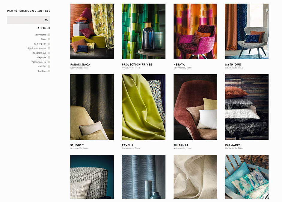
The collections layout is quite similar to the home page. Throughout the scroll, the photographs display left/right all along the page with a little bit of parallax. We wanted it to stay clean in order to highlight the scenes.
A collection is particularly about products. The user would be inspired by the photographs and then see what fabrics have been used. We loved how the product thumbnails came out as graphic pieces extracted from the photographs. We came up with the idea of associating the photographs with thumbnails of the fabrics that have been used on them. The thumbnails would send the user to the product detail page.
The products
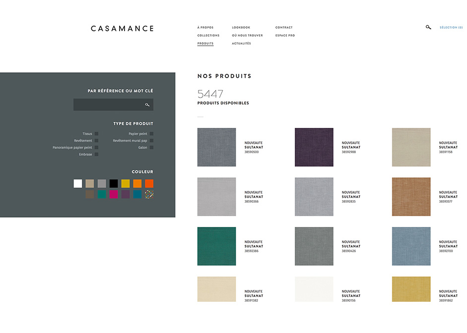
There are more than 5000 products, classified by type and color. We wanted to create a cleaner product listing page as possible, letting the fabric colors and textures be highlighted instead of something else.
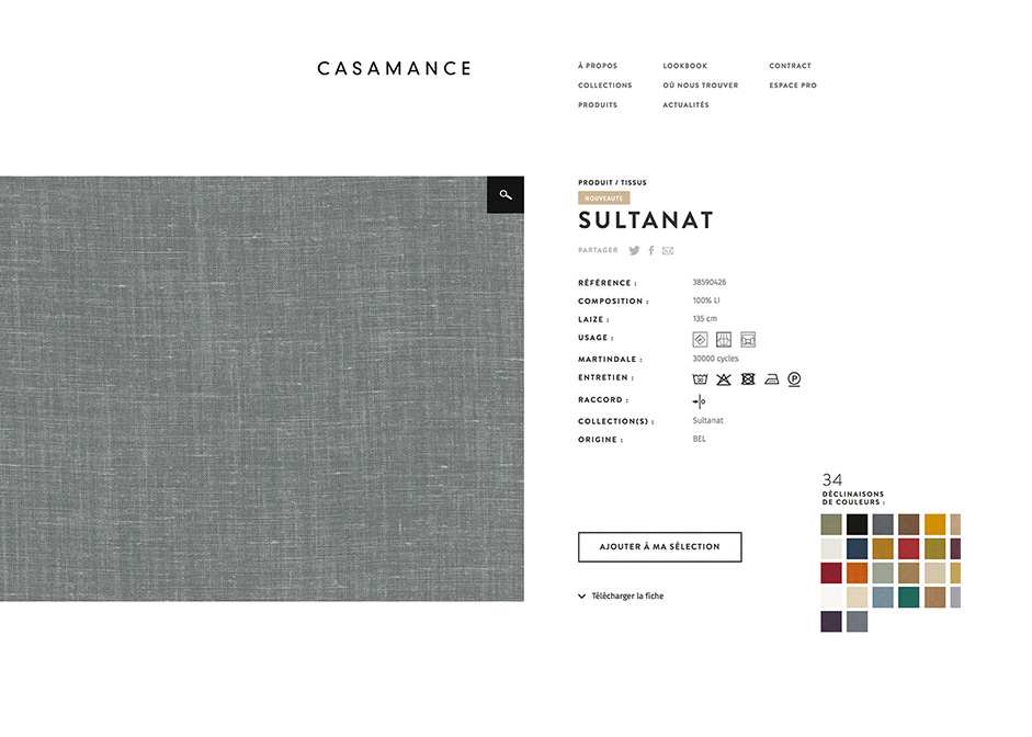
The product page design is fully based on a simple idea. It’s quite difficult to imagine the fabric quality over a web page. As the Casamance salespeople are working with their client's on a tablet, we wanted the zoom function to be improved. This way, by clicking on the picture, a full hi res quality shows up and scaled up fullscreen, as if you were handling the real fabric.
The Lookbook
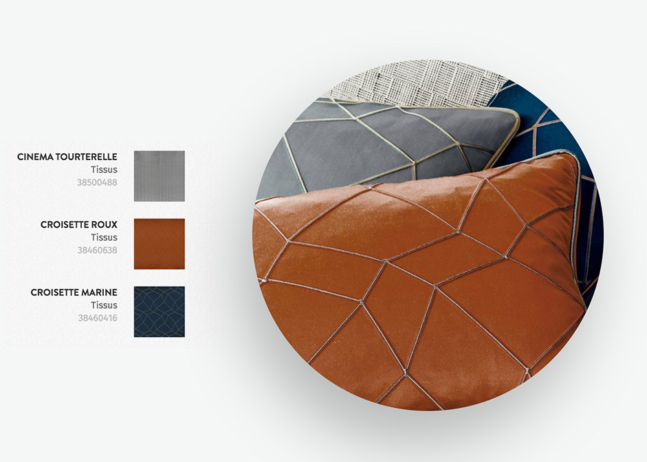
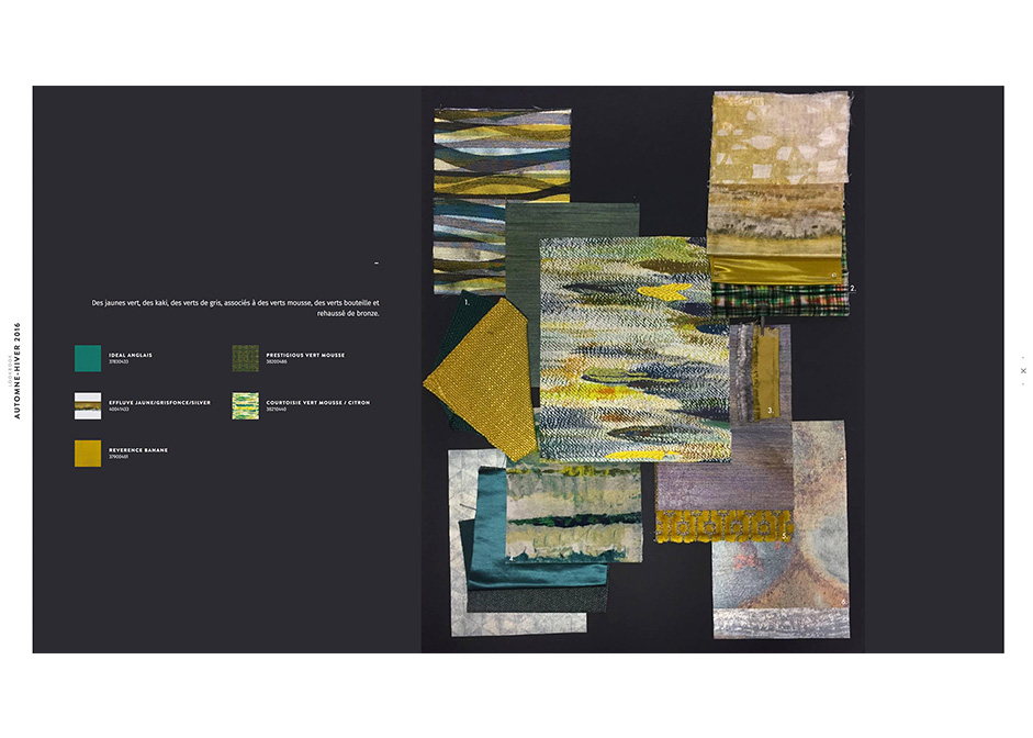
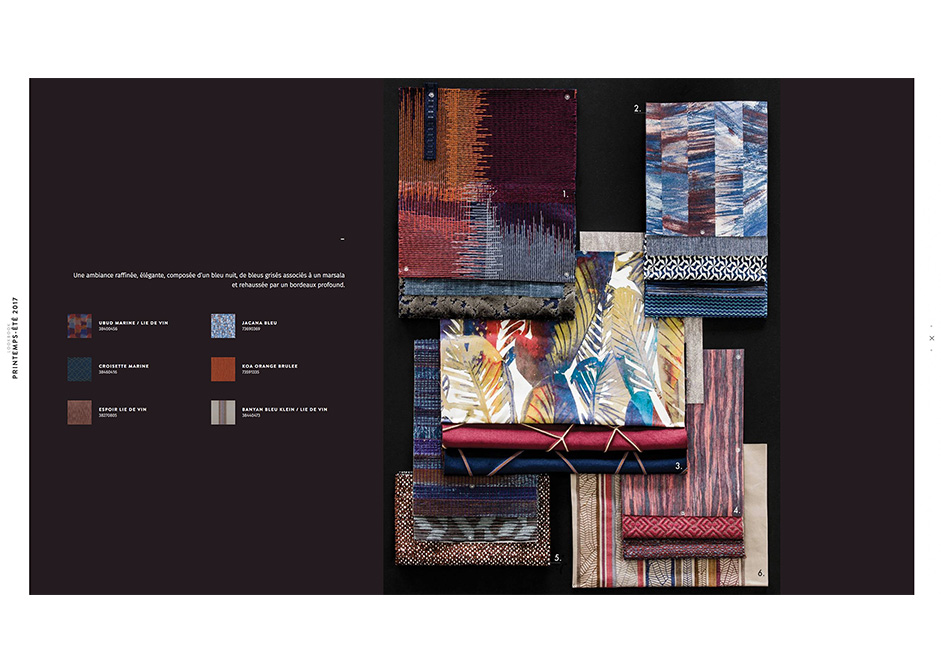
Before creating a collection, the designers at Casamance collect inspirations, pieces of fabrics, everything that reflects their ideas and goals, and put them onto mood boards. The last thing about the this project is showing the “behind the scenes” as rough as they are. As the entire site plays with fabric thumbnails as pattern pieces, we wanted to keep this idea in mind and introduce the seasonal lookbook with quick dynamic blocks of artwork made with each product that comes out from this inspiration.
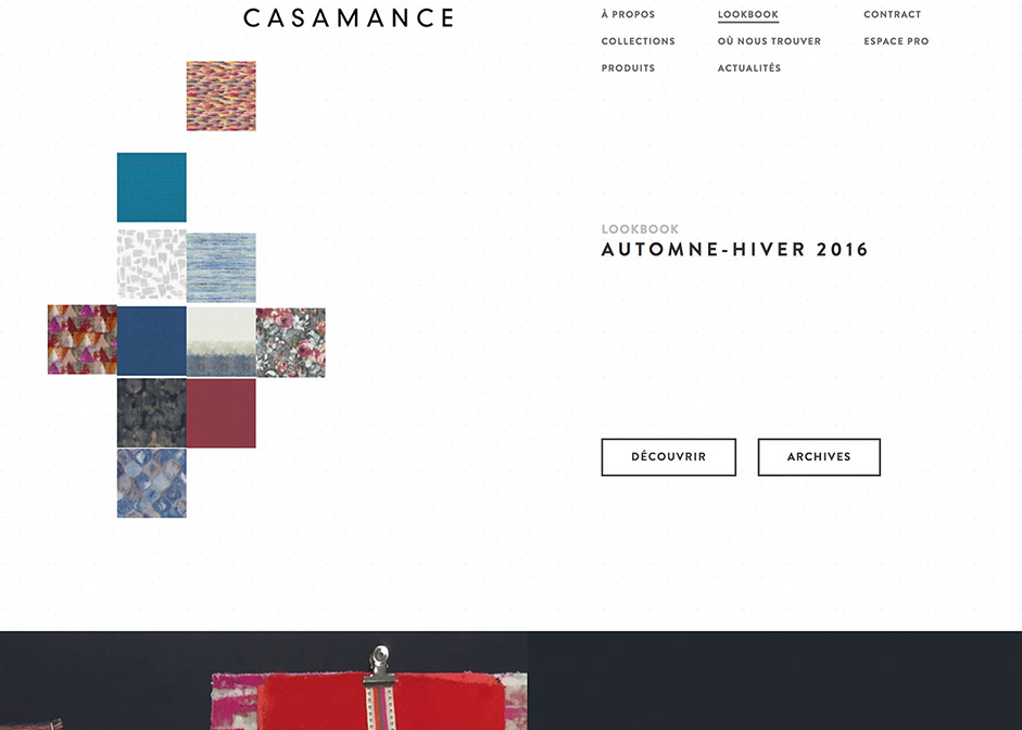
One inspiration, one block. The ambient background color is automatically set as we detect the best dark colour association with the brightest colors of the moodboard.
Last word
We were glad to win Site of the Day on Awwwards for our efforts!
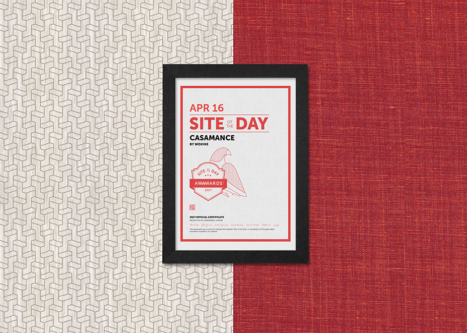
Check it out on www.casamance.com, and follow the brand on instagram for exclusive fabrics and wallcoverings top end inspiration at @casamance_official.
Company Info
Wokine is a french global digital agency and a startup studio, providing innovative, modern and aesthetic solutions, since 2004.
