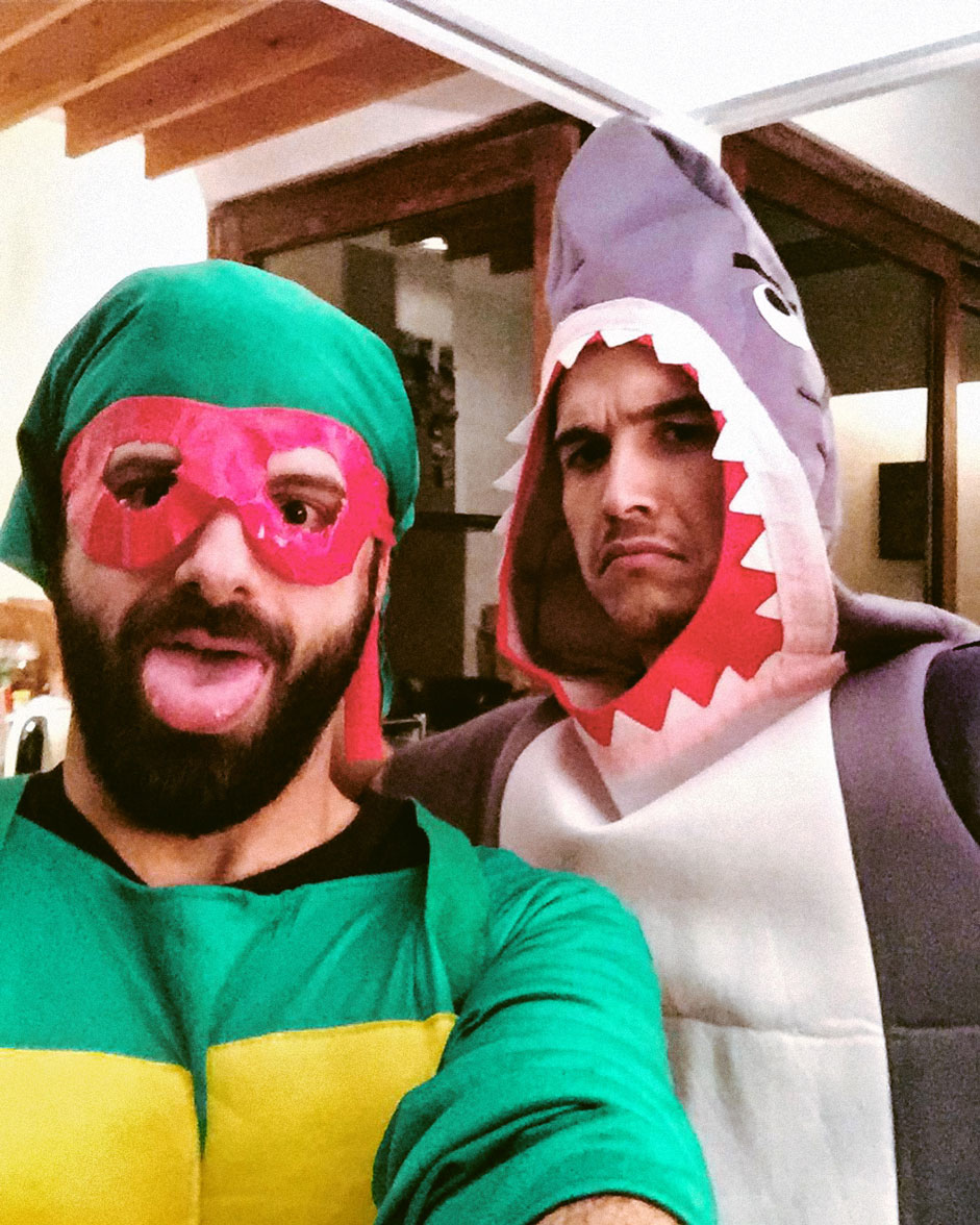
Hi! This is Developer Christian MacMillan and Designer Xavier Cussó. We met in Barcelona while working for the same design shop, and had the chance to get to know each other professionally while working together on quite a few digital projects. We both realized we needed more room to experiment with new ideas, to get away from client work and, more importantly, to have a laugh. This is when:
Burundanga Studio was born

Our First Project
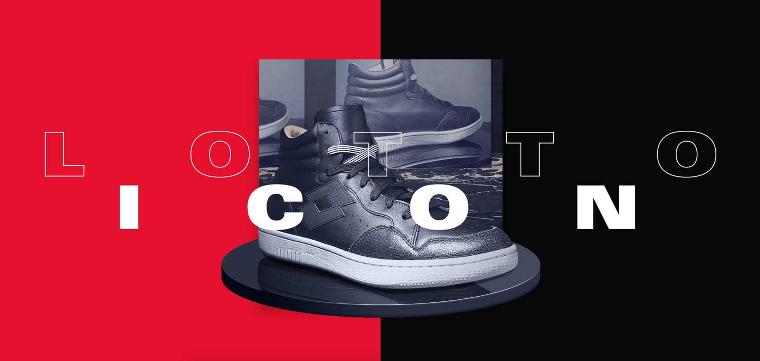
Xavier Cussó portfolio started out in the summer of 2016. He needed a shiny new portfolio to stand out from the competition (Barcelona has one of the highest ratios of designer x m2...) The new portfolio would contain some of his favorite and most successful projects from 10 years of professional work for the global market.
It would be the milestone to get him started as an independent/freelance designer and a good excuse to sign the first job under the Burundanga Studio alias.

The design phase (Xavi)
It all started with the homepage. I had been collecting ideas for a while and was already certain of how I wanted it to look. I wanted it bold and colorful, with a branded preloader, big typography for the project titles, an animated split-screen to transition between project covers, and the use of hero images that would become full viewport on a seamless transition towards the project page. So the design phase was pretty straightforward. Starting on desktop, mainly using Photoshop and Illustrator, always bearing animation in mind, and how it would adapt to other devices based on an adaptive grid and layout.
The second stage was animating the UI (After Effects) and figuring out the most suitable transitions as a solid reference for front-end. I do that every time I have the chance to. You can see one of the initial animation references here:
Finally, I handed over the files to Christian for him to start playing around with, while I finished designing for mobile and what was left of the site.
The development phase (Christian)
If, like me, you are not a long article reader, I will leave you with a link to the boilerplate I use for my projects and a list of all the libraries involved. In the boilerplate you will find the basics of this project. Feel free to use it for whatever you want. If you think it's a bit out of date, I would probably agree, I am totally open to new suggestions, improvements and/or add-ons.
Aside of what is inside the boilerplate we use:
The making of
As Xavi said, we started the portfolio more than a year and a half ago. At that moment I was just starting to use Vue js and I really loved (and still do!) the way that it controlled the DOM through data. So, even knowing that it was going to have a quite straightforward structure in terms of routes and components, I quickly discarded the option of doing it from scratch. I know that there are other frameworks like React or Angular which do the same but you know, sometimes, I like to be fancy and trendy as well. So easy peasy, Vue js was on board.
After coding the base structure in terms of CSS and HTML, we got to the main challenge, to get the different animations right. I was aware of two things:
Firstly, it was going to be very important to clearly define the layer levels before starting the animating. As you can see in the landing, we have a lot of different masks which are combined differently, if you hover on top of a project, you change the active project in the carousel or you enter it.
So I started checking different options, libraries like PixiJS or ThreeJS looked promising for that but finally, I decided not to use them, because at the end almost all the components were involved and I didn't want to have the whole website inside a canvas.
I understood it was possible without them. Even recognizing that maybe I am creating a lot of nodes for doing it. What do you think about it? Do you see a clear line where to say YES/NO to using canvas for almost a complete website? Performance/cross-browser and SEO are the only ones? Obviously for SEO Vue is not a really good friend either. I would probably be using Nuxt.js today - comments welcome at the end of the article!
Another important thing was to keep a high frame rate in the animations, while loading assets and creating DOM nodes with Vue. Obviously, using the right assets for each device is basic to load the least megabytes possible, but I quickly realized that it was not more important than choosing the moment, the way of loading them, and then the moment of placing them on the website. This was something that I had to bear in mind for all animations but, especially, in the loader. If you have a regular % loader, you really don't care about fps, but since Xavi wanted a branded loader, which contained an animation, it was very important to keep this animation with a good frame rate because, in the end, first impressions are what matters.
At first, I was not following any concrete timelines, above all in mobile, sometimes the frame rate went down a lot so what I did at the end was:
- Create only the loader nodes
- Start the loop animation
- Use regular js image objects extract the base64 of the images and store them in vuex
- Stop the loop animation
- Create all nodes and assign the assets
- Start the initial animation
- Destroy loader nodes
The frame rate improved A LOT. And this is a structure that I tried to reproduce in all animations.
"Don't let perfection be the enemy of good enough"
To conclude I would advise doing something that I, sadly can't usually do. Finish things, and finish in a concrete time, put yourself timescales or something that helps you to finish in a concrete period of time. Otherwise, you will find a better way of doing what you did before and you will never finish.
How we work
Digital design and development go hand in hand and need to complement each other. For that reason, our creative process is very open and collaborative, from Christian sharing animation ideas or usability references with Xavi or the other way around.
Equally important it is how seriously we take having a pixel-perfect implementation of the design and consistent animations. To achieve that, we can do rounds and rounds of tickets and Q&A, sharing honest feedback, until we achieve a desired final result. And we can both be very demanding.
"Burundanga Studio understands design and development as a marriage"
Finally, we pay a lot of attention to good internal communication, since we barely ever work from the same room. We mostly use Slack and Trello to stay in touch.
Conclusion
Both of us were employed full-time during the production of the portfolio, so it has been tricky to push the project forward consistently. It all happened in the evenings, weekends, holidays and even lunchtime breaks over the last 1.5 years.
That meant a lot of extra effort to make it happen, but here we are and we are proud of the result and the project feedback so far.
"Self-initiated projects are always worth it"
We would like to thank our girlfriends Eva and Natasha for their patience and our dev friend Miguel Angel Garcia aka @tribadelics for his feedback and advice.
Company Info
Burundanga Studio is the digital playground of designer Xavier Cusso and developer Christian Macmillan. Currently working on a couple of other self-initiated projects. We are up for collaborations. Eventually, commercial work in the near future.

