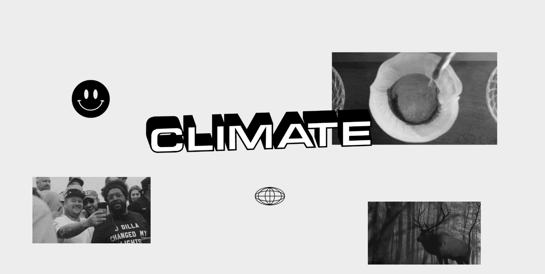
The Project
Climate produces standout media for some of today’s largest consumer brands. They work alongside agencies and in-house teams to develop and execute creative concepts for various global campaigns and initiatives. Platoon was asked to help launch the company by-way of establishing a visual identity and website. The brief held two core goals: 1. to create an identity that reflected the company’s unique personality and 2. to create an online portfolio that would catch the eye of their ideal clientele.
Our Approach
It was important that Climate launch with a bang. With a target audience of bold creative directors, we needed to figure out a way to visually portray their personality and style in an exciting way that would break through the noise.
We spent two days with Climate’s leadership learning about who they are and how they work. We gained a deep understanding of their target market, their vision for the future, and uncovered what really sets them apart from competitors. During our time together, it became clear how resourceful of a company Climate is, allowing for a rather unconventional yet effective approach to creative projects. We needed to create an identity and online experience that reflected each of their unique traits.
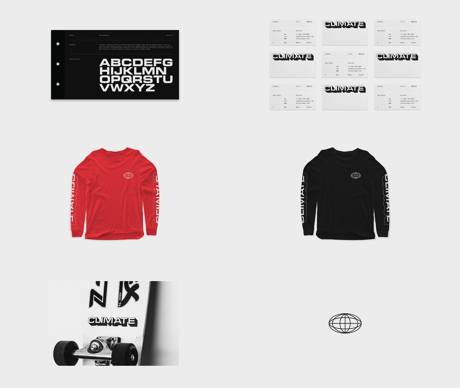
We pulled a lot of visual inspiration from areas of their team’s personal interests: skateboarding, punk/hardcore music, and streetwear fashion.
Through close collaboration with Climate’s founder, we began building a visual direction that would reflect their personality while establishing a unique look and feel in the market. We pulled a lot of visual inspiration from areas of their team’s personal interests: skateboarding, punk/hardcore music, and streetwear fashion amongst many more.
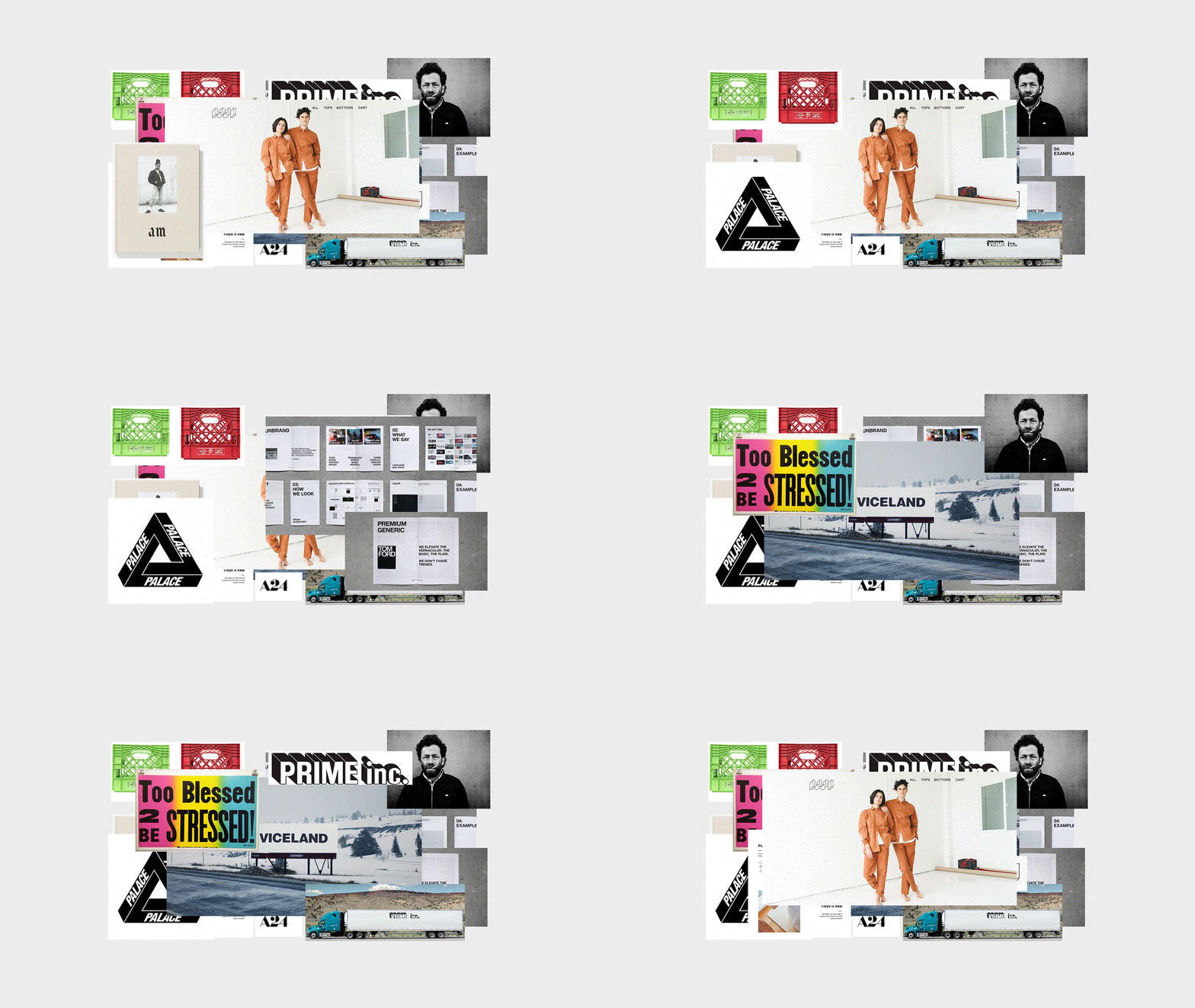
As soon as a general direction was defined, our team began ideating actual identity concepts led by art director, Garrett DeRossett. We ultimately landed on three unique concepts that we felt supported the strategy and requirements set forth.
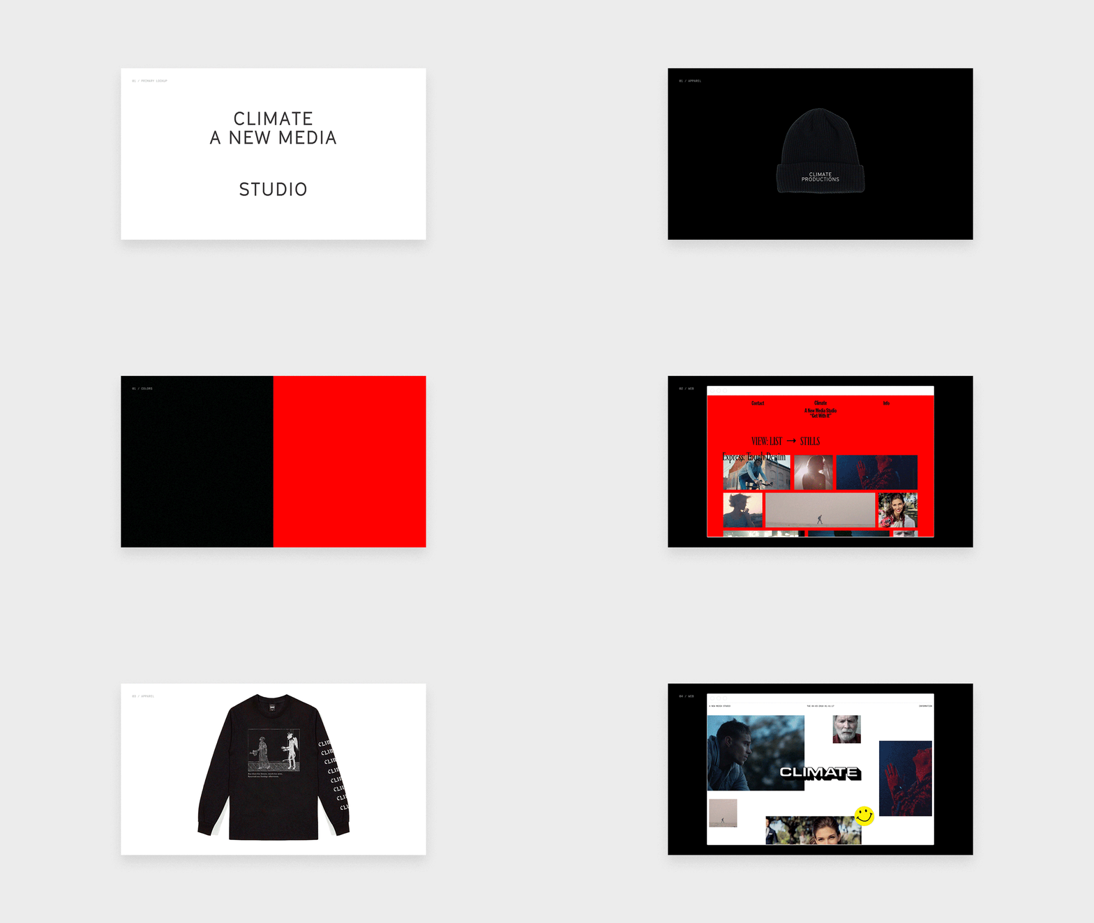
Before we had even finished presenting all of the concepts, it was clear that we had an immediate unanimous winner, and we knew we had created something truly special. Upon selecting a concept, we further refined the identity and began applying it to various touch-points.
“The Climate identity was always meant to be a vibe rather than a brand. Equally inspired by vintage trucking logomarks and modern fashion design, we set out to make an identity that felt worldly, aggressive, inclusive, but most of all — effortless. The result meant we were able to apply it easily to interesting collateral and promotional items that let Climate look like more of a club or a clothing company as opposed to an agency.” — Garrett DeRossett
In addition to the required stationery items, we produced shirts, hats, stickers, buttons, and other accessories that would increase brand awareness and draw attention to the company.
Using WebGL, we created an interactive 3D logo that reacts to the user’s cursor position, whilst sitting atop of slowly scrolling samples of Climate’s work, creating a whimsical yet memorable experience
It’s Alive!
Climate’s logo is three-dimensional. We wanted visitors to not only see but interact with the logo in a way that would leave a lasting impression. Using WebGL, we created an interactive 3D logo that reacts to the user’s cursor position, whilst sitting atop of slowly scrolling samples of Climate’s work, creating a whimsical yet memorable experience. Our goal in this project was to showcase their body of work in a way that would make users actually pay attention to it.
We approached the creation of the 3D logo with a clean slate— asking ourselves, "What is the least amount of software that can be used to get this done?" In the majority of cases, it does not involve a heavy library like Three.js. The interactive logo didn’t need any fancy model or texture loading, skeletal animation, audio, or any of the other many pieces of functionality that Three.js wraps. We think it's important to critically judge the (often subtle) downsides of using a library/framework — a skill that only comes only after doing things the wrong way many times over.
By building the renderer from scratch, we were able to have absolute control over every draw call and squeeze out great performance even on really low-end devices.
By building the renderer from scratch, we were able to have absolute control over every draw call and squeeze out great performance even on really low-end devices. The development machine we used is a $200 Celeron-based netbook, which keeps our scope of reference at the bottom of the totem pole. If it runs great on this machine, it's going to run wonderfully on most everyone else's device.
Using Blender, we extruded the original vector logo and exported the vertices as a plain array of floats ready for the GPU and baked it right into the source code (no .JSON, .OBJ, or .DAE here).
On capable mobile devices, the position of the logo is guided by the position of the device. After testing the gyroscope interaction on as many phones as we could get our hands on, we came to the unfortunate realization that standardization of accelerometer/gyro data is a complete disaster. Gyronorm.js was a savior there.
Technologies
Even though the website consists of only two pages, it was important to still implement a CMS to keep everything easy to manage and maintain. We decided to stick to Wordpress, as Climate’s team was already familiar with the software.
It was extremely important that Climate’s work be accessed easily and without error. To achieve this, we used Plyr alongside Vimeo hosted videos, thus combining a nice custom-made player interface with the highest quality streaming performance available.
All of the page animations and transitions were created with GSAP alongside BarbaJS. This approach allowed us to avoid reloading each page, keeping the transition between the Home and Info pages very smooth. We then used Webpack to build the production assets.
Company Info
Platoon helps new brands start up and old ones start over.
platoon.studio / @platoonstudio
Fabio Carretti is an award-winning Creative Developer based in Italy.
crrtt.com / @FabioCarretti
Matt Reyer is a lead engineer and designer, developing new products and improving existing ones.
lookintothebeam.com / @wind_up_toy
