We have a winner for February's Site of the Month, burocratik have beat off the competition with the beautiful Couro Azul. Here they go into more detail about their project. Thanks to everyone who voted and tweeted, the winner of the Pro Plan can be found at the end of the article.
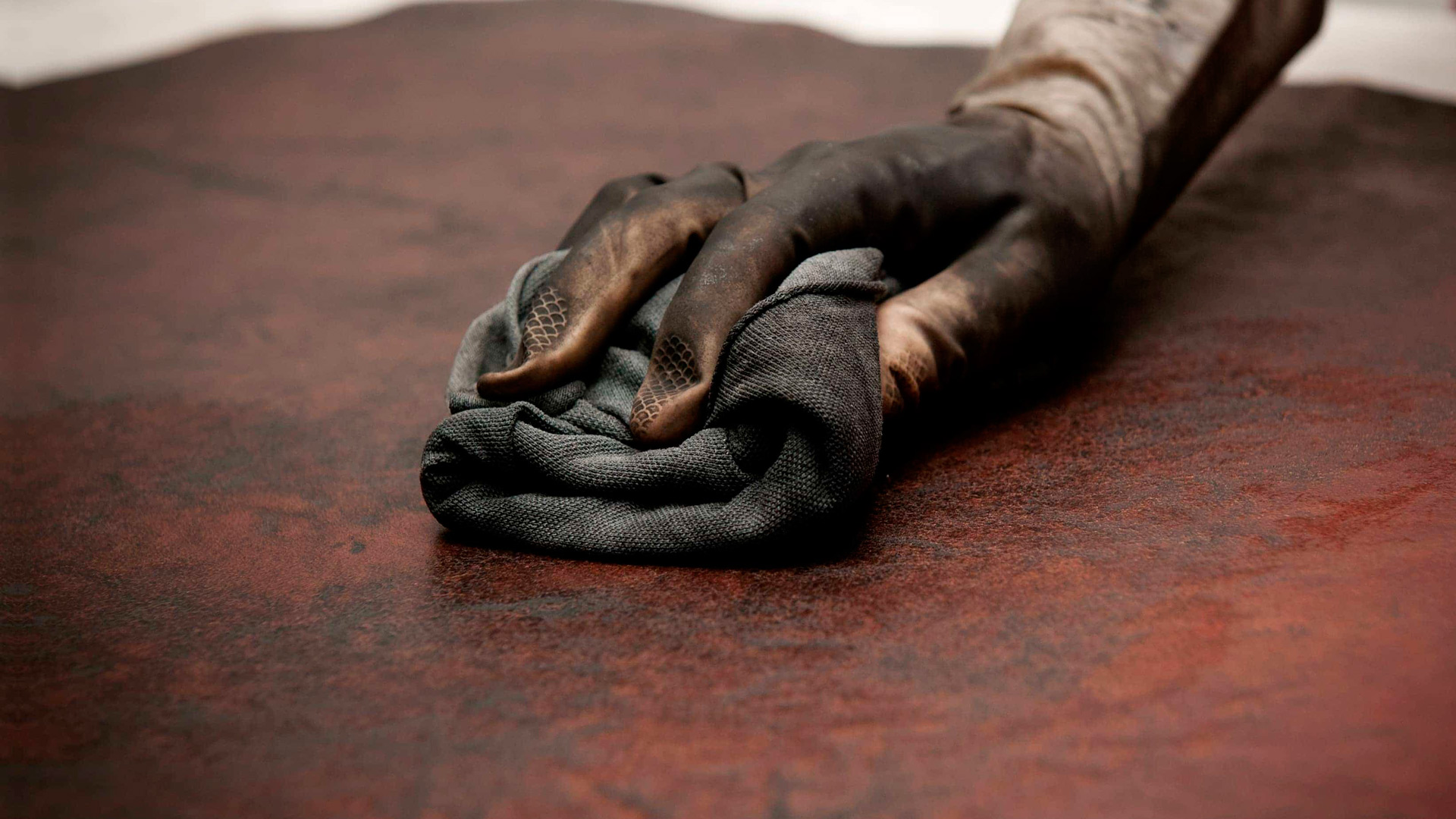
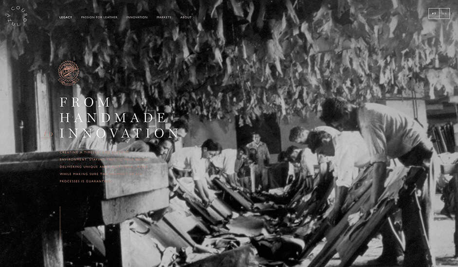
Couro Azul (Blue Leather in English) is a strong player on the automotive market. With clients such as Porsche, Volvo, Mercedes and VW, Couro Azul holds an impressive record of over 56 million steering wheels served since 1998 and needed an impressive website to match their automobile leader presence and get visibility for the other brands. Couroazul.com is a website build with exceptional care for details and respect for the legacy of the company. The two main objectives of the website were: raising awareness of their product quality to the auto brands and to have a respectful tribute to the company remarkable 78 years heritage.

The website is clearly targeted for the automotive/railway/aircraft markets. Built upon carefully crafted video and photography, that triggers the senses, with the forefront quality of their leather-clad interiors boosting quality on every frame.
What hosting provider did you use?
It’s a Portuguese provider called www.dominios.pt. It’s a pretty cheap shared hosting and this was part of the challenge of running such a demanding website, full of videos and interactions, on a hosting provider with so many limitations.
Can you please describe the server architecture for this site?
As a shared hosting the architecture is pretty straight-forward: a LAMP stack.
What kind of back-end and front-end technologies have been used?
The website is powered by Wordpress for the content management and the back-end framework. The front-end is done with classic HTML/CSS/JS
What kind of web stack, frameworks and tools?
jQuery for DOM manipulation, HowlerJS handles the audio, PixiJS allowed us to achieve high performance on the factory plant presented on the about section, Bodymovin for some complex SVG animations and several GreenSock libraries for all the main interactions and transitions.
For the development, we use our own framework with NPM and Gulp to automate the workflow, compile SASS, and manage all the javascript dependencies.
We've designed the website in Photoshop, desktop first. Made the motions/interactions basics on After Effects: to get the approval from the client and as starting point for the developers. Mobile was last, done directly over the code after all the desktop development adjusting proportions and remove the unnecessary extra spice.
Do you want to highlight something from the project? any anecdotes?
The website took around 6 months to build, plus 1 month for content: video, copy, sound design all custom made to enhance the experience and storytelling. The project spanned across a full year and the process was pretty smooth,without any change from the client during all the steps — which was mind-blowing as we came out from our worst experience ever from our previous website where everything changed several times, except the budget of course.
When the website was finally ready to unleash the client woke up and started to finally give feedback. Clients never really look at the websites until the very last week. Oh well ;)
Thank you Awwwards and everyone who voted for Couro Azul!
To everyone who voted and tweeted - thanks for showing the love, the winner of the Year's Pro Plan in our Directory is Charlie_Cordoba please DM us your username to activate your prize!