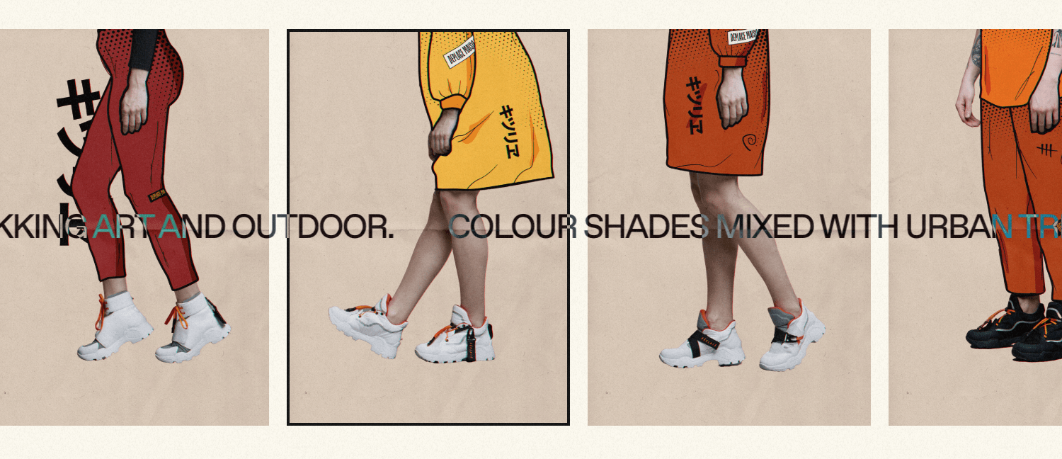
Déplacé Maison is a French term meaning “out of place”. When the brand asked me to create their new e-commerce of urban trekking shoes and accessories, it turns out that the team members included a tattoo artist and an architect. So the idea was to base the whole art direction of the site on ink and paper in order to design a digital product through the team itself.
Alongside the team, I spent a few hours learning and understanding the brand’s needs. They love to sketch, flames, listen to music and literally combine stuff together as the brand is reflected. They aimed for a unique visual communication, to sell and entertain at the same time.
Bold Illustrative
First things first. The main key stage of the art direction was to design bold illustrative sketches over images in order to shift the user's attention to the shoes, and bring it to life through flat colours, hand drawing strokes and a slight reference to the comic book style.
First things first. The main key stage of the art direction was to design bold illustrative sketches over images in order to shift the user's attention to the shoes
After outlining the strokes over the images, the choice of colours was taken based on the period of the launch collection. For this reason, warm colour palettes were used for fall and cold tones for winter.
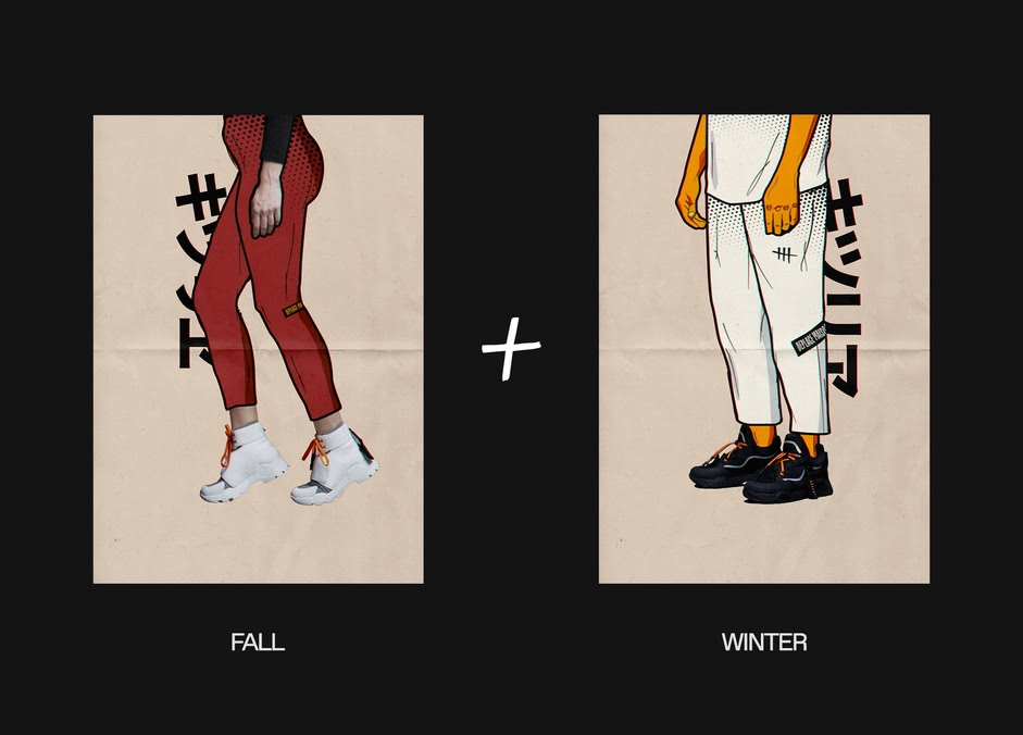
Ink Mode
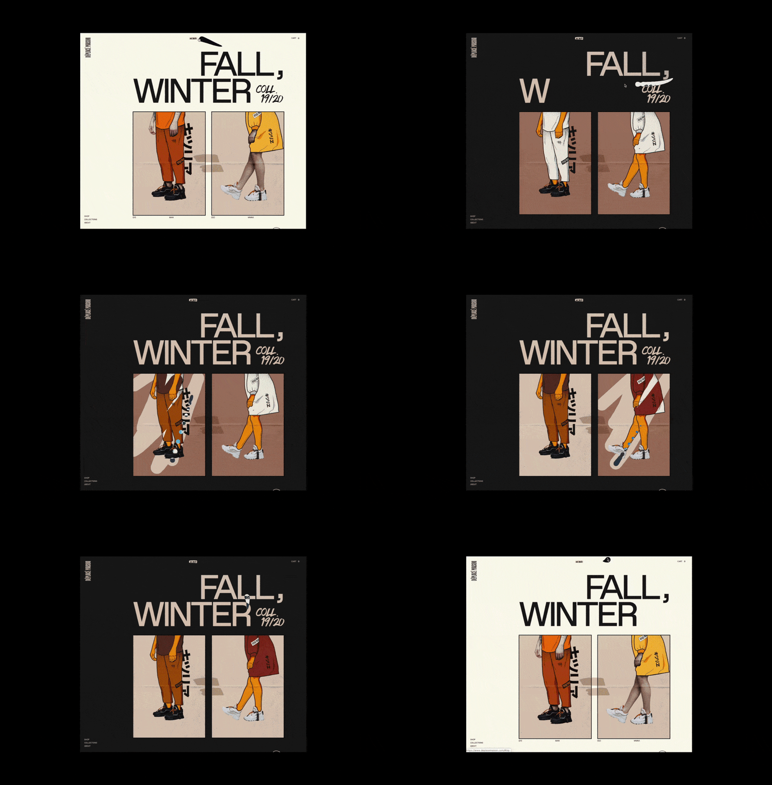
Time to make it more fun. Using a 2D canvas, alongside the Milan-based developer Luca Mariotti, we created a scratch off mouseover effect using pure CSS and native Javascript with a screen-fill animated over 70%. The user is able to view three difference-blend styles of the same product, to make it go literally from autumn to winter back and forth.
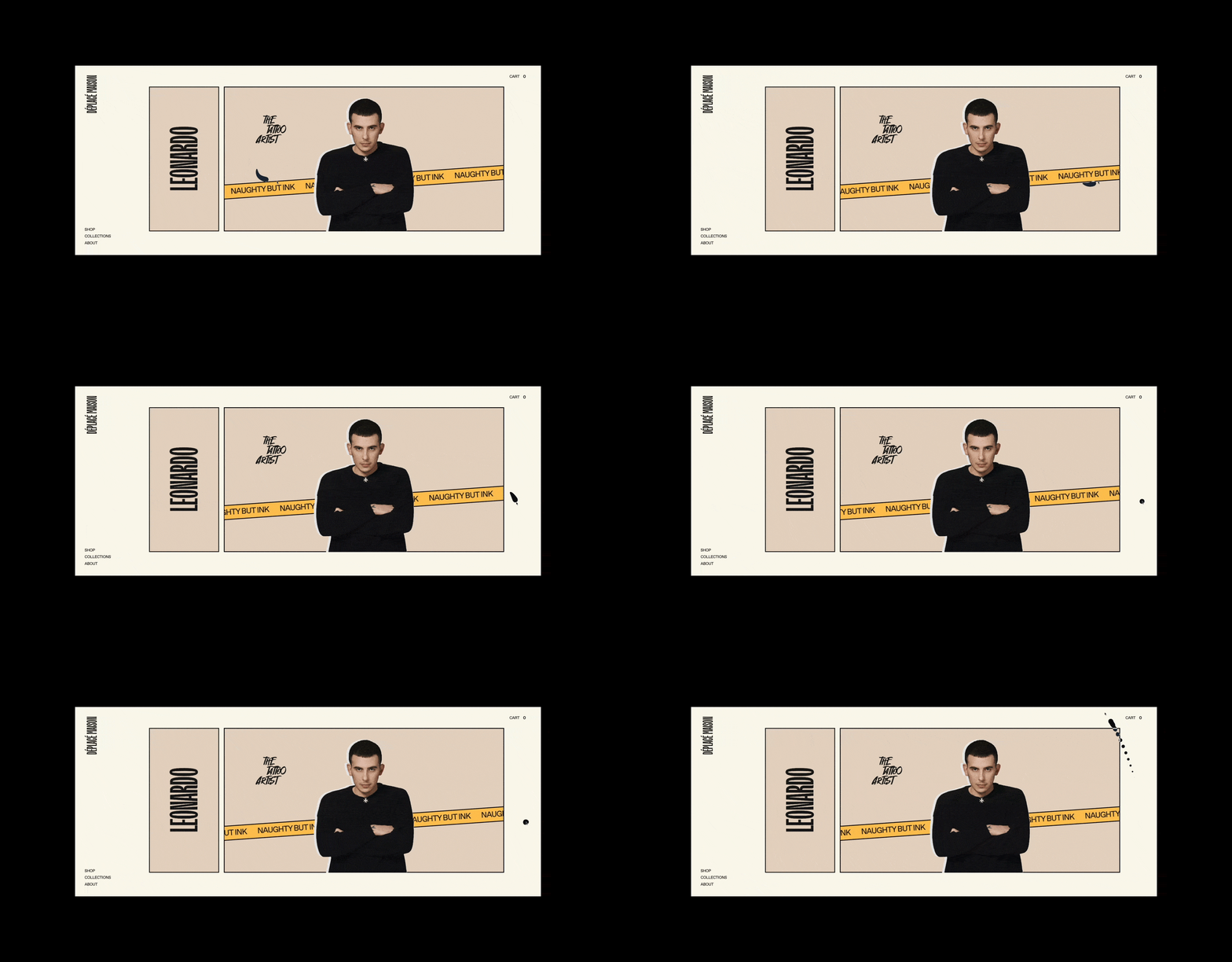
To make the scratching more solid, we paid homage to Leonardo (the tattoo artist of the team) choosing to use a custom cursor made available on Codepen by Ricardo Mendieta that gives the effect of a tapered ink line.
Assets
The members of Déplacé are silent craftsmen who love to write and note down everywhere. The sneakers, as well as the bulletproof vests are internally handmade and made of special fabric components.
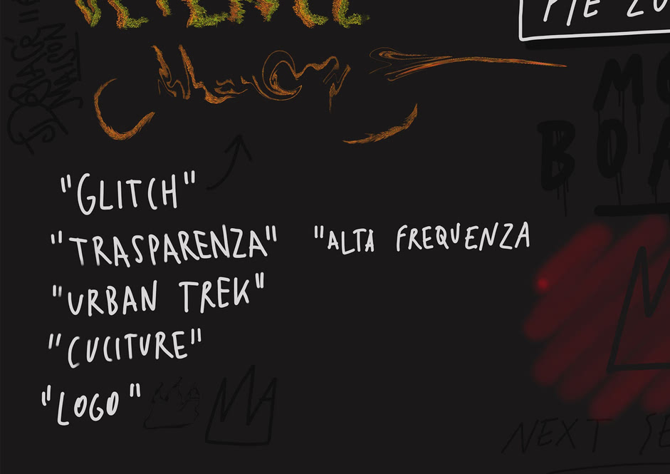
To embrace their “hand culture” and give the impression of craftsmanship, I found it interesting to combine the concept of hand drawn assets with a minimal design. Each piece is a SVG to have small file size and keep down the performance as well.
To make some assets interactive, we follow up with this guide that allowed us to generate a handwriting effect on the SVGs when the page loads. We used Adobe Illustrator to define group paths and CSS3 to animate it.
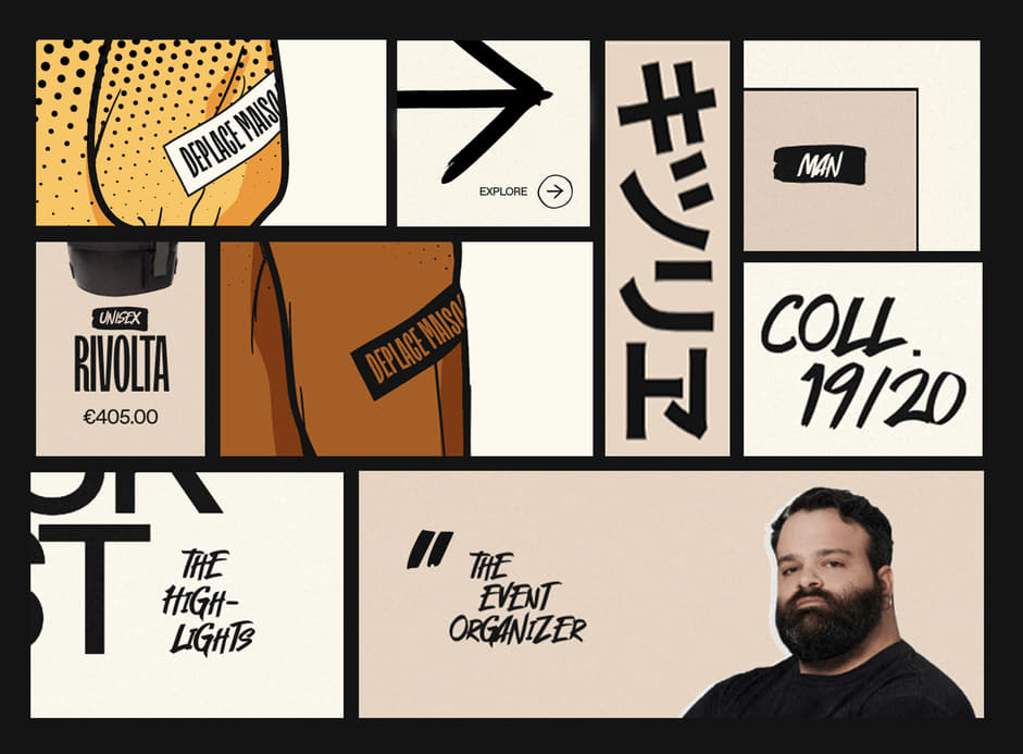
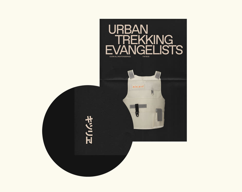
The team literally loves flames and fire, the brand logo is a flame. While drawing the illustrations I wrote a nonsense sentence with Japanese characters, I wondered what these meant. Incredibly it turned out that it means "kidsfire". So the Japanese style became the label of the brand and the icon of pages loading transition.
The team literally loves flames and fire, the logomark itself is a flame. While drawing the illustrations I wrote a nonsense sentence with Japanese characters wondering myself what these meant. Incredibly it turned out that it means something like ‘kidsfire’.
Product Sliders
Marquees and sliders are cool, responsive and dynamic. The horizontal development of e-commerce was a first choice, in order to have an easily navigation with a full-customizable assets integration.
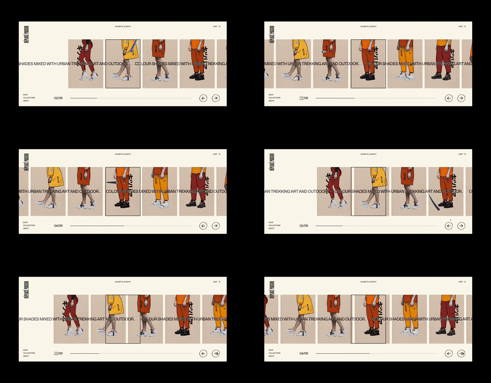
Sometimes in clothing stores reflective mirrors are inserted at the end of the hanger trolleys to give an illusion of depth. That's why I thought of digitally simulating the same concept with an infinite split scroll of a product slider, having the brand only 18 products being its first launch collection.
Sometimes in clothing stores reflective mirrors are inserted at the end of the hanger trolleys to give an illusion of depth. That's why I thought of digitally simulating the same concept with an infinite split scroll of a products slider
The split scrolling user interactions (autoplay, scroll, drag) are realized with GSAP and Hamster.js to manage multi-threading and parallel processing. The struggle here was to filter products within categories. With the infinite double column scroll, Luca and I spent a lot of time trying to make the right match between the back-end of the products and the categories filters.

Marquees
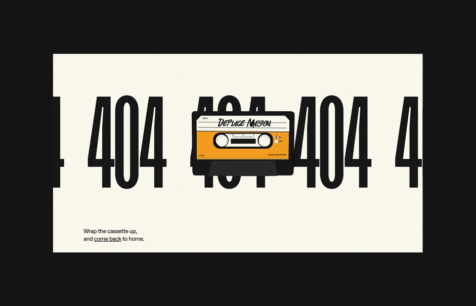
Queen have combined several musical genres, creating a unique style in the history of music, breaking all the rules. Why shouldn't digital creatives do it? Each section that concerns the brand member is a mixture of brutalism, a semi-style comic book with a clipping collage mask and a simple CSS marquee inspired by the yellow tapes of the crime scenes.
Queen have combined several musical genres, creating a unique style in the history of music, breaking all the rules. Why shouldn't digital creatives do it?
Technologies
➭ CMS / HostingIn order to create a fully customized e-commerce site, choosing Webflow was a great choice. Of course, it has limitations, but it has allowed us to have complete control of the layout by being able to easily manage the back-end and allow the customer to easily process orders from the store.
➭ PrototypingThe initial prototyping was designed using Sketch, then Adobe Illustrator to create the illustrative bold and trim paths, After Effects to create basic micro-interactions/animations to get an idea of how the site would come out.
➭ Canvas 2DTo build the scratch off mouseover effect, we simply used native Javascript to achieve a happy medium between usability and performances.
➭ AnimationsGSAP has become the best friend of every creative developer, giving animations an extra kick. To avoid boring lists of products we used Flickity Slider, a customized third-party library configured with JavaScript to achieve flexible and responsive carousels flicking feels natural. Basic transitions have been realized through Webflow IX2 and CSS for the marquees and basic animations.
Credits
Niccolò Miranda is a creative designer/developer and art director, currently young jury member at Awwwards.
Luca Mariotti is a full-stack developer based in Milan.
Company Info
Déplacé Maison is an independent brand of urban trekking shoes and accessories that comes from a convergence of arts and personalities.
