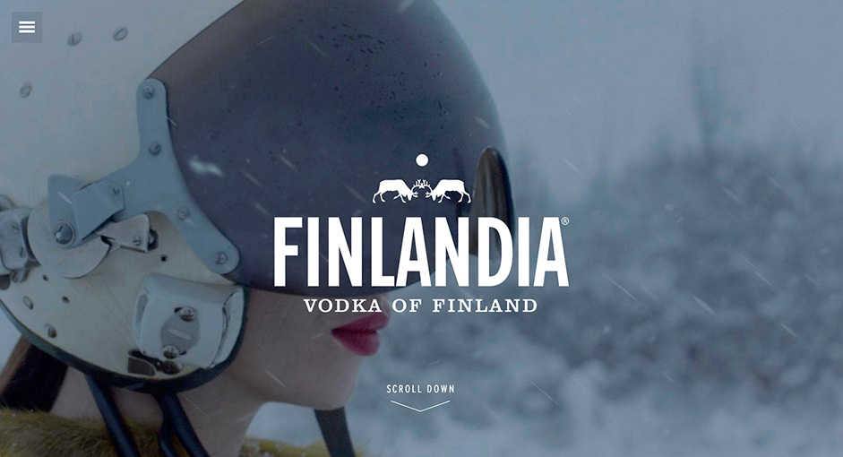
Every global brand faces a unique challenge in digital. Its main website has to translate its message and offerings to an international audience, but the design and user experience cannot sacrifice SEO or viewability on older browsers or devices.
In 2013, Finlandia Vodka debuted a world-wide campaign that inspired consumers to toast the less ordinary aspects of life – their site had to become an embodiment of this philosophy. Our challenge was to create a fully-responsive digital experience that was accessible across all devices, browsers, and audiences – without sacrificing the visually-immersive story we wanted to tell.
Designing a site less ordinary
The idea behind the site was to tell the campaign story while housing the nitty-gritty – the flavors, drink recipes, and information about Finlandia’s tastemaster and global mixologist. The goal was to immerse the consumer in the Finlandia brand, taste, texture and lifestyle.
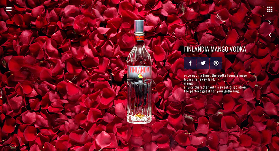
The new campaign brought with it a distinct voice, a poetic interpretation of "the less ordinary aspects of life." It was a world where nature came alive and anything could happen.
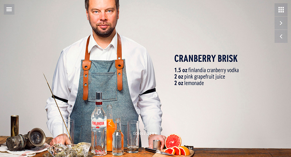
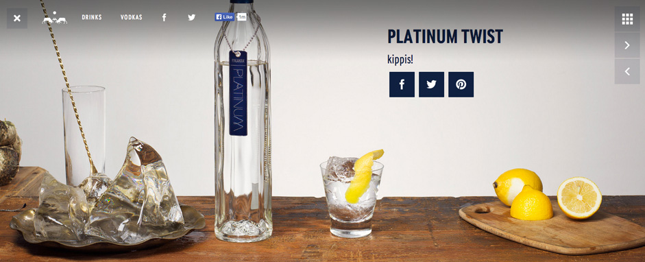
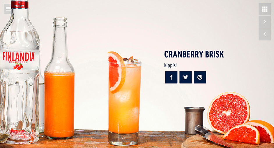
We were fortunate to have a photographer on the ground in Finland to shoot custom imagery for the site. For example, big, bold shots of Finlandia’s Global Mixologist Pekka Pellinen demonstrating how to create unique cocktails – this aspect became the main focus for the "Drinks" section.
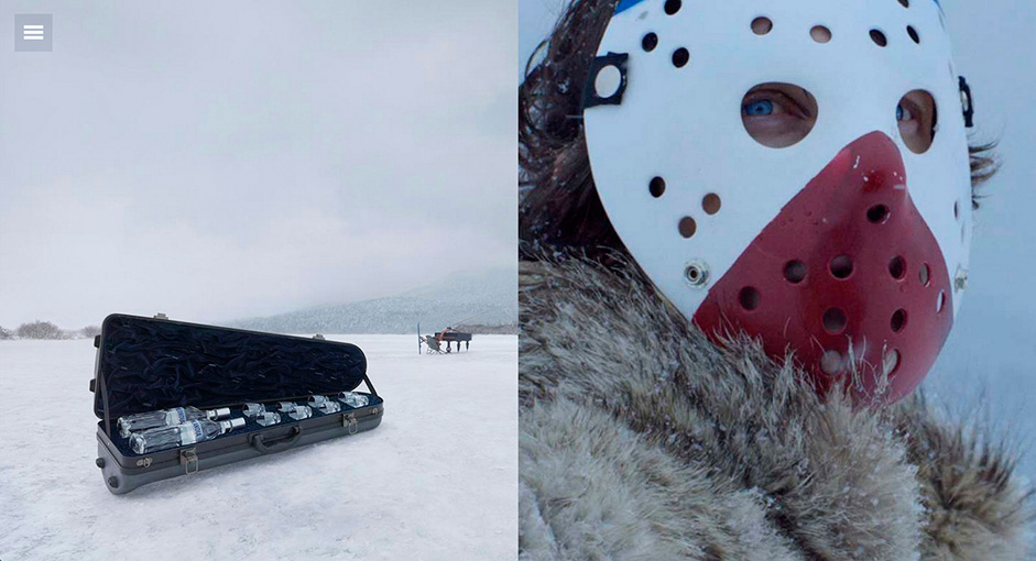
We also were provided with beautiful photography from a campaign by Wieden+Kennedy London.
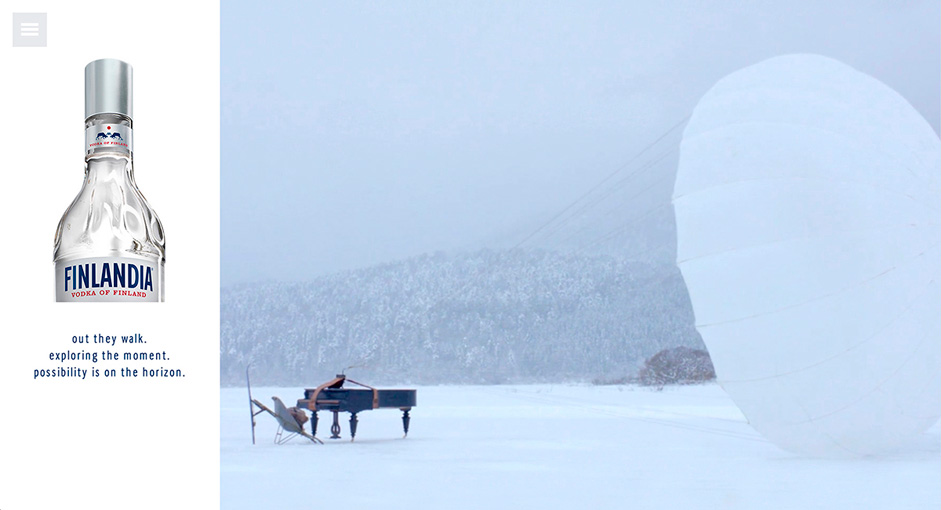
Simplicity at a global scale
All too often, big, cinematic sites are typically campaign microsites – not platforms for international content. In Finlandia’s case, we wanted to deliver that immersive, poetic, emotional feel, and have it work to tell the brand story in its entirety.
We landed on a simple, clean, dynamic scrolling experience that breaks down all traditional notions of a beverage brand site.
For example, a singular access point icon has replaced the fixed navigation, the Finlandia logo surfaces only when necessary, and product-specific sections, like Drinks, are more about cocktail inspiration than a generic recipe archive.
Other subtle details were layered in to surprise and delight visitors. For example, when you move your cursor on the landing page, the snowflakes follow your every move.
Beneath the ice and snow
To create a site so seemingly simple actually took considerable time and planning.
We wanted the site to be responsive and feel as media-rich as possible while maintaining optimal load times. After all, we weren’t building a one-page static microsite – this was the brand’s global presence.
To do this, we incorporated several frameworks and tools, including Laravel 4 for our server-side API and CMS, GreenSock for Javascript-based animation, and Blade and Handlebars templating to render data on both the server-side and client-side.
This architecture allowed us to load the Vodkas and Drinks detail pages on the server-side to maintain SEO integrity, while progressively loading our sibling products on the client-side to ensure quicker load times for our full-page carousel. The site and API are CMS-driven, and currently available in 12 languages, from Ukranian to Korean. Content editors from all Finlandia markets now have the opportunity to tailor content to their country’s needs.
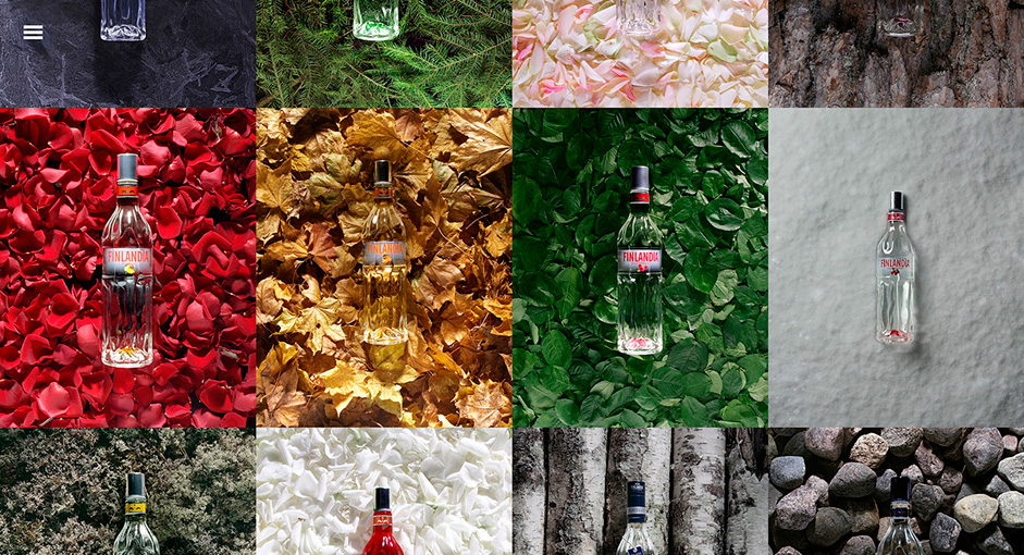
The CMS was custom built to meet the needs of Finlandia’s publishing requirements and to achieve a rich user experience. The goal was to create a publishing platform that fostered global visual consistency, while offering localized content.
The success of this project – from both a creative and technical standpoint – was a direct result of the trust and collaboration established between both teams right from the start. It was a true partnership in every way.
As they say in Finland, kippis!
CREDITS
Advertised brand: Finlandia Vodka
Title: Finlandia Vodka global website redesign
URL: www.finlandia.com
Digital agency: Code and Theory | codeandtheory.com
Creative Director: Brad Dixon and Andreas Tagger
Design Director: Chris Delia
Associate Creative Director: Paul Cooper
Associate Creative Director: Michelle Spivak
Creative Strategist: Moritz Kettler
Designer: Mario Licato
Copywriter: Nick Francis
Creative Strategy Director: Corey Gehrt
Creative Strategist: Saeid Vahidi
UX Designer: Sune Matras
Technical Director: Anthony Bovasso
Engineering Team: Nils Stolpe, Aaron Hitchcock, Anthony Paparella, Richard Lehmann
Quality Assurance Engineering Team: Maryna Ulasava and David Hyun
Account Directors: Alexis Dorenter and Katie Resch
Producer: Ryan O'Rourk
Client: Alexander Sneen, Global Marketing Director, Mike Bueno, Digital Director

