
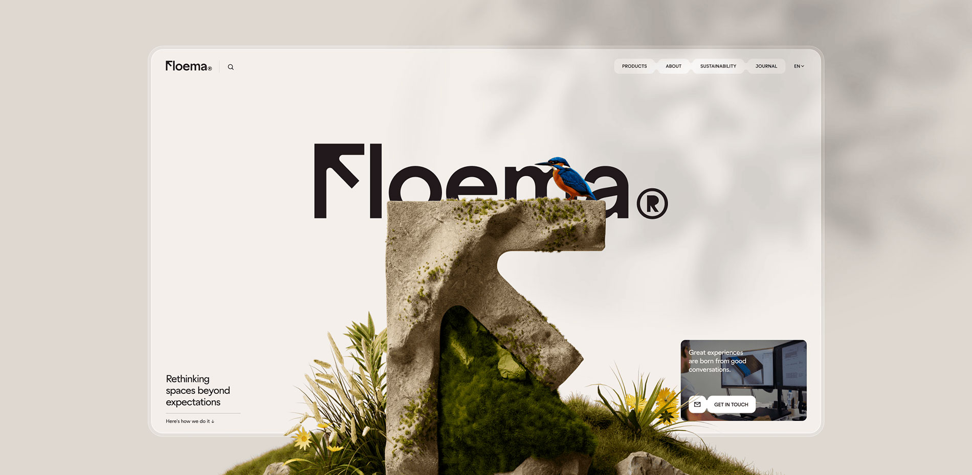
Floema designs and produces sustainable urban furniture and signage for natural spaces. Spaces for people, made for life.
With a growing portfolio of signage, urban furniture, and spatial solutions, Floema came to us looking for a new way to communicate the scale of its catalogue, the quality of its products, and the evolution of its brand. The ambition was to position Floema alongside Europe's leading product manufacturers.
The collaboration spanned more than two years. The first focused on rebranding, restructuring, and redesigning the product catalogues. The second culminated in the website, bringing the entire brand universe along with the products platform into the digital world.
At the heart of Floema.com is a product-first experience. The website functions as both a catalogue and a storytelling platform, balancing the needs of B2B professionals seeking detailed technical information with a more emotional narrative exploring Floema's relationship with nature, materials, and the public spaces its products help shape.
Rather than treating sustainability as a headline, we let it emerge naturally through the products themselves. The materials, the manufacturing process, and the environments Floema creates speak louder than any claim ever could.
The result is a platform designed to grow with the brand, where every interaction reinforces the same philosophy that defines Floema's work: Spaces for people. Made for life.
Floema needed a brand rooted in its signage legacy. Direction became the guiding principle.
The logo balances legibility with character, built around a twist in the “F” that feels intentionally directional.
As simple as it looks, it was hard to approve. “That’s not an F…”. Fair. It’s now an “F” that behaves like an arrow, pointing upward with intent, grounded in Floema’s legacy on nature’s signage. You question it first, then it clicks. Especially on the website. I’ll grab my raincoat.
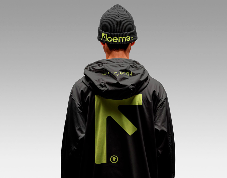
Typography followed the same logic. Conventional grotesques felt too clean and rigid for the realities of Floema's manufacturing. Their world is shaped by CNC-cut metal, recycled plastics, and laminates, each with its own constraints and behaviour. The sharp corners and neutrality of most sans serifs needed a softer approach.
La Bolde Vita's Zimula struck that balance: a contemporary geometric typeface with a warmer tone and prominent rounded ink traps that subtly echo the constraints of CNC manufacturing. It almost feels custom.
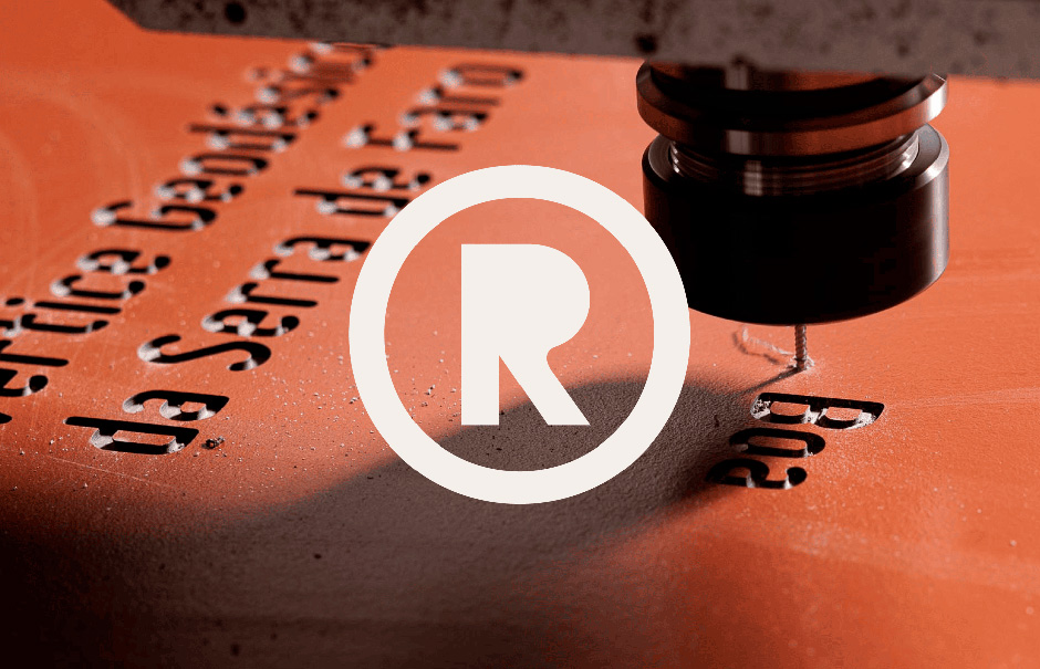
The final detail. We removed the (R) counter, the inner shape of the letter, because that's what naturally happens across most production processes. Stripping it back expresses the brand at its core. Not an error. Intent.
Materiality closes the loop. We looked for a synchronicity between the materials used in Floema's products and those defining the brand's texture and finish, from Gmund Beer Ale to Fedrigoni Materica across the catalogues served with fluorescent green foil and black screenprint.
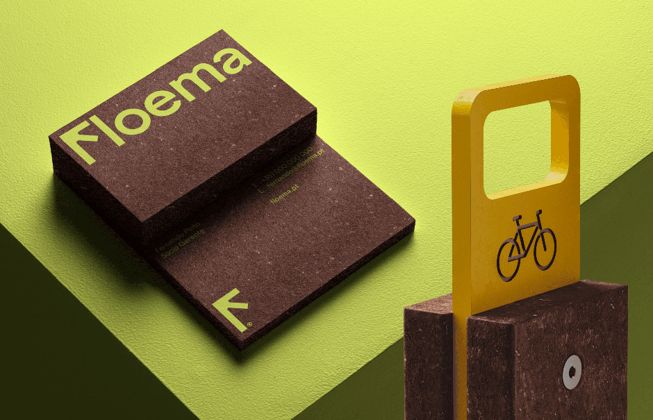
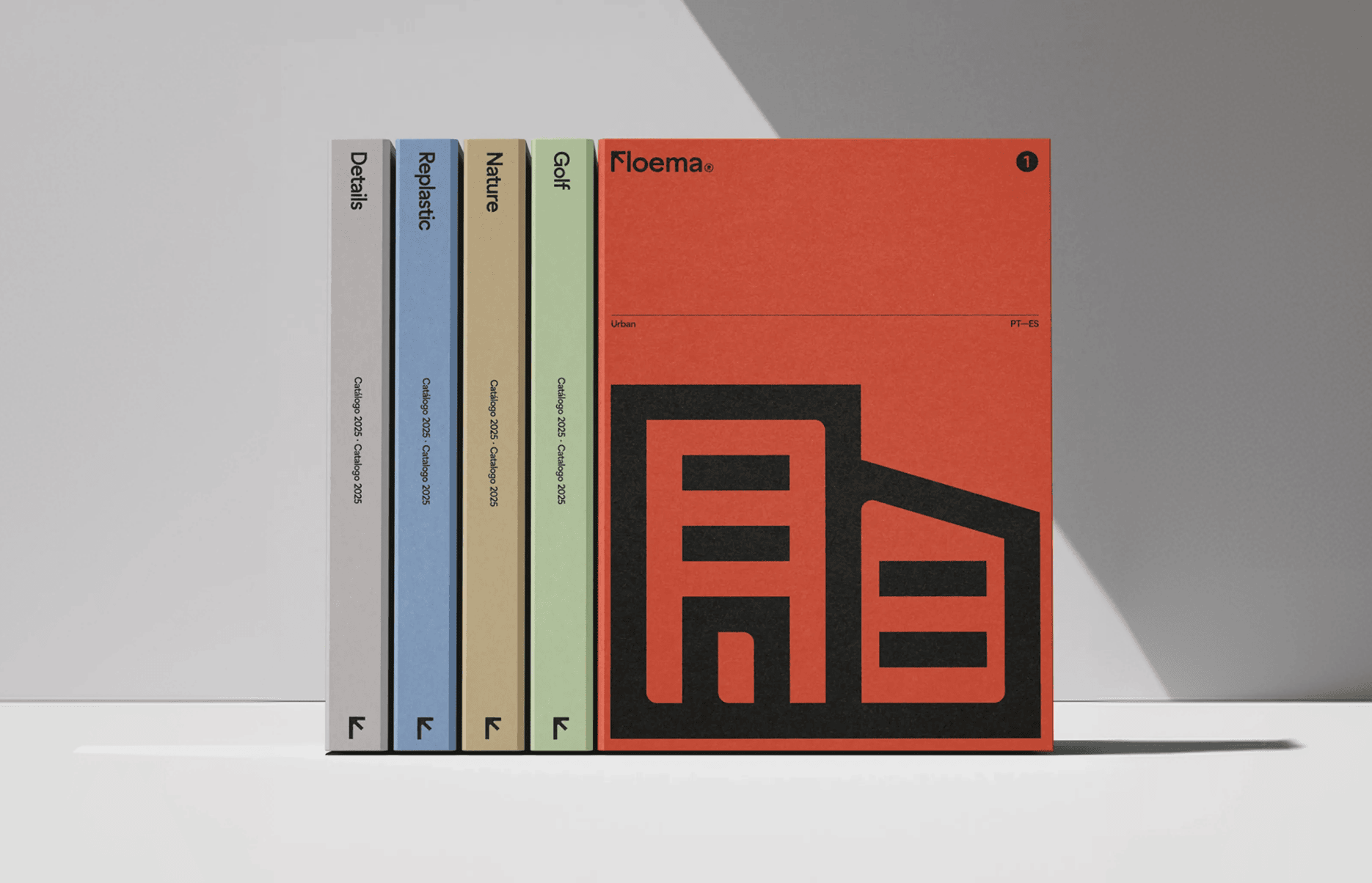
From the very beginning, we chose to let the products speak for themselves.
A website always starts with content, and for us, photography and video remained an essential part of the experience, capturing Floema's products in the environments they were designed for and helping tell the story of how they shape public spaces. But when it came to connecting the catalogue and the website, we needed to start with 3D.
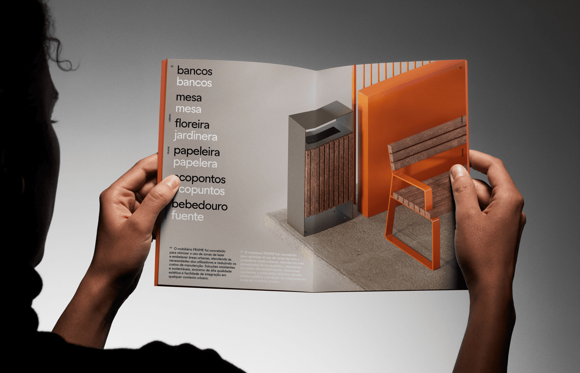
Every catalogue listing is presented through carefully crafted category 3D renders, establishing a consistent visual language across the entire collection. On the product detail pages, those same assets become fully interactive 3D models, allowing visitors to explore each piece from every angle before diving into its specifications.
On each product page, every single asset had to be optimized for the web, especially for mobile interaction. All 230+ of them.
With hundreds of products across the website, this became an iterative process of refining geometry, textures, and materials until each model reached the right balance between realism and performance.
If you're still reading, it's worth talking about something that rarely gets the attention it deserves: how much easier it is to craft a great website when the content, strategy, and brand assets are already in place. We may be discussing branding more than you expect in a website case study, but we can't stress enough how critical that groundwork is. Before a single screen is designed, the foundations need to be sorted.
We're fortunate to be a studio that does both. Building brands and designing websites as part of the same process is a big reason why our digital work is stronger. Design decisions become clearer, content finds its place naturally, and the website feels like an extension of the brand rather than something built on top of it.
Sort the foundations before the design. Every single time. Challenging, to say the very least, but it ultimately gave the client complete autonomy over content updates. We eventually learned not to panic when a 20+ MB model landed in the CMS. The fix was simple: remove a zero. In reality, it meant removing every unnecessary screw, detail, and polygon. Glamorous work? Not exactly. Necessary? Absolutely.
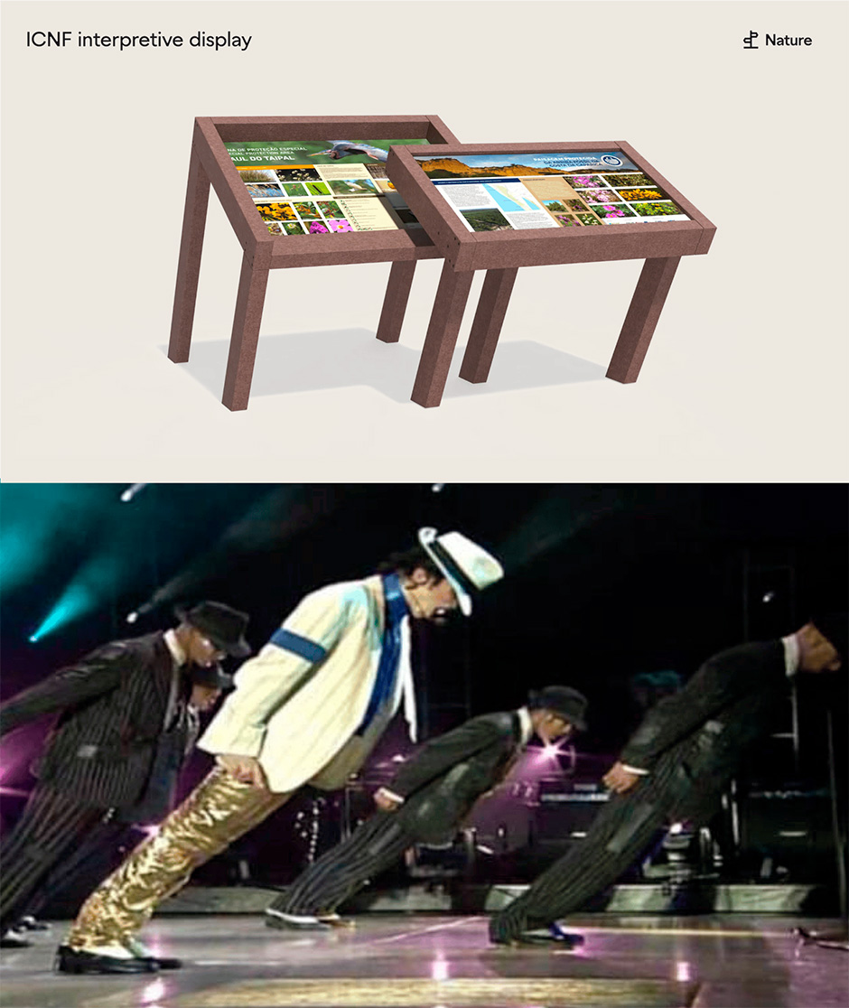
3D models come from different sources, each with its own structure, scale, and optimisation. So we built processing directly into the CMS.
Every uploaded GLB is cleaned, centred, simplified and compressed using glTF Transform, Meshoptimizer and Draco, giving us a consistent, web-ready model.
Editors can then preview the result, adjust the initial camera angle and rotation, and publish those settings together with the model.
A chair is not a lamp, and none of them arrive at the same scale. When a model loads, we automatically scale and frame it to fit the screen. The viewer adapts across desktop and mobile, with extra control for products that need a little more breathing room.
We wanted every product to feel like it had been photographed in the same studio, regardless of where the original model came from.
Instead of baking shadows into the assets, we generate them from the model geometry.
For the softness, we adapted the PCSS implementation from @react-three/drei to work directly with our Three.js setup. We replaced its high-frequency noise calculation with a cheaper interleaved-gradient noise function and tuned the sampling to get a smoother result with less unnecessary work.
The expensive part only runs when it needs to. The shadow map is updated while the model loads and during its intro rotation, then cached once the model stops moving. From there, users move the camera around the product, so the shadow does not need to be recalculated. Soft, consistent shadows without paying the rendering cost on every frame.
The same principle applies to the viewer itself.
The scene renders continuously while the user is interacting with the model or while something is changing on screen. Once everything is still, the render loop stops.
The interaction stays smooth when it matters, without making the browser redraw the same frame in the background.
As for the elephant in the room, yes, AI was part of the process, mainly during the visual exploration phase.
The sculptural interpretation of Floema's iconic "F" was first explored using Midjourney, allowing us to rapidly generate and evaluate creative directions before selecting a final concept. Rather than replacing traditional craftsmanship, AI simply became another tool in the creative process. Once the direction was chosen, the concept was completely rebuilt in 3D, with custom materials, lighting, and animation, until it became the centrepiece of the experience. Thanks for all the patience, Rob.
But we didn't stop there. The "F" evolves with the seasons, reinforcing Floema's manifesto of durability through the years, season after season. As we were already producing a brand film across all four seasons, featuring Floema's products in context, extending that idea to the About page hero felt like the obvious next step.
The seasonal transitions themselves were created with AI, using our CGI renders as the foundation. AI is just another tool. Used with intention, it can do some remarkable things.
The website was soft-launched in early 2026 to meet the client's agreed deadline. Then came our favourite phase: refining, polishing, and obsessing over the details.
The Kingfisher and Owl were not paid actors...
Because they never existed in the first place.
They were the only elements on the website created entirely with AI, guided by plenty of human art direction and an unhealthy amount of iteration.
The story actually started elsewhere.
While reviewing the About section, our Creative Director felt something was missing. It looked right, but lacked that final spark. We didn't want to clutter it with unnecessary 3D effects or gimmicks. Then a song came on on his headphones. Breakingms20 by Henrik Wendt.
It had everything the experience was missing: birdsong, a nearby river, and space to breathe. Suddenly, it became obvious. The scene needed a real kingfisher—the most natural inhabitant of a riverside landscape, and a personal favourite ever since we illustrated one for a previous Büro wine packaging project.
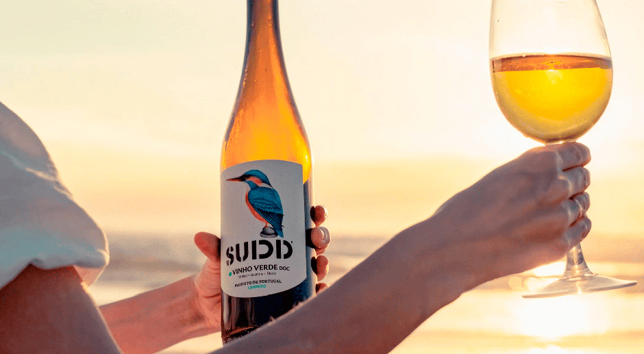
So we knew what we were after: a beautiful kingfisher inhabiting the existing scene, accompanied by audio design to complete the atmosphere. Henrik Wendt kindly licensed the track, shared the stems, and the search for the bird began.
Building and animating it from scratch in CGI would have been ma$$ively time-consuming. Instead, we let AI handle the heavy lifting while we focused on what mattered: directing the outcome, integrating it into the interaction, and taming AI's unpredictability through countless iterations, masks, glitches, and hallucinations.
It still took far longer than expected, but it became one of the most rewarding details of the entire website—two and a half years after the project's inception.
“Wait, is the owl leaving and returning to the “F” depending on scroll interaction?”
An owl? Oh yes.
During the R&D phase for the kingfisher, an owl unexpectedly appeared. We liked it too much to leave behind, so it became part of the experience.
Too impatient to wait until winter? Here's a sneak peek: https://floema.com/en/about?season=winter
Technically, the 3D stone "F" and the animated bird are two completely independent layers. Although they appear as a single composition, getting the bird to land perfectly on the sculpture took more than a few attempts—and plenty of head-scratching. The best part? We didn't change the original section at all. We simply added another layer of interest on top of it.
The birds are driven by three animation sequences:
01. Entry
The birds fly in and land on the "F".
02. Idle
A seamless looping animation where they simply exist, doing bird things.
03. Exit
They take off abruptly, as if startled by the scroll interaction.
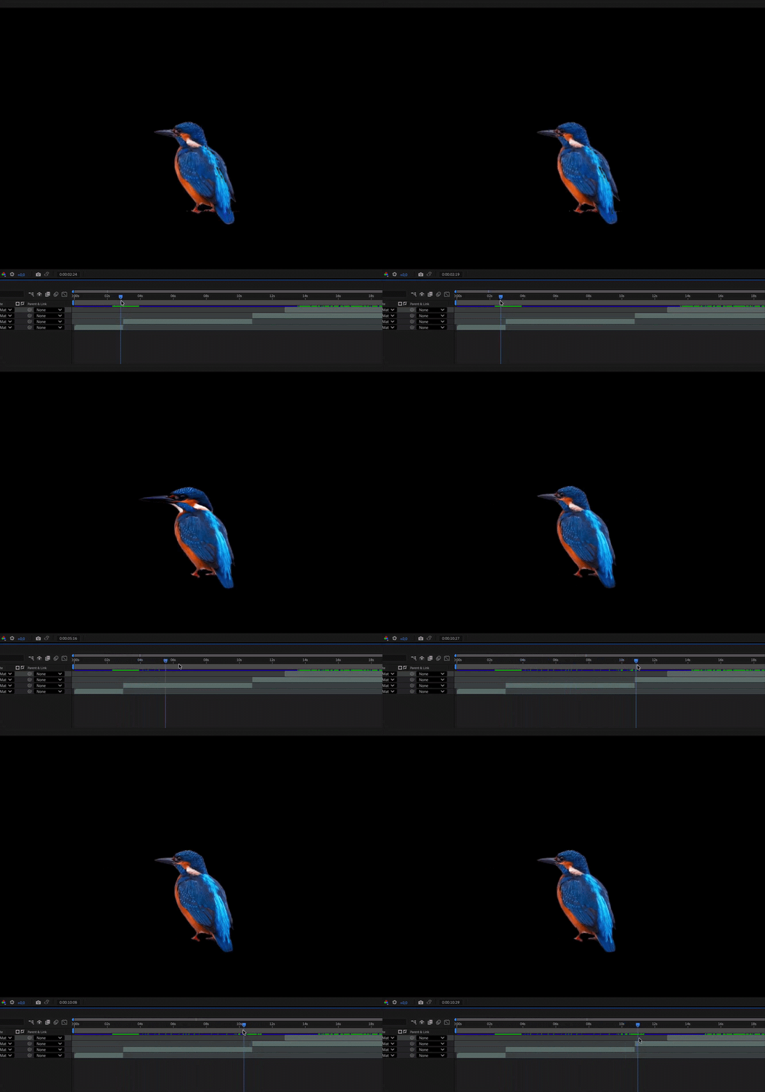
Choosing the sounds for the entry and exit sequences took some time also until every chirp, flap, and takeoff had to feel just right. Along the way we created a new audio layer for the Sustainability city soundscape, this time made internally by our skilled musician and developer Thomas. This way the branded pages have a more continuous experience.
The Sustainability hero begins with a floating 3D outline inspired by engineering CAD software.
For the charging-station 3D model (the one who actually starts spinning around), we wanted an outline that followed the structure of the product rather than every polygon in the mesh. We based the technique on Omar Shehata’s surface-ID outline experiment, which follows the post-processing structure of Three.js’s OutlinePass. Surface IDs give us much more control over which parts of the model create lines, helping the final result feel clean and intentional.
We prepared the surface regions in Blender using the IDMapper add-on, then store them as vertex colours inside the GLB. Those colours travel with the model and are read directly by the shader, so the boundaries are already defined before the model reaches the browser. This gives us a precise outline built around the structure of the product itself. We also only render while the user is scrolling, keeping the animation responsive and light.
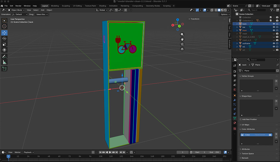
Last but not least. The WebGL shadowy plant silhouettes. They could have easily been a video, but we couldn't resist elevating them.
We wanted the shadows to feel alive and react to the experience, so the video was not the right fit. It would also mean a much heavier asset for something we could recreate with a small texture and a lightweight shader. Instead, we pack several grayscale leaf masks into the channels of a single texture, then reuse them with different offsets, rotations, scales. This gives us more variation, keeps the asset lightweight and lets the shadows respond in real time.
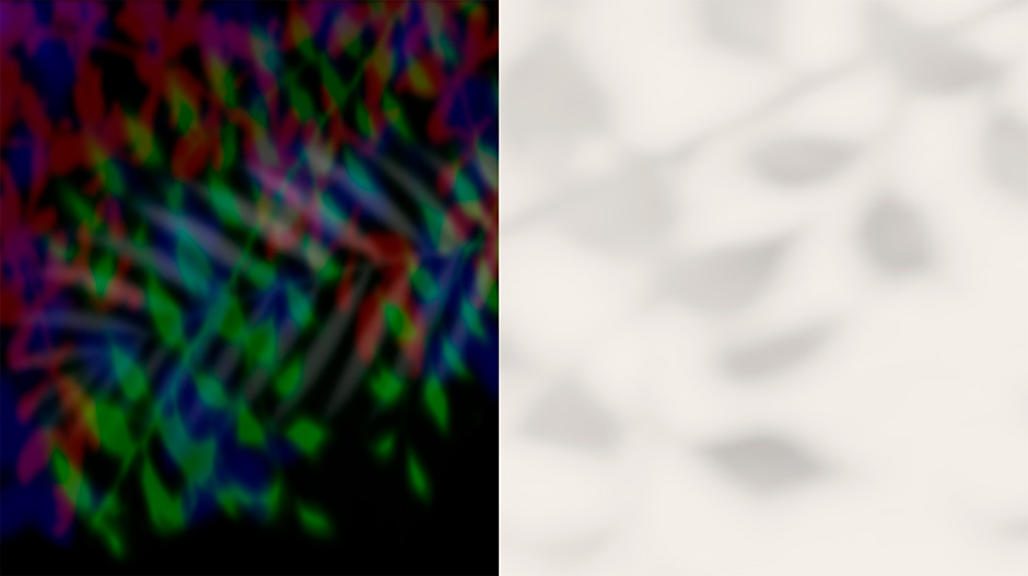
The shadows are animated with slow sine and cosine motion, giving them a soft, wind-like movement. Cursor movement adds a subtle shift, while animated noise changes the opacity over time. Together, these small variations make the shadows feel less repetitive and more like real sunlight moving through leaves.
Floema. Made for life.
So here you have it. A project that proves you can bring genuine digital experiences to a B2B sales-driven website. That deliberate 50/50 balance between product sales and brand storytelling holds a special place in our design hearts... and, more importantly, in our client's sales spreadsheet.
A final note on what we love to do at Büro. We enjoy working with real, tangible brands where design can make a measurable difference. Brands that go beyond an idea or an imaginary product deck, where strategy, craft, and execution have a direct impact on the business along at the same level as investors.
Floema is one of those projects. The client understood what was being built and, beyond simply giving us time, found the resources and commitment to do it properly.
Technologies
We used Vue/Nuxt.js as the framework, Sanity as the headless CMS, and Vercel for hosting. Smooth scrolling is powered by Lenis, with GSAP and Rive handling the moving pixels. Three.js brings the WebGL magic, while Zoho powers the product wishlist integration.
About Bürocratik
Bürocratik is a fearless Portuguese design studio with two decades of craft, ranked Europe's #1 Digital Design Studio in the European Design Agencies League (2021–2025).
If you’d like to discover the story behind the studio, we published a book and a companion mini-site called 18 FKN Years with Büro. Pre-orders are available at book.burocratik.com, and you can explore the project at 18.burocratik.com.
Credits
Made by Büro, from Porto & Coimbra, Portugal. If you’re ever around, drop by for a beer.