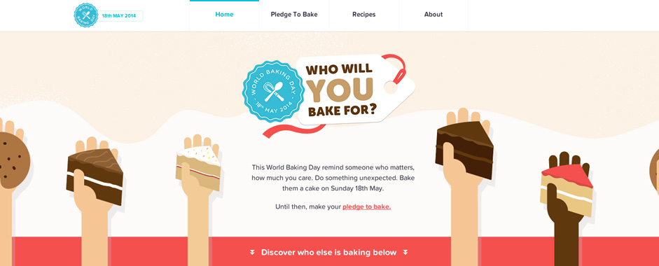
The extraordinary brashness (or rather, brash extraordinariness) of overtly stylized webs with all the bells and whistles on never arouses indifference in their beholder. While some old-school designers continue in their attempt to create websites with spellbinding effects and to adorn their designs with colorful and glossy elements, the advocates of flat designs are growing at a brisk rate.
Minimalism may or may not have replaced extravagance in web design as yet, but it is, without doubt, a trend that has only been getting trendier. In its bare bones, you call a design flat or minimal when it gets rid of its stylized and glossy attributes. What's left is subtle, yet, equally fascinating. However, it has to be done right otherwise it just turns out to be dull. So, you remove the effects like shadows, fancy fonts, multiple colors, and any and all scream-out-loud effects, etc.
Flat Designs Is What Everyone Seems To Be Leaning Towards
There are reasons to why flat designs are gaining immense popularity, and it all begins with the fact that they are crisp, and they are chic.
A minimal design doesn't pull a viewer's attention in all directions, it instead draws focus on the element that's supposed to draw maximum attention. Not to mention, it has its own visual charm.
How Did Minimalism Come About?
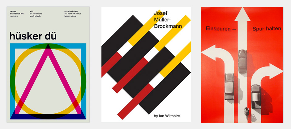
Most of the trends in web design have their roots in print design, as does minimalism. The experts say that the biggest inspiration comes from the Swiss style of designing that they exercised back in the 40's and 50's.
 International Style Posters
Restraint was their strong suit as they didn't rely on flashy, shadowy effects. The use of colors was done in a most subtle manner and the font style used was mostly sans-serif or Helvetica.
While the trend has its roots in the 20's, the popularity grew three decades later. The goes for flat design. It is only when the multinational giants like Apple started adopting this style of design that it started becoming more popular with the rest of us.
Even on this date, there are ancient artworks that have used the art of minimalism to send a message and captivate viewers.
How Minimalism Started To Establish Its Footprints In The Digital Realm
No matter how giant our strides towards the future are, history always manages to catch up. Flat design, which started in the 20's, rose to fame in the 50's, and now in this overzealously digital age it is making a serious mark. Going by an ever-growing popularity, the flat design trend is here to stay and dictate terms. Brands like Microsoft and Apple have been the biggest contributors to this growing traction towards minimalism.
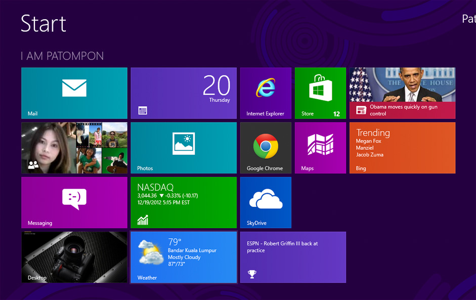
 Windows 8 UI
Apple released it's iPod with sleek lines, a little gloss but mostly subtle textures. Microsoft followed suit by launching the Zune media player that was not boiled with all those visual effects akin to the Windows media player. The typography was simple, the colors minimal. When Windows Phone 7 was launched, it employed the same characteristics. Based on a grid-like structure, it kept its layout pretty direct, using the sans-serif font style icons that were not what you'd call fancy. Not one bit.
And then,they called the design Metro. Upon gauging the feedback that this design received from all quarters, Microsoft decided to stick with it. And thus, we saw its stamp all over Windows 8 OS. Now, as and when Microsoft launched new products, it keeps them stylized in a grid-structure, using colors subtly, using the sans-serif font styles.
It Was Time For Apple To Do Some Catching Up
Skeuomorphism was dictating terms in Apple's designs; which is why they decided to ditch it for a flat way of designing stuff. Skeuomorphism was already looking a little outdated by this point.
When Apple released their updated iOS back in 2013, they made it abundantly evident that they were also leaning towards minimalism. Apple has managed to glide past its competition because its aesthetics have been much more chic and visually exquisite.
So, Why All This Clamor?
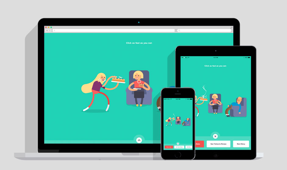
Is visual appeal the only reason why flat design has gained so much popularity? Indeed not. Responsiveness has been a head-turner in the realm of web, and unless your website is responsive across different devices and OS platforms, you are not likely going to receive a great deal of quality traffic. The lack of responsive is a direct way of losing your loyal visitors and losing them fast. For webmasters with continuous and relevant traffic on their agenda, responsiveness is a necessity, and that's where minimalism proves to be an even more crucial facet.
Responsiveness is a necessity, and that's where minimalism proves to be an even more crucial facet.
How Long Until Minimalism Stops Dictating the Trends?
Predicting this ins't practical nor possible, there will always be new web design trends (rooted in the past) that will come along and replace flat design. Until then, let's bask in nonchalance.
Samuel Dawson is a specialist Web Designer at Designs2html Ltd. a Web Design Company. Samuel gives valuable and best tips on context of PSD to wordpress theme conversion and design technique. He possess a huge experience in technology domain and loves all things comes under web Design niche. He trying to spread his intangible knowledge to maximum people he can in order to make a equal knowledge platform.


