
Speed is of the essence now more than ever in web design - your site visitors want to have a blazingly fast site experience, and if you don’t deliver, they’ll go somewhere else where they can! That’s just the way it is today, as the trend is heading toward faster and faster sites.
Designers who continually test to make sure their clients have speedy sites will be valued more than those who don’t. So what’s a fast website you ask? How can we quantify this in numerical terms?
Looking at the data, we have several studies that say the following:- 47% of users want a site to load in two seconds or less (according to an Akamai study)
- E-commerce shoppers want a site to load in about two seconds, but Google aims for less than half a second (according to Google Webmasters)
- 57% of users will abandon a mobile site if it takes longer than three seconds to load (according to a Mobify study)
Clearly, the consensus is that faster is better because it greatly improves the user experience. Here are some fantastic ideas on making your clients’ sites faster!
Make your design minimalistic
It stands to reason that, when you create a bare-bones design, your site simply has fewer elements to load. When there are fewer elements to load, you can meaningfully increase the speed of your site.
It all depends on your philosophy of how you approach site design. You can save yourself a lot of trouble from the very beginning by designing smartly to avoid harmful practices that affect your site’s loading speed.
Designers need to stick to the true principle of minimalism to come up with a site that’s light on its feet and doesn’t take forever to load from one page to the next.
Minimalistic features are:- A hamburger menu instead of a standard navigation bar
- More white or negative space
- Short web forms
- Smaller images
- Just one font instead of different types of fonts on your site

Wikipedia is an ideal example of this go-light-for-minimalism approach to design.
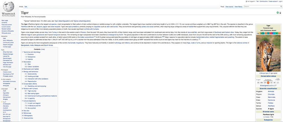
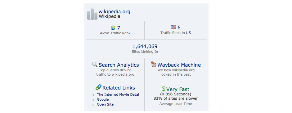
From its homepage, when we enter a search term in the bar, let’s say “tiger”. It takes just under a second to get to the Tiger Wikipedia page. Looking at the Alexa toolbar extension, we can confirm that this is true!
Understand the importance of the perception of performance
Even in web design, perception is reality. This means that designs that are merely perceived to be highly usable don’t necessarily have to be blazingly fast in order to produce high levels of user satisfaction or a perceived, excellent UX.
Although having a fast site is of utmost importance, you can also create the perception of a faster site and often if it’s perceived to be fast, your users will be happy.
In this insightful video of Luke Wroblewski, he explains that speed is a critical path of the user experience. Instead of implementing complicated technical solutions to improve the response time of a site, using good design we can increase the perception of performance and make the interface seem faster.
Get some help from Google
Google wants your site to be faster. That would help its overall mission of making the Internet faster, which it promoted when it released its compression technology, called “Brotli” last year. So why not use the amazing tools that Google’s offering you as a web designer?
The best place to start is Google Developer’s own Make the Web Faster page. Here, you’ll get a stellar assortment of tools and info to speed up your site design.
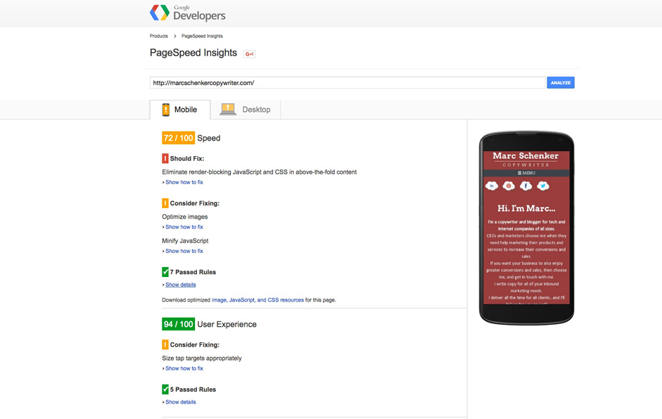
One of the best tools Google offers is PageSpeed Insights, where you get detailed insights into what’s causing your current site to be slow. The best part is that you can get detailed reports and recommendations for both mobile and desktop versions of your site, so you really have no more excuses for presenting a slow site to your clients!
After putting your site’s URL into the field, you get a list of things you should fix for both site speed and the user experience, which, of course, go hand-in-hand.
On my website, for instance, we see a 72/100 speed score, which is good, but obviously not great. Underneath the score, we see a bunch of recommendations for what I should fix on my site to make it that much faster and get closer to a 100/100 score. In spite of the speed score, though, the mobile site almost has a perfect score, indicating that speed isn’t the only factor in determining mobile UX!
When we click on the desktop tab, we see a considerably better speed score at 84/100. The same and new recommendations are listed below, too.
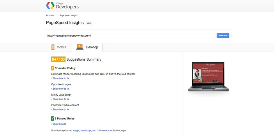
The more of these Google speed recommendations you follow and implement, the faster a site you’ll create for your client.
Get lazy with lazy loading
Ever heard of lazy loading? It’s a design pattern that’s characterized by not rendering objects until the point in time that they’re necessary. So, for instance, objects that are below the fold will only begin to load and initialize when users are actually scrolling down the page. This only-when-necessary design approach means that your site needs to rely on fewer resources, thereby making it faster in performance.
Special note: If your page has a lot of content and therefore requires that users scroll down a lot, lazy loading is naturally very effective. If you’re designing a
To incorporate lazy loading into your design, simply pick from the various lazy-loading plugins readily available.
A few good ones include:
Apple’s iPhone 6S product page is a long-scrolling page. This makes it a perfect candidate for lazy loading. If you scroll down the page, you see how many different images, each one taxing the speed of the page, have to load. The page could benefit from lazy loading, as the Alexa toolbar extension indicates that it loads in just under two seconds and is only average!

Optimize Your Servers
An important aspect of making your site super-fast is how you handle your servers. In particular, tackling your server response time so that it, too, is super-fast is key. Your server response time is how long it takes for your server to respond to a browser request.
In other words, you can optimize your individual pages for speed all you want, but if you neglect your servers, your overall site speed will still be lackluster! ( source )
It’s a must-have to implement the following strategies with your server to make sure that your server response time is super-fast:- Use fewer resources for each page (Defer images, combine external CSS files, combine external Javascript files)
- Use a content-delivery network or CDN
- Use a caching solution
- Improve your web server software configuration
One of the easiest ways to improve your server response time is to move your website to a managed hosting provider. There you will get help to take advantage of all these features, which is perfect if you have limited time. If you use WordPress we recommend the hosting company Templ, which offers managed WordPress hosting and is based on Google Cloud.
Faster sites get more users, buyers and readers
Designing for speed can’t be stressed highly enough these days! Your users, buyers and readers want a fast user experience. Otherwise, they’re bound to go to one of your competitor’s sites that has been optimized for quickness!
By implementing the following tips above, you’re guaranteed to improve the speed of the sites you design. This means happier clients who’ll be impressed with your design skills and, therefore, more business coming your way as a designer!
Of course, keep testing your site to see that it really is the fastest, possible iteration that you can create. There are always tweaks you can make here and there to keep it as fast as possible.
