First of all we want to thank all of you who voted, many of you are enjoying your well deserved vacations but once again found time to help us award the SOTM for June. Thanks to you Legwork, an independent design studio from Denver, CO. has won the title this month and is now closer to becoming Site of the Year. Find out the idea behind the project.
We began to work on our new site with the simple goal of clarity. For us this meant doing a better job at showing who we are and what we love to do. At the time we were feeling really inspired by the swissted poster series which combined punk rock and swiss modernism, two of our favourite things. Though on the surface these two movements seem to have nothing to do with each other, they both do one thing really well: cut out the fat.

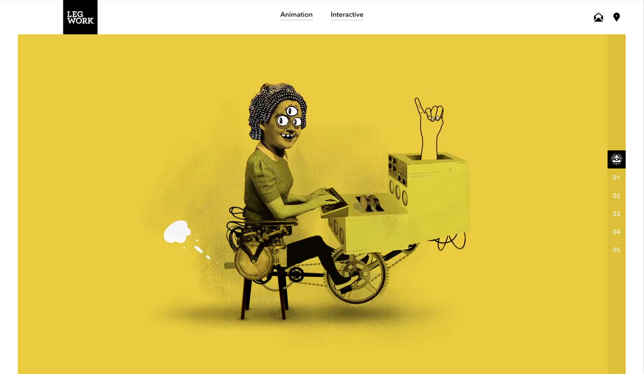
So, we started with some rough sketches and a lot of prototyping. We wanted a minimal UI so our primary focus was on how it should work. We quickly settled on an interaction model built around a poster-inspired display. Next we went through countless iterations on the most minor of details, like how to credit a client on a project or what a link to a reel should look like. The crazy illustrations Aaron was working on really pushed things over the top though. In a weird, abstract way each of the three page headers represents the tenets Legwork was founded on: Creativity, Innovation, and DIY ethics.
Since we really wanted our punk rock spirit to shine through, we applied this aesthetic to everything from the project titles to the page transitions. Then we attempted some crazy ideas around interacting with multiple layered videos to create some trippy masking effects, but that unfortunately didn’t pan out. It was too much and didn’t perform consistently. We never wanted a dev trick to take priority over the content anyway. Now all that was left was putting together the stories for the project detail views. This was no small task, but it was a fun trip down memory lane. We all pitched in where we could and after some late nights hit our deadline… just barely.
The reception of the site has been amazing for us. We can’t thank everyone enough for sharing a link on Twitter, clicking a little heart button on Awwwards or sending us a thoughtful email. We have an awesome community and this has been a good reminder for us to never take that for granted. Let’s do a project together!
Winners!
Each month we give away exclusive design prizes just for voting for your Site of the Month and sharing them on social media. The lucky winners of 3 One year Webydo Pro Plan licenses are: @essalprod, @kernelhazard and @JoBltr.
