
Massive congratulations to Retail 710 & AQuest for winning Site of the Month September with the beautiful ecommerce experience, MA! Thanks for everyone who voted and shared, the winner of the free Pro Plan in our Design Directory can be found at the end of the article.
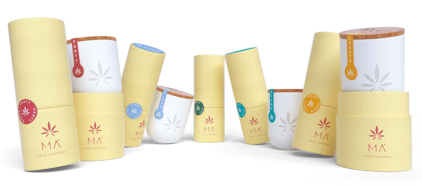
Visionary and ambitious, the MA True Cannabis project was born from the desire to create a true emotional journey, with unique details designed to reflect the characteristics of MA products and guide users through the Four Worlds.
Combining our creativity with skills of designers, frontend developers and 3D artists, we gave birth to a fresh new concept that has shaped the development of the website, where a strong user engagement and e-commerce functionalities merge into a seamless experience.
Giving life to an emotional environment, capable of arousing sensations similar to those the product can provide
Challenges
From a creative perspective the initial stumbling block was the ex-novo representation of the web site visual identity. The sole starting references were the iconic logo and the refined packaging.
The first step was to interpret the brand insights and take out the product soul giving it a shape. We prepared mood boards proposing different paths and worked on the brand tone of voice. We focused on the concept of “making the ordinary extraordinary” and on the ways of representing this through characters: an ordinary object (a shoe, a bed, a camera, etc.) becoming extraordinary thanks to off topic elements with a surprising and disruptive effect.
The result condensed mainly in the homepage slider but at the same time it represents the leitmotiv along the whole website surfing experience.
3D development
Beyond the e-commerce platform development, a great care was given to the 3D characters creation and 3D packaging modeling.
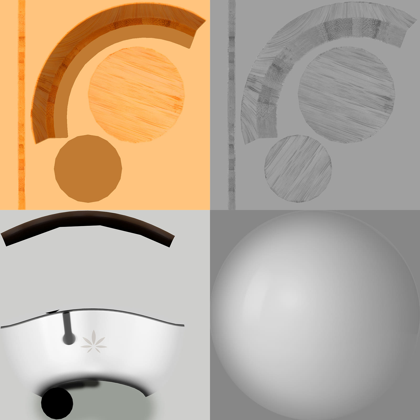
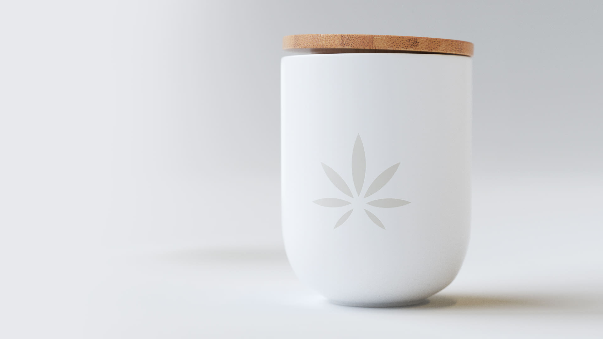
Fundamental was the creation of the most realistic pot product, from the bamboo top to the branded ceramic container. The main challenge was to keep a highly qualitative result with the lowest number of polygons possible: therefore we chose to bake texture shadows of a high-poly model (projecting them on the low-poly model) with the result of a peculiar texture and a smooth & soft shadows.
The pot product with its label and top is composed by 1000 quads and 5 texture: 2 types of diffuse, a bump, a special texture for labels (with overlay on the world color) and a matcap for lighting.
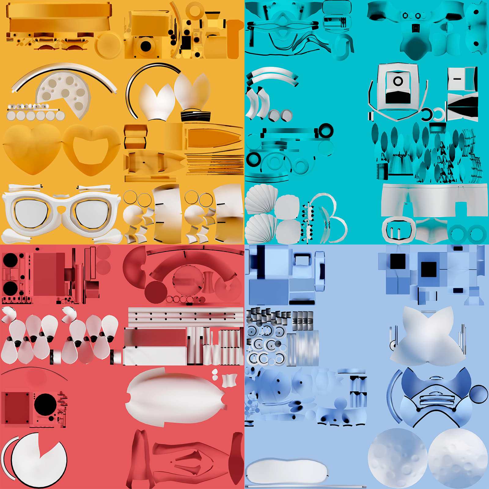
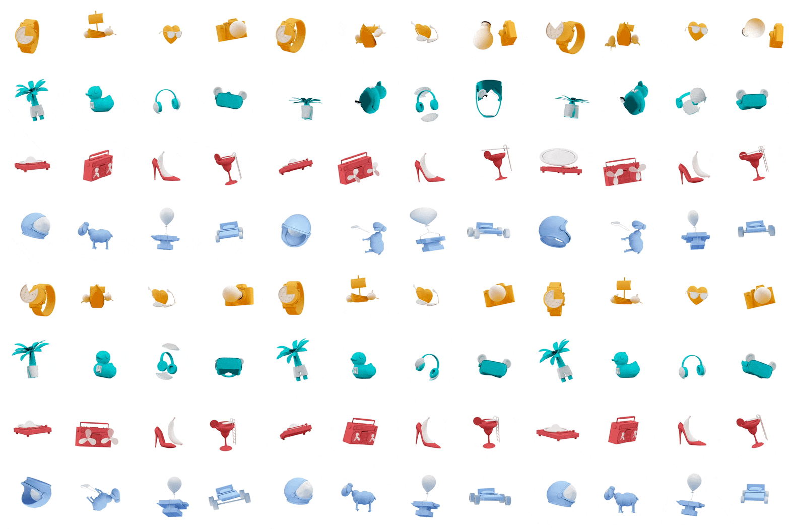
16 low-poly models were created in order to represent and tell the story of all MA characteristics. We tried to create complex shapes keeping at the same time a restrained size for every single model, with an average of 200 KB and 1500 quads each, and less than 1 MB each world (four characters each). Shading was given with a single texture to optimize the scene.

Finally, while developing the elements animation and the fluidity of the overall website, we created the products still life and all website compositions.

Frontend development
From a frontend point of view, this project gave us the possibility to get out of our comfort zone. The goal was to provide to the user a unique experience, by thinning the boundaries between 3D and DOM.
The main slider
The carousel implementation reserved us the most difficult challenges. These are some of them:
- Background
- Objects
- Element Shadows
To optimize performance, all light effects in the background are simulated inside of a fragment shader. Thanks to a glsl mix function we overlap previous, current and next color in one main program.
The 4 objects of each world are loaded and added to the scene only when requested. Using requestIdleCallback api the transition is triggered when all demanding operations (like adding a new object to the scene) are completed, ensuring a very smooth transition.
The element shadows were simulated by a simple faded circle, with some dynamic properties (opacity, radius, etc...) based on the corresponding object position.

Load only what the user sees
Thanks to features like code-splitting and dynamic imports, each page, animation or component is loaded only when required (object hover animations, checkout section, admin area, etc...); this technique allowed us to save a lot of bundlesize.
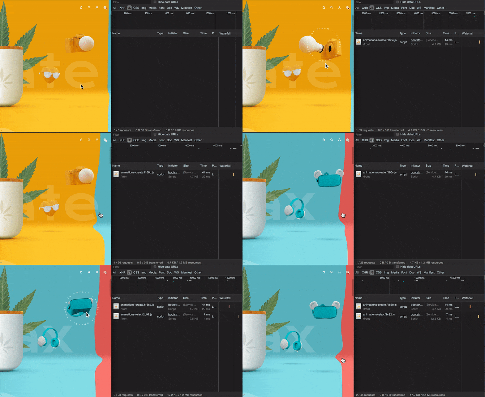
For object animations, animejs provided us different easing functions, that gave as result a physical feeling.
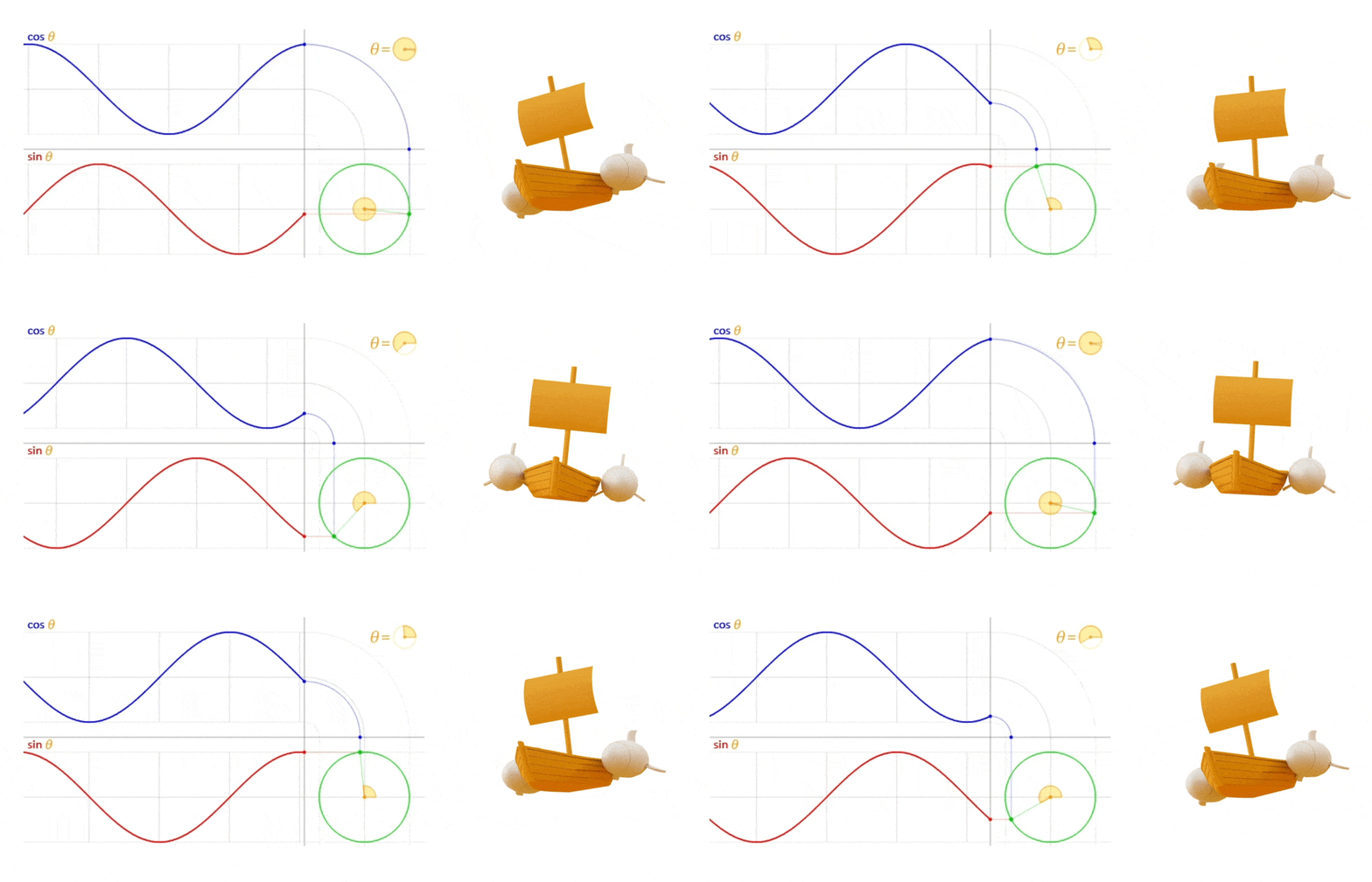
Math.sin, our old friend
The objects idle state was created combining multiple sin functions, each with different frequency and amplitude. Applying this to the rotation and position properties, the output seems to be always different.
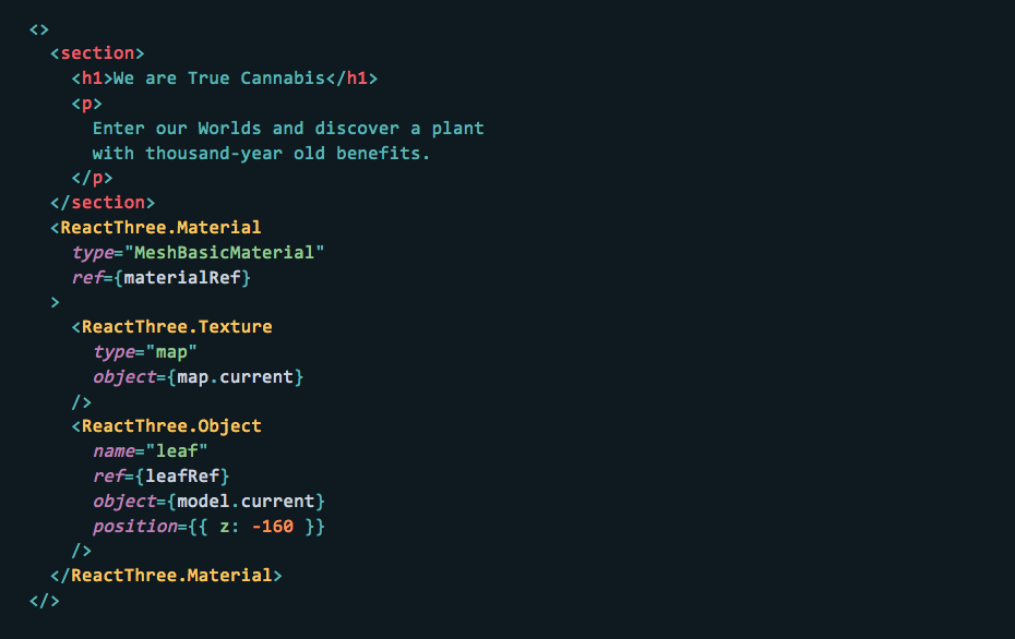
Everything can be a component!
Thanks to the React new Context API, we created an internal package called react-three, that allowed us to render threejs components inside of a traditional dom render:
Frontend Technologies
- react 16.8 with a large use of hooks
- redux and redux-axios-middleware for state management
- threejs custom build
- animejs for ui and some 3D animations
- webpack as module bundler
- malmo as cli tool
Company Info
AQuest is a Creative Production & Technology Company that combines creativity and technology to create digital experiences that connect brands to people’s hearts. We value emotions, our talents and collaboration as key elements of an ever-growing culture of innovation. We welcome challenges and never stop striving for excellence.
MA was founded in Switzerland in 2017 with the aim of redefining the market for recreational cannabis at international level, following years of research and development. The project was designed and developed by AQuest in collaboration with the brand MA, part of the group Retail 710 Sagl. AQuest and MA have combined ideas to come up with “Ma True Cannabis project”, with the main goal of exceeding conventional limits.
Thanks for all the social media love, the winner of the free year in our Directory for Designers is Jo Portus, Jo DM us to get your profile activated and get seen by leading agencies all over the world.
