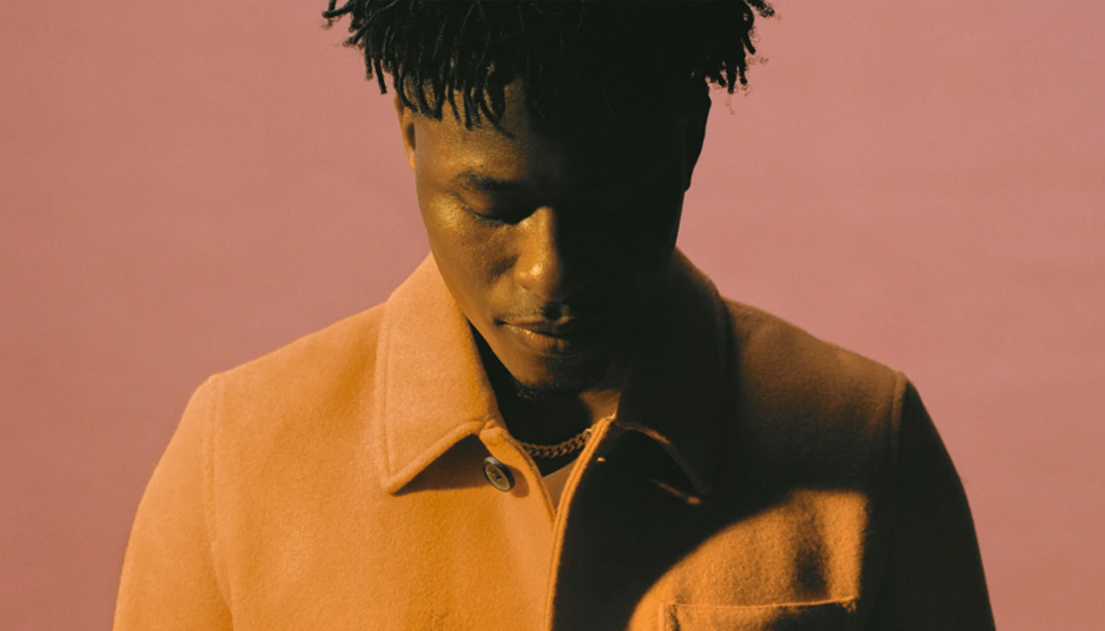
The photography portfolio of Madeleine Dalla by Marvin Schwaibold, Yael Bienenstock and Jesper Vos wins Site of the Month March 2020, thanks for everyone who got involved with the votes and shared it on social media. Now we hear about the making of Madeleine’s elegant new portfolio website.
Madeleine Dalla is a Swedish, Nicaragua born photographer based in New York. To frame her incredible work we built her a visual identity accompanied by an elegant new portfolio website. With this project, we didn’t want to overwhelm her work with art direction and motion but strip it free from these elements and delicately accentuate her photography.
Art Direction
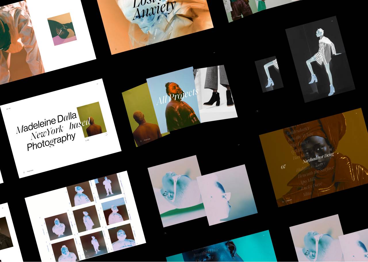
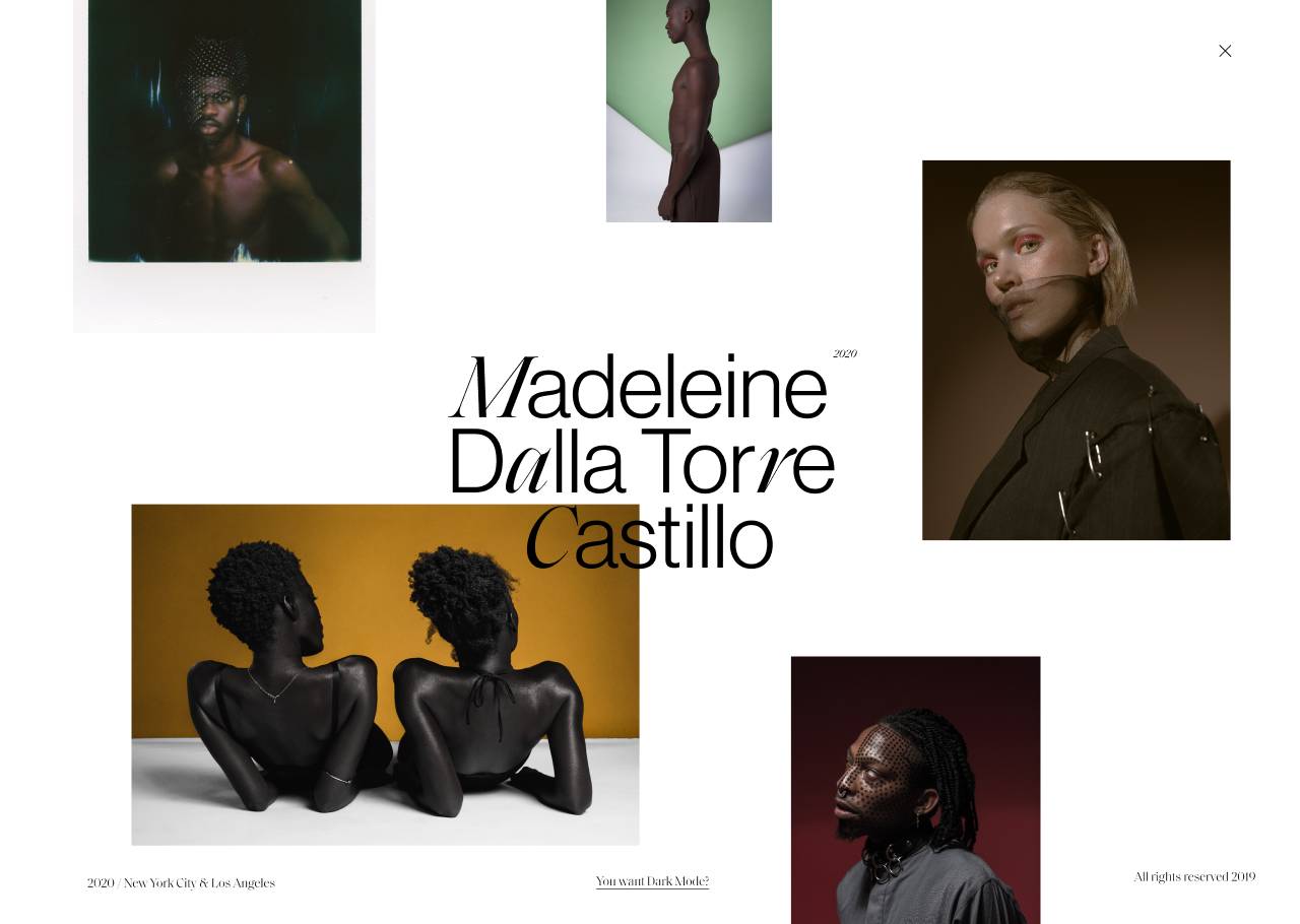
We set a general style throughout the site with a broad editorial look. Especially in the project pages we underlined this with straightforward and transparent components that, in their simplicity, best present Madeleine’s work.While keeping some distance from any unnecessary elements, there is a lot to be said about the typography in this project.
It's a symbiosis of moderate and distinctive fonts that come together in harmony.
Used in combination with Neue Haas, Saol Display—elegant, abstract and peculiar, not only mirrors Madeleine's unique style but also accentuates the complexity of her work. Therefore both fonts were used deliberately in the same contexts and juxtaposed throughout the entire branding. It is important for us to showcase Madeleine’s photography in the best light we can, and inspired by analog negatives and their development, we gave her work a second life by inverting the colors and presenting it in an optional dark mode, toggleable from the menu.
Professional Identity
Working together as a creative trio for the first time, we combined our diverse professional backgrounds into this project. Yael and Marvin work in the Web Concepts Team at Squarespace in New York City and Jesper works at RESN in Amsterdam. This being a side project of us three, one thing that spoke deeply to us was the fact that we wanted to give it our personal touch while keeping the client in mind. We like to think of this visual identity and website as a creative product that, not only perfectly matches Madeleine’s work, also reflects us as creative professionals.
In this project we all had an essential part to play. Each of us has a different skill set and creative perspective. Ideas are very fragile and can easily be disregarded or forgotten so trusting each other and being equal was important to us. We made sure to give each other enough room and opportunity to express ourselves and be proud of the final result. We tried to never separate the tasks; the design, the motion and development all came together from start to finish and we think that’s why the project came out the way it did.
Interaction & Motion
Although clean and unobstructed, some details we spent quite a lot of time on are the title animations and rollovers. The motion of these is elegant and delicate to mirror the beautiful imagery and elevate the intricate typography. Yael's professional background brings a unique motion style to the web. Mirroring her style in development is an interesting and fun challenge to take on.
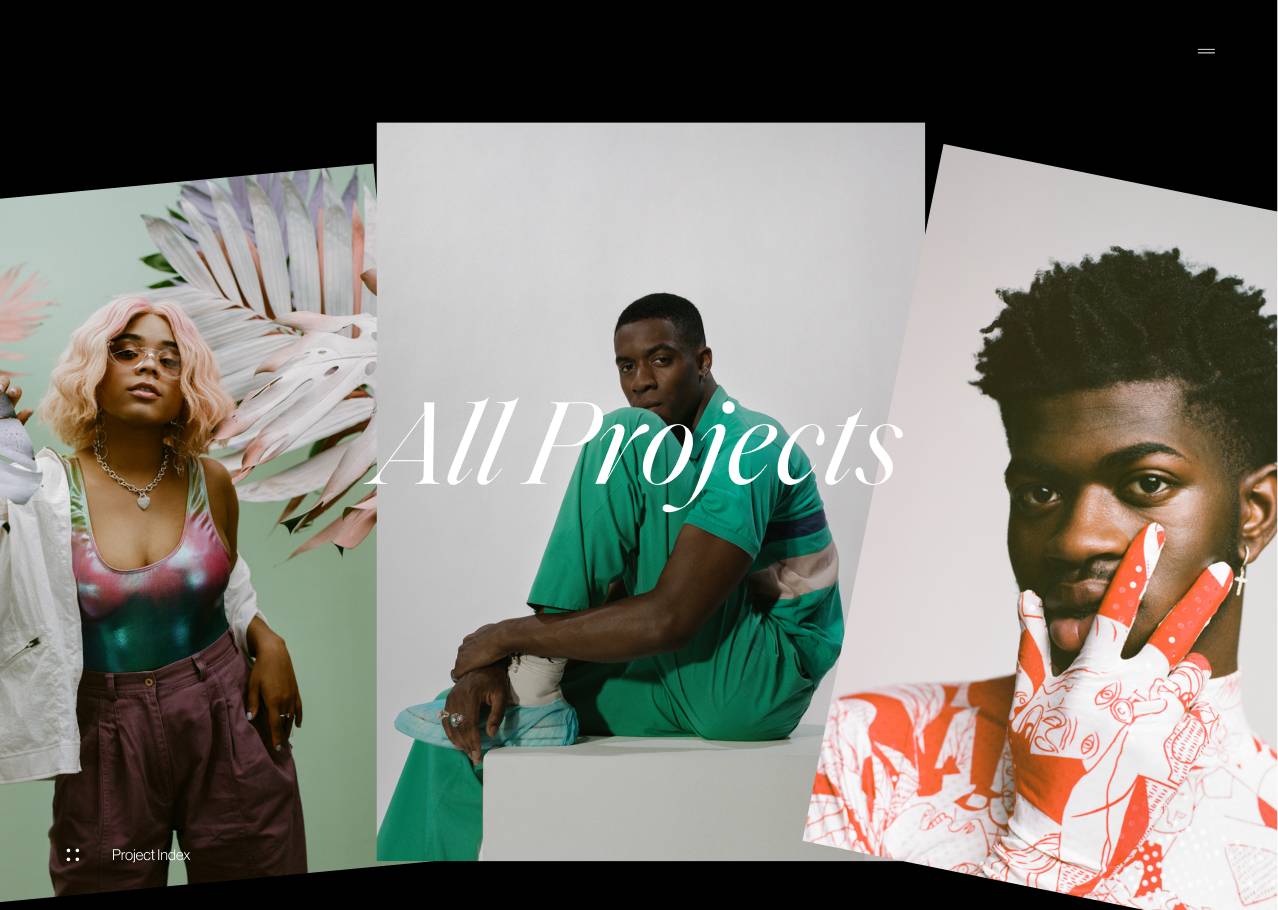
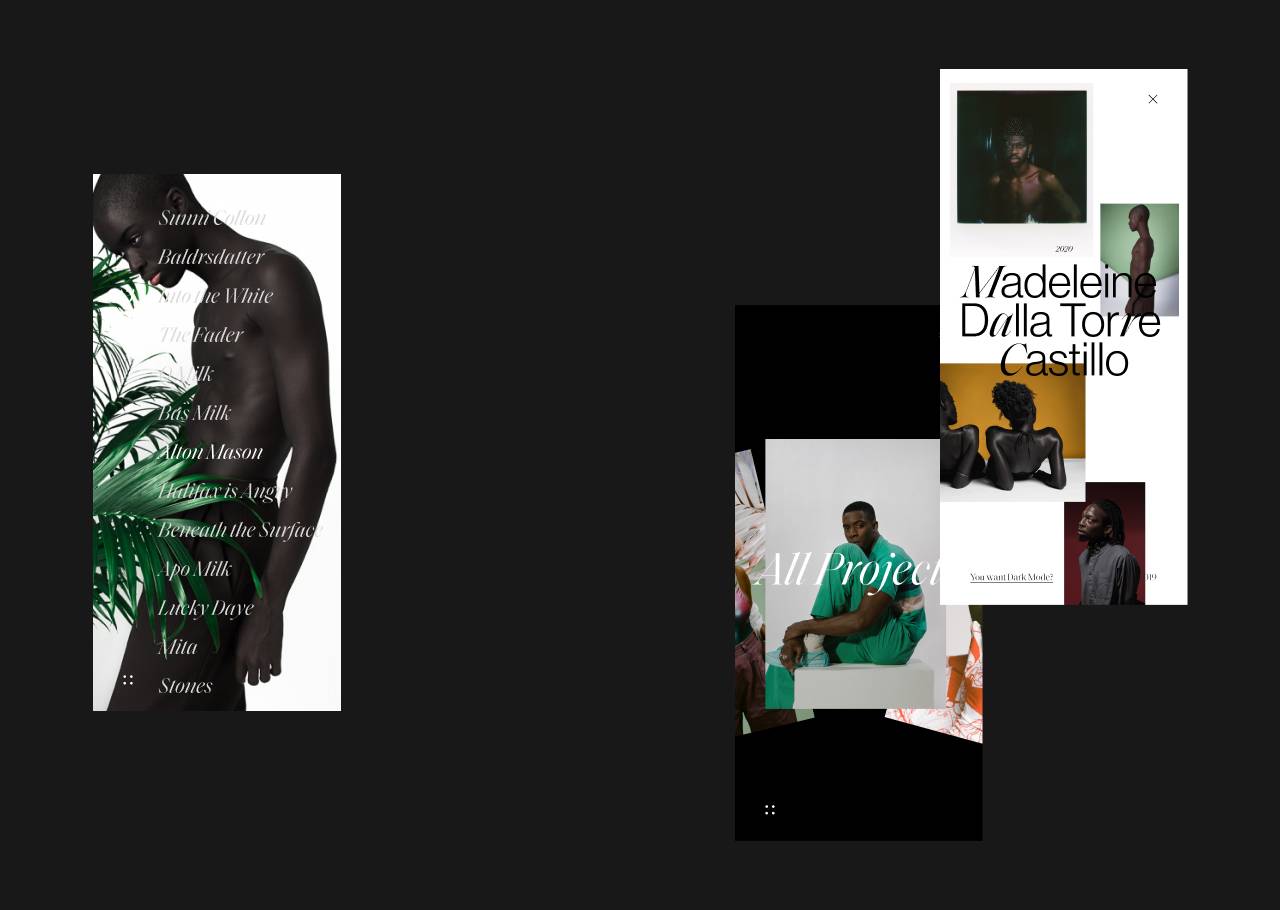
Also keeping a native and responsive feel to the website’s experience, while still building unique interactions, was a challenge that we faced as a team during the process of this website. The double navigation system enables visitors to either search Madeleine’s projects by title or visually explore her work in an infinite, scrollable carousel. For the ones who want to view all photos uninterrupted, we made it possible to navigate linearly through all projects by adding a ‘next project’ link at the bottom of every page. Additionally, we built an archive page that, using a randomized grid layout, gives an overview of older projects and experiments Madeleine wants to showcase.
Technologies
It could be said that we mirrored the lightweight aesthetic of the website’s design into the development process. We used Nuxt.js with Prismic CMS to generate a very lightweight static website that is hosted on Netlify. Only the essentials are preloaded, and for best performance almost all animations are made with css.
We mirrored the lightweight aesthetic of the website’s design into the development process.
Although it wasn’t a main focus, we implemented many accessibility features into Madeleine’s portfolio. For example, the markup required for the text animations creates a very awkward situation for screen readers. By using the right ARIA attributes these titles are processed like normal. As a bonus, this website can be installed as a PWA. While running it in standalone mode a service worker will intercept and cache all server requests making this portfolio completely offline available so Madeleine can present her work wherever she is and whenever she wants.
Technologies used
- Nuxt.js
- Prismic
- Netlify
- Figma
- After Effects
Company Info
We are a trio of creative professionals with diverse professional backgrounds. Marvin is a senior designer in the Web Concepts team at Squarespace in New York City. Yael is a motion designer and also works in the Web Concepts team at Squarespace in New York. Jesper is an interactive developer currently working at Resn in Amsterdam.
