Over the past 17 years, Metalab has been quietly shaping the internet through product design and development (obligatory name drop from our marketing team: Slack, Uber, Midjourney).
As an agency, we tend to focus more on our work than ourselves but it was time to look inward.
Off the back of our rebrand project, we tasked our team with redesigning our dot com.
As we do with all our clients, we began by establishing goals and guiding principles. That way, when things inevitably get sticky, we have a place to point back to.
Goal #1 — Let the work do the talking
We rarely have time to create big think pieces because we’re busy doing the work and honing our craft.
Our work speaks for itself, and we let it. It was important to maintain that philosophy through the new site.
Goal #2 — Focus on product
While many of our competitors have expanded their services, we remain singularly focused on product.
Our website needs to reflect that — not only through the projects we showcase and messaging but in the experience itself.
The vision was clear: create a dot com to feel more like a native product than a website.
Goal #3 — Inspire our community
As an agency, our site must resonate with three unique audiences: our clients, our team, and our community.
We knew if we designed to impress designers, the talent and the business would follow.
That doesn’t mean over-adornment or complexity but rather finding differentiated, unique, and engaging details to challenge the norm and uplevel the collective.
Ultimately, we want to leave visitors with a sense of wonder and thinking — Metalab is a group of people I want to work with (in any capacity).
Divergent Concepts
A difficult part of translating brands to new sites and products is finding one specific element to leverage.
We already knew we wanted the website to embody our brand’s core emotion of wonder — so the question was not what but how.
On any project, we try to cover as much ground as possible in our exploration and then select one idea.
For our website, this meant developing three different concepts centered around different executions of the theme wonder before choosing one that best aligned with our goals.
Frames — Opening the door to wonder
Our first concept centered around the idea of revealing wonder, using the frames that we developed for our motion language as a starting point.
The frames reveal openings into the Metalab universe, creating doorways that invite visitors to explore the site and dive deeper into our world.
Constellations — Discovering the worlds of wonder
“Where some see nothing, we see everything.”- The Metalab brand book
The constellations concept embraces the infinite potential of the unknown.
The homepage creates a vast universe of many moving parts. Each project becomes its own square star (or pixel) on the map — a world to be unveiled within a limitless constellation.
The unorthodox UX pattern allows for exploration as you interact, inviting you to navigate and discover our breadth of work.
Editorial layers — Revealing wonder
Centered around the principle of humanizing product.
Editorial layers blend the best of both graphic design and product mechanics to add texture and physicality to the site, making it uniquely tangible.
Built on a classic foundational grid that allows us to tell stories in a digital space. The layers reveal a catalog of our greatest hits as visitors page through the experience.
Ultimately, we chose the frame concept.
A flexible system supporting an ownable digital choreography. The custom grid opens a multitude of doors into the Metalab universe.
Playing on the metaphor of multiverses and spacial design, levels become more focused as visitors travel deeper into the site.
While we took inspiration from pieces of the other concepts in our final design, we intentionally chose not to blend the three and instead leaned into the frame's unique strengths and physics.
“I personally don’t like when you end up with different concepts that you try to merge…We call it Frankenstein. It has no point of view. It’s trying to do everything, but it’s doing nothing.” — Samuel Medvedowsky, Creative Director, Metalab.
Iterative Magic
After settling on that concept, our first challenge was figuring out how to reflect the concept in the site design while making it easy to use. That process involved a lot of iteration.
We developed various compositions and prototypes, designed different flows and screens, and pressure-tested them with users to determine what worked best.
To help with the sense-making of wider navigation across the site, we reframed the idea of frames into portals.
Then, to stop people from feeling lost, we designed the portals to trigger through interaction. If you don’t engage with the site, nothing happens. It’s only when users scroll, hover, and move around that site that the different universes open up.
We stressed the system and extended the logic to create a consistent way of showing up online. That allows us to share our work in a unique way while creating a visual and experiential consistency with the website.
From concept to execution
Next, we had to make the concept a consistent part of the website experience.
The navigation system is constant throughout the site, so we explored how to translate the concept of revealing wonder into the site's wayfinding.
We experimented with making the portals a way to navigate through different layers.
The portals transport you to different worlds: our universe, the universes of our clients, and the universes of different projects.
Home — The universe of our clients
Something we loved about the old Metalab website was the directness of the homepage.
Rather than waxing poetic about our services and making it all about us, we know we’re only as good as our work. Show, don’t tell.
Of course, it helps that our client’s names speak for themselves.
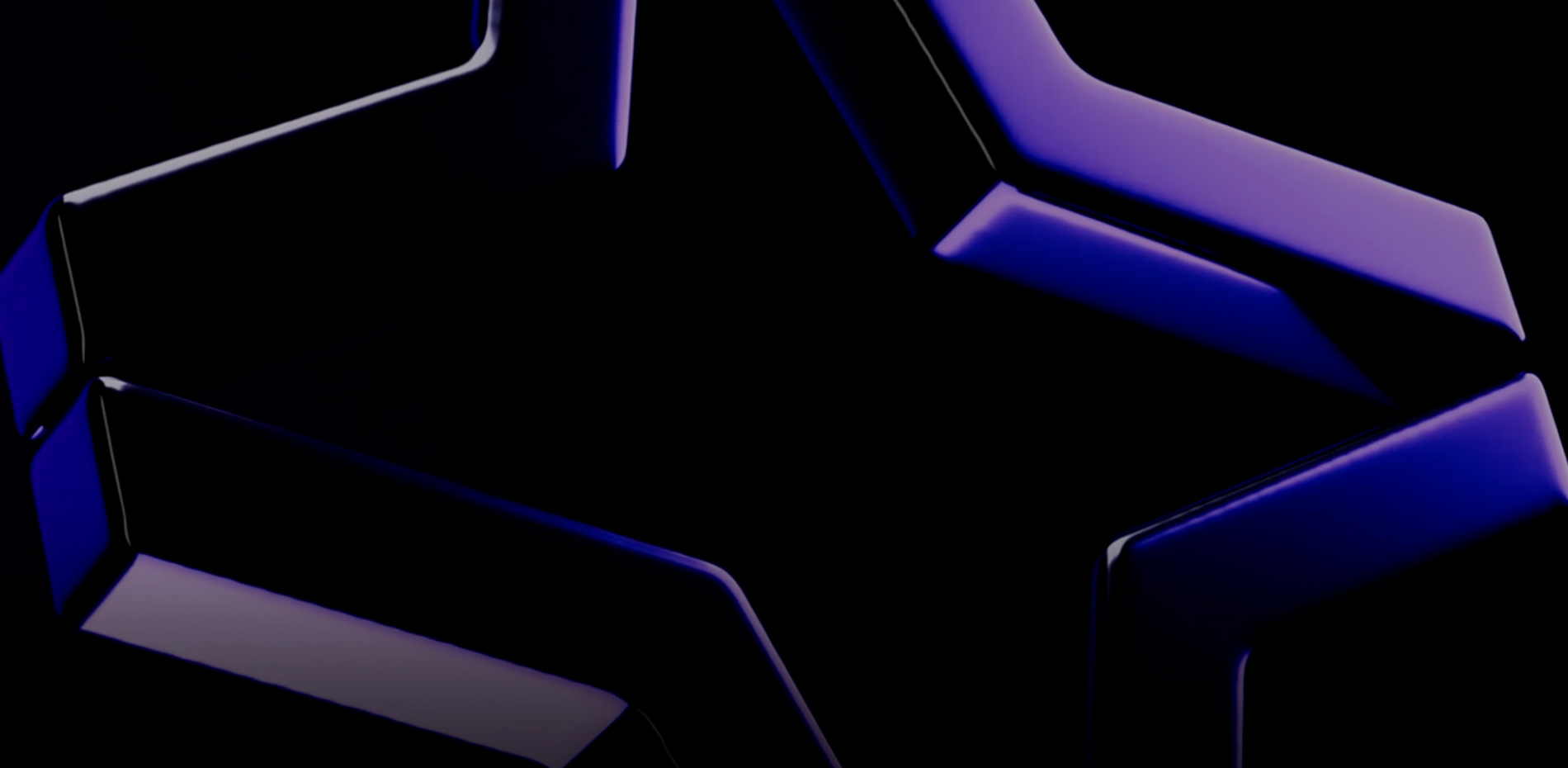
That confidence carries through to the new dot com. When you land on the site, an animated 3D render of our icon draws you in, almost hypnotically.
The only copy on the page is our iconic tagline and a 157 character description about us.
Then we direct you to the reason you came — the work. A curation of our latest hits across startups and leaders.
As you interact with the homepage and hover over our clients' names, you discover 3 types of windows or portals that invite you to explore and dive deeper into universes of individual projects.
For those who want to see more breadth of work, go to our All Work page.
Menu —The Metalab universe
Navigating to the menu reveals the Metalab universe.
Here you get access to About, What we do, and Latest. All the pages about us.
The portal preview of these pages leverages the seasonal elements of our brand. Various 3D renders of the star. We’ll swap out and create new renders for these windows as we go through different seasons as a company.
The notifications panel brings in those product flourishes we wanted while providing a stream of updates about our clients and our team.
Case studies — The universes of different projects
As you transport from the homepage or our menu, you immerse yourself in the world of our clients.
Each page stands as unique as the projects themselves but with a consistent thread that signals it was us behind the work.
You see the product itself — the functionality, the features, the micro-interactions and the system behind it all.
You see the human side of the products — the people who use them daily, the environments they’re in, and the outcomes they unlock. Together, you see the personality of each product.
In the end, we were thrilled with the final result. Prior to launch, we knew we achieved our first two goals. Being recognized by Awwwards as SOTD confirmed we also achieved the third.
Credits
Sara Vienna - VP, Design
Sam Medvedowsky - Creative Director
Adi Zuccarello - Design Director
Adrien Joulie - Principal Motion Designer
Matt Ellis - Brand Director
Nathan Dallaire - Creative Developer