Clear Pathways
As a top web design agency for not-for-profit organizations, Brand Vision designed and upgraded Clear Pathways' branding and website, and they collaborated with a leading digital marketing agency in the United States to improve their digital appearance and boost their SEO.
More about this project:
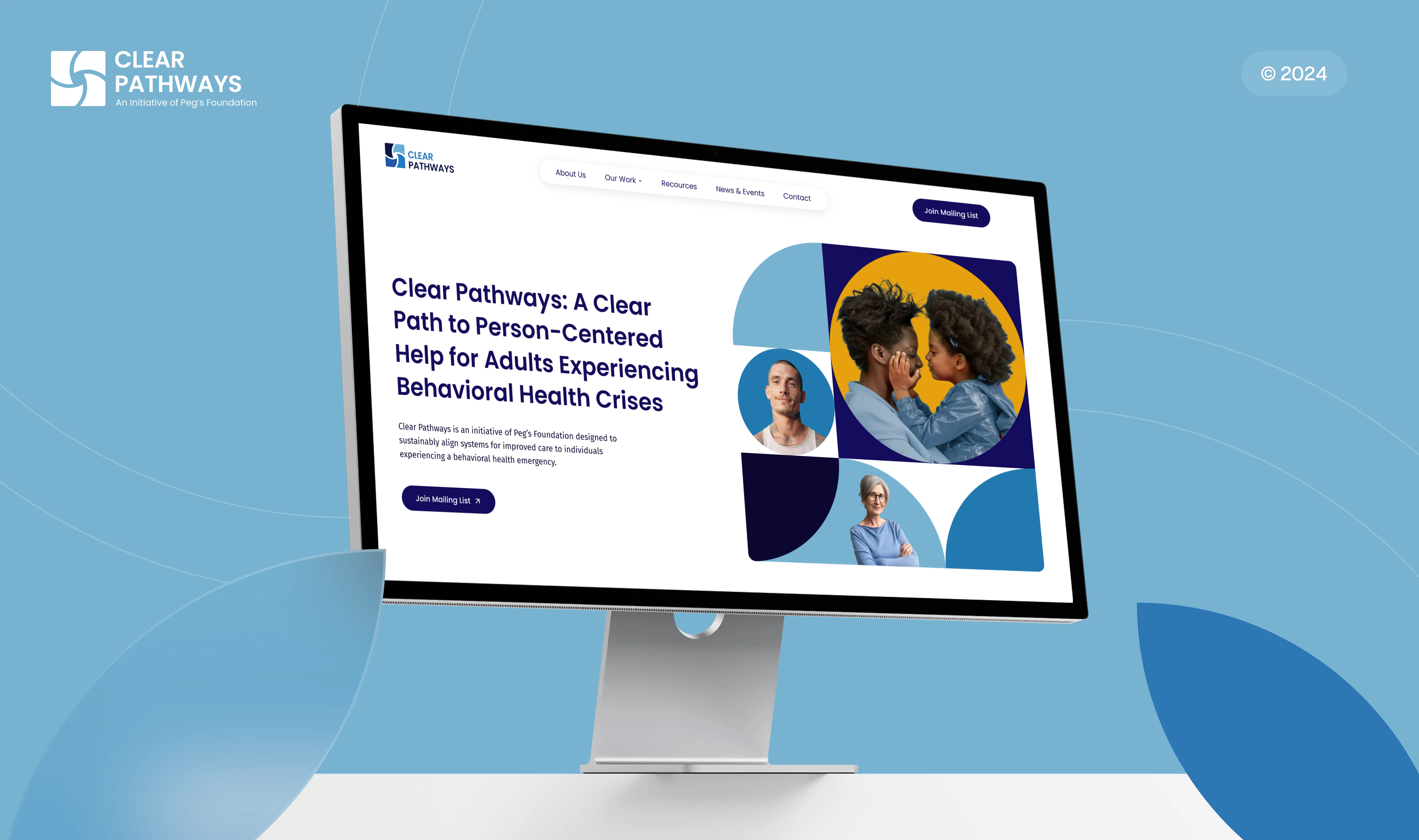
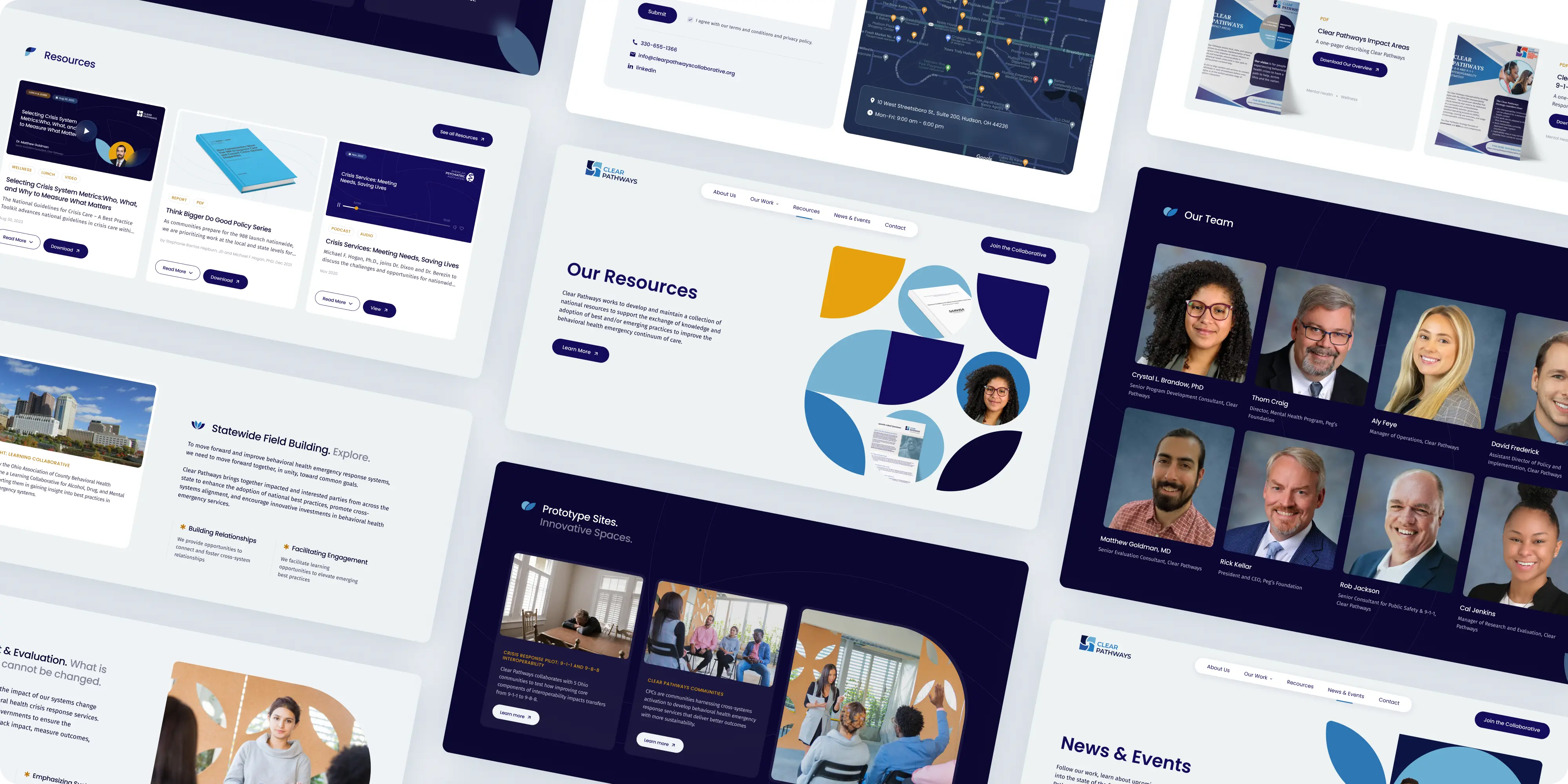
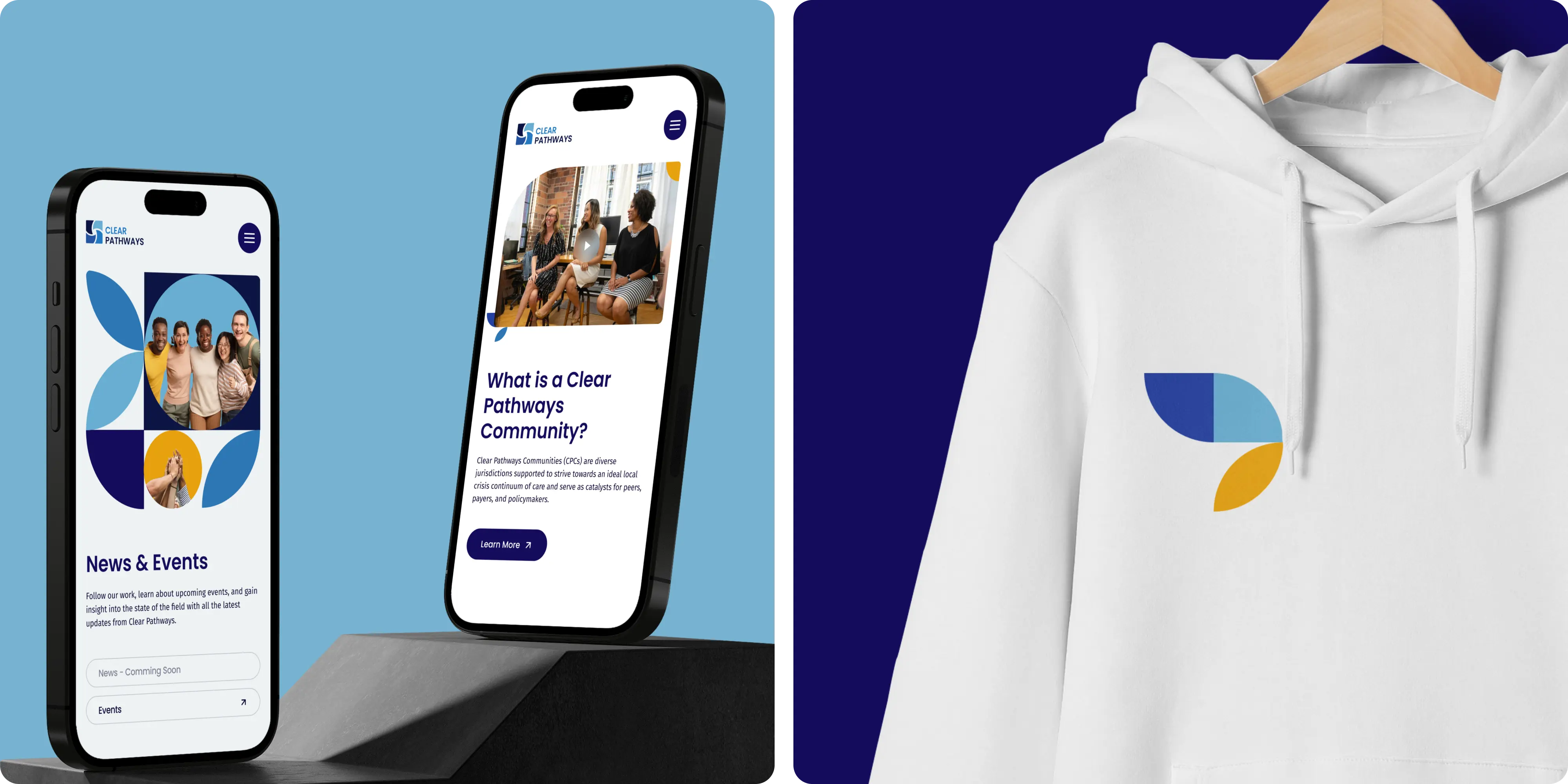
The website was built using WordPress Elementor, allowing for easy updates and expansion over time. The redesign resulted in a beautiful, unique, and timeless website that significantly improved SEO and site speed. As a top UI/UX agency, we pay close attention and ensure we create seamless navigation and accessibility with the design.
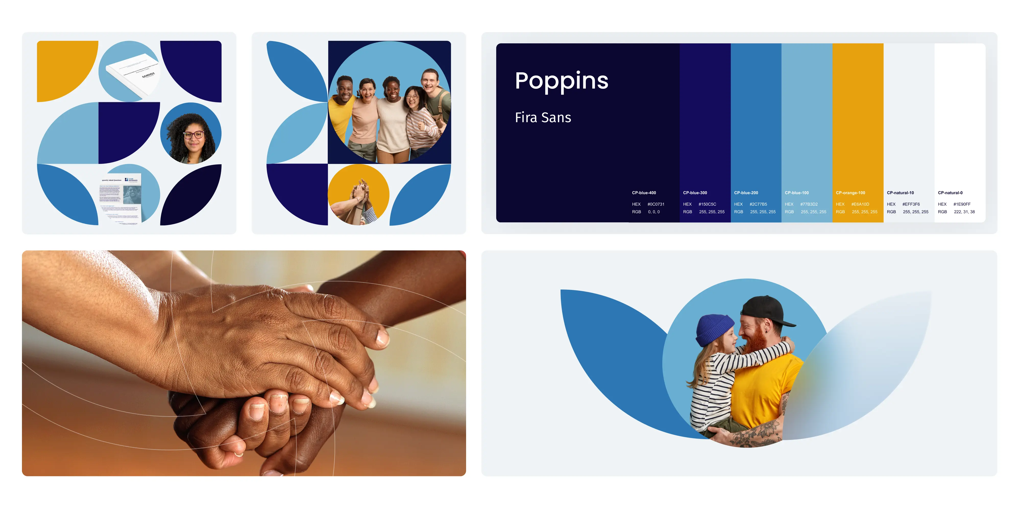
The chosen colors include warm shades of blue and yellow, complemented by white. These colors stimulate feelings of trust, warmth, and professionalism. Blue signifies reliability and approachability, yellow conveys positivity and optimism, and white serves as a neutral backdrop, enhancing readability and reflecting transparency.
Typography was carefully selected with Poppins and Fira Sans for their readability, versatility, and modern appearance. These fonts ensure clear communication while maintaining web accessibility. Custom graphic elements with soft shapes and soothing colors were designed to create a welcoming and supportive atmosphere. These elements encourage emotional connections with visitors and enhance the user experience.
Project Details