
Well done to Active Theory for winning Site of the Month May 2021 for Prometheus Fuels. If you voted and tweeted you could be the winner of a free Pro Plan in our Directory, so check and see if it's your name at the end of the article.
Prometheus Fuels came to us with their vision of a zero net carbon world—one in which we’ve eliminated our fossil fuel dependency and where the public is as excited about new technologies as they were back in the golden age of science fiction. Given this retrofuture direction, we decided to create a scrolling narrative of the company’s mission to both educate and immerse people in this exciting new world of possibilities.
Case Study Video
Visual Direction
From the outset, the branding developed by the Prometheus team represented a time of untethered creativity, aspirational dreams of the future, and predictions of ambitious technology. This theme of retro-futurism was present in the previous iteration of the Prometheus website, and to help us with our execution, the Prometheus team brought us up to speed with the theme, narrative, and copy they had developed.
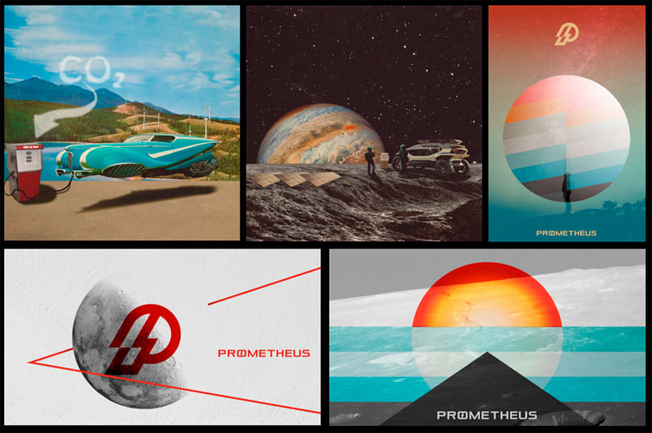
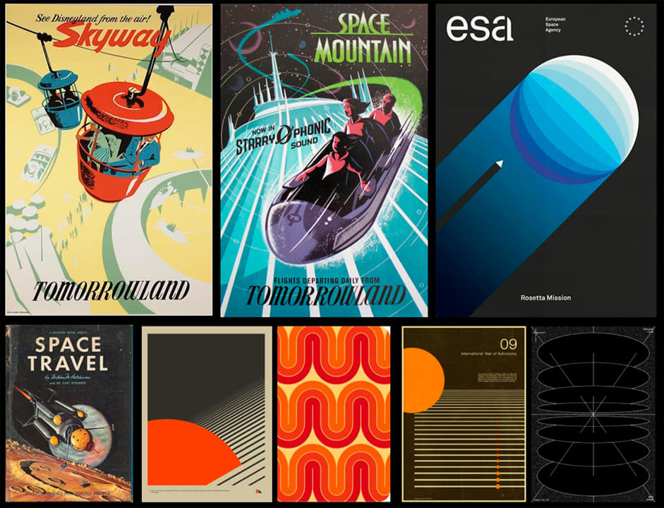
At this early stage we began to think about how to represent this information on the new website, and experimented with different designs and references.
A Story with Chapters
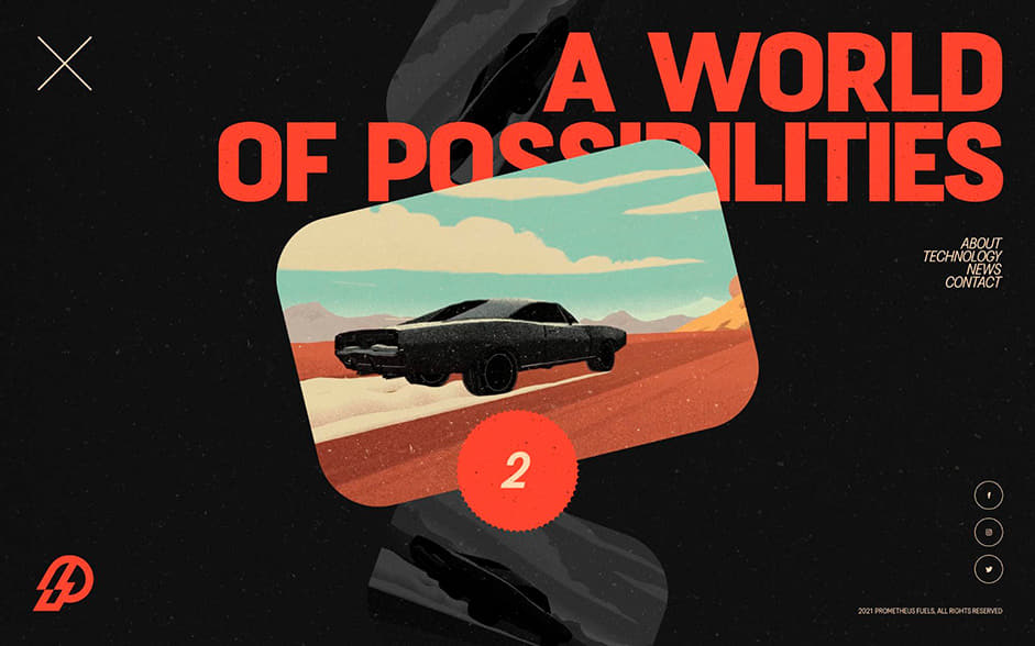
Once the visuals had some direction, we needed to establish a way of telling the stories. We began this by working with the Prometheus team to split the narrative into two chapters: “The Birth of a New Era” and “A World of Possibilities.” Presenting the story as chapters not only plays nicely from an artistic standpoint, but also gave us production flexibility to continue to add chapters over time as the Prometheus story evolves (stay tuned for more).
In terms of content selection, while we wanted to lean into the untethered creativity and adventure of science fiction, we also needed to take a couple of steps back to first explain how Prometheus’s technology enables a promising and more sustainable future.
we decided to center Prometheus’s restored Mustang fastback—or the “Promethean Stang”—as the protagonist of our story.
To tie the two chapters together, we decided to center Prometheus’s restored Mustang fastback—or the “Promethean Stang”—as the protagonist of our story. Since it would be used to stage the company’s initial ZNC fuel demos and road trips along the iconic Route 66, featuring the car on the site seemed a natural fit.
Our earlier explorations experimented with various color palettes, grain textures, animations, and collage-style photographs
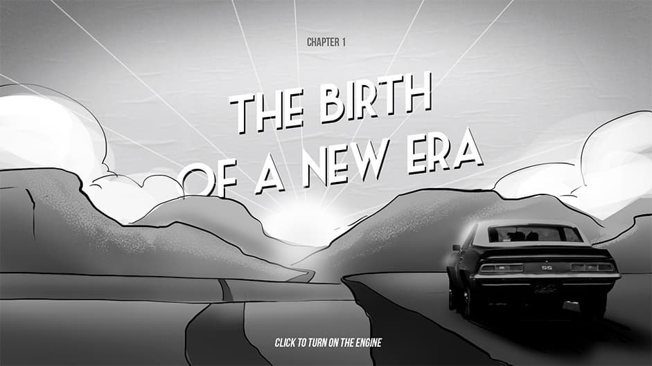
Chapter 1: The Birth of a New Era
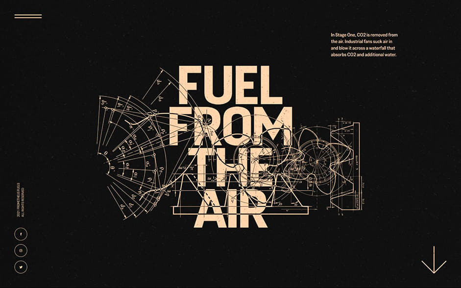
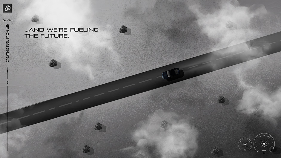
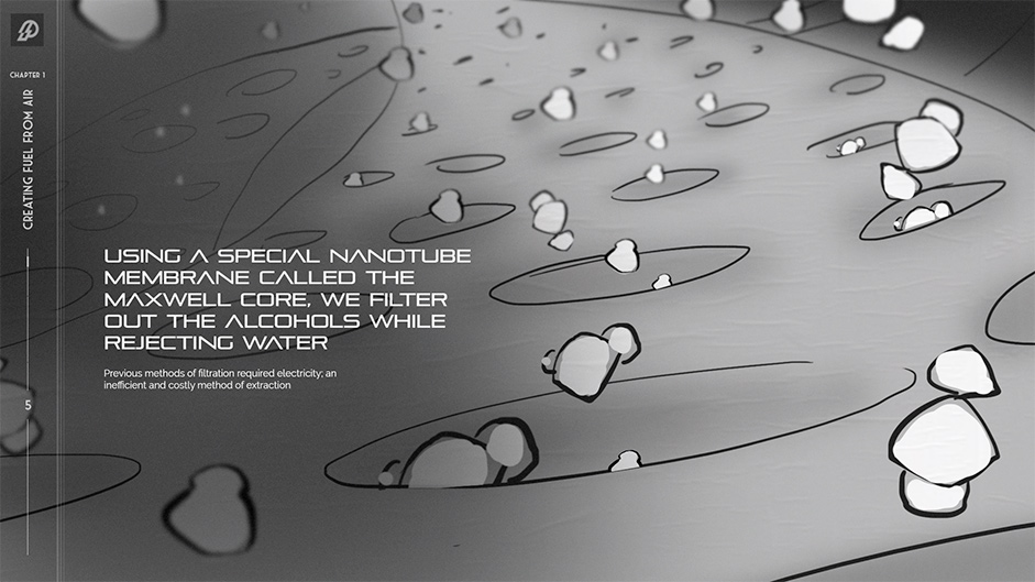
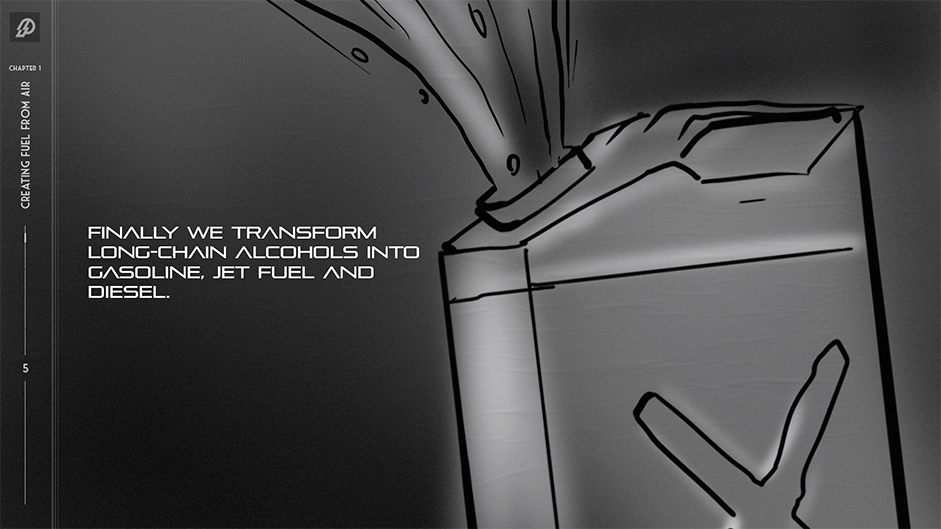
Chapter 1 was dedicated to explaining the technology itself and setting the foundations for what Prometheus does. Given the story would unfold as a linear and scrolling experience, we planned out the story through a series of illustrated storyboards. These demonstrated how the content would be brought to life scene by scene.
Chapter 2: A World of Possibilities
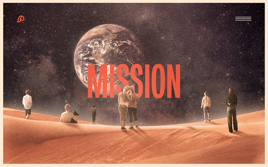
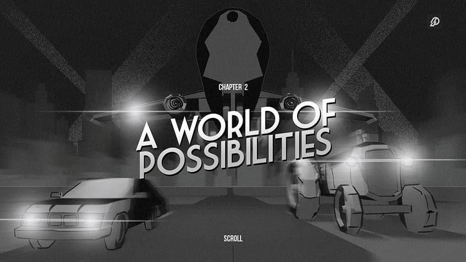
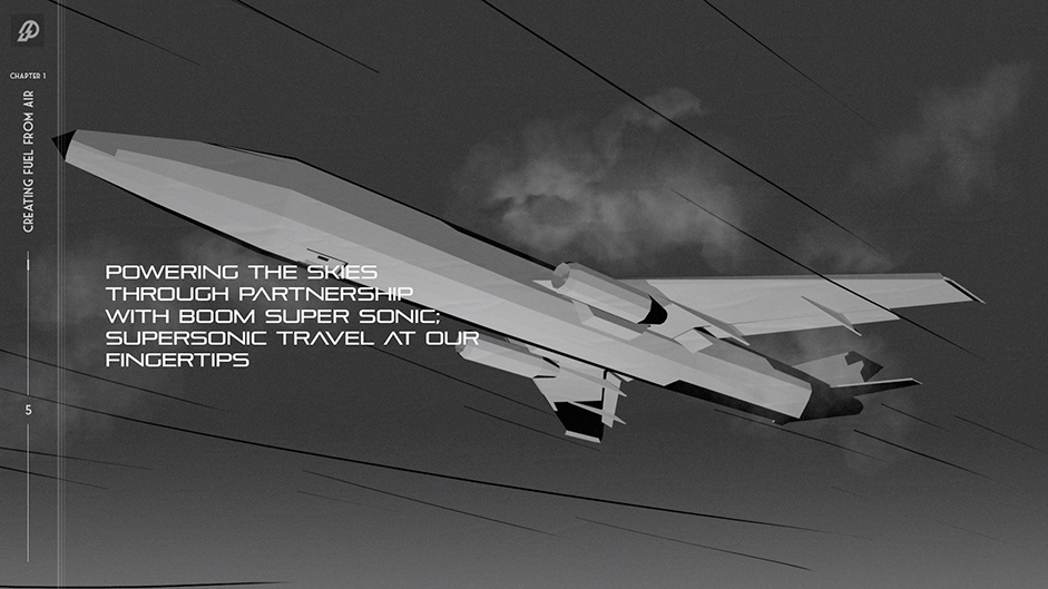
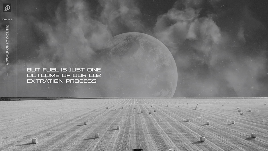
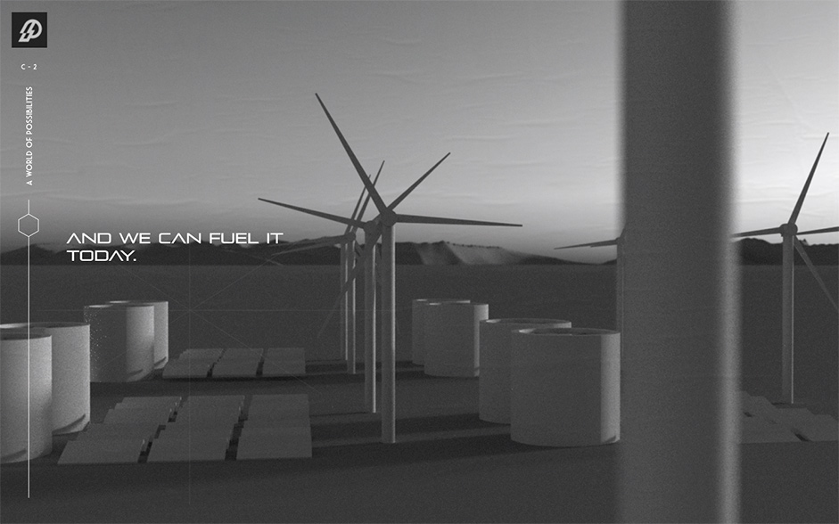
With the fundamentals of the product established, Chapter 2 would look to the future and the vision that Prometheus was painting. While Chapter 1 was much more detail-oriented (featuring lots of micro zooms and interactions in the scientific process), Chapter 2 took a step back and allowed us to visualize bigger environments and scenes.
Illustrative Rendering
To match the branding of Prometheus, the art direction needed to have a retro-futuristic feel. We used the collage style of Frank Moth as a jumping off point but, since we knew we wanted to leverage 3D camera moves for certain storytelling moments, we ended up steering away from a completely 2D experience. Instead, we settled on a mix of both illustrative and photographic elements applied to 3D meshes. This worked quite well, and was completely in line with the collage-style nature of our references. To achieve this look on the web, we borrowed several techniques from the world of motion graphics.
One simple but effective technique we used was limiting the frame rate for several supporting effects, such as the scrolling road texture, to 12 frames per second. We found that as long as the scene camera and any other major elements were left to run at a smooth 60 frames per second, the addition of some lower frame-rate elements in the scene added to the sense that these were hand-drawn animations, and not just computer-generated effects. This is, however, a technique that needs to be applied tastefully, as users may otherwise think they're experiencing poor performance.
Illustrations and photos were projected onto 3D meshes for a parallax effect
To give our textures and gradients more organic edges, we blended them with screen-space noise. The trick is to add noise to a gradient, and then use a step function to clamp the values. With noise it's easy to overdo things if you add it too heavy and thick. But with this technique, noise only gets applied to gradient edges, rather than over the top of everything in the scene.
To give our textures and gradients more organic edges, we blended them with screen-space noise.
Scrolling Transitions
We knew early on that we wanted the site to have the feel of a vertically-scrolling webpage while also leveraging the power of our 3D engine. An important part of the experience was the camera flow when scrolling from scene to scene. To do this, we needed a system that would give our artists full control over this aspect and allow them to iterate on things quickly without having to export a different spline path each time they wanted to make a small tweak.
References of invisible edits to string multiple shots together
We came up with a system that defined a start and end camera for each scene with exposed parameters that would update in realtime without the need for any exports. This way, an artist could scroll up and down the entire website, making small tweaks to values in the side panel, and author the entire camera flow from start to finish in the browser.
An early test to demonstrate vertical scrolling between 3D scenes (first) vs. the final build (second)
To keep users engaged with the story, we included interactive directives for playful engagement moments. Spread throughout the experience were moments where users could tap or hold a key to interact with elements on the screen. For some additional playfulness, certain effects were also linked up to the scrolling behaviour of the site so that users could control the forming of clouds or the chemical reactions of elements simply by moving up and down the page.
“Hold spacebar to energize the molecules”
Performance Considerations
The main performance consideration with a long scrolling site like this is to make sure you're not rendering too many scenes at once. Even with two scenes rendering at the same time, the draw calls can stack up quickly and cause stuttering on low-powered devices. Our solution to this problem was to only ever render one scene at a time. During transitions, when two scenes are visible simultaneously, we "ping-pong" between them so that we still only ever render one scene per frame. Though barely noticeable, this provides a huge performance increase and keeps the experience smooth across all devices.
Conclusion
The Prometheus experience is currently available at prometheusfuels.com. At this time of writing, users can experience the two interactive storytelling chapters outlined in this case study. Stay tuned for more updates from Prometheus soon.
Company Info
Active Theory is a creative digital production studio with offices in Los Angeles and Amsterdam.
Thanks for getting involved with the votes and sharing it on social media - @veacks you have won the pro plan.
