Jan 16, 2013
Responsive Solutions to Design Menu Navigation in Low Resolution Mobile Screens
In responsive design for smartphones and mobile devices with low resolution screens, one of the most common and difficult challenges to address is the navigation menus.
A small space problem
Classic web design always allowed and was oriented to provide horizontal scrolling menus at the top of the pages, which enabled users to have a good browsing experience. By squeezing the elements for a responsive layout, reference and visibility criteria for the navigation elements are called into question, and it’s really not always easy to find a way to keep them usable.
There are several solutions available for menus and menu items, which we illustrate here with examples of good responsive designs.
Five Solutions for Good Design
1) Squeezing in successive lines | 2) Display as blocks | 3) Dropdown menu | 4) Menu Icon | 5) Combinated solutions
1) Squeezing in successive lines
The most simple, intuitive way, which doesn't require doing anything, is to let the style label 'relative' work in the menu items when the resolution is reduced, squeezing in successive lines. It's not very complicated. This can be a good solution when there are few menu items, because if the number is very high you may lose visibility for other content and cause a bad user experience.
For example: Buffalo or Studio Nudge

Buffalo studio's website and Nudge use this solution successfully, maintaining clean and simple menus.
-
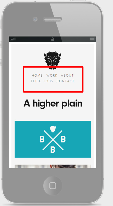
Try it reducing the browser window from builtbybuffalo.com
-
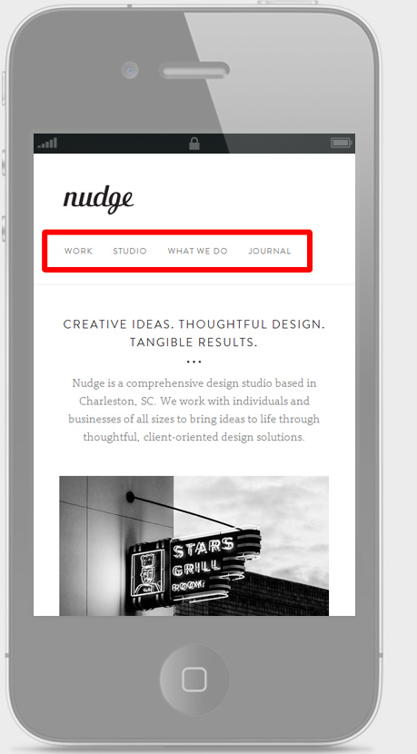
Try it reducing the browser window from studionudge.com
2) Display as blocks
This option is to use the whole screen space of the home page only as a menu, whose items are displayed as large blocks occupying its entirety and directly link to each of the pages.
It may be a good choice for simple sites with few pages or prominent sections.
The disadvantages of this option occurs when there are many items, forcing the user to perform a very long scroll. Also a loss of content visibility in the first instance.
For example: RVLT or Love&Luxe
-
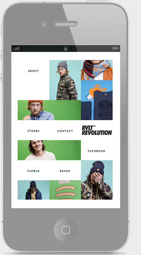
Try it reducing the browser window from rvlt.com
-
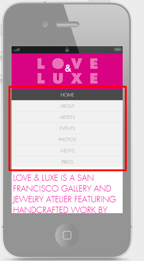
Try it reducing the browser window from loveandluxesf.com
3) Dropdown menu
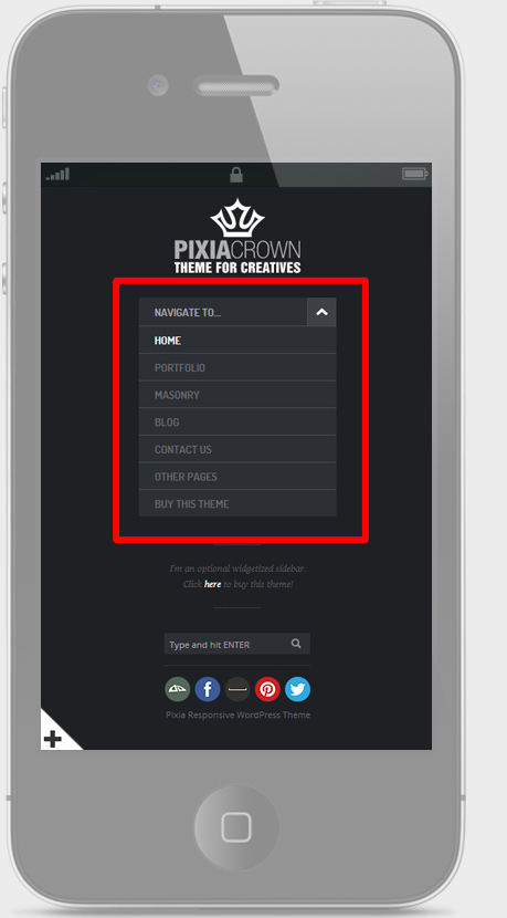
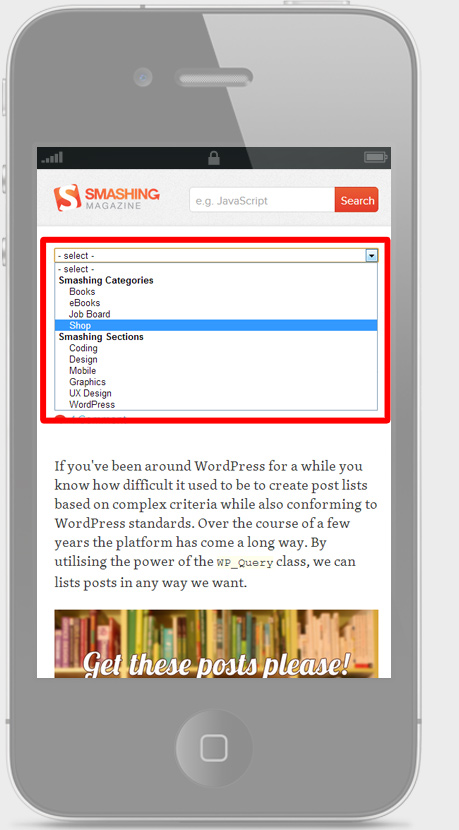
The second option is to use superimposed dropdown menus showing all items after selecting the dropdown box. This can be a good solution.
However it often presents the disadvantage that the options cannot be customized with CSS styles, so customization is limited to device operational support, producing a less full, or even a poor, user experience.
On the other hand, the first display of the site will be for the content of the page itself as it saves a lot of space, and development may be more straightforward.
For example: Pixia Theme or Smashing Magazine

-
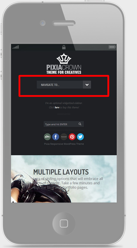
Test it: Pixia Theme
-
-
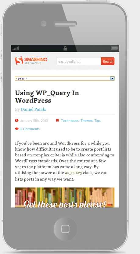
Test it: www.smashingmagazine.com
-
4) Menu Icon
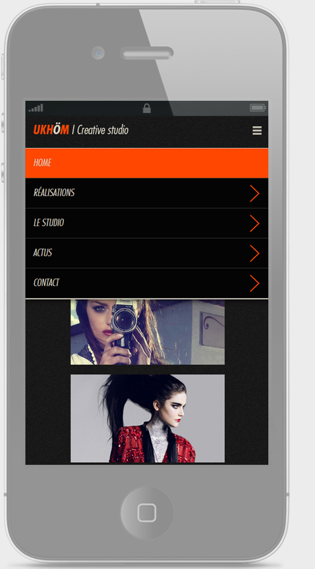
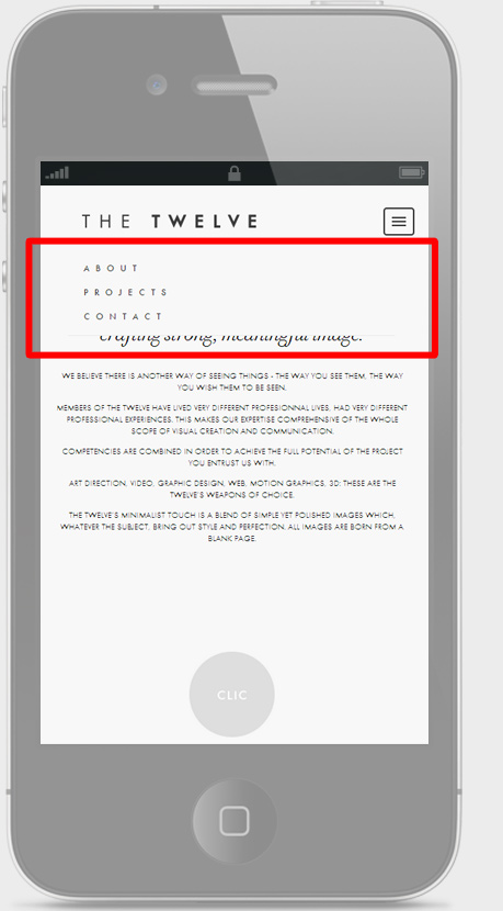
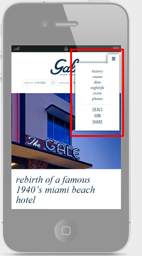
Having a menu icon can be an excellent solution that takes up little space and allows you to apply site styles with complete control.
-
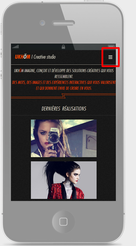
Try it reducing the browser window from ukhom.com
-
For example: The Twelve or Gale Hotel
-
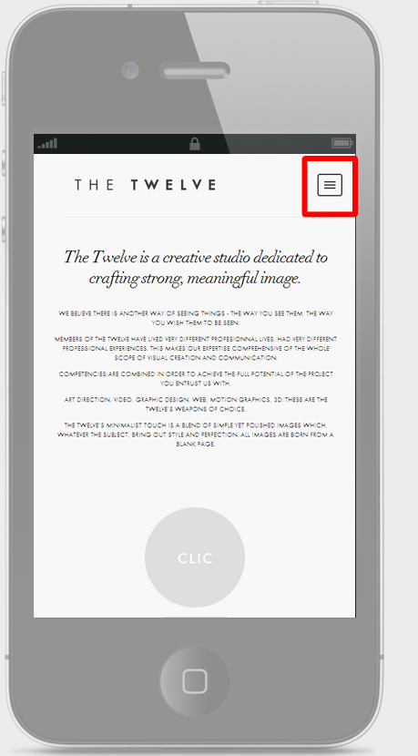
Test it: www.todaythe12.com
-
-
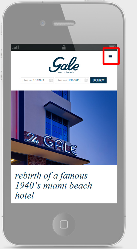
Test it: galehotel.com
-
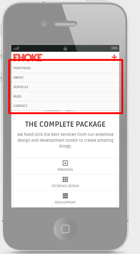
5) Combined solutions
Having a menu icon can be an excellent solution that takes up little space and can apply styles site with complete control.

-
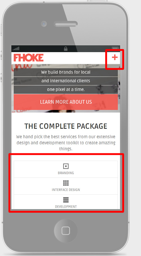
Test it: www.fhoke.com
-
-
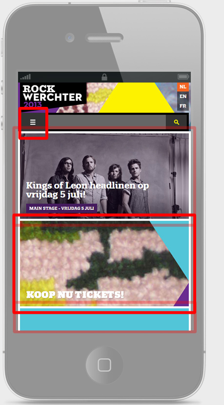
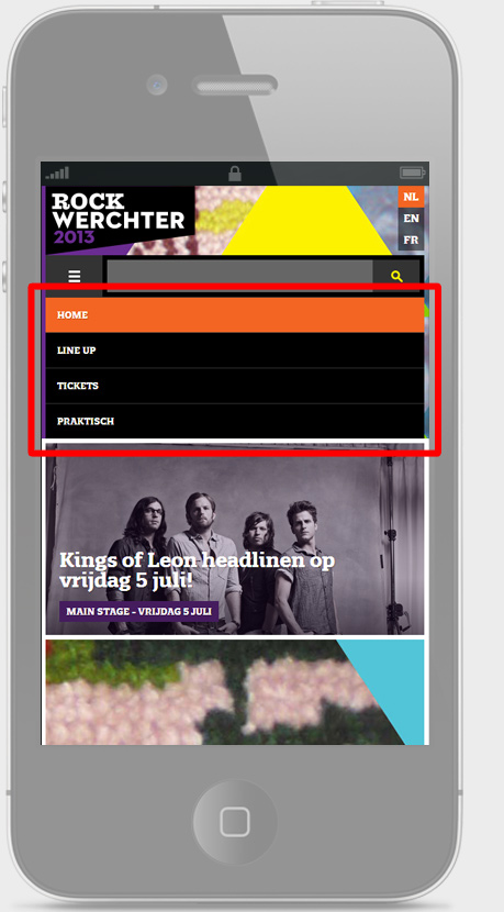
Test it: www.rockwerchter.be
-
