Nov 9, 2021
Sea Shepherd - No Fishing Net by Makemepulse wins Site of the Month January 2021
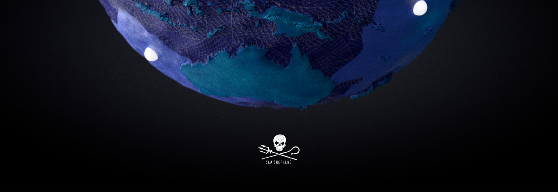
No-fishing.net is a campaign created for Sea Shepherd to draw attention to the irreversible damage of fishing nets within oceans. An experiential site bringing this important narrative to life and allowing users to educate themselves and donate to the work of Sea Shepherd.
Context & story
We built an interactive website that shows you the fleet of boats and vessels Sea Shepherd have actively working. The website is part of a wider campaign that includes a social film and online activation.
To bring this narrative to life digitally, we invite users to virtually fly over the oceans and explore any chosen vessel to find out more about its work and history. We showed real-time information about the plight of the ocean through pop up statistics.
Creating a mechanic to visualise the impact of a donation was really important. Each donation is visualised by showing the number of nets that it will help remove from the ocean.
Production Kickoff
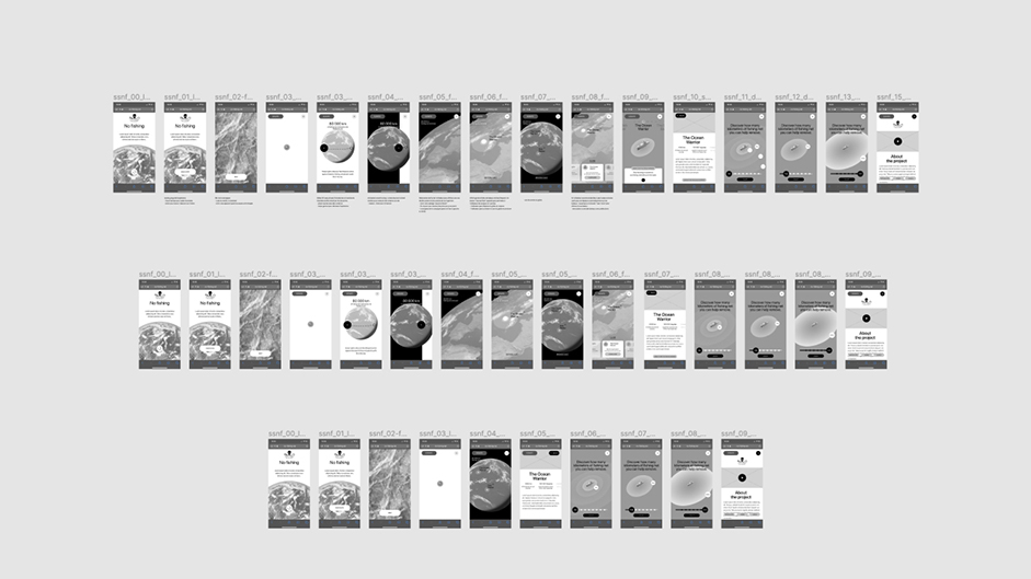
No Fishing is a pro bono project that our team agreed to work on during office hours and beyond. We created a small team to optimize the cost of the production and work efficiently. We started by narrowing down the concept into 3 versions: a gold one, a silver one and a bronze one.
Costing & timeline
This process allowed us to evaluate the different features and have a better understanding of the key elements necessary to tell a consistent storyline. We compared each version to see what fit best in our timeline. We settled on the bronze version. Well… That’s what we told ourselves but we still tried to implement details there and there to make the experience even more appealing.
Globe
At that point, we knew we needed to create a 3D globe in order to let users discover Sea Shepherd fleet and visualize the impact of fishing in the seas. Louis Ansa, designer on this project, started doing moodboards and did some sketches to talk with William Mapan and Arnaud Pinot, the two lead developers.
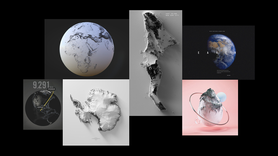
We quickly moved into the 3D design to define the global art direction. This 3D phase had a lot of back and forth before finding the right style. Trying to get a realistic style was out of question because of the schedule, we needed to find a less time consuming approach that would still fit the overall tone of the theme.
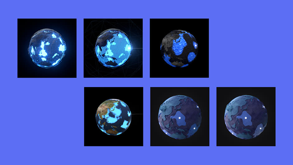
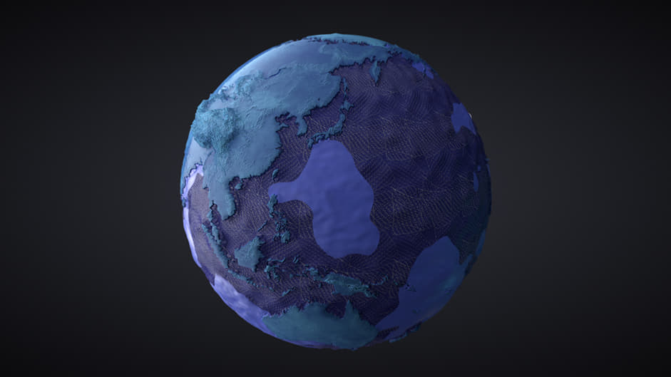
Louis came up with the concept of showcasing the polluted oceans and seas with fishing nets covering up all the water parts on the globe. In doing so, we could then reveal some areas of clear water to illustrate the action of Sea Shepherd ships around the globe.
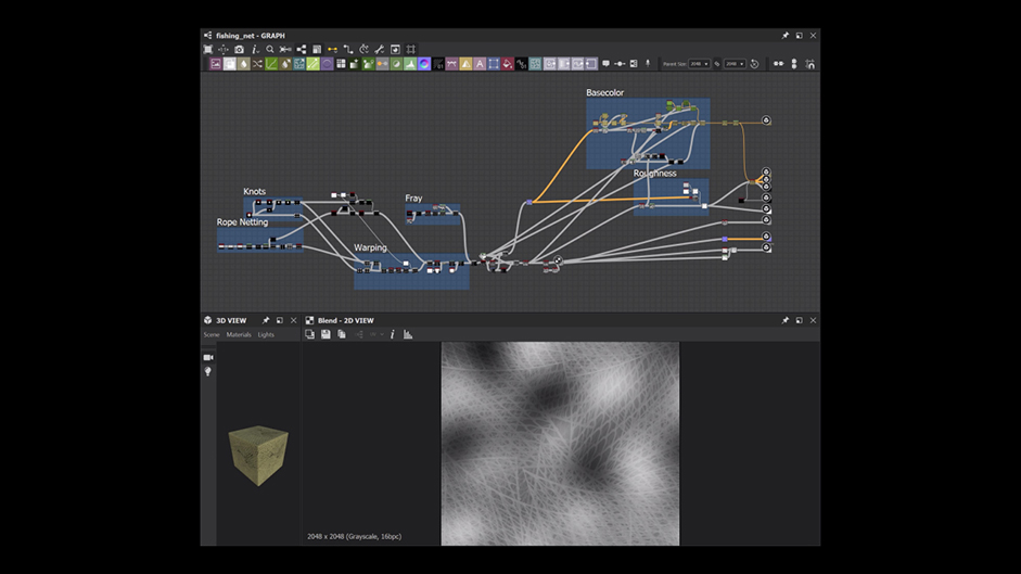
In order to tile the fishing net texture, we “noodled” our way in Substance Designer. It was a tenuous process as we don’t master this software at all! Thankfully, we managed to get a result we liked while keeping the file size very small.
We also used Blender node system to simulate the clean areas in the water. Using a slider, we could visualise a work in progress render of the globe.
Blender scene’s nodes
Design
Now that the 3D development had enough material to start, we focused on the website design in Figma. We found an amazing typeface, Monarch by Wisetype foundry that looked like it was designed to fit our purpose! Some letters look like fishing hooks! The overall style is sharp and elegant.
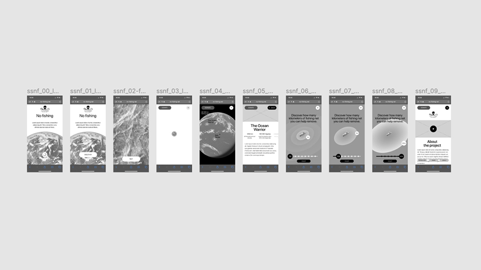
Following this step, we designed the different layouts on both mobile and desktop at the same time. In doing so, we made sure to be consistent between the 2 versions. The interface features a clean and straightforward design while using the 3D space to place elements such as draggable cursors, hotspots and ships names.
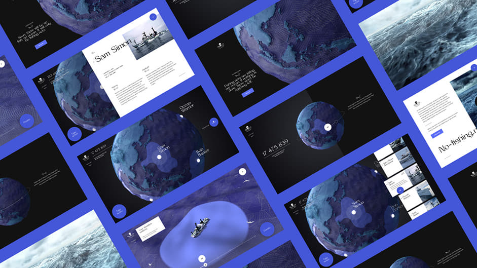
As the design phase was in a good shape, we worked on an animated UI kit in parallel. In doing so, we were able to leverage the power of the product design workflow and optimize the workflow between design and development. We didn’t animate every element on the website, instead we selected the “key interactions” and focused on those to distribute the effort in a smart and efficient way.

Experience
Right after the loading screen, the introduction film features Paul Walker’s voice (Founder of Sea Shepherd) talking about the effects of fishing on the planet. As the film ends, key information appears with the 3D globe and a circular module invites users to swipe/drag to discover more.
Drag interaction
The main view shows the globe and SS’s fleet. Users can zoom in and out, spin the globe and rollover on each of the ships. We also added a secondary navigation to let users browse the different ships. Each of those has its own page, giving information about the ship, its age, and it’s iconic campaign.
Browse fleet
The next big challenge was to break the donation aspect down. We wanted to use the power of story and emotion to help users visualise the literal action of their donation. The donation view shows a SS ship on the sea along with a donation slider. As users start to slide the cursor, the amount of donation changes as well as the 3D view above it. The ship is surrounded by a cleaned sea circle, illustrating the action of SS thanks to the user's donation. When the cursor moves, the circle reacts and grows. This type of mechanism allows the user to project her/himself into what donating is actually doing: Help cleaning the oceans.
Donation slider
We’ve put a lot of love into the donation view to make it as immersive as possible. We started by adding some seagulls into the scenes.
Our lovely birds
We then added some vfx under the ship to add some details and help users understand that it’s sailing forward.
Our lovely birds
We also added a pirate flag because… it’s pretty badass!
Pirate flag
And finally, we were pretty damn happy with the result! At that point, we were very excited to implement all those details in the project. Unfortunately, timeline issues forced us to cut down some animations and we had to choose what was more important. We are still satisfied with the result in the end!
The ship with all the details
Wrap up
We are very grateful for this Site Of The Month awards as we strongly believe that this type of projects are what makes the web exciting. Passion projects like this one and the previous one we did, Nomadic Tribe demonstrate that the web industry is not always about advertising. It was an honor to work for Sea Shepherd and we want to thank Brandstation, the Agency we partnered with, and of course the Sea Shepherd team. Cheers!
About Us
Makemepulse is a global interactive production studio. We turn aesthetics into experiences. Light-as-air tech with purpose.
- Nicolas Rajabaly - CCO
- Louis Ansa - CD & Design
- William Mapan - Development
- Arnaud Pinot - Development
- Mathias Roumy - Producing
- Fabien Motte - 3D
- Anthony Meric - 3D & Motion design
- Pierre Lepers - Development
- Marius Ballot - Development
