Mazda USA
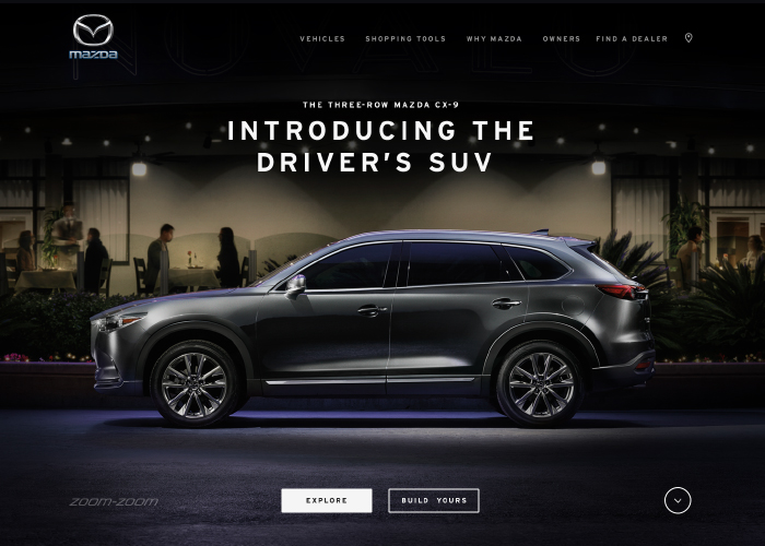
Mazda's goals were to improve the overall user experience and vehicle shopping experience. Vehicle shopping is unlike most other industries when it comes to online experiences. The site focuses on understanding this unique customer journey, supporting the changing needs along the way, and removing any distractions. Finding the blend of shopping tools and story telling allows the site to support the needs of the pragmatic shopper while creating lasting bonds with the brand. Additionally, Mazda is in the process of redefining their brand. Mirum worked with them to identify core principles to guide us along this journey: "Premium, Real and Ownable". The goal of Mazda’s UI was to simplify the design in order to let the car images become the hero of the site. With our core design principles in mind, every element across the site was made to match these guides. We wanted the design of the site to be so intuitive it was invisible to the average user. The result was an elegant, premium shopping experience with a brand emotion that is unique to Mazda.
This website has been created using...
Votes (15/51)
Design
Usability
Creativity
Content
Overall
-
55555.00
-
88888.00
-
78787.40
-
76676.50
-
78787.40
-
77777.00
-
65665.70
-
77777.00
-
77777.00
-
66655.90
-
77777.00
-
77666.70
-
88888.00
-
77777.00
-
77777.00


