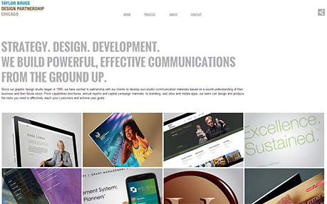
Tarlorbruce Design Partnership
The “Taylor Bruce Design Partnership” site is a device agnostic, responsive design that is uncluttered and showcased client work. This is accomplished this by the use images arranged in a responsive tiled layout, each representing a client project. CSS3 transitions along with JavaScript was used throughout the site and used to ease each project tile into view as the page is first presented. Page resizing causes the project tiles to reposition using the popular masonry layout animation. The image size and image aspect ratio was an important design element that allowed the main slideshow portfolio of each project to be visible “above the fold” yet still allowed each thumbnail image to completely fill the screen of smaller mobile devices. A Joomla extension (SobiPro) allowed each project to be categorized and presented by category, allowed for the automatic generation of “related projects” links, and additionally allowed each to be assigned to multiple categories. SobiPro also facilitated the By Client view, allowing dynamic assembly and presentation of the entire list of projects for a given client. This site went live in February 1st, 2013.
This website was built with...
Votes (15/53)
Design
Usability
Creativity
Content
Overall
-
75566.10
-
76566.25
-
65655.75
-
56565.25
-
56555.15
-
56565.25
-
86777.35
-
66666.00
-
66666.00
-
55555.00
-
55555.00
-
54454.60
-
66666.00
-
77777.00
-
55555.00


