Mar 18, 2026
The Art of Getting Noticed: Product Design and Development for an Artist Social Network Startup
A case study on how we helped a startup develop a professional platform and attract attention to it. A promotional website and SaaS platform for artists and curators. From strategy and visual communication to development and launch.
“Attention is rare. In a world where there is an endless amount of content, the opportunity to be noticed is worth its weight in gold.”
For artists, this is not a metaphor. It's what they wake up to every day: you put love, time, and meaning into your work, and it drowns in endless streams of content and machine algorithms. Not because it's weak, but because that's how the system works.
When Follow.art approached us with the idea of creating a social platform for artists, we immediately recognized the scale of the project. Not only in terms of technical execution, but also in terms of the opportunity to help creative people realize their potential.
The problem
In the art world, connections are everything. But for most artists and curators, these connections are complicated by galleries, institutions, and social media algorithms. It is not the authors themselves who decide who will be noticed and who will not.
Follow.art was created by people in the art world who were tired of a system where visibility depends on algorithms rather than talent. Social networks are geared toward the reach and engagement of entertainment content, not professional contexts. Other industry platforms start out as spaces for creative people, but as they grow, they inevitably become mainstream — and end up reproducing the very thing they promised to eliminate.
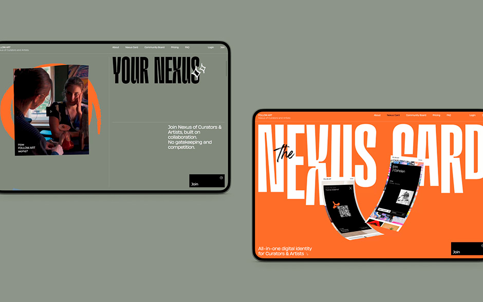
The Follow.art team wanted something different — a place where professionals could find each other without outside control or rules. Not competition, but community — that's the philosophy behind the project.
Strategy and positioning
The client came to us with a ready-made idea — to create a social network for the art community. Our task, as a design agency for startups, was to turn their vision into a working product: strategy, brand, design, and platform. We started with immersion — a series of sessions with the team that helped us understand the audience, the competitive field, and the uniqueness of the offer. All of this formed the basis — from the structure of the product to the tone of communication.
The client wanted to implement many things at once. We helped them set priorities: to form a minimum set of features for a quick launch in order to get real users as early as possible and rely on their feedback rather than hypotheses.
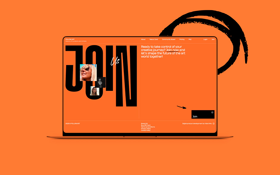
A phased approach to development became one of the key strategic decisions for the project. The first step was a promotional website that served as a landing page for collecting early access applications — even before the full platform launched. This allowed us to gauge people's interest and build a base of early users.
The voice of the project
The Follow.art team already had a strong understanding of its audience and a clear voice — rebellious, direct, informal. Each message is aimed at a specific need: to be seen, to find like-minded people, to step out of the shadows. Without pretension or corporate politeness — an honest conversation with people who are tired of the system.
Our task was to help organize storytelling and develop brand identity. To find a visual expression for this voice — a style that not only illustrates words, but amplifies them. So that the audience doesn't just read, but feels.
Visual language
A departure from clichés
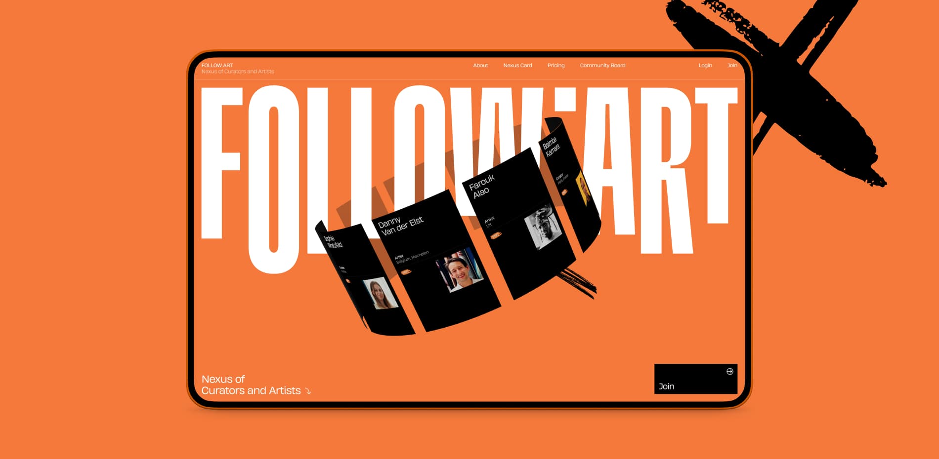
The visuals had to be read as “the world of art,” but not repeat its clichés. We consciously moved away from gallery minimalism — white walls, quiet fonts, muted tones. Follow.art has a different energy: loud kinetic typography, dense color, and visual boldness. This is not just another “neat” art platform. It is a statement. A performance.
The rebellious spirit is embedded in the details: the dot is not at the bottom, but at the top — a deliberate violation of the rules. Stretched letters are a faux pas in typography, but why do we need other people's rules in a project steeped in freedom? The icons and decorative elements are slightly reminiscent of street graffiti — where creativity does not ask for permission. Even the product screenshots are not flat but curved—an unconventional technique that serves as another reference to this character.
At the same time, as we moved from the first concept to the final one, we consciously sacrificed some typographic expression in favor of text readability. The balance between boldness and convenience is one of the key decisions in the project.
Searching for direction
In the early stages, we tested a concept that contrasted classic and modern. We looked for famous paintings with a double composition — two main characters — as a metaphor for the connection between curators and artists. Michelangelo's “The Creation of Adam,” works by Magritte, Brezhnev, and Honecker's kiss on the Berlin Wall. Each image was reinterpreted in a modern way — deliberately provocative, with a touch of street art.
The concept solved two problems at once: it attracted attention and visually conveyed the platform's main ideaof the platform — connecting people. The client initially liked the concept, but after validation, they decided that it looked too provocative. The concept did not make it to the final stage, but it played an important role — it helped to find the necessary degree of freedom in the visual language. And much of it was incorporated into the final design: the dynamics of the letters, colors, fonts, and overall feel.
3D and animation
The site is supplemented with 3D effects that help immerse the viewer — they help them feel the project's ideas rather than just read about them. At the same time, the technological side is not an end in itself: each effect adds uniqueness and depth to the project, reinforcing what is inherent in the visual language.
The central element of the main screen is the artists' profile cards, implemented using WebGL. Their rotation creates a feeling of a living community, rather than just a catalog of profiles.
WebGL is used actively, even where it is not obvious. Screenshots of the interface are curved in 3D, which adds volume and a sense of a living product rather than static images. Brush strokes instead of hover effects, blocks like album pages rather than ordinary sections — every detail works towards a single idea. All together, it creates an energy that doesn't just let you read — it draws you in, makes you feel and want to be a part of it.
Platform
The promo site serves as a bright and emotional entry point, but Follow.art's main product is a full-fledged social network for the art community.
We provided a full cycle of product design and development — and acted not only as designers and developers, but also helped shape the product itself. We started with user needs: CJM, scenarios, the Jobs to Be Done framework — all of this helped us understand what artists and curators need at every step. Next came interface hypotheses, interactive prototypes, and UX tests. From a multitude of options, we chose the most effective solutions and infused them with that rebellious style — so that the platform would be not only convenient, but also recognizable. The functionality is unique — we didn't copy existing social networks, but designed everything from scratch.
The platform brought together the most important features for artists: a digital business card, a portfolio, a professional catalog, a blog, and a forum. The client deliberately gave each element of the platform a unique name — not “artist list” but Connectory, not “profile card” but Nexus Card. This is branding for things that usually remain nameless.
Development was iterative: first, basic registration and cards, then a catalog, then a forum, then paid features — each stage expanded the platform's capabilities based on real user feedback.
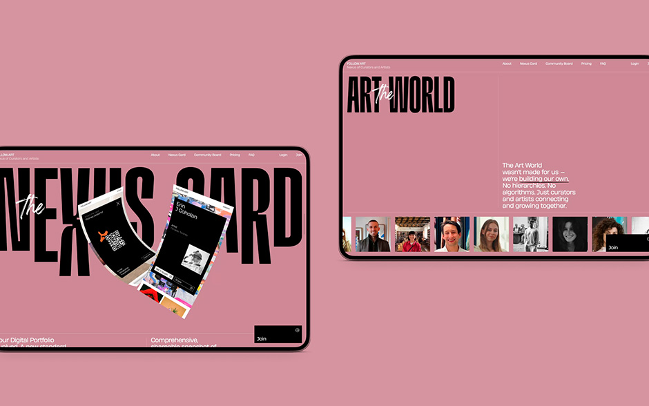
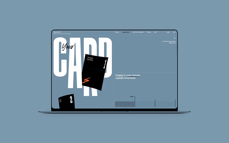
Nexus Card
The core of the platform — Nexus Card — is a digital business card, portfolio, and profile all in one. It takes minutes to create, is easy to send, and works in wallet applications. At the same time, it doesn't look like a utilitarian card, but like something you want to share. The artist's work is in the foreground. Professional information is presented in a compact form, without unnecessary visual noise.
Each artist can style their card — upload a background, customize it to their liking. As a result, the cards turn out to be lively and unique. Even without customization, Nexus Card looks stylish — but when authors invest in the design, the card becomes a full-fledged reflection of their practice.
A separate feature is the QR code for donations. The artist generates it from their Nexus Card, prints it in a stylized template, and places it next to their work at the exhibition. Visitors stop at the work that caught their eye and can express their admiration not just with silent admiration, but with action. The artist receives feedback in real time — and in real money.
The Connectory
Through the Nexus Card, the user enters The Connectory — a catalog of artists and curators with search and filter options. The task is simple: find the right person and write to them directly.
The filters are designed to make searching convenient — based on parameters that are truly important to professionals, not algorithms.
Artworks
A separate section of the platform where you can view the works of all artists in a row — without being tied to a specific profile. This allows curators and colleagues to find interesting works based on content, not the author's name.
Community Board
Community Board is a forum for Connectory users. Posts, comments, and a separate “Let's Collaborate” format are easy ways to find a project partner.
Insights
Project blog. The Follow.art team publishes updates and articles here about why an open art community is important.
Paid features
The platform offers advanced subscription features: profile statistics — how many people visited, how many times you were found in search, card promotion, and the ability to accept donations. Monetization is designed so that basic functionality remains available to everyone, while paid features help those who want to grow faster.
Mobile version
The mobile version of the platform fully replicates the functionality of the desktop version — and this was a priority from the very beginning of development. The platform should be easy to use on the go: viewing cards, searching for people, and communicating. Integration with Apple Wallet and Google Wallet was one of the key ideas at the start — the ability to add your business card to your phone and always have it at hand.
About Vide Infra
Beauty is perceived as truth. If something looks flawless, it is trusted. Vide Infra is a design agency for startups and ambitious businesses. Since 1998, we have been helping companies build digital strategies and implement them through flawless communication, product, and UX/UI design and innovative technological development.