50 years ago, Douglas Engelbart invented the mouse. An everyday object that we still use and love. The truth is, even though new interfaces are appearing, pointing devices are not going to vanish anytime soon.
I bet you can’t name a person who has never seen a mouse, or doesn’t know how to use it. Don’t try to say “my grandma”, there was a time where she couldn’t even turn the computer on, but to at least my dismay, she is now on Facebook.
What does the mouse have to do with hidden UIs? Well, nothing, but this is in-line with the point. How you use a mouse is not exactly obvious. Somebody had to teach you what each button can do, what a context menu is, how the pointer moves when you slide it across a surface.
And this is the main difference from this peripheral and the ones that have been appearing lately, new peripherals are trying to create ubiquitous and natural UIs.
Ubiquitous UI

A thing is ubiquitous when it’s present everywhere - for example, the way you check your e-mail or talk to your friends using WhatsApp: you can be at work, home or having lunch. The context is irrelevant, you have a device that enables your goals. May it be a workstation, laptop or phone.
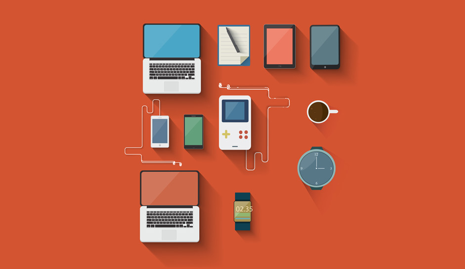
Phones play an important role in ubiquity but new device segments are trying to fill gaps that phones can’t, after all, they are huge glass bricks inside your pockets. Last year a whole new wave of wearables was released: watches, wristbands and a couple HMDs.
Thanks to high-speed mobile technology, the on-the-go internet is much faster and accessible, making possible the interconnection of a myriad of devices, including lights bulb and fridges. Arduino, LilyPad and a huge array of shields have made prototyping much faster, speeding up hardware development.
Natural UI

When you reach your phone or watch to open an App you’re still aware of the devices around you. You’ll be pressing a button and finding the correct icon by touching the screen. It is not much of a hassle since theses steps are already infused in our minds, which is good, but far from optimal.
Things can get pretty magical when using real world paradigms; talking, moving and holding. I have since stopped opening the clock app after Siri came to life, and it’s awesome to ask her to play my favorite song while driving.
This is the beauty of natural UIs, hiding themselves behind natural paradigms we have known since a young age. Of course there still exists a learning curve for the user, but the goal of Natural UI is to turn users from novice to expert by affording already learned behaviors.
You don’t need to be a gamer to play “Just Dance”, there are no triggers or buttons to be pressed, dance!. The same occurs with ‘Ok Google’, asking a question makes sense, it’s transparent.
Development
Rooted in webcam based experiences, and moving on to Kinect and Leap Motion, we’ve gone a long way but we still have further to go. A group at MIT that is trying exciting new things. Open this link, you won’t regret it.
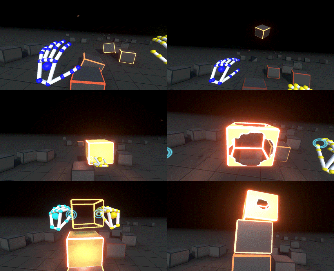
VR devices play an important role in the evolution of natural UI. Moving in space and grabbing objects is a game changer. It is hard to understand the feeling until you have tried it. Have a look at Job Simulator and definitely try it if possible, the experience illustrates really well what I’m trying to explain.
New technology can feel strange, especially when they are cutting edge, but it’s up to us to find the place where it can shine. As designers, our job is to find solutions, and in some cases - solutions to problems we never knew existed.
Usage

It’s common to get excited about new technologies but if you don’t differentiate content consumption from playful experiences you’ll end up being gimmick, not natural.
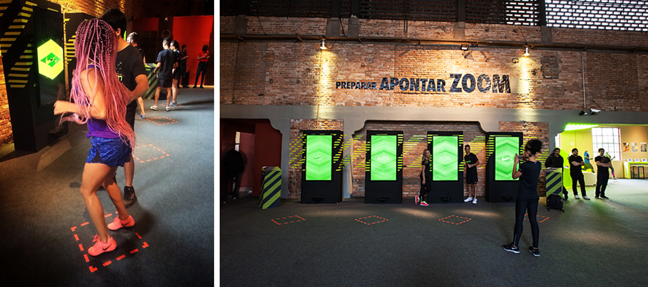
The key for me, is to find meaning, i.e: Most of the time you don’t need speech recognition to fill a form, and you may not need gestures to navigate UI while sitting in front of a computer, but it makes sense if you’re building OOH, where people usually just pass by.
Of course there are exceptions to any rule. Our industry is always trying to push the web further. Trying and experimenting is valid and welcome, even if your goal is to showcase a piece of technology.
Things change all the time and new target audiences are already embracing digital languages. The ‘natural’ concept may change to follow new generations and probably our current paradigms will become outdated, this is already happening and is the reason why skeuomorphism already lives on the past.
Let’s keep pushing.
