In 10 short years, the web has evolved from a collection of barebones informational sites, to a vast world of interactive experiences, immense social networks, complex data visualizations, applications and utilities. It has become a huge part of our lives, and as such we have shaped it to fit our ever evolving needs. This article will explore the emergence of the scrolling site: what it is and how it came to be one of the most popular and effective ways of presenting content on the web.
The early days
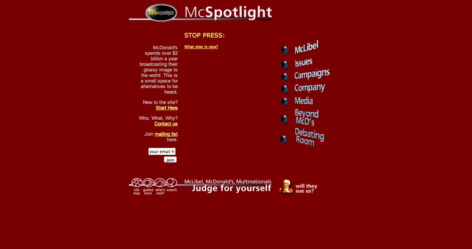
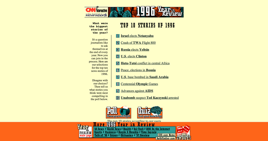
The early web landscape was a barren place: Sites were static, simple and mostly informational. Some remnants of this early and dark past are still alive today:
These sites serve as a reminder of what the web used to be: a collection of pages consisting mostly of text, strung together with hyperlinks.
With time, faster internet connections and more powerful computers became accessible; New technologies emerged; Flash allowed designers and developers to create sites with interactive and aesthetic complexities that could never have been fathomed before. Animations, sound effects, video… Flash websites started looking and behaving like video games and as such, the flash site was primarily a fullscreen experience. Content was positioned around the screen, and hierarchy was determined by scale and motion.

Jim Carrey’s personal site is much like his acting style: over the top
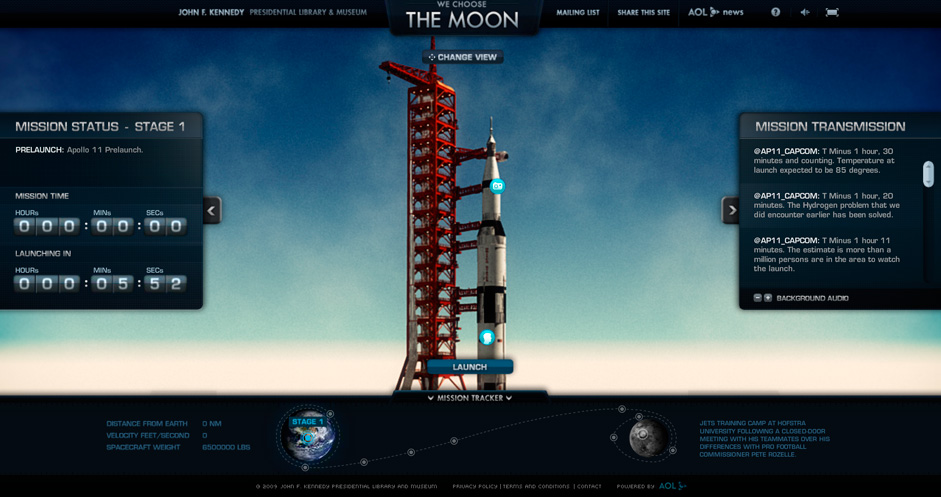
An example of flash used to create a highly interactive and engaging experience
The emergence of the scrolling site
Before we go any further, lets take a second to define the difference between fullscreen and scrolling sites. The fullscreen site is designed to display all content above the "fold." The fold, in the world of web design, is the bottom of the screen. In a way, this layout is similar to that of traditional print - like a book or a magazine, the content is laid out in a fixed area - and transitions of some sort are needed to navigate the content of the site ( like page turns ). With the scrolling site however, content is no longer constrained to the height of the screen, instead it overflows vertically and most be scrolled.

The fullscreen site is designed to display all content above the "fold"

With the scrolling site, content overflows vertically
The dynamic web
The early web was primarily static - content on a site would rarely change, and if it did it would be curated change : either by the owner of the site or the webmaster. Web 2.0 is described as the collaborative web. Blogging platforms, Social networks, Online newspapers… these are dynamic sites in which user generated content is king. Flash sites are great at providing a cool animated interactive experience - but they struggle at handling dynamic content, which is much easier to stack vertically than to cram into a fullscreen experience. As such they are almost exclusively scrolling sites.
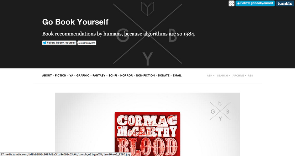
Tumblr is a prime example of the use of scrolling to display dynamic user generated content

Online Newspapers use the scrolling format to accommodate articles of variable lengths
The smartphone
The smartphone ( and the iPhone in particular ) permanently changed the way we interacted with the internet. For the first time people had access to the web everywhere they went: waiting for the bus, walking down the street, sitting on the toilet… The touch screen of an iPhone is a marvel of technology, but it doesn’t play well with fullscreen experiences. Unless you have the dainty fingers of a young child, it can be incredibly frustrating to navigate a complex fullscreen experience. This, combined with the natural gesture of the vertical swipe on a touch screen, made scrolling sites a great solution for displaying content on mobile devices.

Scrolling sites, with vertically stacked content, play well on mobile devices
Browser sizes
Up until not that long ago, most browsers fell into a rather narrow array of sizes. You could design a site for a 800x600 monitor, and be relatively sure it would look the same across most PCs. In todays eco-system however, this is no longer the case : The range of browser sizes has exploded : from the very small to the obscenely wide. As any web developer will tell you, it’s all well and good to code a pixel perfect fullscreen site given a fixed browser size, but as soon as that browser width and height start moving around, it can quickly become a nightmare to make sure content look good across the board. The scrolling site, by stacking content vertically and allowing the site to have a variable height, largely eliminates this problem.

Scrolling sites are easily made responsive across various browser sizes.
A final note on fullscreen sites
The fullscreen site is far from dead. Every day incredible fullscreen sites emerge : beautiful photographic portfolios, rich canvas visualizations, immersive interactive video campaigns, cutting edge webGL experiences… These sites are technically and visually astounding and are pushing the boundaries of the possibilities of the web browser.

Clouds over cuba is an incredibly engaging and informative fullscreen experience
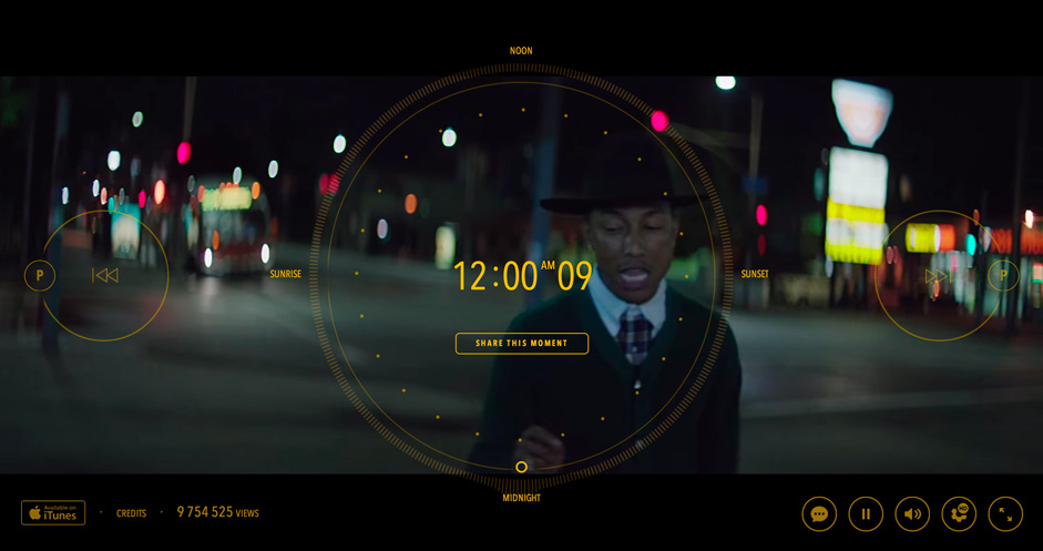
24 hours of happy is a fullscreen experience that pushed the boundaries of web technologies and interactive video
Nonetheless, the content of these sites is primarily static, often contains very little text, and is rarely optimized for mobile. And in these areas where the fullscreen site fails, the scrolling site excels.
The new scrolling site
If you observe the landscape of the web today you will notice that the scrolling site has become the new norm for dynamic and editorial content. And as we explored in depth above, it’s a format that makes sense. But more than that, a slew of new and improved web technologies have emerged in the last few years which have allowed scrolling sites to be not just functional, but also cool. Faster javascript compiling and more powerful and flexible CSS have allowed developers to exploit the structure of the scrolling site, and to inject new life into it, creating a sort of scrolling site on steroids.
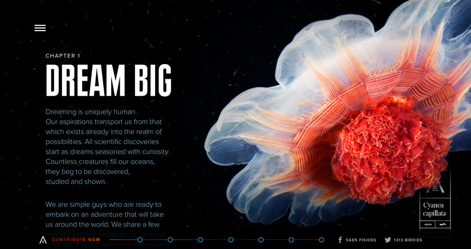
Aquatilis is a beautiful scrolling site that makes the most of modern web technologies
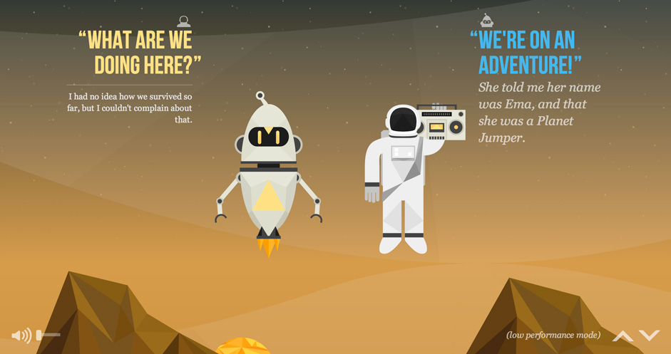
The nasa project is a highly interactive and engaging scrolling site, with lots fun animated SVG graphics
Making scrolling sites cool
One of the fundamentals of the modern scrolling sites is the ability to take advantage of the scroll event. One of the ways this can be used is to trigger various outcomes. This could be initializing an SVG animation, playing an embedded fullscreen video, or activating a CSS effect.
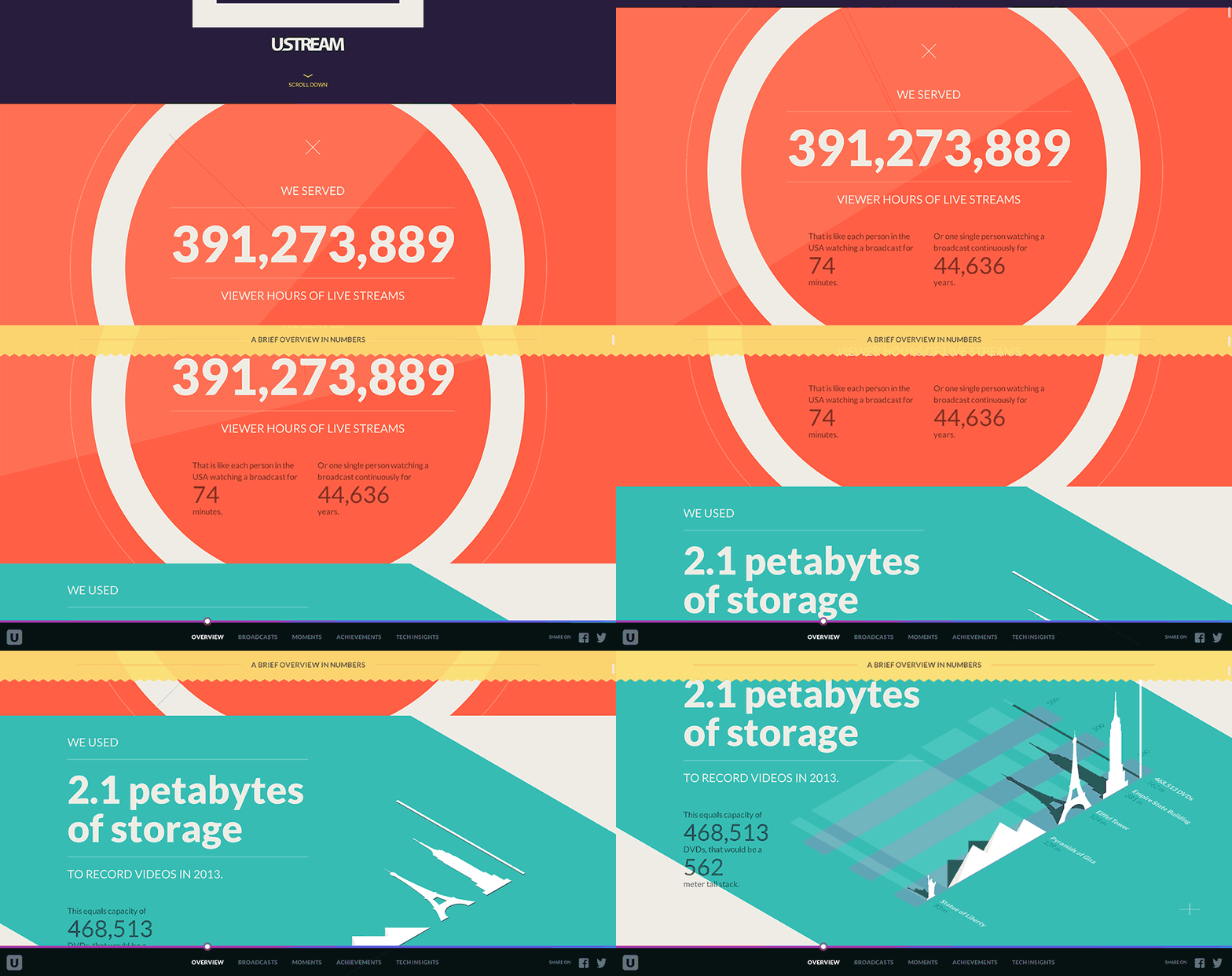
Ustream’s 2013 interactive review made great use of scroll triggered css animations
Parallax
Parallax occurs when an element on the page is directly and proportionally tied to the scroll movement. When different layers on a page are moved at different speeds, this nifty tricks creates a sense of depth that can be very effective.
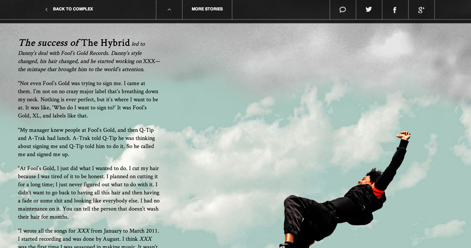
This scrolling interview with Danny Brown is chock full of cool parallax
Hybrids
Fullscreen sites are beautiful and immersive, but, as mentioned above, can be impractical at showing long form and dynamic content. In these cases a fullscreen/ scrolling hybrid site can be effective. We Are Visual Animals (WAVA) is a blog I created to showcase emerging visual creatives, and uses this hybrid format. The fullscreen experience allows the user to navigate the various artist interviews, but can open up into a scrolling view to explore the artist’s work in more detail.
WAVA changes between a fullscreen view and a scrolling view to explore artists in more detail
Scrolling Storytelling
Scrolling sites are great at telling stories because they allow an uninterrupted flow of content. But theres nothing more intimidating and discouraging than a long page of text. But combine that text with imagery, animations and interactivity and you can create a truly compelling experience.
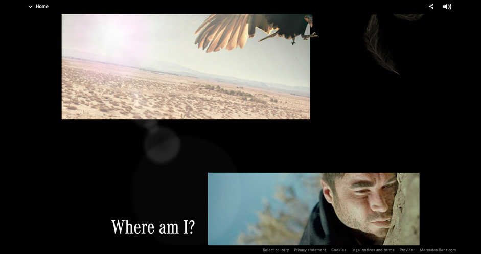
The forgotten roadtrip is a masterclass in interactive storytelling, making great use of the scrolling format
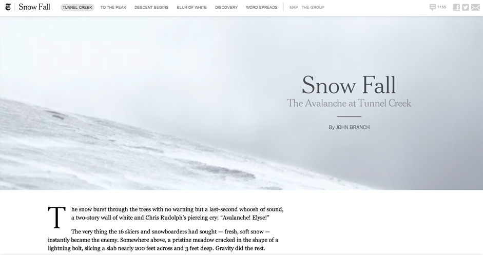
Snow Fall is a pulitzer winning interactive article published on the NYT, that revolutionized the way we think about interactive news publishing.
Conclusion
It took some time for scrolling sites to become the staple that they are today; But the widespread adoption of smartphones and the explosion of dynamic content on the web created a need for a new way to browse. And since we are visual animals, we quickly came up with ways of bringing this content to life in engaging and beautiful new ways.

