The final Site of the Month of 2018 was awarded to Resn for Twenty Øne Piløts. Thanks for all your votes and tweets, find the winner of the Pro Plan at the end of the article.
Twenty Øne Piløts released its latest album, Trench, accompanied by a convoluted lore about a homonymous fictional world. wherein nine ruling bishops keep its population suppressed in the dark and dystopian city, Dema. This generates a contrarian organisation called Banditø, which is determined to escape the bishops’ suppression and seek a place to create a life of their own.
The band teamed up with Spotify's in-house team and Resn to recreate this world and give the fans the possibility to experience the journey from Dema to Trench for themselves.
In this article we will take you through our process of creating the immersive Banditø experience, from concept to technical execution.
Only interested in the technical details? Scroll down to “Technical”.
The Concept
The experience’s main focus is the journey from Dema to the Trench. We wanted the user to enter an experience that fully embodies this odyssey — travelling through a world built out of moody environments, cryptic graphics and hidden messages.
Although the Banditø experience was preceded by three music videos — setting some of the scenes we needed to integrate — we created a rough storyboard to define the timeline and the mood of the five chapters we would build.
Each of the chapters connects to one of the five sections in the song’s structure, while a continuous transition from dark to light and from realistic to stylised creates a cohesive narrative. This transition symbolises the journey from conforming to being free.
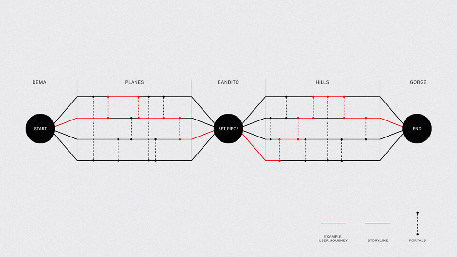
We have given the user control over the camera and created multiple paths to the destination. Each path is connected with the other and the user can move between them at certain moments in the journey. This allowed us to enrich the experience but it’s also a metaphor to the mental journey from anxious to liberated. Everyone’s process is different.
Environments
Relative to the chapters, we designed five environments. Each with their own look and feel based on their position on the timeline.
Dema
Upon landing in the experience the user is introduced to Dema — a dark dream sequence where the audience escapes the conformist city.
A succession of five scenes, from the top of the tower to the hidden tunnel, illustrates the user’s escape. Each of these settings was modelled after surroundings seen in the Nico and the Niners music video. Recreating the scenes from the music video was very important since the dedicated fanbase was already familiar with the environments they had seen there.
In the Banditø experience however, we completely desaturated the colors and applied some heavy fog and hard shadows to achieve the dark and cold feel we were looking for in the first chapter to conform to our timeline concept — dark to light.
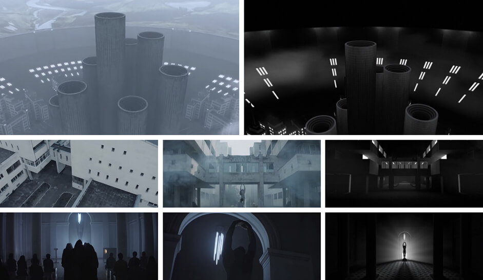
As an additional layer of content and interaction we blended in some short image sequences from the music videos. These “flashbacks” could be triggered by clicking or tapping the scene. We gave every scene its own specific set of images to match the environment.
Planes
Leaving Dema’s low lit tunnel overexposes the user’s “eyes”. Upon adjusting to the brighter daylight they finds themselves in a vast open landscape. Progressing in the scene, the user might get a feeling of anxiety in the endless space. Even more so when five shadows appear to be chasing them.
? “When in between two places, Where we used to bleed”

Within the scene, there are a series of “portals” that are connected to similar wide open landscapes. This creates a maze where the user feels lost. At the same time, since different paths can be chosen, this scene will give them a feeling of control.
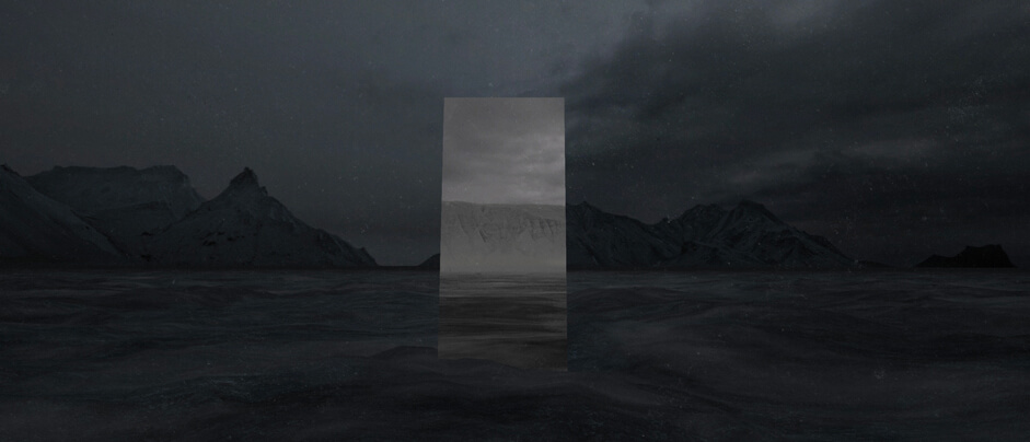
Similar to Dema, we added the “flashback” interaction in this scene. Again we curated the image sequences to match the environment.
Set piece
The shadows from the previous scene have now caught up with the user. Are they friend or foe? The camera slowly rotates revealing that the user is surrounded by shadowy figures. Gradually they reveal themselves as Banditøs.
Again, the scene includes recognisable objects. This time less obvious than before, but the users find themselves standing next the burning car seen in the Jumpsuit music video.

The set piece accompanies the song’s bridge. It’s the section that connects the dark and realistic settings to the light and stylised scenes. Like the bridge contrasts with the verse in the song, the set piece contrasts with the other scenes visuals. Hence the bright yellow background and duotone details.
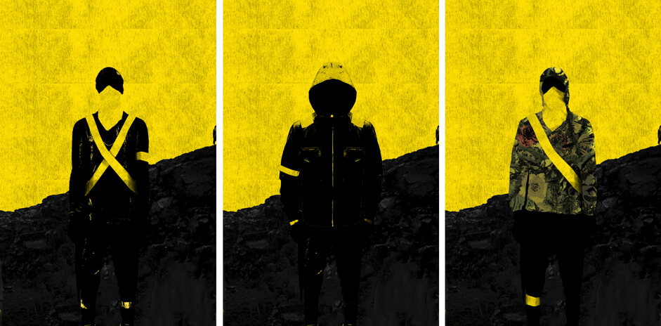
We gave the user the power to uncover the silhouettes by clicking on any of them. This would reveal the florals patterns on the uniforms and identify them as Banditøs.
Hills
After the set piece the experience continues in a more figurative and stylised world. The user enter a vast open landscape with hills and plateaus where the they can decide to create or destroy. Similar to the Planes chapter, the scene offers a series of “portals” that are connected to similar landscapes.
? “I created this world. To feel some control. Destroy it if I want”
Not only can the user choose his own path in this scene, they also control the landform by clicking anywhere to create or destroy hills.
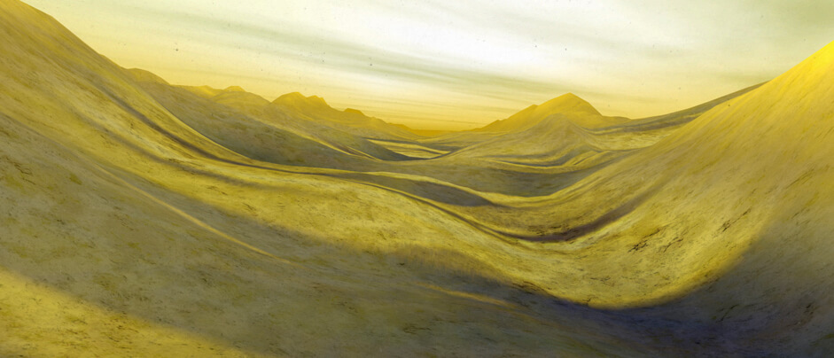
As the user progresses through these landscapes, they will start to notice that the world is morphing. As the song progresses in intensity, the deformations will increase until the climax.
Gorge
This is the last part of the journey. The user is progressing through a gorge, highly stylised to the Banditø colors and patterns. With a nod to the Levitate music video more and more Banditøs can be seen on each side of the gorge, above the user, throwing down yellow flower petals.

At the end of the gorge the user finds the Banditø camp. At this point full 360 degrees control of the camera is available, representing the free mind.

The user continues forward into an open ending of the story. Completely free to create their own.
Hidden Content
Lots of metaphors and cryptic graphics were incorporated into the experience. To satisfy the curiosity of TØP’s very dedicated fanbase we placed five hidden symbols throughout the experience. Since the release of the album the meanings of these five symbols have been a mystery to the fans.

Upon finding the symbols the user gathers “secret” documents that explain the meaning of each.
Technical
Now that you know why we made the experience as it is, let’s have a look at how we made it work.
Models
Since we were making a 3D experience and we wanted to match the settings from the band’s music videos, we had to recreate what we saw as 3D models. Keeping the vertex count low on these was by all means necessary. Since we knew the camera freedom was restricted (always looking forward) we didn’t have to build geometry for the backside of the models, and any other side that could not be seen during the experience. This saved quite a lot of vertices and thus increased overall performance.

To further optimise the rendering, we opted for unlit materials in the whole experience. This meant we had to bake lighting and shadows in all textures. Since many models shared the same albedo map, we exported shadow maps separately for every material. In these textures we used different channels for shadows and light sources — multiplying the albedo with the red channel and replacing it with full white based on the green channel of the shadows map.
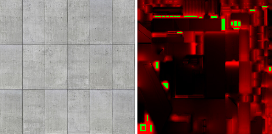


To speed up initial load time we decided to progressively lazy load scenes. At the same time this meant that we would have to upload textures to the GPU while the experience is playing. Because of the high CPU load of this process we noticed huge frame drops during initialisation of new scenes.
To get back to a smooth experience we converted all images to GPU-ready textures using the ktx file format. This format can be read by the GPU directly so no decompression by the CPU is needed, removing the frame drops completely.
Landscapes
To create the smoothly animated terrain in the Planes and the Hills we had to start from scratch to overcome some technical hurdles. We needed a terrain that:
- Could display a complex deformation
- Had a diverse texture that doesn’t look tiled
- Update at a fast rate without causing any frame drops
We ended up using a custom generated mesh that was deformed by a mix of displacement maps and was procedurally textured in the fragment shader. This mesh had a high poly count near the camera and transitioned to a low poly count in the distance as a Level of Detail implementation (LOD). We then exported this mesh to a GLTF file to avoid having to generate the mesh at runtime.
In the shader, we mixed multiple textures at different scales to create variety in the look. We applied the displacement texture to a plane in Cinema4D to render out a Global Illumination pass. In turn we multiplied that texture on top of our custom mesh to add high quality lighting that matched up perfectly with our deformation. Finally, to add to the atmosphere, we drew an extra layer of fog on top that was deformed over time.
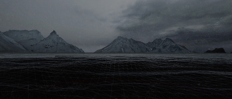
Now we still had to create the illusion of traveling through the landscapes. To prevent artefacts in the moving terrain, we avoided sliding the displacement map on top of the mesh. This would cause each vertex to animate up and down, accentuating the resolution of the mesh. Instead, we decided to animate the mesh’s position. This only meant that, after a little while, we would see the low-vertex geometry close to the camera and even run out of geometry. So we had to find a middle ground between these two approaches. We ended up animating the mesh to the second level of detail, then reset its position and update the displacement map accordingly to achieve a smooth, seamless and continuous motion.
Portals
The Planes and Hills scenes feature a series of “portals” through which the user can travel to different landscapes. In its essence a portal is simply a mask, and we knew that masking in GL can be done by using the stencil buffer.
Render order is particularly important when working with the stencil buffer. These are the render calls we made to achieve the effect:
- Render portal geometry to stencil buffer.
- Render portal landscape to frame buffer.
- Render main landscape.

We used Threejs layers to split the portal geometry from the landscape in order to render it separately to the the stencil buffer.
Finally we rendered the portal landscape texture from the frame buffer object to screen coordinates and onto the main landscape. At the moment the camera is at the position of the portal a “swap” is executed, switching the portal landscape to be the main landscape.
We tried a method wherein we additionally inverse-stencilled the main landscape to reduce load on the fragment shader, but this didn’t seem to boost performance since an extra draw call would be necessary.
Petals
We spent a lot of time creating a custom particle system that would fit our needs for the flower petal rain in the final scene of the experience. We wanted the system to support:
- Thousands of flower petals.
- A depth of field simulation.
- Spiral motion around the camera.
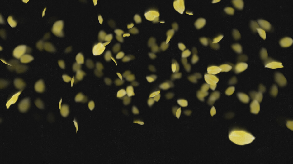
In order to fluidly render the amount of petals we needed we used Instanced Geometry for which we copied the mandatory attributes from a simple, custom made, petal model we imported from a gltf file. We generated additional attributes that would determine the position of each petal in 3D space. Based on the z-position we could sample the correct texture from the petal atlas that we made. This way we achieved the Depth of Field (DoF) simulation.
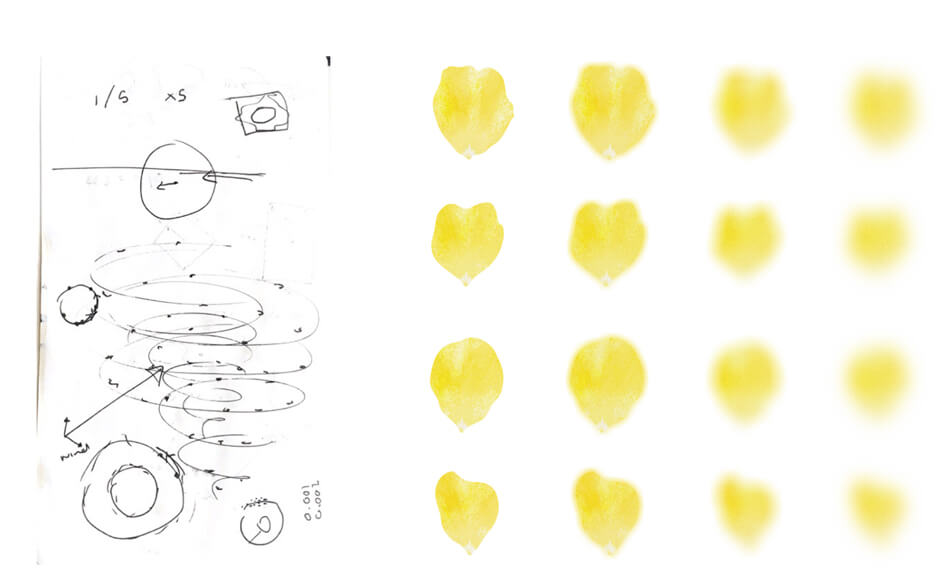
Since all petals now had a set z-position we could animate them in a radial motion around the camera while “falling” from the sky. Since each petal rotated around the centre with its own radius (its z-position), the distance to the camera was constant — keeping its DoF texture sample stable and precise. To keep the distances stable this also meant that we had to move the entire vortex to be centred around the camera at all times, but since it consists of only a single instanced geometry this was no big deal.
So that’s a behind the scenes look into the creation of Banditø — an immersive experience that generated over 450 thousand sessions on the first day. With an average duration of 05:19 minutes and 60 thousand sessions at peak hour we are very pleased with the results.
Thanks to Spotify's in-house team and Twenty Øne Piløts for this amazing collaboration.
View the experience on imabandi.to
The winner of the free Pro Plan in our Directory is @marcotdonkelaar, please DM us on Twitter and we'll set up your new Plan.
