
There are two unassailably important considerations when designing an effective web presence. Namely: UX and SEO.
While these two fields have the common goal of providing a service, the conventional wisdom says that they cater to two distinctly different crowds. UX designers keep end users in focus, while SEO professionals try to figure out what those elusive search algorithms are prioritizing this week.
Both are dynamic fields and each have seemingly divergent priorities. Often, they seem to be diametrically opposed. Whether or not that’s the truth, it’s an extremely common perception.
Your visitors have to be able to find you, and once you’re found, they need to be engaged and impressed. Both considerations are paramount to your website’s long term survival, and it can be difficult determining which one deserves to be prioritized. That’s because the two do occasionally work against one another.
When that happens, you’re left juggling both requirements in a one-step-forward, two-steps-back sort of tango. Keep up that dance and you’re bound to fall into obscurity and ineffectuality. This is pretty much the exact opposite of what you want.
How can you address these issues? What can be done to make peace between these two acronym-based opponents? It’s important to understand where the enmity begins. From there, you can tell where the negotiations break down and address some common goals as well as useful solutions.
Common Conflicts between SEO and UX
The problems between the SEO and UX camps usually begin with structure, and end with content. You have to design a site to meet certain needs, and you have to decide whose needs you’re concentrating on: either those of the user, or of the search-bot.The real dilemma is that search-bots are dumb. They don’t read the same way that human beings do, so content that’s optimized for search can look ugly to a sentient eye.
Google is constantly working on ways to make their algorithms more accurate and relevant to what users are searching for, but problematically, users often construct their search queries improperly as well. Google has even gone so far as to rewrite queries to produce more relevant results. That, however, is a mighty long digression with a lot of ethical drama that we don’t have time for today.
Instead, let’s focus on what SEOs are doing to grab the attention their clients so richly deserve.
SEOs are on a never ending mission to game the algorithms and find a content balance that acts as a billboard for search engines and users alike. However, they inevitably end up leaning towards the robots. And when you’re writing for robots, your copy sounds... well, robotic. Google is obviously working to improve in that regard, but they’re not there yet.
Still, they’re making progress. That’s why our first “conflict” is a bit outdated.
Keyword stuffing
This conflict has become a bit of a cliché, and at this point most SEO professionals know that it doesn’t help to cram keywords and keyword phrases into their content with no thought to the piece’s overall readability. Yet the mistake still regularly occurs.
To be clear, you shouldn’t be stuffing anywhere, including:
- The footer
- In a white background with white text (sneaky sneaky)
- In the metadata
- In the alt text
- In the CSS
Stuffing in extra keywords in any of the preceding can result in a negative hit on your overall SEO score. That’s right, Google has actually gone 180° on this one and learned to recognize overt keyword stuffing in order to punish spammy perpetrators. These days, keyword optimization is best achieved with concision. In other words, don’t “stuff,” rather “insert sparingly and carefully.”
The problem with stuffing is that it affects the quality of the content. You can keep keywords in the H1, 2, or 3 tags, and a couple of times in the text to tip the search engines off, but never at the cost of quality.
Awesome Vocabulary
In the effort to avoid keyword repetition, some SEOs aim to use fancy shmancy synonyms to pick up the slack. Unfortunately, this isn’t the best solution. It’s still repetitive, and it’s bound to make your user’s eyes bleed. Plus, using “high” English, as it were, can be off-putting to readers.
Now, that’s a heartbreaker for me. I love using uncommon language. Big words just hit my ear in a pleasing manner. Moreover, they feel deliciously appealing as they roll off my fingers onto the keyboard. Unfortunately, unconventional syntax doesn’t always best serve the audience.
I dream of a world where we can all claim an exceptionally high degree of literacy and academic prowess; however, my dream is—as yet—unrealized. Using unusual vocabulary can alienate readers and (just like in regular conversation) make you seem snooty rather than smart. If I had a nickel for every client that told me to simplify my text, I’d have a few bucks, at least. Yet my impulsive pomposity continues.
Thus, using your thesaurus to come up with clever synonyms for keywords might seem like a good idea to avoid repetition, but you have to keep the audience’s needs in focus. So while it might be sexy as hell to talk about “a surreptitious somnambulist,” you should probably just stick with “a sneaky sleepwalker.”
It’s important to note that you shouldn’t be taking this advice to extremes and making your content sound repetitive by avoiding synonymous language. Using the exact same keywords and phrases too often will result also in that negative SEO hit I mentioned earlier. It’s more about using simple language to add a degree of accessibility to your writing. Speak the common vernacular of your audience and make sure you’re clear enough to where non-native speakers can understand you as well.
One Page Websites and SEO
One page is all the rage. These sites provide an awesome UX by coagulating all of the relevant content a user is looking for in one big bloody glut. They’re extremely popular in terms of landing page usage, and they often have a lot of attractive aesthetic features, such as parallax scrolling and slick CSS transitions. They even have a bit of SEO architecture available to them.
Single page sites with long scrolling format can include multiple H1 tagged headings, which make for a few keyword opportunities on the same page, however, they still don’t pack quite the SEO oomph that a paginated site does. After all, you can’t exactly interlink on a single page, can you? Nor can you easily refresh content on a site with one page. You’re basically required to change one of your vital elements every so often.
By and large, you’re in a bit of trouble if your aim with one pagers is to attract search traffic. There are a few tricks to improving your SEO score on a one page site, but for now, you’d be best served to think carefully about how you want to use them.
UX and SEO aren’t combatants, they’re dance partners
It’s easy to see how SEO’s have adopted a combative attitude. For one thing, Google intermittently launches cutesy animal-named assaults on all of their hard work. Matt Cutts even takes time out of his busy schedule to chew out guest bloggers (the big meanie). This creates a very reactive environment for most SEOs to inhabit. The scenario frequently plays out like so:
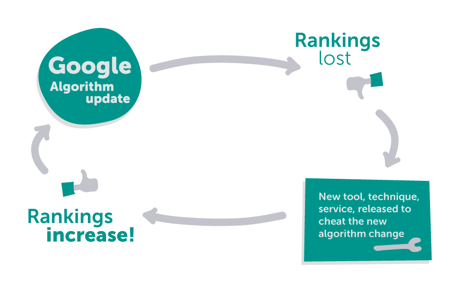 Based on the original image by hi_plains_drifter in Warrior Forum poster.
In light of this, it’s probably a good idea for the UX pros to extend the olive branch.
Good SEO meshes quite well with good UX. They have way more qualities in common than one might assume. Concise, legible, and informative copy—sprinkled lightly with high quality keywords—serves the purposes of both UX and SEO. Not only that, but properly structured sites are intuitive for search spiders and users alike.
Google wants to serve its users relevant content that provides positive UX. The SEO crowd wants to attract that Google traffic. I reckon there’s a complimentary relationship in there somewhere. Performant SEO practices should, and do, reflect a positive UX. The real problem occurs with outdated black hat SEO techniques that are still in use.
You’ve been misinformed about SEO and UX conflicts.
Many of the foundational methods of SEO simply aren’t viable any longer. Let’s examine a few common misconceptions.
Misconception: imagery always engages user attention
Truth: images don’t always improve usability. If they’re high quality (read: especially heavy) they also hurt page load times. That’s a hit to both SEO and UX.
Misconception: choice always trumps simplicity
Truth: it’s nice to have navigation options, but too many can result in indecision and overwhelm. Keep things simple for your users. Have a clear path envisioned for them throughout your site. That means easily recognizable tab titles and an easy to locate menu, with only the important destinations marked out. Reserve a multitude of options for moments when you’re serving extremely diverse veins of content.Misconception: content below the fold doesn’t count
Truth:while content above the fold still retains top visibility, efficacy, and priority; users definitely scroll down the page. The data is consistent on this one. Just like those 5 paragraph essays you used to write in high school (which is a terrible way to write, by the way), you start with your important info and delve into the supporting details of your idea as you go down page.
By far the biggest misconception about SEO and UX (and I admit to misleading you a bit with the title to this article. And you fell for it. Hah!) is that one is more important than the other. Both have their place, and neither has to be at odds.
Examples of UX and SEO harmonizing
All of the following benefit both Googlebots and users:
Sitemaps
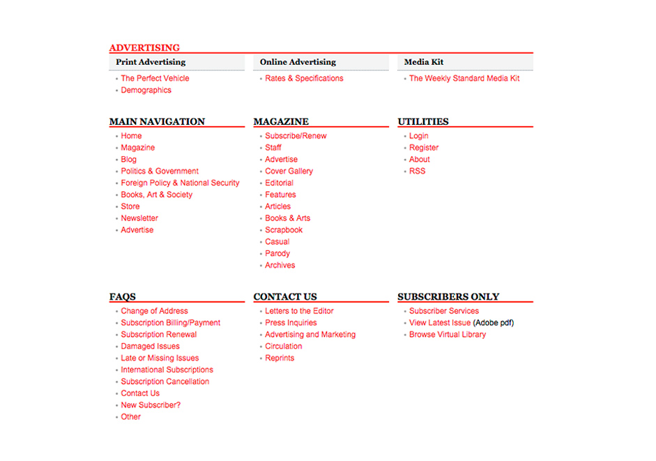
Sitemaps make your website easy to index, navigate, scan, and crawl for both users and search engines. Learn to build one yourself with Google’s tutorial.
Intuitive navigation patterns

Let your users know how to navigate through your site with prompts, dropdown menus, and other navigation cues. You don’t have to crowd your UI either, just take a look at the minimalist layout that web design firm, BigDrop Inc. has going on their homepage. It’s easy to figure out exactly where you want to go from anywhere on their site, and it’s accomplished inconspicuously.
High quality content

Mic.com is one of my favorite recent finds (and they’ve been around awhile, so I guess I’m late to the party) for the simple reason that the site is so well designed. They’re catering to their millennial market very well, apparently. Furthermore, they serve descriptive and interesting content that appeals to their audience. You know exactly what each heading is going to give you, and it’s a real pleasure to read once you’re into it.
Breadcrumbs

Breadcrumbs offer an easy and intuitive way for both search spiders and human users to track their progress through a site. They always know where they are and how they got there. There are many different types of breadcrumbs: path based, attribute based, and location based are among the most popular.
RWD (as usual)
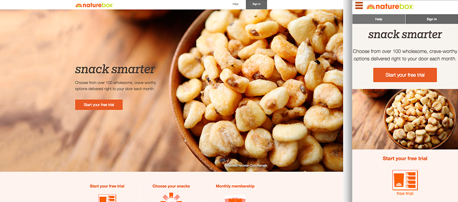
Responsive design is killing it lately. If you haven’t heard about it by now, I’m forced to wonder what you’re doing reading anything on a web design blog in the first place. Assuming that you haven’t been living under the proverbial rock, however, I’m sure you’re aware that responsive design is Google’s preferred method of serving web content across multiple viewports. Just recently, in fact, Google announced that implementing RWD on your site will result in an SEO boost. When implemented properly, it looks fantastic and can deliver a high degree of usability for mobile and desktop users alike.
Faster page load times
Google punishes slow load times and so do users. Ideally, for search purposes you want to be under 5 seconds. Over that time, your bounce rate starts increasing exponentially, as does the penalty on your search rank.
Page load times are constantly shifting, so if I posted one that was fast today, and it slowed down significantly when you read it tomorrow, I would look pretty silly. Here’s an infographic instead of an example site.
A match made in heaven
To sum it up, the two itinerant lovers, UX and SEO, were off to a rocky start. In true Shakespearian form, not unlike Beatrice and Signior Benedick, they’ve realized that they’re crazy about one another. Madly in love as they are, the happy couple gallops off into the sunset to serve both users and search engines their just content desserts. Happily ever after.
Then again, Shakespeare wrote a lot more tragedies than comedies. Do you think the current state of search and user experience, the meeting of the minds as it were, will continue? Google’s rewriting of search queries has some folks worried. Are they right to be wary? Is this a match made in heaven, or two cats caught in a bag together, holding a temporary truce? Let’s hear your thoughts in the comments.
