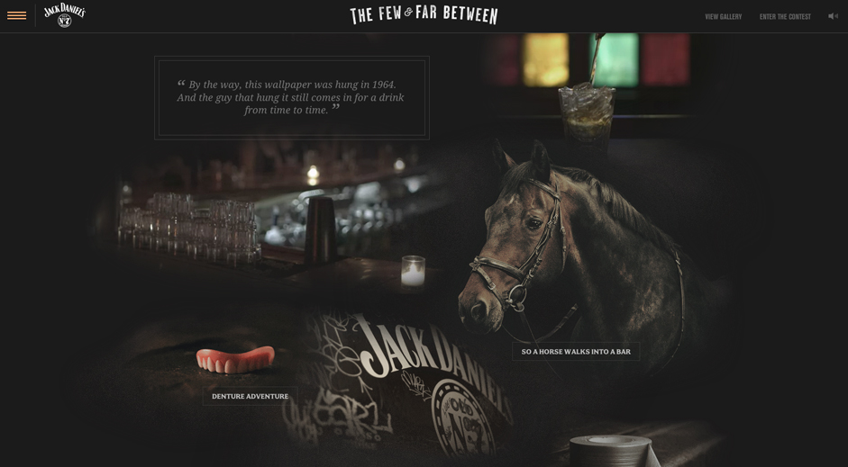
With single page websites bubbling from being an untested endeavor to becoming a hotly pursued trend, the concept of vertical scrolling has found itself in the limelight. The designers, meanwhile, are taking giant leaps of innovation in order to further push things in its favor.

Now, having a website design geared by vertical scrolling is less about inviting creativity accolades and more about ensuring user-friendliness (if you manage a concoction of both, you’ve got yourself a blockbuster design). As a natural propensity, we grow more patient as we start getting used to certain activity. For our Internet existence, however, it is the other way round. The more web-centric our lives are becoming, the thinner our patience is growing. And thus, we usually do not prefer to stay on websites that take time going from A to B. The 3-click rule no longer rules. We wish to reach a piece of information on a particular website with even lesser number of clicks, or rather, with no clicks at all. This is where single page websites find their stride. And this is where the vertical scrolling trend takes a leap.
2014 has been a busy year for web designers and with more and more webmasters leaning towards pageless websites, the vertical scrolling phenomenon is going to take center stage in 2015. Not everyone is going to get it right, but there will be a gazillion of attempts made nevertheless.
Let's take a closer look at what's in store for us in the upcoming year:
The SEO Challenges Will Be Taken Head On
The obvious SEO-downside to a single page website is the fact that all your site's content is on a single page and thus, all the keywords have to appear on the same page as well. Apparently, this looks like the keyword-stuffing exercise and the overall language does not look natural since you have to include all targeted keywords on the same page. It goes without saying that this has direct consequences on your search engine rankings.
Let's say you are running a website for a software development company that offers services like PHP development, Wordpress development, and Android development. Now, information dedicated to all the services has to be included in a single page. There are entirely different set of keywords for each service. How odd would it look when you have keywords like “Hire PHP development services”, “Hire Android developers”, “Hire Wordpress development services” - all on one page? Search engine bots have a difficulty in figuring out what your website is about, and this would negatively reflect in the rankings.
All said, you can trust webmasters and developers to make their greatest efforts in order to overcome this drawback. While the corporate blogs are a common sight on the Internet, there still are major players out there who undermine the value a blog site can bring to their rankings. While the website's homepage can cover all the requisite information about the services, the CTA buttons and stuff, a blog site will give you an opportunity to attract new readers by posting industry-relevant content, and most importantly, using your keywords at will.
Storytelling Will Become More Relevant
With a website accessible through vertical scrolling, one gets to use a grid pattern which allows them to weave a narrative around the brand. This narrative can be made even more interesting using a few interactive elements. And this will be seen in a greater measure this year as more and more brands resort to storytelling way of communicating with their audience.

Even Greater Focus On Minimalism
Because all the brand information is being displayed on a single page, along with the images, videos and other multimedia files, it is natural that the page size of a single page website is comparatively greater. And thus further fuels the need to be minimalist in your approach. You can afford too much gloss on the website as it is only going to burden the server and lead to slow loading times. Flat designs have already perched themselves comfortably in the web realm, and with single page websites, they are only poised for greater relevance.
Contrary to the popular opinion, flat designs can be as visually stirring as the vivid designs. All you need is a an inventive approach backed by reliably excellent skills.
Let's Face It: There Will Be A Lot Of Shabby Attempts Being Made
Vertical scrolling is all set to be a shape-shifter (for lack of a better word). And just like the other shape-shifting initiatives since the dawn of time, the beginnings are going to be extremely coarse. Yes, we have a truckload of websites already implementing this method, but we are only getting around to understanding it.
Remember how Flash changed the way we designed on web? Everything turned livelier, sleeker and fancier. However, we have also witnessed outrageously terrible use of Flash that has lead to unimpressively designed websites. Not only are they the 'fashion' disasters, but they also fall in the bracket of slow websites. Not to mention the misplacements of Flash elements that lead to the most crucial pieces of information being obscured by something gaudy and in-your-face.
As much as we would like to believe otherwise, vertical scrolling is going to witness something similar. You already have designers starting on a wrong footing. There are plenty of websites supposedly adding to the Christmas festivity with those bells and whistles and snowfall displayed throughout the page. The designing disaster is when the users have to strain their eyes for reading the text behind all this flamboyance.
The awe-quotient you are trying to raise here doesn't last beyond few seconds. Post that, your users want to get down to business and fetch the information/service they are there to fetch. And if your designs gets in the way, they won't waste a lot of seconds before navigating off to your competitor's site. So, even if you are screaming from the rooftops on how one should avoid all of it, 2015 is not going to listen.
Everything said, there are going to be websites that will stand as the poster child for the most awesomely creative and relevant use of vertical scrolling.
Mobile Users Are Going To Grab It With Both Hands – And So Will The Brands
The made-for-mobile approach has already laid firm foundations. Brands across all realms are going for websites that do not fail the mobile-compatibility test since they know an overwhelmingly large chunk of their visitors come from mobile. The clarity of the interface is also crucial since the screens to view your content are much smaller.
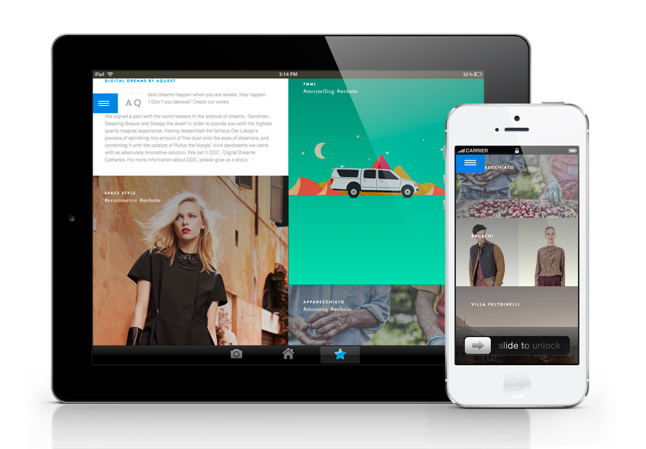
So when you talk of vertical websites, they are the most natural fit for Smartphones and tablets. Not forcing the user to keep looking for the menu links, the vertical scrolling lets them access to all the information by a simple scroll.
The brands who have so far been ignoring the mobile content consumption statistics are going to stand up and listen – and follow suit.
Content Will Keep Splitting In Smaller Blocks
You need more of power content – that piece of content that kickstarts the message right away and has substance. And because you are making your audience scroll through every bit of information you have to offer, you can't have long sermons about your company and its services.
The content has to be crisp and abundantly clever. The message will have to be put across in as few words as possible and that's where you would need to head to the experts. Now there are businesses who hire cheap content writers for their copy, but vertical scrolling is going to bring big bucks for the more skilled writers. Mundane and monotonous content will only spell doom for websites that let the words hog the limelight.

Pushing The Non-Saleable Content To The Corner
The direct upshot of this trend may be the companies cutting down on doling out their history and stories about how they grew as a brand. And if they do include it in an elaborate manner, it just might be pushed right to the bottom since the focus has to be on selling. An impressive story will do just that – impress; but it is never usually convincing enough for a prospective customer to hit that “Buy” or “Contact us” button.
For all intents and purposes, vertical scrolling is a surefire way to get people involved on your website. Giving your attempts to make your website more accessible and responsive while giving it an adrenaline shot of relevancy. Done well, it will sync your website and content with what an average web user wants.
