Yuen Ye is the online portfolio for Graphic / Interactive designer Athena Tian. Athena came up with the name Yuen Ye for her portfolio, because it shares the same meaning with her Chinese name. The word 原野 (Pronounce Yuen4 Ye5) means "immense grassland". Earlier this year when Athena decided to make a new career jump, she thought a shiny new website would most certainly help her open some doors, so Athena and I got together and created this portfolio.
In the world of design, I like to run free in my boundless imagination. — Athena
The Approach
Both Athena and I wanted to keep the same idea as Athena’s first online portfolio—to focus on emptiness and boundlessness. But this time we used a different visual approach. We both thought that wind can play a big role contributing to the idea of emptiness. So we used wind as our key element to bring our idea to life.
We want to keep the layout minimal and the interactions meaningful.
The Execution
When we designed the front page of the website, we used the simulation of cloth in wind and the classic text marquee to achieve the boundless effect. We also used a dark theme colour with very little secondary design elements to achieve the emptiness feeling.
We wanted to evoke a stronger feeling in both visual and audio during the users’ interactions, as if they are the wind traveling through an open field. When the users scroll through any of the pages, the wind ambiance is calculated based on their scroll distance—the ambient wind sound is louder, and the wind strength on the cloth is stronger.

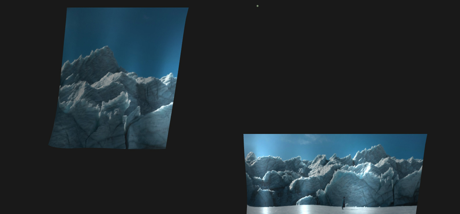
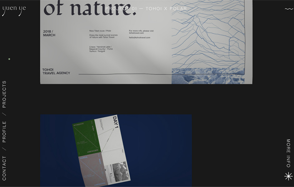
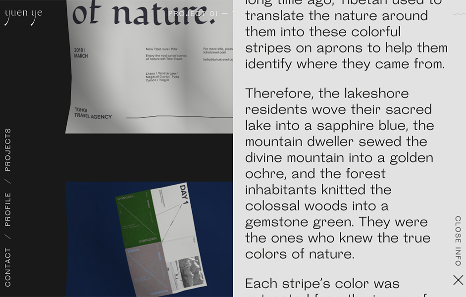
Athena wanted the project case page to be visually driven when we designed the layout for this page. With the aim being to let the images do the talking, the case page starts off by displaying the title in a special typesetting to set the project persona, then a clean and minimal grid to display the case images. All the additional text information is displayed through a simple slide toggle. To make the browsing experience as seamless as possible, the case images are also treated as cloth textures, but they are pinned to the two x-axis.

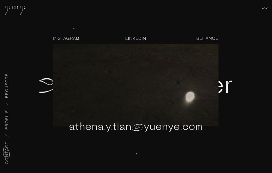
As someone who is easy going with a strange sense of humor, the profile page is a great place to display Athena’s playful personality
Technologies
Frontend Framework: I used jQuery for the simplest DOM tasks. For things that are on a smaller scale I still prefer using vanilla JS or jQuery over modern front-end frameworks.
Canvas: I used the amazing Three.js library for all the canvas elements. The cloth mesh on the site done based on this Three.js example. The glitch effect on profile page a shader material changed from this example. Except for the sound wave button, it is a native canvas line distorted by a Math.sin() formula.
Animation: I used the GSAP library to animate pretty much everything that are not triggered through mouse movements or scroll events.
Page Transitions: I used Barba for the page requests, and to handle the animations.
I used Wordpress as the CMS. The back-end is the hosting provider’s standard PHP7 with Apache.

Credits
Kin Hui-Lo: Freelance interactive designer / developer from Toronto Canada.
Athena Tian : Graphic designer from Portland USA, currently working freelance in Toronto.
