
We recently had the pleasure of launching “The Magic and Mastery of Carlos Alcaraz”, an ESPN collaboration covering the story of a rising tennis superstar. The young 20-year-old Spaniard has been recognized for his rare trifecta of talent only seen in other players like Roger Federer, Rafael Nadal, and the legendary Novak Djokovic.
ESPN developed the story idea to teach fans more about Alcaraz, the next big star in tennis who had just ascended to the world No. 1 ranking for the first time in his young career. The story idea: compare him to the Big 3 in tennis (Federer, Nadal and Djokovic) to show how Alcaraz takes elements from each of them to make his game one-of-a-kind.
The Idea
Creativity always benefits from a few constraints. For this project, our audience was primarily mobile users preferring scroll-driven interaction. Some Creatives may see that as limiting or, more typically, start imagining a traditional text-driven article. However, at Studio 28K, we believe it’s a matter of angle. If we can find the right creative angle and concept, we can make anything interesting.
Finding the right angle is hard work! We explored through multiple directions, from a 360º video experience breaking down Carlos’s famous stances to traveling through Carlos's career via interactive paintings. While these were exciting concepts, their execution carried them, not their ability to tell the story.
It’s like baking a cake; your ingredients must improve the flavor, not distract you from it. Whipped Cream and Fondant Flowers simply don’t make your cake taste better. That’s why wedding cakes are usually forgettable, and a classic New York cheesecake is more cherished than a birthday cake.
To make something memorable, you must put the story first.
So, we went back to the drawing board. We wanted to take the story closer to the action on the court; in fact, what if we could literally tell the story using the court? Sketches started developing, and it became clear that there was an idea with the right ingredients to tell the story. We found an angle!
The Storyboard
It’s no secret that we like storyboarding at 28K. We always try to think of a screen as a window where anything can happen, and Wireframes can mess with this perception. While it’s tempting to start putting labeled boxes onto a page, it limits your ability to imagine the experience as anything but a long, flat, transitional webpage. While there is a time and place for that, it’s not an approach conducive to storytelling.
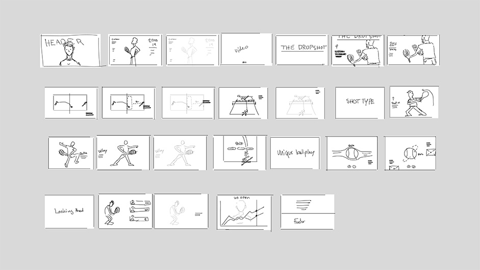
When storyboarding, you naturally put the story first. You don’t build a page; you create a sequence of events — the very thing a story is made of. It’s helpful, even if you’re not good at drawing, as it helps you think about what needs to be said and how the visual can help emphasize or explain it. At the very heart of it, storyboards make you both think and work like a storyteller.
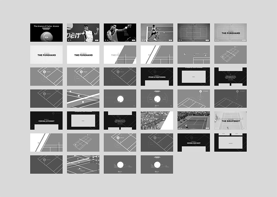
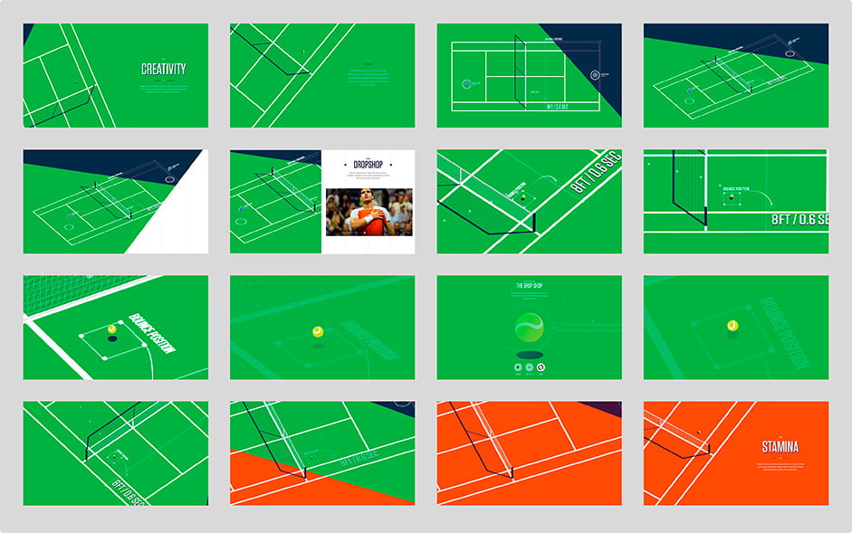
The boards for Alcaraz told the story across three chapters, each breaking down one of Carlos’ most iconic shot techniques compared to the three tennis legends Nadal, Federer, and Djokovic. Each chapter would take place on the tennis court, showing an iconic rally from a previous match and breaking down Carlos’ point shot with data visuals. Using the camera, we’d be able to move highlight areas across the court by the story.
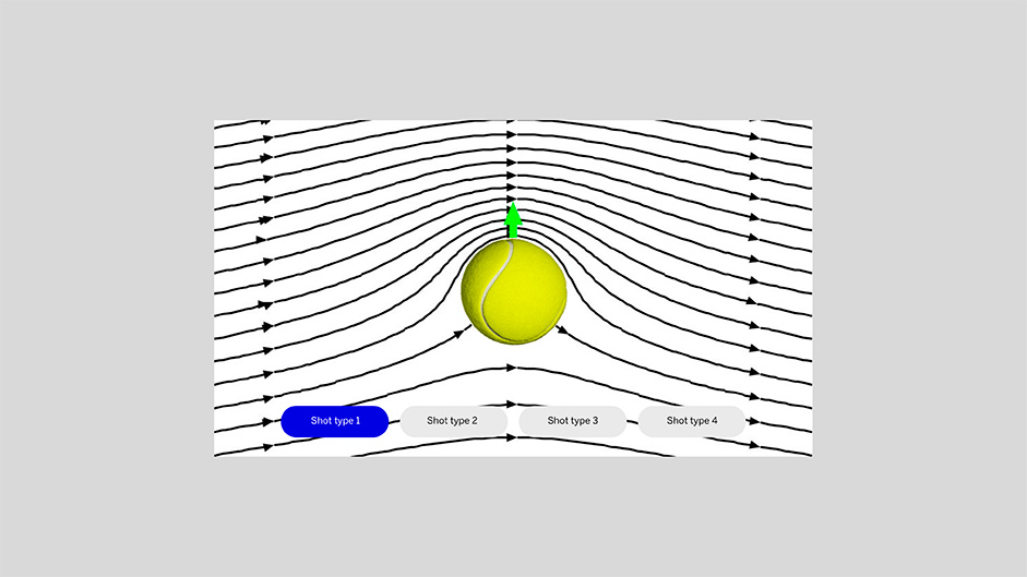
One idea involved a zoomed-in ball movement breakdown, analyzing velocity and spin. But as often goes, this feature didn’t make it into the final build.
Art Direction
Developing the Art Direction presented a new set of challenges. In our previous ESPN collaboration, Ovechkin800, we had worked with Hockey’s raw and loud aesthetic.
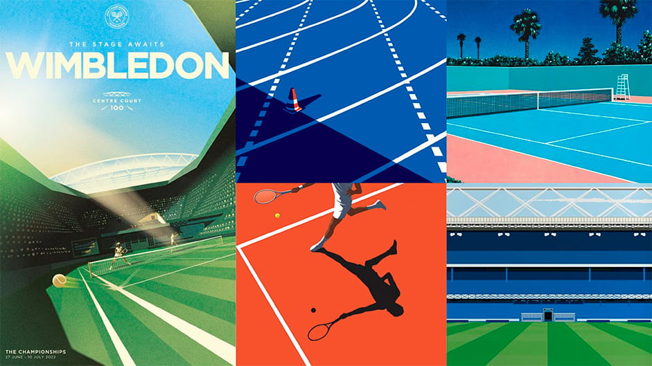
We initially tried the same approach for the story of Alcaraz, but it didn’t feel right. It didn’t represent the refined culture of Tennis. So we went back in time and looked at the aesthetic of golden age tennis, a style most easily described as preppy, with a generous splash of mid-century European classiness. Less Americana, more Monaco. The Art Direction needed to say, “Quiet, please, thank you.”
Typographically speaking, we went for a much more minimal and muted look, with splashes of beautifully simple data graphics that would go perfectly with a Pimm’s Cup and a sweater over your shoulder.
For the 3D tennis court, we challenged ourselves further.
Most webGL you see is typically dressed to impress. Having limited processing power, creatives and developers will do their utmost to make the 3D as realistic as possible in an ongoing attempt to show what’s possible — often with impressive results. So, in 28K fashion, we decided to challenge that and instead go for a style that would be timeless.
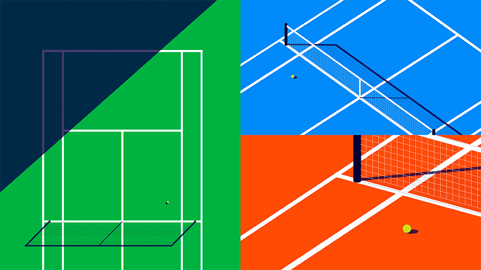
Having seen some of the beautiful illustrative works associated with tennis, we wanted to take the retro-simplistic approach to illustration but bring it to life in real-time 3D as an element of surprise. No shaders, no particles, no fancy baked textured. Just three colors, a sphere, and some rectangles. An approach that would make even Hiroshi Nagai proud.
Prototyping
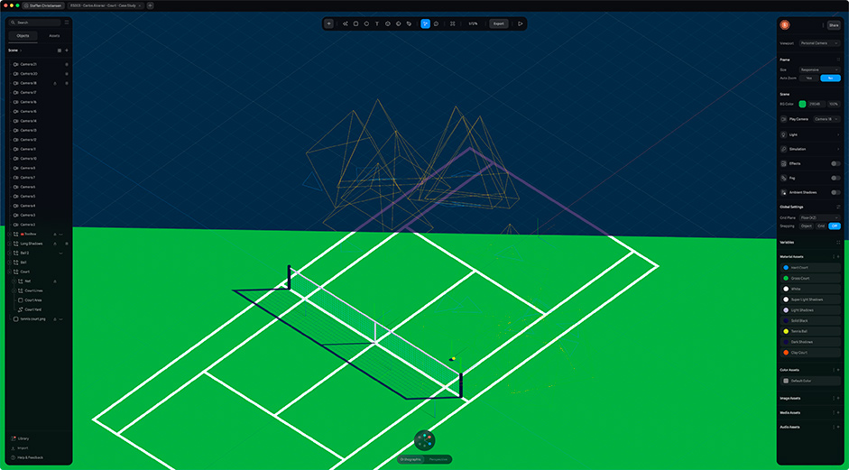
To make it happen, we used one of our favorite new toys, Spline.
Having done many webGL projects, Spline is, in all honesty, amazing. On past projects, we’ve spent countless hours modeling, lighting, and rendering in Cinema 4D, followed by endless tweaking with the developer to make the 3D look as intended in the actual build. With Spline, everything is real-time from the get-go. What you see is what you get.
We modeled the court, added the ball, and drew in the shadows with an SVG. Next, we modeled each chapter’s scene and data visualizations, from bouncy balls to heat maps. Not all of these made it to the final build, but they were fun to work on.
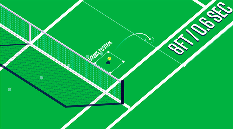
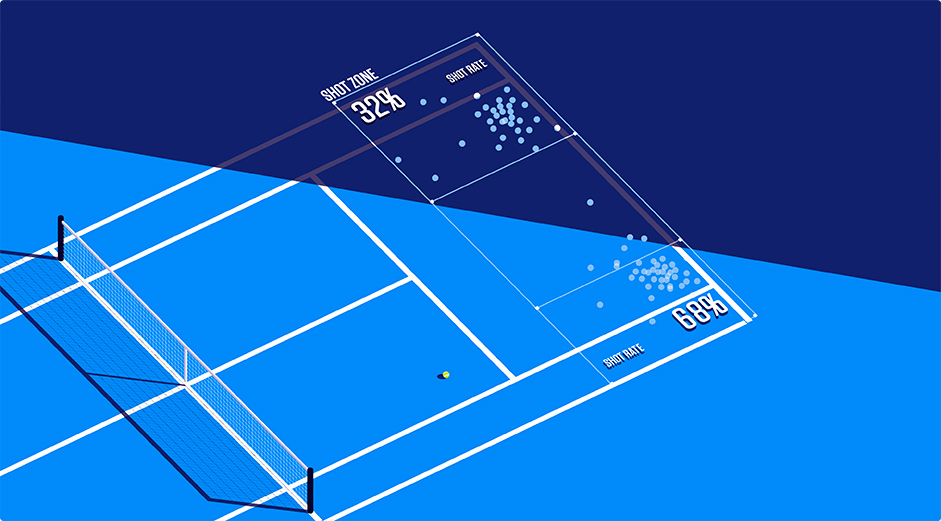
Last but not least, we placed cameras and animations across each scene, and voila, a prototype of an interactive tennis court ready to be referenced by the development team.
ESPN researched various iconic rallies shot by shot, and plotted them in detail so the rally animations are both compelling and accurate.
Bringing it Together
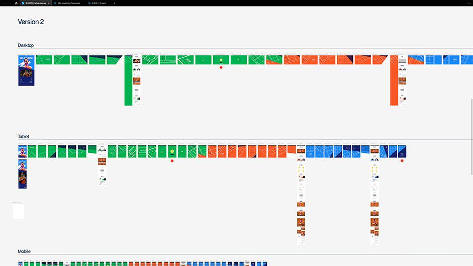
With all the ingredients ready, it was time to combine it all. This is where storyboarding once again becomes invaluable. We mapped out the entire sequence of each chapter, showcasing both the court’s behavior and the editorial. Showing the experience in sequence, at this fidelity, helps everyone visualize the end product. Designers, animators, developers, and stakeholders alike. Furthermore, it allows us to iterate on transitions and UI animations quickly.
To connect the final features with the story, ESPN worked with data provider Hawk-Eye Innovations to get match data (tendencies, historical info, shot location and more) that informed our visualizations throughout the piece. Data is also on display in the large chart in the conclusion, which shows projections of how Alcaraz might stack up to the Big 3 before his career is over.
The piece also featured story reporting from Alyssa Roenigk of ESPN, who spoke with big names across tennis (including Alcaraz’s childhood coach in Spain, Federer’s former coach and tennis legend Chris Evert). This helped balance the stunning visuals with new information that ESPN’s audience wouldn’t find anywhere else.
And to further shed light on the way Alcaraz plays, ESPN also photographed Alcaraz at a tournament earlier in the year, and created flipbook animations to highlight his approach in various facets of his game. These include drawn lines to draw attention to his grip, racket angle, body position and other elements.
To draw fans into the story, a series of high-quality “hype” highlight videos were produced. These appear in the beginning of the piece and once per section in the story.
Conclusion
By starting the Design Process early in the story’s development and focusing on finding the right conceptual angle, we made yet another successful project together with ESPN.
Using storyboards over wireframes, we kept the story as the main driver of the experience and ensured to think outside the box. Combining a unique art direction atypical of the medium with the clever use of new tools, we drastically reduced the time, effort, and processing power it usually takes to make an immersive 3D-driven experience. Keeping the book open and the designs flexible enables the story to evolve beyond the original draft while staying true to the concept and intended design.
So there you have it, the story of a rising tennis star and how to make it memorable. The response to the site has been overwhelmingly positive, even going as far as being nominated for Site of The Month on Awwwards — to which we’re immensely grateful.
Technologies
Our team of storytellers at ESPN had previously attempted a webGL project and we were faced with technical issues when the technology was still young and devices not as powerful which affected its success. It was important to pull off webGL correctly this time so we didn’t turn away people again from this now-household name in technology.
We were excited to use webGL on Alcaraz to help tell our story in a way not possible with a text-based longform article. We used prototyping to test out the tech to prove it was a viable option. We scheduled overlapping sprints with the design and dev teams to build 3D feature tests and iterate till they were performant and reliable and supported our story. We encourage constant collaboration and iteration.
At ESPN we work in the publishing space so we need to build flexible systems that can be quickly pivoted as the story is being developed. A common pattern we use is building style guides, font systems and component libraries that can be used to easily create new modules and organize existing ones. Thinking in patterns has changed how we think about design and programming and that helps us stay nimble.
We can’t plan for everything, though we can stay on track with proper prioritization, building the features that most support the storytelling and through learning from our shared project experience on what’s successful and what needs more iteration in process. We encourage our team to constantly try new things. Solve problems differently, think creatively. Innovate. And make decisions analytically after becoming an expert in that space through practice.
Frontend Frameworks and Libraries:
SSG with standard build process that compiles static files from liquid templating for HTML, Sass as a css extension language, babel compiler for vanilla Javascript and content managed in json. Three.js for the 3D.
Backend Technologies: n/a
Server Architecture:
Runs on an custom in-house CMS connected to an s3 bucket to serve static files.
Tools:
Figma, Frame.io, VS Code, PasteApp (clipboard manager), Three.js docs
For the photo flipbooks, ESPN used the Frame.io tool for the first time in order to map out the visuals and content. It proved to be useful in isolating the specific details that we wanted to highlight for fans.
The match data from Hawk-Eye was another new use of tech for ESPN. Hawk-Eye Innovation’s proprietary data is collected using a series of cameras that capture the location of every shot. By partnering with them, we were able to take that information, typically reserved for television broadcasts, and bring it to life in the digital space.
Company Info
A Design Studio Devoted To Making The Most Memorable Experiences Within Our Time.
