As designers, building a brand and website for someone else feels natural, because we have an outside perspective, but when it comes to the personal portfolio, things are different.
It's a lot more difficult to introspect and figure out how one should present themselves, due to this, portfolios are seldom finished and if they are, they often end up unsatisfactory.
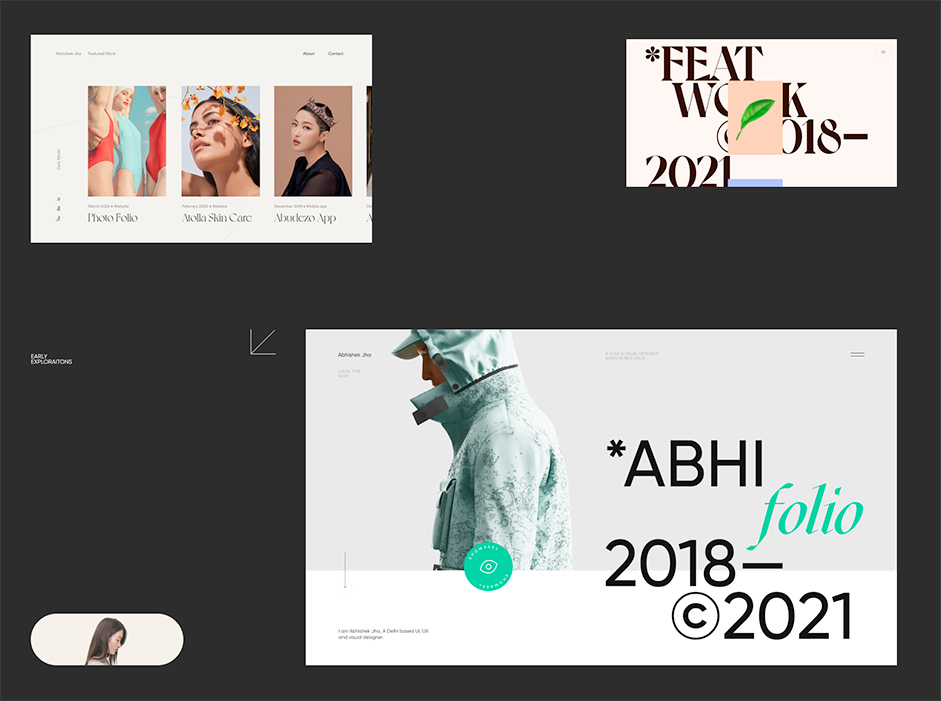
I have accepted the fact that my folio is never going to be good enough, thus iterating is the only option. For me, building my folio is a fun exercise and a ritual, that I practice every year or two, as it allows me to try new aesthetics and front-end techniques. I usually put a very lenient timeline, usually about 6 months up to a year, doing so allows me to leave the designs for a few weeks, and when I resume I can see it from a fresh pair of eyes, uncovering many new flaws and areas of improvement which were not so apparent before and also experiment with new trends.
As a front-end enthusiast, I enjoy coding my folio, while learning new front-end techniques in the process. One resource I would recommend to learn new frontend tricks is Codrops & awwwards courses. The process starts with going through past work and figuring out which ones to keep and where.
"Portfolios act as filters, they should reflect the type of work you want to get in the future." The main thing is to have fun while building it. Don't stress too much about it.
Site Structure:
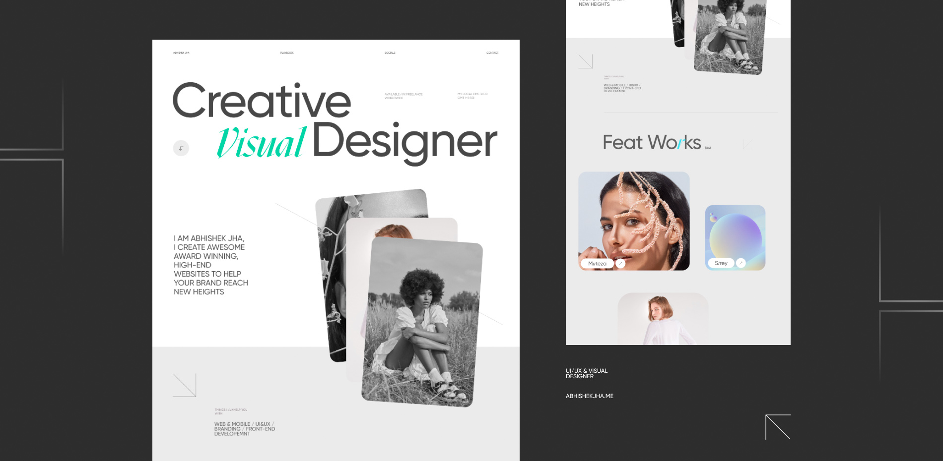
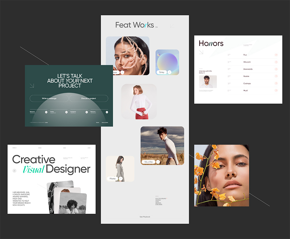
I wanted to keep it skimmable and let the work speak for itself, to do that, I decided to have just two pages, Homepage & Playbook. The homepage consists of a hero, about me section, works, achievements, and contact. My previous portfolios didn't have a dedicated page where I can show random work that I did for fun, playbook served as a place where I can just put anything without an explanation, Having a playbook or similar page is important as it allows a potential client to get a sense of your style in one glance. It helps them make a decision faster, whether they want to work with you or not. As a rule of thumb, always put the type of project that you wish to get in the future at the top, and in order of most recent to old, I usually mix client and personal projects.

Design & Layout:
Once that's decided, the next is to do is basic branding, initially, I decided to go with Voyage as my primary font, but later decided to go with Gilroy and Mazius. Picking two fonts that go well together usually gives us a lot of freedom to play around and present a multidimensional aesthetic. Also, it's trending :) For paragraphs and small texts, I usually go with neutral highly legible sans-serif fonts, in this case, I am using Gilroy.
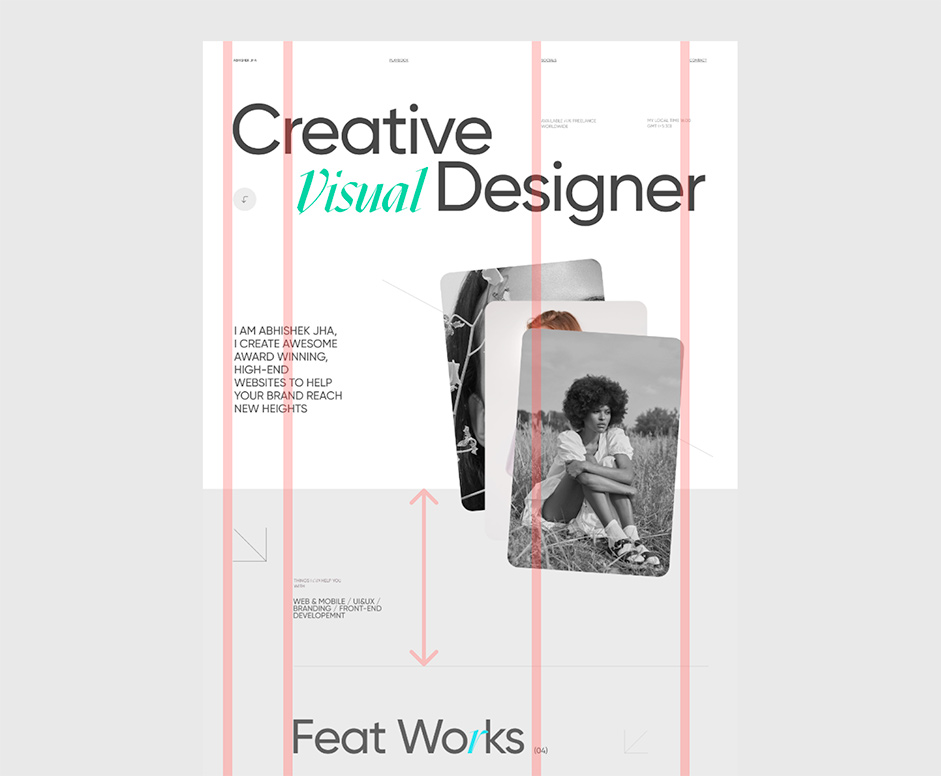
While designing, I try to break the grid in such a way that's interesting but keeps the viewer on track. Having plenty of whitespace between sections is a good way to achieve that balanced and minimalistic look that's popular these days. It also allows users' eyes to have some rest in between sections.


Hover Snippet:
When seeing other portfolios I am a little hesitant to click on any project, because it's uncertain as what I'm about to see is worth my time or not, as thumbnails alone don't give you enough context. I didn't want users to feel the same this time, so I decided to have an on-hover snippet that quickly traverses through multiple screenshots of the project, giving users a sneak peek to decide whether they would like to see more or not.
Development:
Some prefer to use no-code tools, for me, development is part of the fun of making a folio. It's one more way for me to express myself, and be better. My last portfolio had a really bad responsive version, my analytics show that the majority of my users are on desktop still, this time mobile was a priority. I'm a novice in front-end development, so I generally avoid getting carried away with interactions and tend to not use any frameworks like React and Vue for small projects, I used HTML, CSS, & Vanilla JS along with GSAP, Locomotive Scroll & Highway JS.
The simple text reveals are too common these days, but too good to not add, I needed to do at least one thing that people will remember, so I added a "visual" text animation, You can learn how to create this effect in this article. With this, my folio was near completion, the only thing to do was to test it and make improvements. There are still a few bugs in Safari, so if you find any please let me know. There's also an easter egg, which can randomly appear when you click "Discuss a Project" in the footer section.
Company Info
Abhishek Jha is a UI/UX & Visual Designer, currently working as a freelancer (previously working at Flipkart) who creates high-end, unconventional websites and apps for brands and agencies all around the world.
