Aircord is a creative studio that undertakes innovative projects in the field of creative technology.
The goal of this project is to maximize the features of aircord and provide an impressive online experience that allows users to feel the "experience" of aircord more strongly. Although the target audience is not broad, the aim was to create a website that deeply resonates with specific users, including clients, through uncompromising design and development.
First and Foremost
We have undertaken the renewal of aircord's website four times so far. Over a long period, we have observed the charm and features of aircord and have discussed and experimented with what is important for aircord's website. Throughout this process, what has always been clear is that aircord is a studio that provides a wonderful "experience" in the real world. It was important in this design and development to make users feel that "experience" in the digital world as well.
Design
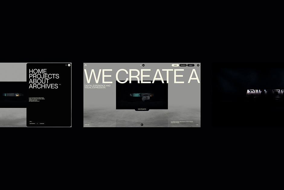
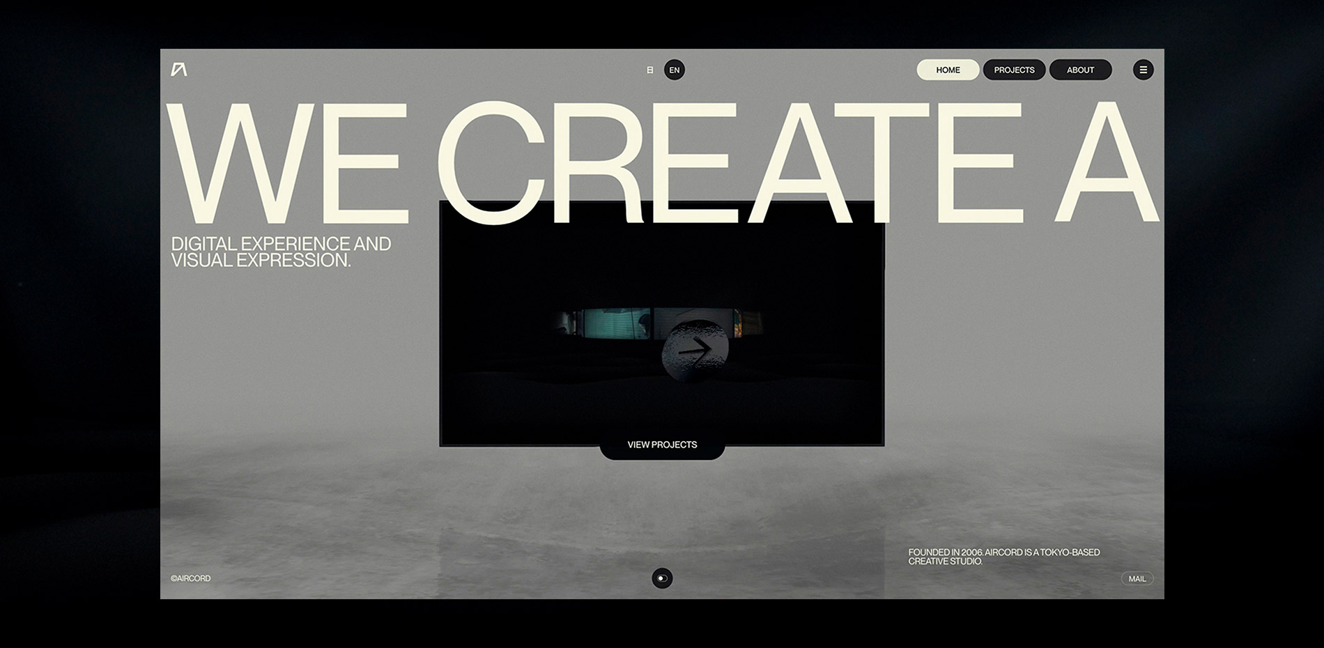
The key to the design is how to create this experience. To impress users, impactful effects are necessary. Therefore, we thought of an idea that seamlessly transitions from 2D to 3D space and back to 2D space. This is an intuitive and smooth page transition animation that provides users with consistency and immersion. What is important here is that these effects need to highlight the world view and projects of aircord.
This transition gives users the feeling of entering a different space, enhancing the interactivity and immersion of the entire site.
About Page: Water Surface Expression
For the About page, we designed the floor with a water reflection effect to add depth to the 3D space and incorporated an animation that moves underwater as the user scrolls. This effect expresses our desire for users to "get to know" aircord deeply.
Visuals and Functionality
To balance beauty and usability in the design, it is necessary to pay attention to details in both the visual and functional aspects.
For example, the icons that follow the cursor always accompany the user, indicating the current function and effect. By combining intuitive navigation with visually engaging effects, we ensured that users can smoothly access information.
GUI Testing

During the design process, we utilized GUI tools (tweakpane.js, stats.js) to test and fine-tune various visual and functional elements. By dynamically adjusting parameters such as camera angles, animations, scenes, lighting, and particle effects, we compared different UI and typography options to achieve the optimal design. Additionally, adjusting animation parameters allowed us to visually confirm transitions and subtle movements, making it easier to communicate design intentions that were difficult to convey with words alone. During development, we monitored performance in real time, checking resource usage and frame rates to identify and quickly optimize high-load processes and bottlenecks.
Technologies
The technologies used in the development are as follows:
Design
- Adobe
- Figma
- Blender (for 3D motion demos)
Development
- WebGL: Three.js (Tree Shaked)
- Motion: GSAP.js
- Animation: Lenis.js,Barba.js
- CMS: WordPress (Static Generate)
- CDN: S3 x CloudFront
- Video Provider: Vimeo API
Although this configuration is classic, I thought it was the best combination for this project when prioritizing adaptability and speed. Managing JavaScript without a framework is somewhat labor-intensive, but since I was the only developer on this project, I was able to manually manage potentially bloated JavaScript files and achieve lightweight optimization on a kilobyte-by-kilobyte basis.
2D and 3D Layers
The seamless transition from 2D to 3D space and back to 2D space requires complex camera operations, but its basic principle is simple. This website has five layers (RenderTargets), each controlled by a camera. The following is an explanation of each layer:
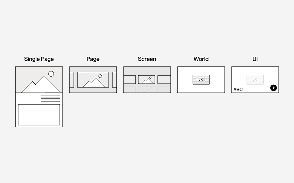
Single Page Layer (deepest layer):
This is a 2D layer that displays videos and images of each project. These media elements animate in conjunction with the DOM scroll of the single page.
Page Layer:
This is a 3D layer that renders the PlaneGeometry using the Single Page Layer as a texture. The About page is also rendered on this layer.
Screen Layer:
This is a 2D layer that renders the Page Layer as a texture.
World Layer:
This is a 3D layer that renders the BoxGeometry using the Screen Layer as a texture. It is a 3D layer designed to make the Screen Layer appear three-dimensional.
UI Layer (shallowest layer):
This is a 2D layer that renders the PlaneGeometry using the World Layer as a texture. UI elements such as the cursor are rendered over this plane. In this way, each layer interacts with each other to achieve seamless transitions between 2D and 3D.
Water Surface Expression
The water surface expression on the project and About pages is implemented by extending Three.js's Reflector.js. The underwater movement effect implemented on the About page, in response to scrolling, determines whether the camera is positioned above or below the water surface by comparing the camera's Y position with the Y position of the plane.
Cursor
To make the loading lighter, the 3D cursor is implemented with TextGeometry. Each icon is created in Adobe Illustrator and converted into an icon font family. This allows the icons to be rendered as text instead of using 3D files, improving performance. Using font-based icons makes it easy to adjust sizes and styles, enabling more flexible design.
Mobile

Assuming that many users will view the site on mobile devices, we aimed to implement the site in a way that minimizes the differences between desktop and mobile environments. Considering the challenges of low connection speeds, limited bandwidth, diverse screen sizes, and rendering capabilities, we employed several techniques to reduce these burdens as much as possible. Here are some of the small techniques we used:
Javascript:
For example, even with Three.js, the minimum required modules for desktop and mobile environments differ. By making optimal selections according to each environment, we were able to reduce the code size for mobile by 1MB.
Media:
Basic weight reduction measures include converting images to webp format, adjusting resolutions, and introducing PWAs (although not done this time due to usability issues such as update management and pop-ups during installation). While these alone can achieve significant weight reduction, aircord has taken the following three additional measures this time:
Optimized video delivery using Vimeo:
When videos are uploaded to Vimeo, multiple resolutions such as SD, HD, and FHD are generated, allowing us to provide the appropriate resolution for each environment.
Media loading using WebWorker:
This helps distribute the load and prevents rendering from being hindered.
Control of loading timing:
Instead of loading all media during the initial load, we stagger the loading times for each piece of media and perform preloading for transitions incrementally. This ensures smooth transitions.
Company Info
Garden Eight is a digital design studio based in Tokyo.
X : GardenEight
IG : @garden_eight
IN : gardeneight
aircord is an interactive creative team specialized in fusion of technology, filming, lighting, and sound.
X : aircord
IG : aircord_inc
IN : aircord
Credits
Designer/Developer: Kenta Toshikura (Garden Eight)
Producer/Director: Toshiyuki Hashimoto (aircord/The Shift)
Copywriter: Jiyu Park (The Shift)