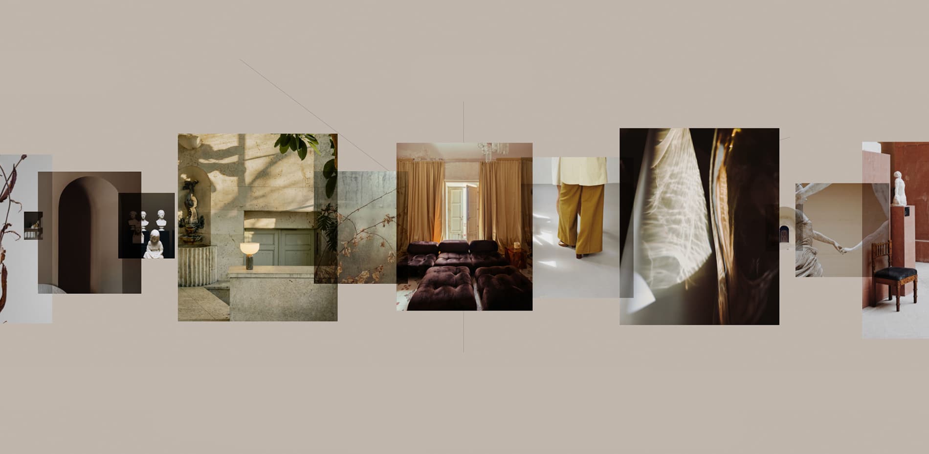
This is a folio website of a Copenhagen-based creative studio and production house with storytelling at its core called ALET.
It is a result of our close collaboration with Anne-Sophie Rosenvinge, the founding director, to build a special folio website for her creative studio that offers visual communication and creative consultancy for aspiring brands within the creative sectors.
Where everything started and how it evolved
What makes this project special for us, is that we got challenged by the client to experiment with various layouts, visual directions, and user experience overall. As a result, we’ve gone through at least 3 completely different visual directions, evolving the website a lot – this has allowed us to end up with the design concept that both the client and ourselves enjoyed most.
Ending up with this direction has allowed us to achieve all the project goals set at the beginning such as showcasing the studio’s content from the first moment you enter the website, telling a detailed story about the studio itself and its process as well as creating a refined and elevated experience to motivate website visitors to hang on the website for a while and reach out should they need any services that ALET offers.
Design highlights
The project itself is full of unconventional design solutions. The homepage is offering an interactive slider experience with a background that changes its color as the user explores the page. There is also an alternative random view that offers a completely different experience while both options focus on highlighting the work of the studio and listing the services they offer.
There is also an alternative random view that offers a completely different experience
Another worth mentioning design element we are excited about is a stacked process page with a step-by-step reveal of the studio's creative approach to projects. Such a gradual representation allows us to tell the story of how the studio works on each project in great detail so that prospective clients can get a clear understanding of what to expect.
To demonstrate that the studio generally provides multiple services to their clients as well as to show some light statistics on the most popular services offered, we’ve come up with a color coding idea on the work page. What’s more, there is also a quick overview of all the clients of the studio since the year of their foundation so that the website visitor can dive in to explore the particular work in detail. There is also a subtle Easter egg that supports the overall idea of the page and allows viewing it in light and dark modes.
The world is increasingly going mobile. That’s why we always pay a lot of attention to how the website looks and behaves on mobile devices to make sure that smartphone users get an equally engaging and immersive experience as desktop ones. To achieve this, our approach is to keep most of the desktop interactions and animations that make sense on mobile and test them thoroughly across a wide range of devices and breakpoints.
Development
This has also been an intriguing development project for our team as they were experimenting with quite a few unique modules among which is the homepage slider with random and linear modes. Such functionality has been achieved by translating the elements into the position of their hollow (invisible) correlating elements.
Something similar is possible to be achieved with the GSAP flip plugin but we went ahead with using a custom solution that contributes to the overall uniqueness of the project. Behind the slider itself, there is a GSAP draggable proxy that handles the momentums and resistance.
Behind the slider itself, there is a GSAP draggable proxy that handles the momentums and resistance.
The other interesting part of the website is a process page on which the idea was to mimic the sticky scrolling behavior by transforming the active sections using the javascript within a huge parent container.
Speaking of the Javascript frameworks, Vue with Nuxt have been used as their component-based structure perfectly corresponded to our needs and allowed us to address one more challenging part – ensuring the variety of the different layouts for the project components on the inner pages when reusing the same component. This has been achieved by recognizing a few key CSS properties and by passing different values to the component as the configuration object. The above also represents our general approach to development, focused on allowing our clients to easily administer their website once the project is finished.
Vue, Nuxt, Contentful, and GSAP are the main technologies used for this project. DNS is being managed via Cloudflare.
Company Info
Synchronized is a full-service creative studio crafting unparalleled web experiences since 2018. We stand for bringing strategic value to our partners and making their businesses thrive thanks to a strong digital presence.
