Todd Torabi, Founder of Wolf&Whale, has a bold prediction: “In the next few years, smaller creative studios will be the most attractive option for clients because of their undeniable advantage in amassing talent, most of these studios are run and founded by the best in the industry, the people who want creative freedom and have too much to offer to be limited by bureaucracy.”
In Wolf&Whale's first 18 months, he serviced 12 clients, including WeWork and GoDaddy, from his small office space in New York City, with no overhead, no full-time employees, and no marketing budget, just a high investment in a mega-talented team of remote designers.
without a compelling portfolio website, it would be an uphill battle earning the trust of new prospective clients and freelancers.
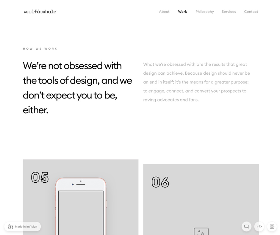
There was one problem though: Within Todd’s first year of business, he quickly realized that without a compelling portfolio website, it would be an uphill battle earning the trust of new prospective clients and freelancers. The vision of his company would be lost in the weeds. The thought was: If you’re the client and hiring a studio to design your product or website, you definitely want the studio to walk the talk. In other words, their portfolio website better speak well and look damn good.
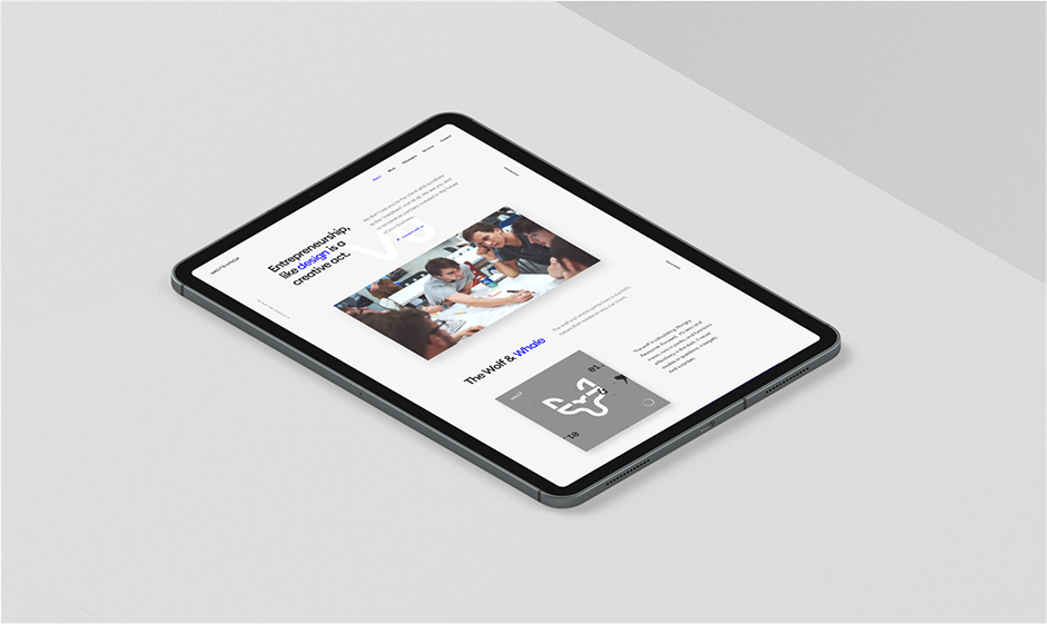
So, Todd and his team got to work. A few goals for this new portfolio website included sharing Wolf&Whale’s client work in a beautiful and simple way, depicting the core creative concept behind the name ‘Wolf&Whale’ (more on that below), as well as ensuring that visitors had a chance to connect with the company and learn more about their services and philosophy.
To kick-off the project, Todd hired Terri Trespicio, a fantastic content strategist and TED speaker who helped him with copywriting and architecting content for the website, and partnered with MakeRegin, a creative studio from South Africa, to help design and engineer the website. He found MakeReign on Dribbble, and felt their background creating world-class websites would add meaningful value towards creating Wolf&Whale’s portfolio.
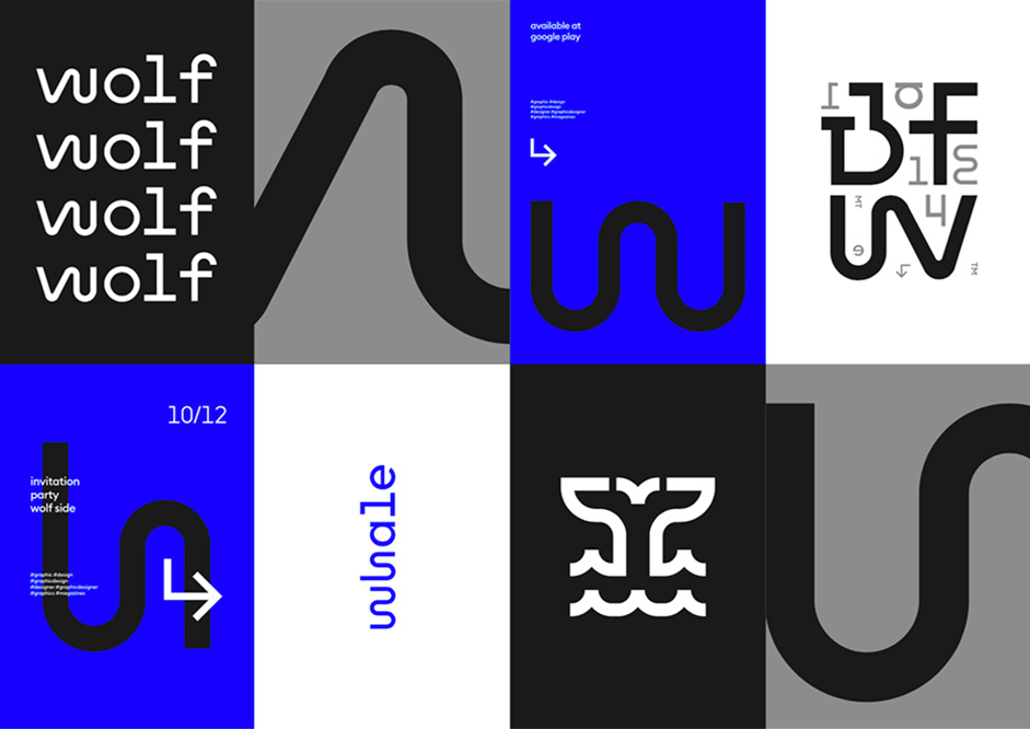
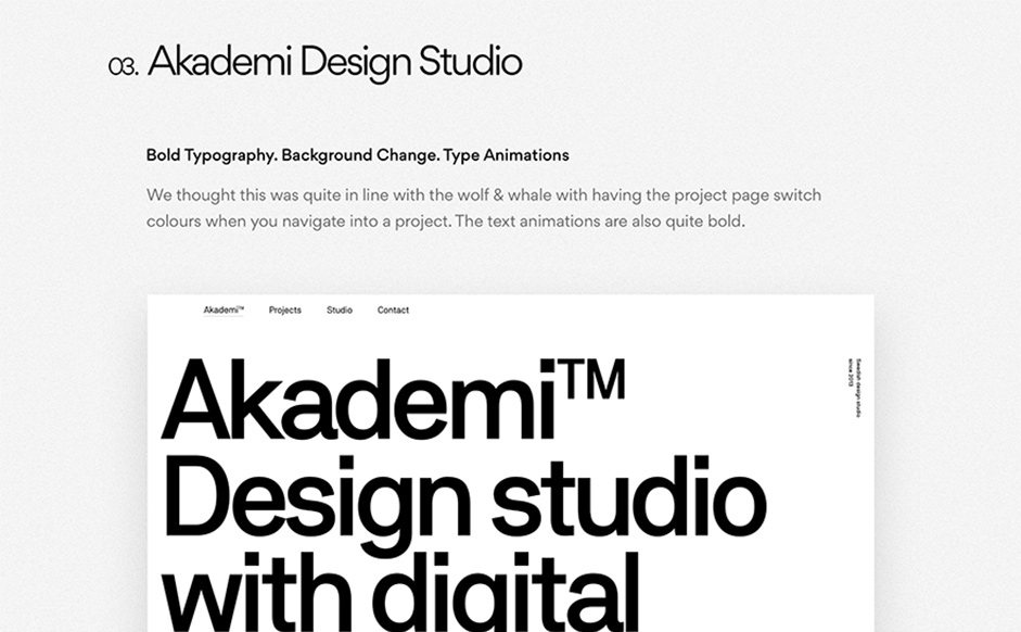
Fast forward a few months in, the success of the Wolf&Whale and MakeReign partnership rang true, as both teams challenged each other exploring and playing around with several creative concepts. They worked on ensuring the skeleton of the site and the user experience was sound, too - considering interaction paradigms, how elements work and move, and how color and hierarchy would work across the site. A lot of these explorations were resolved after reviewing hundreds of references and what MakeReign called ‘style-tiles’ as points for inspiration.
Why ‘Wolf’ and ‘Whale’?
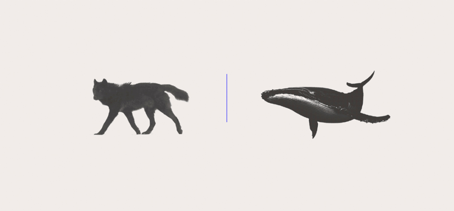
We figure you might be curious about the name. The wolf and whale concept was inspired by a late night discussion between Todd and his co-founder at the time, Anthony Agrios, about spirit animals (no drinks were involved, they promised). Todd thought of himself as a whale while Anthony thought of himself more as a wolf. The contrast in the two animals’ natures was what caught their attention. The wolf, known for its calculating, hungry and focused nature starkly contrasted with whales, known for their solitude, patience, methodical thinking, and how much they seem to relish the attention of millions of whale watchers worldwide.
The founders’ two opposing natures perhaps provided an explanation for why they formed such a dynamic, complementary creative partnership, but more importantly they noticed, it benefited their clients’ work too. As an entrepreneur or product owner, you must be hungry and quick, strategic and focused, like the wolf. But you also want to be patient, methodical, and celebrated, like the whale. The balancing act of these forces within the creative process is what Todd and Anthony believed led to the best end products for clients.
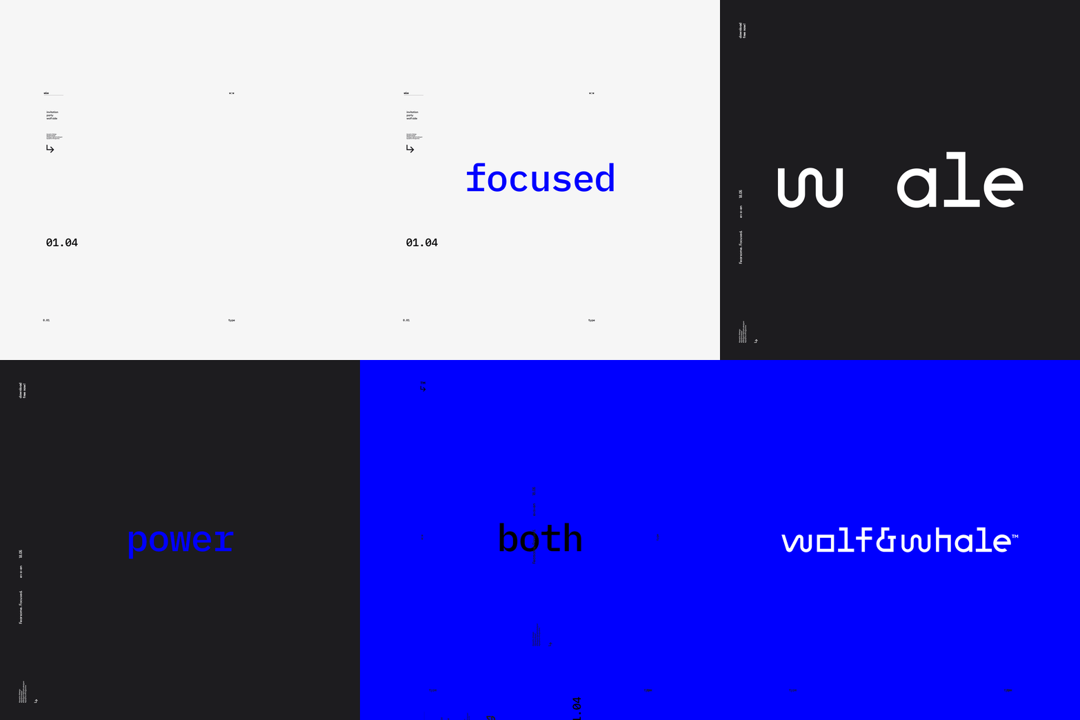
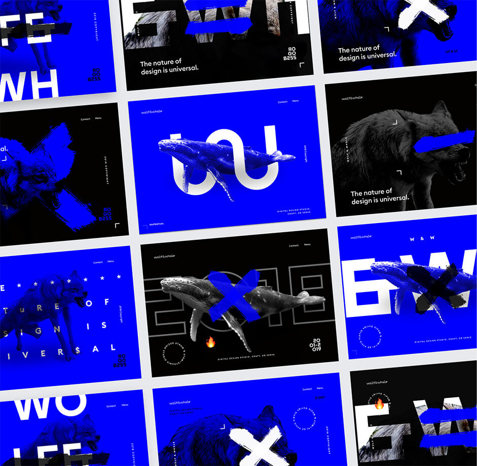
it was important to engage with the MakeReign studio in quick-fire UI explorations; seeing how different elements could work together design-wise, and how to push forward the theme of dualism.
With this insight as a basis for the Wolf&Whale philosophy, it was important to engage with the MakeReign studio in quick-fire UI explorations; seeing how different elements could work together design-wise, and how to push forward the theme of dualism. Some references were type-driven, while others more image heavy. Balancing minimalism with heavy use of animation and bold elements helped drive the dualism concept ever so slightly, too.
Final Touches and an Easter Egg
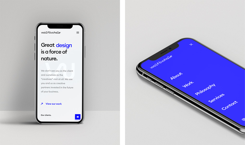
Together with MakeReign, Wolf&Whale extended the bold, quirky graphic language into a minimal, modern UI that made our case studies the focal point of the experience. They integrated the key branding typeface, despite its quirkiness, into the look and feel in a surprisingly legible way, enabling for the theme of dualism to shine. Using Principle for Mac, they were able to articulate product interactions across all screen sizes, how everything fit together, and how motion could be another signature extension of the Wolf&Whale brand. Wolf&Whale worked with several collaborators, including the motion studio Okalpha to create a video that encapsulated the energy of the brand. And you can access this video in a hidden way - by hovering over the logo in the navigation, as depicted below.
Early Recognition and Awards
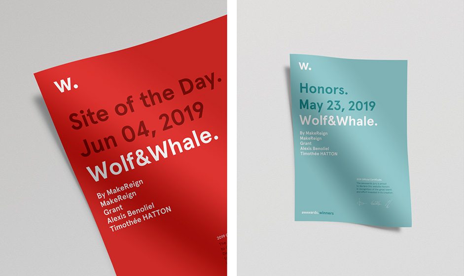
The Wolf&Whale website was showcased and awarded by several organizations like Minimal Gallery and Awwwards for Honorable Mentions, Site of the Day, and recently nominated for Site of the Month.
Technologies
The team’s wonderful engineers, Alexis Benoliel and Timothee Hatton built this ultra smooth and responsive portfolio website using these frameworks and technologies:
Frontend Frameworks and Libraries:
Backend Technologies:
Server Architecture:
Tools:
- Github
- Custom continuous deployment script
Company Info
Todd Torabi created Wolf&Whale in 2014 on the belief that a company that uses design to think about how their company relates and not just appears will be more memorable, impactful, and profitable.
