Having spent our formative years of the studio mostly on commercial works, OKOK Services conceived the idea of starting a fun personal project where we would get fellow creative friends and partners to get involved to interpret what ‘OKOK’ could actually mean.
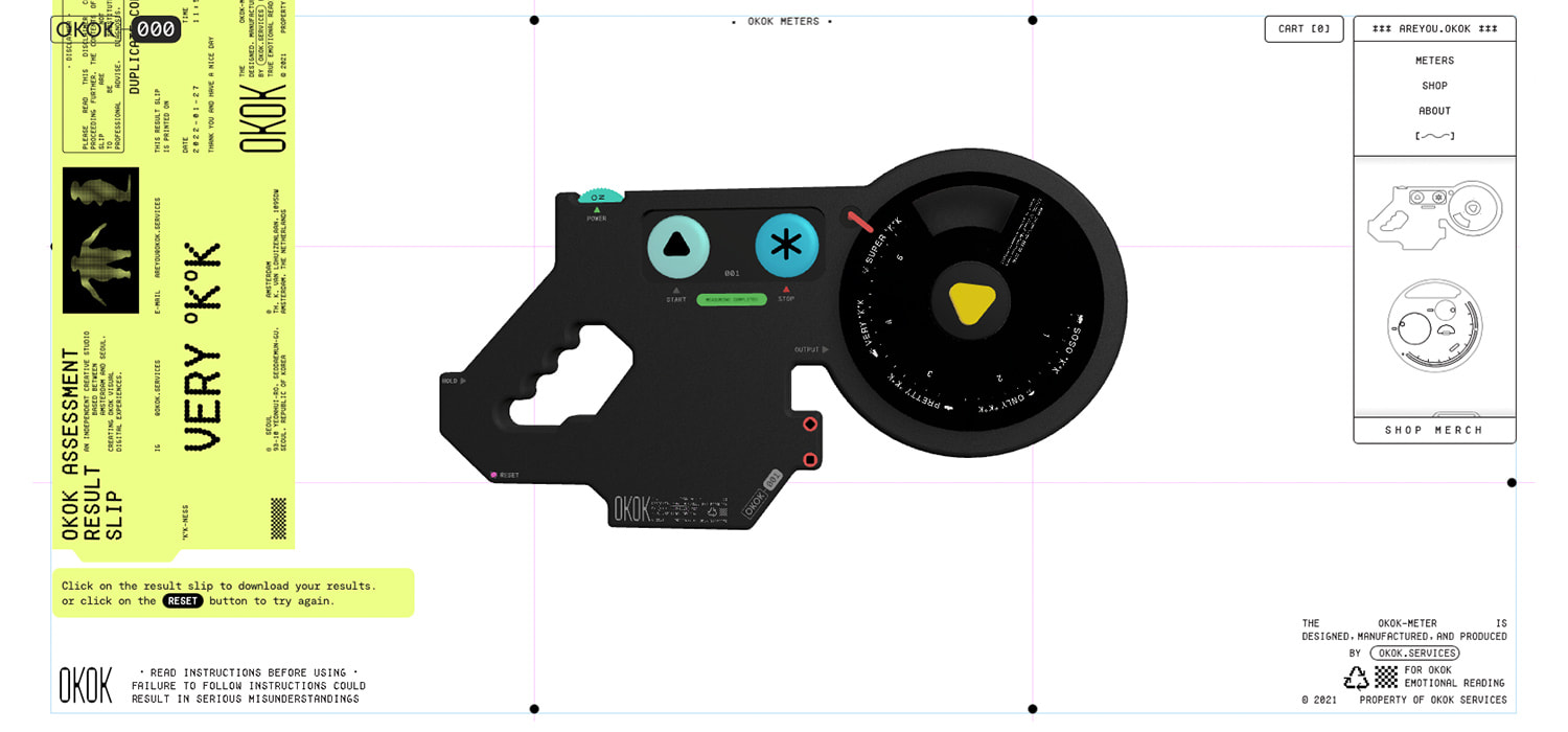
Together with our friends at MPTY, we conceptualized the ‘OKOK Meters’, which are virtual measuring instruments that playfully dispenses reading slips based on particular user behavioral patterns.
It was in some way a figurative take on the relationship between humans who write code as instructions for computers to process based on if-else statements and likening this to our behavioral patterns with people around us, constantly checking for true / falses before executing an action.

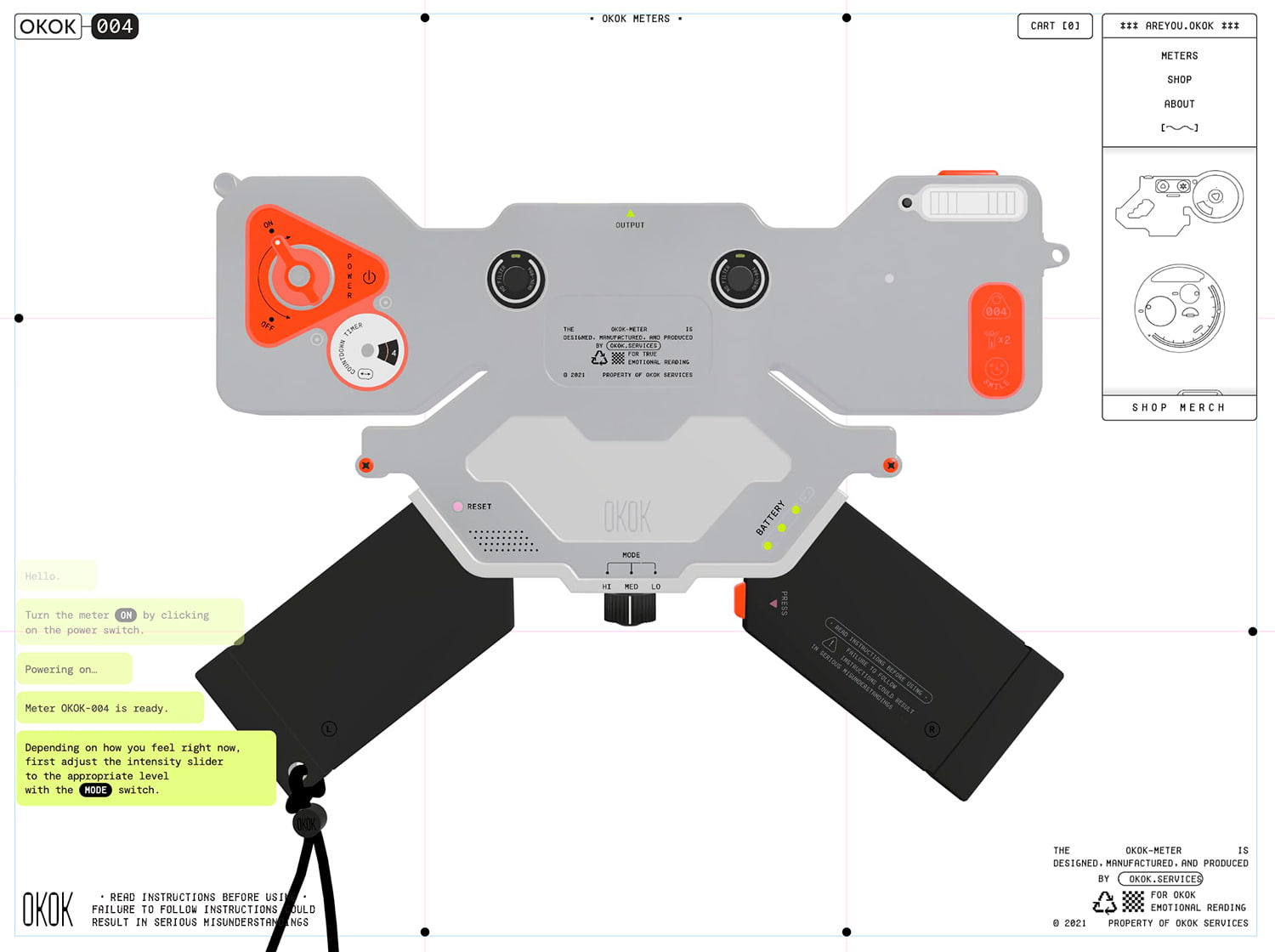
We also found beauty in the details and utilitarian aesthetics that comes from the visual language of meters and gauges, which meant it was possible to interpret these meters into various forms, colors, and sizes. We also looked into devices of different shapes and sizes, past and present, analog and digital to inform the visual style.
We found beauty in the details and utilitarian aesthetics that comes from the visual language of gauges which meant it was possible to interpret these meters into various forms
Approach
In the process of collaboration with our partners to design the meters, we also had to think about how they would be translated into 3D objects and be mindful that users will have to interact with them not with a tactile touch but with a mouse cursor or on a device touchscreen instead.
The site design of the website itself, with elements such as scrambled text animations, blinking lights were informed by the design of the meters itself. Certain motions website – for example, intentionally limiting the frame rate of the menu transitions – were used to further carry this theme through.
Experience
The overall experience of the website is slightly unconventional in the sense where certain interactions are intentionally kept obscure. We felt that this encouraged users to discover the individual models more spontaneously, and led to happy surprises when particular interactions occurred. An example of this was the result slip printing animation that happens when users successfully manage to figure out the workings of a particular meter. This result slip was also downloadable by the user to then share it on their socials. ‘Wrong’ sequences of interactions will also yield errors, which adds an element of trial and error for the user.
The overall experience of the website is slightly unconventional in the sense where certain interactions are intentionally kept obscure.
Experience of discovery and playing with an OKOK Meter
Sound was also an important part of providing the user with a richer experience. The meters were all different in its type of build, whereby some were analog machines with actual dials and switches, while others were more of digital devices with buttons similar to those of stopwatches. To achieve this, we had talented Korean sound artist and musician Yeong Die onboard to create distinct tones and sounds for each of the four meters, on top of a looping BGM which we felt was the final piece of the puzzle to help have all of the website elements come together.
Execution
Having multiple 3D objects displayed on the website at the same time meant that we had to optimize the models to keep the file sizes as low as possible while at the same time optimizing the website performance on various desktops and devices. We eventually found that this was largely achievable by working with a GLTF/GLB 3d file format exported from blender, which then allowed us to work with the DRACO 3D graphics compression pipeline to further decrease the file sizes without noticeable visual differences.

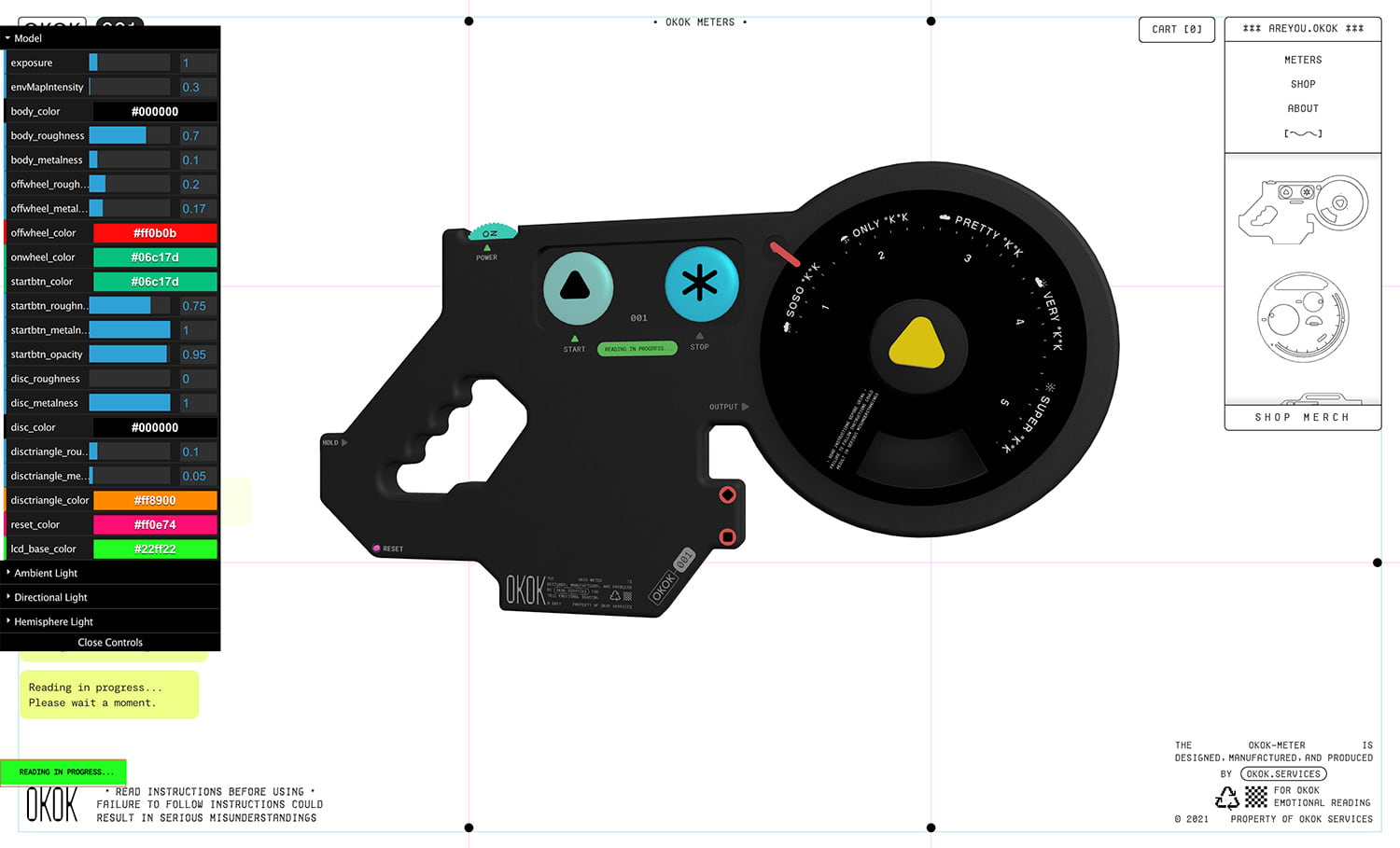
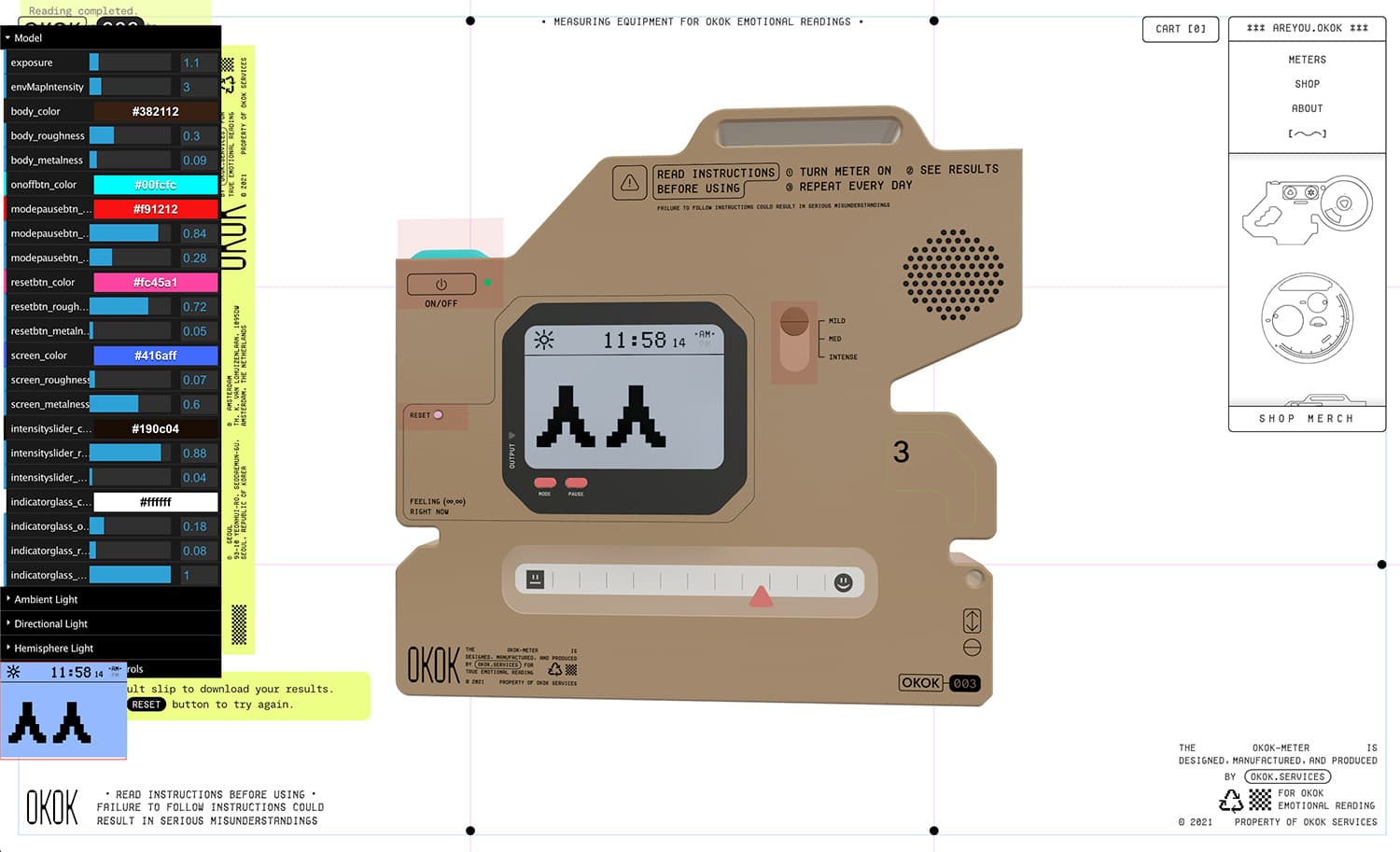
The models were then imported into code and interactions handled with the three.js library. We then had to further tweak the look of the models and the scene lumination to achieve the desired results. The interaction functions for particular buttons and knobs were also integrated at this stage by positioning plane 3d meshes in front of the clickable areas to detect clicks via raycasting. To aid these processes, we made use of a debugging GUI to efficiently make these adjustments on the fly.

For particular meters which had LED displays on them, we utilized an offscreen HTML canvas element to draw and animate frame by frame the different pixel icon statuses which was then passed on as a texture and mapped onto the model itself.
The website was built on the Vue.JS, Nuxt.js frameworks. We also had a simple shop page to sell ‘OKOK Meter’ branded items and this was seamlessly managed by coupling DatoCMS and Shopify’s API.
Conclusion
The experience in creating the ‘Are You OKOK?’ website was a really interesting one as we had the opportunity to be a ‘client’ to some extent and approach projects from the opposite perspective. It was also an amazing experience to have other talented creatives onboard to collaboratively work and bounce ideas off each other to ultimately achieve the end result.
Company Info
Led by creative duo, Faris Kassim and My Kim Bui, OKOK Services is an independent studio based between Amsterdam and Seoul that specializes in creating and directing explorative experiences for all things digital.
Check our Instagram
