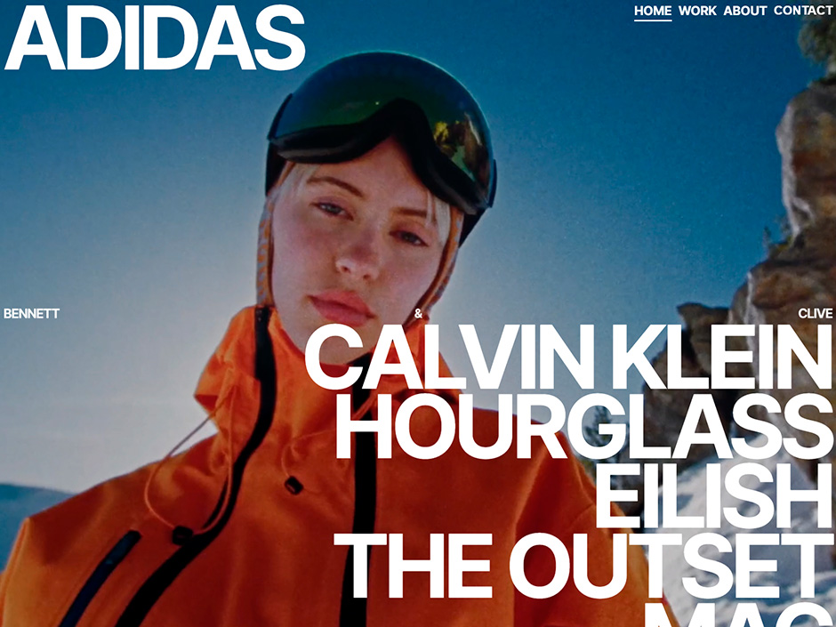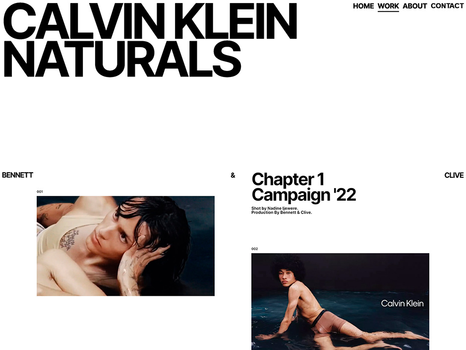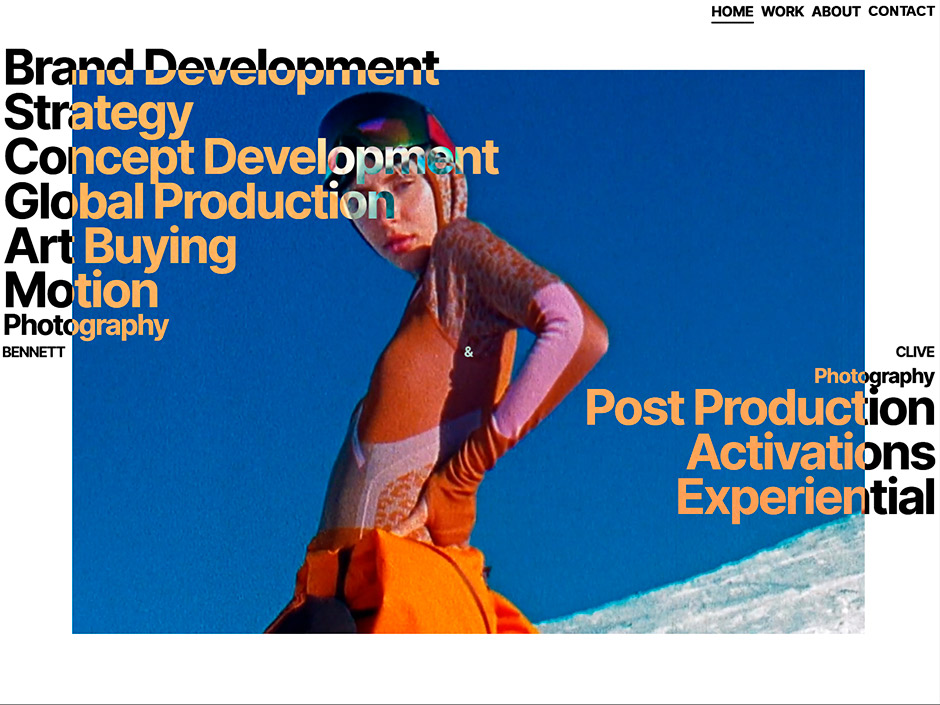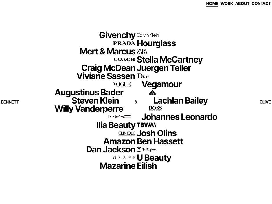
Massive congratulations to SPATZEK STUDIO, THOMAS AUFRESNE & DANIEL SPATZEK for winning Site of the Month March 2024 with BENNET & CLIVE, thanks for all the votes and tweets.
When designing for Bennett & Clive, a production company based in NYC renowned for its collaborations with the biggest brands on earth, the goal was to blend classic, typography-focused design with a state-of-the-art portfolio website that incorporates animations without compromising the minimalist tone.

The Ask
Bennett & Clive approached me with a clear objective: to create a website that reflects their brand’s minimalist yet sophisticated identity. They needed a platform to showcase their creative production capabilities while maintaining a sleek, fashion-forward aesthetic. The client emphasized the need for a unique and innovative design, explicitly stating that it should steer clear of being "too Brooklyn," which was a direction initially explored but later discarded.

The Challenge
Our primary challenge was to integrate animations in a way that enhanced the minimalist design rather than detracting from it. This involved finding the right balance between visual engagement and simplicity. Especially the pages that present the work of Bennett & Clive had to be clean and simple, with a focus on content. On other pages, such as the "About" page, I tried to shift the balance a bit more toward an entertaining direction.


The Ampersand Concept
The breakthrough came with the idea of using an interactive ampersand. This symbol, now central to the company's branding, became the main hook of the website. It interacts with all intersecting elements, adding a dynamic layer to the site while preserving the minimalist aesthetic. The ampersand's interaction with other elements creates subtle yet engaging visual effects, maintaining a fashion-like aesthetic.

Teaming up
For this project, I teamed up with creative developer Thomas Aufresne. This was our first project together, and due to his skills and expertise, everything went smoothly. Typically, my design process is quite 'raw'—I start creating visual ideas and directions that are not 100% polished and then jump right into development. This involves a constant back and forth with lots of iteration and improvements until reaching the final goal. However, working with Thomas required adapting this approach.
Despite not being able to fully implement my usual process, Thomas's skillset allowed for a toned-down version. I provided him with static designs that were less polished, and he brought them to life with animations. I explained the desired animations, and together we developed and refined them. His expertise ensured that the final product met our high standards.

Stack
- Nuxt.js for a robust and high-performance framework.
- GSAP for animations.
- Netlify for deployment and hosting.
- Storyblok for content management.
- Lenis for scroll management.
About
Daniel Spatzek is an adaptive web/graphic designer and developer from Austria. Since 2019 he has owned his own web-design studio ‘Spatzek Studio’.
