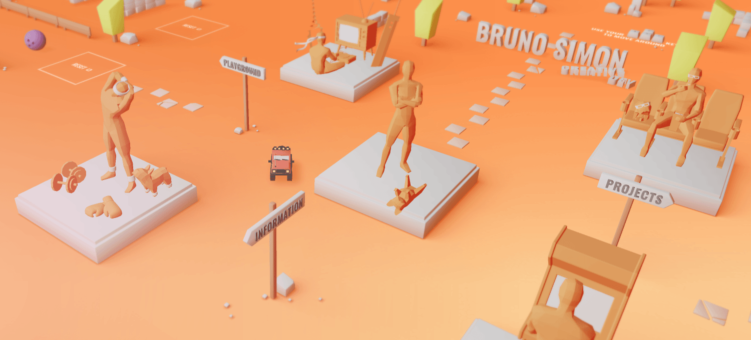
Big Congratulations to Bruno Simon for winning Site of the Month November for his awesome playful 3D WebGL playful portfolio! Thanks for the votes and tweets, find the winner at the bottom of the article.
Almost every developer and designer wants to rebuild their portfolio. It’s a fact. But very few find the time to do it. As a teacher, I’ve been helping my students to build their own portfolio, but mine looked just “okay” and I really wanted to step up and do something that would inspire them.
I’ve been doing WebGL for few years now and have learned a lot while working at Immersive Garden. I like modeling and I’ve been using Blender for a year and a half. I therefore thought this portfolio was the perfect occasion to improve my skills in 3D modeling.
I’m also a huge player and love games that implement physics components. I think that physics isn’t used enough in web while it adds so much to the experience and isn’t that hard to implement. Going for a WebGL game where you can play with objects was kind of an obvious choice for me. And as a first person game would be too hard for a non player visitor, I decided to go for a simple car game with a bird’s eye view. As I often say, the best game you can build, is the one you spend too much time playing on. So I made sure to have fun while developing it. I believe that you cannot work on a project for months if you don’t enjoy yourself.
The best game you can build, is the one you spend too much time playing on
Not any universe
I always say that the portfolio should be something very personal. This is why I always do it entirely by myself and by not following the trends. At least, that’s what I kept in mind while creating the 5 sections that compose the universe:
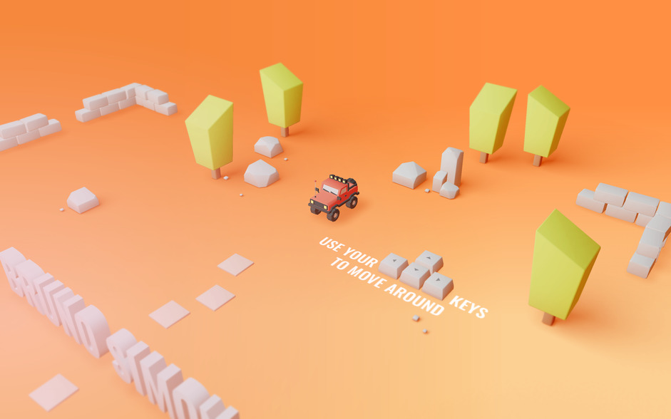
1) The intro where the user learns how to drive around and discover that objects can be pushed.
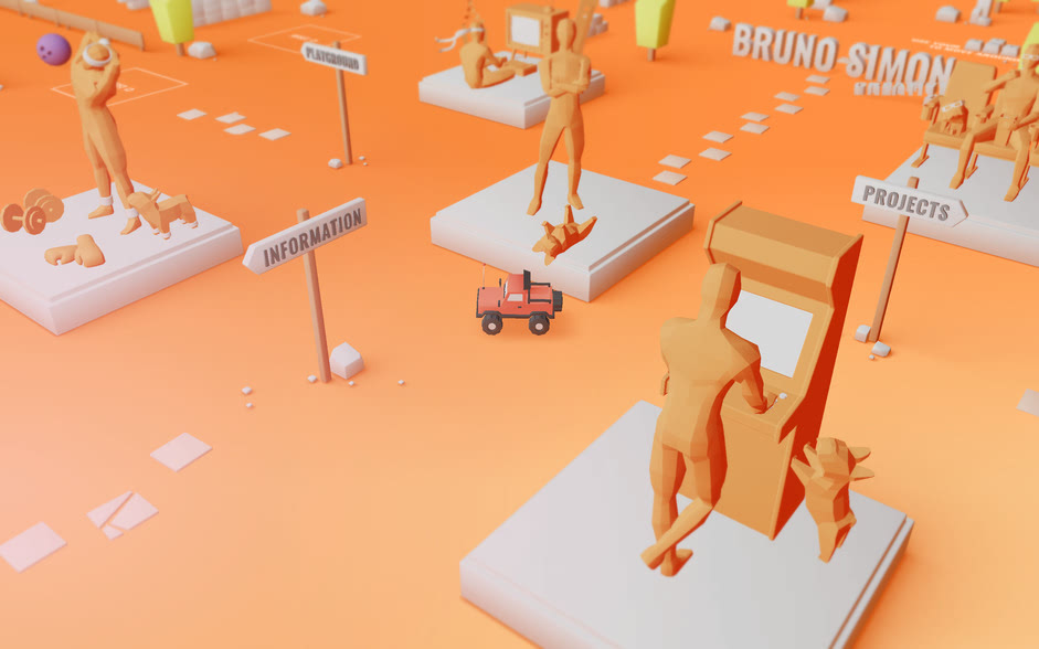
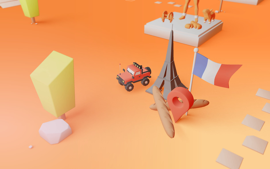
2) The crossroads where I’m represented in different situations as statues and that serve as link between sections.
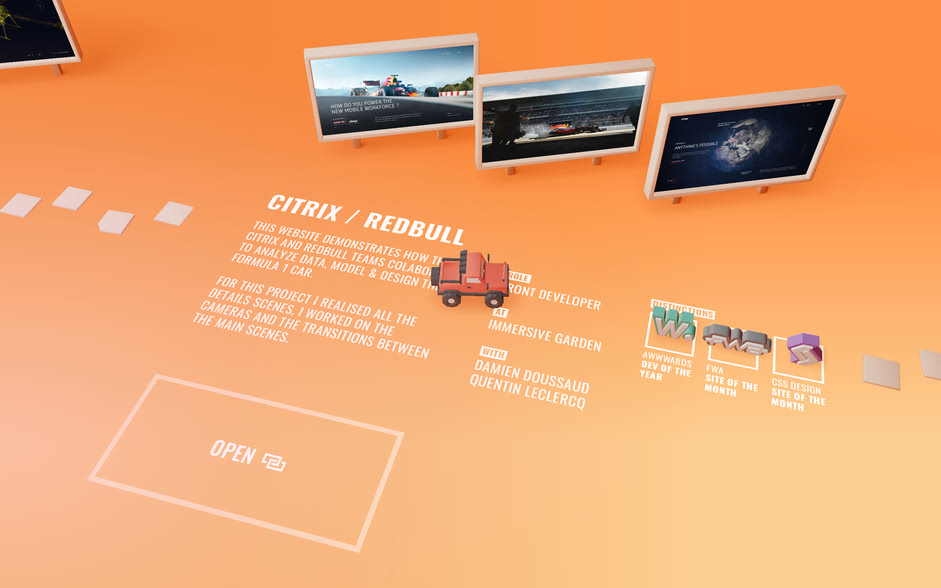
3) The projects to discover some of my favorite work.
4) The information to learn more about myself and how to contact me.
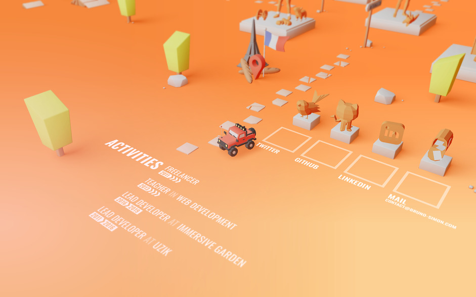
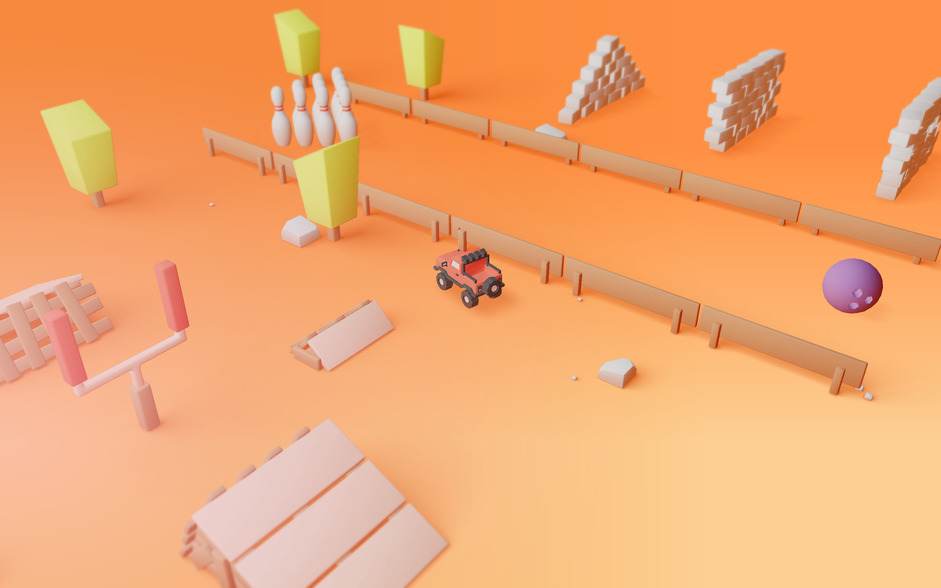
5) The playground where the user can have fun with physics (my favorite part).
Classic Technologies
➭ Modeling
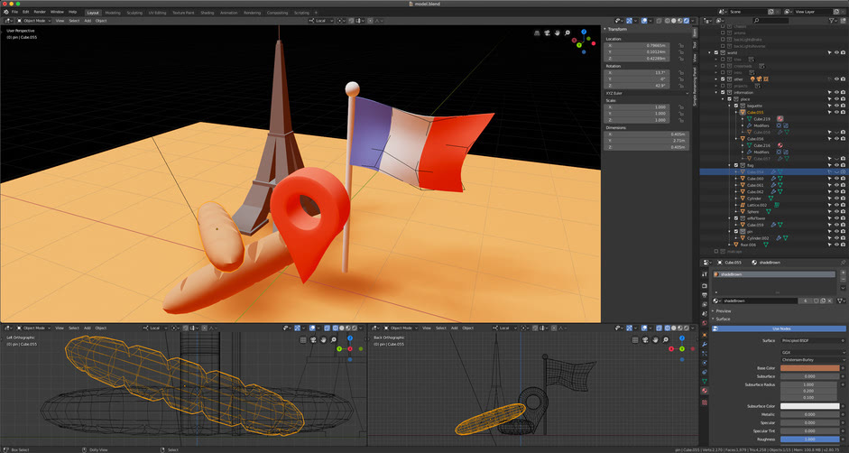
Lately I’ve been using Blender but I still have so much to learn, and as I wanted to test the 2.8 version, I decided to model the whole thing on it.I made a low poly version for the models you can see and I made a primitives version (cubes, cylinders, spheres, etc.) for the physics engine, in order to simplify the calculations. Users obviously can’t see the primitives version, but that’s what is running in the physics engine. I exported everything in GLTF with draco compression. Combined with Gzip, all models weighted less than 2Mo which is fantastic I believe, considering the quantity of models.
➭ Rendering
For the WebGL rendering, I used Three.js. For me, it’s the best WebGL library for 3D. It’s very complete but it’s also very close to the native rendering mechanics making it easy to optimize and customize. Most of the materials I used are custom made, using what we call shaders. They are programs sent to the graphic card (GPU) telling where each point composing the geometry should be and how each visible pixel of this geometry should look. I added some post process effects like a simple blur on the top and bottom of the screen to simulate smallness and a huge glow on the left to imitate sun flare.
➭ Physics
I used Cannon.js for the physics. You can imagine it like a parallel universe composed of primitives (the ones I mentioned earlier) that update on each frame. And after each physics update, the visible universe updates itself according to it.
The devil is in the details
What I like most on good websites are the details. It’s hard to keep spending time on the project where the main purpose is achieved but I believe this is what makes the difference between a good project and a great project.
Antenna
I animated the antenna by myself without the physics engine because I had something very specific in mind. It turned out really great and it was actually awesome to see people intentionally bumping into walls to see how the antenna would react.
Tab title
The title represents the car going forward and backward. Just drive and it’ll update.
Backlights
The backlights turn on and off when you go backward or when you brake.
Easter eggs
I won’t say much so that you can do your own investigation ;)
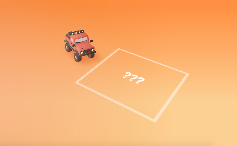
Mobile
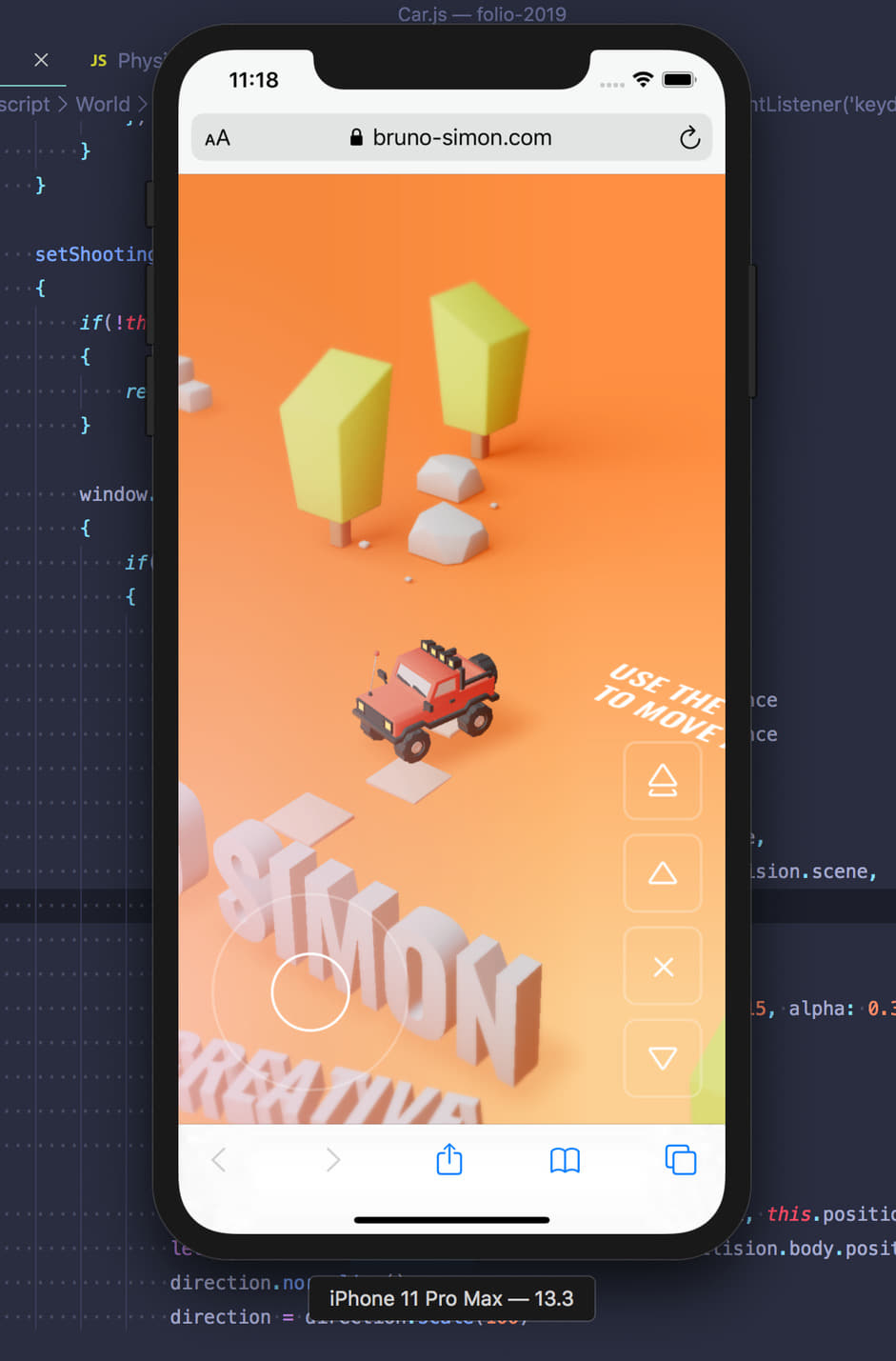
It’s been obvious for many years, every website must be mobile compatible. What a relief when I tested mine on a mobile for the first time and the performance was good! I just needed to add specific controls, tweak few things to make the experience more pleasant on small portrait screens and thank god it was done.
Reactions
To be fully honest, I never thought my portfolio would be such a success. While it was just a fun project to show to my students and inspire them to improve their portfolio, I started to receive hundreds of messages, thousands of followers and hundreds of thousands of visitors. I was not prepared but believe me I’m really really thankful and happy. Thank you for reading me and I hope you’ll find all the hidden easter eggs!
Thanks to everyone in the web design community who took the time to vote and tweet: @magdazelena, you've won a free year's Pro Plan in our directory for designers, DM us on Twitter to receive your prize!
